Vscode: Explore a richer ui for the account picker and settings sync
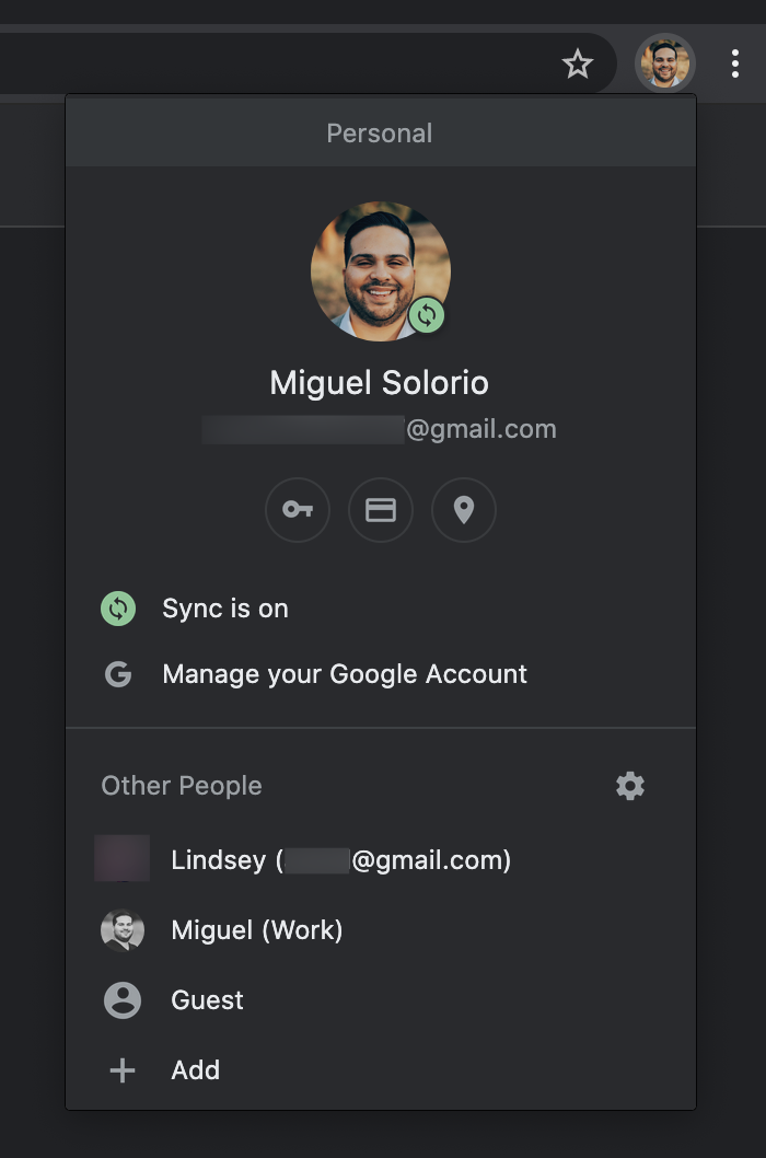
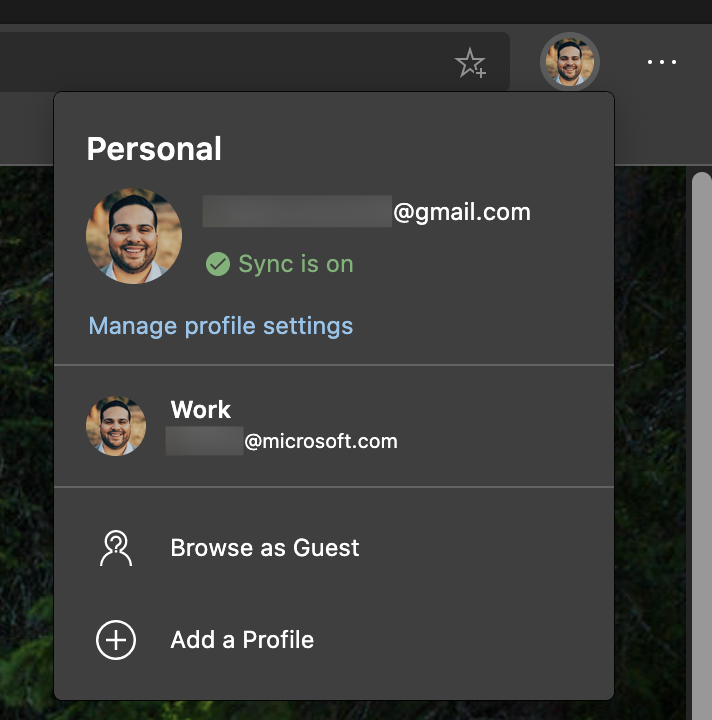
Similar to Chrome and Edge, we should explore using a richer ui to make the information and actions much clearer. This could follow the similar visual patten as notifications.
Chrome
Edge
 misolori
All 3 comments
This feature request is now a candidate for our backlog. The community has 60 days to upvote the issue. If it receives 20 upvotes we will move it to our backlog. If not, we will close it. To learn more about how we handle feature requests, please see our documentation.
Happy Coding!
 vscode-triage-bot
on 7 May 2020
vscode-triage-bot
on 7 May 2020
Here's my proposal for this rich ui. This would be scoped to the account manager and clicking on any of the account items will link to their respective quick pick menu items, clicking on "Sync is on" would open the Preferences Sync quick pick, and whenever an extension does a silent sign in with the badge, this would open the flow for signing into an extension.

misolori
on 14 May 2020
@misolori @RMacfarlane @sandy081 hey, I was wondering if we could make progress on this item, e.g. by putting it back to some milestone? I really liked the UX I saw and wish we could start on the implementation 👍
 bpasero
on 8 Jul 2020
bpasero
on 8 Jul 2020
Related issues
 biij5698
·
3Comments
biij5698
·
3Comments
 curtw
·
3Comments
curtw
·
3Comments
 v-pavanp
·
3Comments
v-pavanp
·
3Comments
 sirius1024
·
3Comments
sirius1024
·
3Comments
 sijad
·
3Comments
sijad
·
3Comments
Most helpful comment
Here's my proposal for this rich ui. This would be scoped to the account manager and clicking on any of the account items will link to their respective quick pick menu items, clicking on "Sync is on" would open the Preferences Sync quick pick, and whenever an extension does a silent sign in with the badge, this would open the flow for signing into an extension.