Vscode: Terminal icons UX / behaviour is not great
I never quite understood the UX of the terminal in general, and even after years of using VS Code, I can't seem to get used to it:

It's probably because I'm a very long date JetBrains user, but for me the terminal (if used) should behave a bit more like the "open editors" or "outline" views of the explorer panel, meaning that you can stack, maximize and minimize them. Intellij Idea does this in a quite nice way:
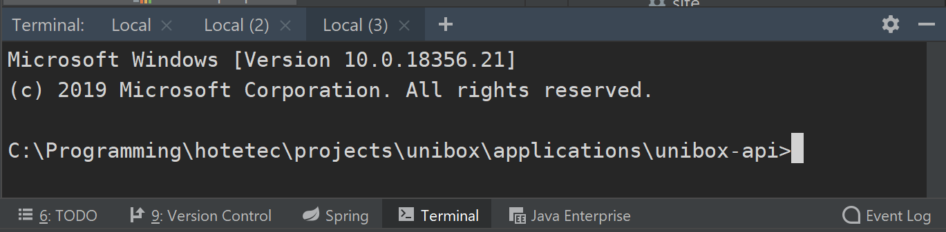
You have one tab per terminal, and you can decide if you want to minimize the bunch, or close one of them. You can easily understand that the + will create another terminal in a new tab, and closing the tab, you kill that terminal.
In VS code, the x button means the terminal is _closed_ but not _killed_ (you have the trash bin for that), and the ^ means it's maximized, but there's no way to minimize it, just to close it, or get it back to it's original size with v.
Plus the select switch is nice, but I feel the tabs are a more visual way of knowing how many terminals you have at any given time (IMHO, I get this is subjective).
My biggest grief is that it's really not clear when you closed the panel if you have a terminal running in background or not.
The splitting option is great, but when you have several ones, you're never quite sure which terminal you're killing when pressing the trash button.
I don't know, I get this is probably a not a very useful post, and it's very subjective. But I think at least an option to "minimize" the terminal would be great (knowing it's there running something but small).
P.S: I always use VS Code as an example of how a project should be managed, and you guys are doing a wonderful job month after month. Keep up the incredible work!
 LeoLozes
All 4 comments
For tabs, hopefully this will come soon, it's on the roadmap this year which is a good sign. It also looks like most of your problems should either be fixed when we add tabs or are just general panel problems (v/^/x).
@misolori FYI, not sure if you had any ideas on improving general panel UX?
 Tyriar
on 4 Apr 2019
Tyriar
on 4 Apr 2019
@Tyriar you are totally right about my main complaint being just general panel problems.
It's just that the terminal is the most shown / hidden panel for me, and I'd prefer it to be minimized / restored, so I focused on that.
Do you think it's worth opening another issue or it's just not going to change? :)
LeoLozes
on 4 Apr 2019
I've personally never understood why the maximize button took precedent over it being minimized as that seems like a more common/useful feature. I did a quick mockup of what it could look like if we made it minimized:
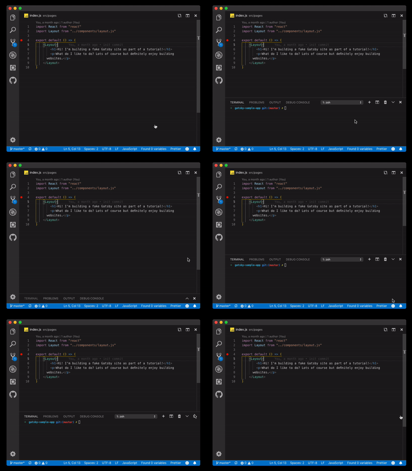
EDIT: After talking through this, another option would be to introduce a setting that would allow you change the default action (maximize vs minimized) and also allow you to hold down alt/option as you hover over the action to toggle the direction (just like our split editor action).
 misolori
on 4 Apr 2019
misolori
on 4 Apr 2019
@misolori well minimize is basically close here, what the v icon gives is the ability to _restore_ the window, so you can jump into a fullscreen terminal and then with a command/keybinding restore it back to the size it was.
Your mockup would make more sense imo as a setting to always show the panel and then we could just remove the x button. We definitely still want to be able to maximize the panel though.
Tyriar
on 7 Apr 2019
Related issues
 v-pavanp
·
3Comments
v-pavanp
·
3Comments
 ryan-wong
·
3Comments
ryan-wong
·
3Comments
 chrisdias
·
3Comments
chrisdias
·
3Comments
 DovydasNavickas
·
3Comments
DovydasNavickas
·
3Comments
 vsccarl
·
3Comments
vsccarl
·
3Comments
Most helpful comment
I've personally never understood why the maximize button took precedent over it being minimized as that seems like a more common/useful feature. I did a quick mockup of what it could look like if we made it minimized:
EDIT: After talking through this, another option would be to introduce a setting that would allow you change the default action (maximize vs minimized) and also allow you to hold down alt/option as you hover over the action to toggle the direction (just like our split editor action).