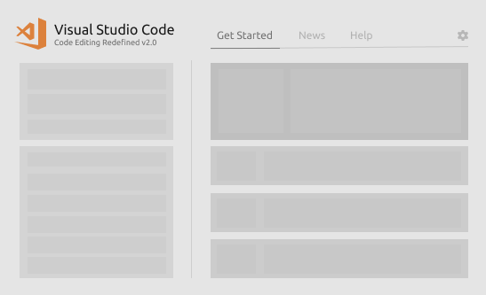
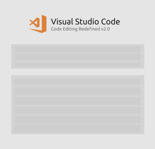
Vscode: Explore improving UX for Welcome Page
This exploration will aim to modernize the look and feel of the Welcome page while also improving the layout for new and current users. Items we're looking to explore:
- Add "privacy" section to page for better visibility
- Add "recently update" section for app and extension updates
- Add underline for text links on hover (consistency)
Related issues
- Ability to remove recent item #22489
- Ability to pin projects #63057
- Don't open browser on first launch without user's action #14934
- Revisit "Interface Overview" page #19491
Current Design

Research
Our research shows that new users install language & keyboard shortcut extensions the most, while current users go to recent projects or open folders. Below is a visualization of the top actions.
Top actions for new users

Top actions for current users

I will be updating this issue with explorations as they're developed.
 misolori
All 38 comments
@misolori from my issue at #56144 there was a comment about pinned projects on the welcome screen too.
And also to keep in line with thw rest of VSCode, the hyperlinks should have an underline on hover
 beastdestroyer
on 14 Nov 2018
beastdestroyer
on 14 Nov 2018
@beastdestroyer thanks, I've updated the issue to include those two.
misolori
on 14 Nov 2018
Should welcome page contain a link to command for git cloning a repo (under the Start section)? IntelliJ and next Visual studio is showing that in their start/welcome page/view.
 gulshan
on 15 Nov 2018
gulshan
on 15 Nov 2018
Explorations
Exploration A
- Moves Start and Recents to the right
- Adds option to star/remove recent item
- Adds privacy section for telemetry
- Condenses help links into buttons

Exploration B
- Moves Start and Recents into sidebar
- Adds option to star/remove recent item
- Adds privacy section for telemetry
- Condenses Customize, Learn, Help into tabbed content
- Adds an "Updates" tab to show app & extension updates

Exploration C
- Makes recents two-columns
- Moves Start to the right side
- Adds option to star/remove recent item
- Adds privacy section for telemetry
- Condenses help links into buttons
- Condenses help links into buttons

Exploration D
- Makes Recents and Start into two-columns
- Moves Customize, Learn, Help into large buttons
- Adds option to star/remove recent item
- Adds privacy section for telemetry
- Condenses help links into buttons
- Condenses help links into buttons

misolori
on 16 Nov 2018
I do think Playground is an important part for people to get familiar with VS Code's editing features and should be a part of the welcome experience.
Being able to try the features right in editor is much better than reading docs in a browser and come back to editor.
 octref
on 16 Nov 2018
octref
on 16 Nov 2018
I prefer B... I think giving regions of space to each set of features could help users process them more quickly/easily at a glance. The background on the right side creates a nice separation. The tabs in the main content area allow a few items to be tucked away a bit, reducing clutter. It'd be a nice bonus if it retained the state of your selected tab.
 Da13Harris
on 16 Nov 2018
Da13Harris
on 16 Nov 2018
I like the focus of C on 'Recent' folders. Is there a good way to use that space when there are no recent folders yet, like on first startup? E.g., by using a subpage switcher like in B.
 chrmarti
on 16 Nov 2018
chrmarti
on 16 Nov 2018
I like C and D, perhaps sort the buttons on D by category like C, lower that container down so it's centre with everything else, and center the Show welcome page on startup checkbox
beastdestroyer
on 16 Nov 2018
Seems like the C is the best option. Focus on "Recents" is the best.
 ghost
on 16 Nov 2018
ghost
on 16 Nov 2018
@chrmarti that's a good idea. We could move the "Help" content up to the recents location when there are no recents, since the users accessing this view would most likely be new users, and then move it back when there are recents:

misolori
on 16 Nov 2018
I prefer D the most and here are my 2 cents. Before I'm super familiar with shortcuts of Open Recent and Open Folder, I used Welcome Page as my dashboard. I bind F2 to command Open Welcome Page and then everytime I just press F2 and then
- Choose a recently opened folder
- Or open a new folder
But now I no longer do that as I have to switch from the keyboard to mouse to operate on the welcome page. When I use Open Recent, I only need to press Ctrl+R, type and then pressing Enter, however with welcome page, navigating into those links is painful.
For option D, as we already focus on the Recent Folders, if we can use arrow keys to navigate between all clickable elements, it can be super helpful

 rebornix
on 16 Nov 2018
rebornix
on 16 Nov 2018
@misolori I like that. 👍
@rebornix I think keyboard-centric navigation is best served by the Open Recent (Ctrl+R) command. We should still think about improving keyboard navigation on the Welcome page, but I wouldn't optimize the design for the keyboard.
chrmarti
on 19 Nov 2018
Exploration C
Here's an updated exploration for Concept C. In this one I explored ways to make the first day experience (Day 0) focused on getting started. From the research above, it's very important for new users to adjust the editor to fit their workflows (via language support and keyboard shortcuts). Additionally, I wanted to make sure that current users (Day 30) we're able to easily access their recent projects while still providing for a way for those new users to access the first day content.
Day 0
- Focal point is on getting started (customizing and learning) while also exploring the product
- Added content tabs for app + extension updates, and help content
- Entire layout is reduced for easier click targets

Day 1
- Moved customize and learn content into tabbed content to reduce visual noise

Day 30
- Increased layout for higher density of information
- Recents turns into two columns

misolori
on 20 Nov 2018
I need to warm up to that little page switcher. Isn’t that an indication of us putting too much information on the ‘Welcome’ page?
I like the other ideas.
chrmarti
on 20 Nov 2018
@chrmarti But can't you also argue that. being a Welcome screen, a lot of features can make it quite appealing, especially to newer users. I would say depending on the content yes there may be too much, but the page switcher with a few buttons isn't at all
beastdestroyer
on 20 Nov 2018
It's a hard balance to make certain content the focal point for certain users, so that's the main reason for introducing the content tabs/switcher. In our current design, we definitely show a lot of content so I'm trying tidy that up while placing a bigger emphasis for Recents and Start.
For example, new users are more likely to install their language & keyboard extensions to support their workflow while current users are more likely to open a recent project. But we can't have an emphasis for all of it at the same time so contextually moving it can help with that.
misolori
on 20 Nov 2018
Another vote for B here, perhaps with a button to expand (& pin) recents to fill the page...for those who want recents as the primary function of their welcome page, after using the application for some time.
Also agree that playgrounds need to feature here somewhere, but I guess that would be under the learn tab.
 dalDevelo
on 3 Dec 2018
dalDevelo
on 3 Dec 2018
After doing a bit of user testing with the various explorations above (thanks to @stevencl), we've found that Exploration C has performed the best and we'll be working on incorporating those changes. The actual changes will likely happen in the next iteration or so. I'll keep this issue open as I post higher fidelity mockups. Below are the latest iterations.
Day 0

Day 30

misolori
on 3 Dec 2018
Below are a couple of the higher fidelity mockups:
Day 0

Day 1

Day 30

Transition (GIF)

misolori
on 13 Dec 2018
@misolori the folders list looks really empty. can icons be added next to them? if a folder is mainly javascript maybe display javascript icon?

 Astrantia
on 13 Dec 2018
Astrantia
on 13 Dec 2018
@Astrantia the intention is to keep it simple, any icons would add unnecessary visual noise since it would be the same icon (projects can contain multiple file types).
misolori
on 13 Dec 2018
It’s a minor complaint, but I think the logo and header text alignment looks terrible in relation to the text below. Maybe the header could be moved up a little further to create more separation from the ‘recents’ section below, or add some background shading to the recents section, such as in exploration B (which I still prefer). It would probably even look a little better if the logo was moved to the right hand side of the text and the header text was aligned to the text left?
Are recent workspaces still identifiable by (workspace) after the title, or will there be other visual indicators of workspaces, such as a different shade of text, perhaps?
dalDevelo
on 13 Dec 2018
@misolori
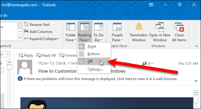
Just a quick proposition, some user might not understand why their view is changing (or even when it's changing). So perhaps adding a dropdown to choose the view that the user would want might help!? I basically think of exactly how that can be customized in Outlook with Pane View customization.
I'm also assuming that your "transition GIF" in your previous post was forced in your code, while you could instead do it with a dropdown.
If you want to keep it simple, you can also skip the dropdown proposition (it's just a suggestion). Your new approach is nice.
Thanks for making VSCode my Go To Editor for all my coding 😃
 ghiscoding
on 8 Jan 2019
ghiscoding
on 8 Jan 2019
@ghiscoding thanks for the suggestion! Can I ask why you'd want to customize this layout and what you'd want to do?
Our main reasoning for doing this two-part view was so that we could help optimize the space for two specific types of users without alienating the other. New users need guidance to get started and existing users jump back into their projects a good majority of the time. While I can see how the dropdown would be convenient to customize, it doesn't really fit into the story of optimizing the space for these two users and a dropdown would be a bit overkill for this (IMO). We also definitely prefer a simpler/minimal approach to our UI 😄
misolori
on 8 Jan 2019
@misolori the suggestion is basically to address what I wrote in first paragraph of my previous post
some user might not understand why their view is changing (or even when it's changing)
Basically your implementation changes the layout after a month without advising the user of the change. Some users might not know why or when it changed (I know myself because I read this thread, but apart from that, I probably wouldn't know that the layout changes after a month). A new dropdown would make it more clear and provide possibility to keep 1st layout forever if user wish to.
Again this is just a suggestion, if you like it then go ahead with it, else I'm totally fine without it.
ghiscoding
on 8 Jan 2019
@ghiscoding I think you may have misread my posts above. The “Day 0” is when a user opens Code for the first time on a fresh install. Once a user opens a project we show them the alternate layout. The “Day 1” and “Day 30” layouts are the same, one just shows when there are less recent projects and the other for when there is more.
misolori
on 8 Jan 2019
Would it be possible to add a setting to hide the "Show Welcome Page at Startup" checkbox?
 loligans
on 8 Jan 2019
loligans
on 8 Jan 2019
I'm a fan of the visual studio 2010 start page as it emphasizes the various sections quite nicely:
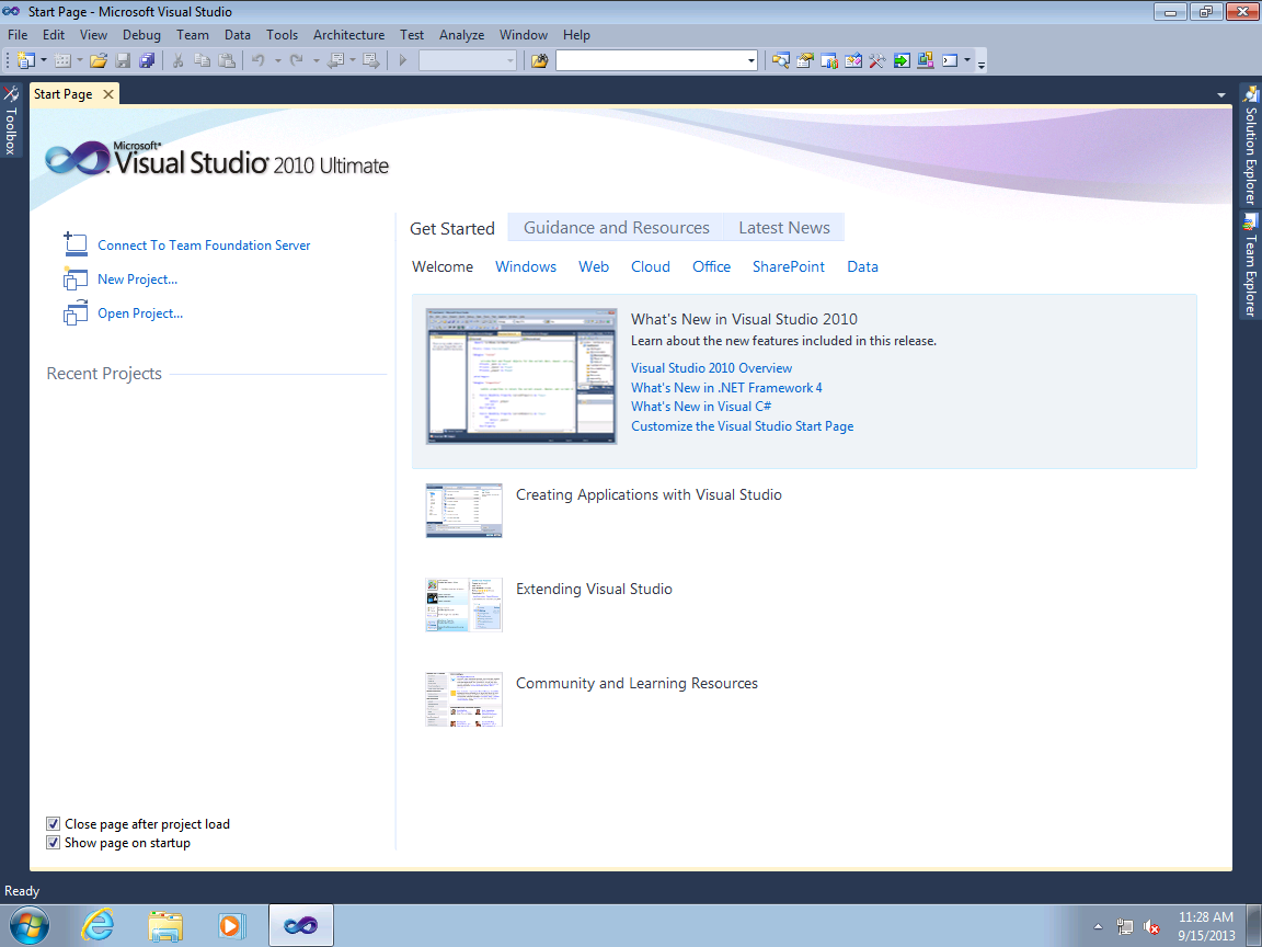
I have the current welcome screen disabled because the keyboard is much faster. However, if the page featured news/tips using the layout above then I might actually enable it.
I'm not sure if the day 30 thing is going to be more useful than just adding a setting that changes the layout whenever the user wants. Experienced users who prefer minimalism would have already modified the Workbench: Startup Editor setting to match their preferences. Instead, I'm in favor of adding these 2 options for the welcome screen:
- Regular welcome screen
- Centered welcome screen with only the file creation and recent project list (for the minimalist)
Here's a quick ugly sketch of what that might look like:
ghost
on 8 Jan 2019
@loligans I get what you're getting at (you don't want to see the checkbox), but I'm not sure it's worth the investment just to hide a single checkbox.
@nealot thanks for the suggestions. Curious to hear why you would enable the welcome page just for tips? I personally don't think adding "news" to an editor is a great idea as there are so many different mediums for consuming it (it's also an old trend that has phased out).
misolori
on 9 Jan 2019
@misolori VSCode has so many great features that sometimes it's difficult to wrap your head around them -- this is especially true for beginners. I don't think most people are devoted enough to go through every single release update (past or future), so displaying tips about unused configuration options now and then might be useful. For instance, a tip like "You can disable _Editor › Minimap: Render Characters_ to render color blocks instead of the actual characters" might benefit someone unfamiliar with that option. Or maybe a featured API reference might inspire someone to create their first extension? Perhaps even some notable keyboard shortcuts could be mentioned? Tiny pieces of information like that could potentially make even the more infrequent users a little more aware of the application's ecosystem.
As for the news, I suppose it's the only other thing I might find useful since I almost exclusively use the keyboard for commands. Aggregating product updates from a bunch of sources (such as this article) to be displayed on the welcome page seems very strategic to me. But if the concept wasn't popular then it's whatever; I'm not particularly attached to the idea, just personally thought it would be a neat addition.
ghost
on 10 Jan 2019
I suggest the "Add workspace folder..." text gets reworded to "Add folder to workspace..." so it matches what appears on the File menu.
And how about adding a link for "Open workspace..." as well? If yes, then I suggest putting it between "Open folder..." and "Add folder to workspace..."
 gjsjohnmurray
on 12 Feb 2019
gjsjohnmurray
on 12 Feb 2019
Hi @misolori ,
I really liked the new mockups, specially the exploration C, but I would like to comment a different area.
Is there any chance (or had any conversation about) allow extensions to _contribute_ to certain sections of the Welcome Page?
I mean, my Project Manager extension allows the user to define _Favorite Projects_ and would be nice to have this list available right from the start in the Welcome Page. This could appear _near_ the Recent section.
There are also some extension that almost makes VS Code a new IDE, like the Java/Python extension. These extensions could add their _new kinds of projects/files_ in the Start section.
Even the Help section could receive contribution from extension.
The idea is the extension _contributes / provide additional info_, not _replace_ the VS Code contents. So the users still gets all the current help/features/support from VS Code, and after extending VS Code with new extensions, the start up would also be improved.
Thanks, and congratulations for the explorations 👍
 alefragnani
on 10 Apr 2019
alefragnani
on 10 Apr 2019
Totally agree with @alefragnani
Really loving exploration C (maybe logo could be a little bigger) and would be wonderful if extensions could contribute to the page.
An exanple could be a GitHub extension to provide open issues or remote repositories.
Or the SSH remote cold provide some host to connect to, without opening a project.
Hope to see soon the new design! 😁
 kowalski7cc
on 8 Sep 2019
kowalski7cc
on 8 Sep 2019
Basing off of: https://user-images.githubusercontent.com/35271042/49915404-45fc5580-fe4a-11e8-918f-473f31dd739a.png
What do you think of moving the "New File", "Open Folder...", and "Add workspace folder..." buttons above the recent files/folders list? They could be represented as horizontally stacked icons, possibly with titles underneath. That way, the "Start" section could be removed, which should provide enough space for the "Customize", "Learn", and "Help" tabs to be broken out into vertically stacked sections (removing the need for a page switcher).
Thoughts?
 andrewrothman
on 6 Nov 2019
andrewrothman
on 6 Nov 2019
@misolori What became of this?
 Matelasse
on 22 Nov 2019
Matelasse
on 22 Nov 2019
@Matelasse we've got a direction for the design but this has yet to be added to a milestone. I'm hoping this happens soon though I don't have an ETA.
misolori
on 22 Nov 2019
@misolori UX is sorted for this, right? I would love to implement the new designs.
 lambainsaan
on 14 Dec 2019
lambainsaan
on 14 Dec 2019
This might be a great improvement: being a non-new VS Code user I never need many items on current Welcome screen and use every day only Recent as show on initial design proposal as top 1 action for current users. I suppose there are many VS Code users doing the same.
 roman-petrov
on 21 Aug 2020
roman-petrov
on 21 Aug 2020
Related issues
 VitorLuizC
·
3Comments
VitorLuizC
·
3Comments
 vsccarl
·
3Comments
vsccarl
·
3Comments
 lukehoban
·
3Comments
lukehoban
·
3Comments
 shanalikhan
·
3Comments
shanalikhan
·
3Comments
 chrisdias
·
3Comments
chrisdias
·
3Comments
Most helpful comment
Explorations
Exploration A
Exploration B
Exploration C
Exploration D