Vscode: Error hover semantic information should be rendered separate of error message
From @octref in #62159
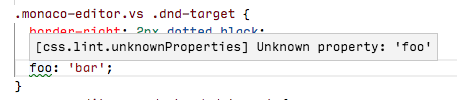
This is a regression on the diagnostics display.
1.28:
Insiders:
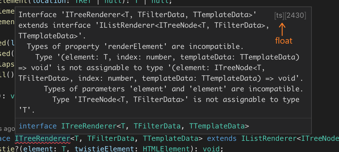
In both case, the diagnostics returned are:
const diagnostics = {
  code: "unknownProperties",
  source: "css.lint.unknownProperties",
  message: "Unknown property: 'foo1'"
}

If we have access to semantic information we should render it much better. The message should come first. Then the source on a separate line, with a Source: label preceding it and in non-monospace font (since source should be a user-readable string like CSS Lint). Then, the code with the same style, but with monospace, since code is often a library/OS error code. Something like:
Unknown property: 'foo1'Source: CSS Lint
Code:unknownProperties
cc @sandy081 @ramya-rao-a @misolori
 joaomoreno
All 36 comments
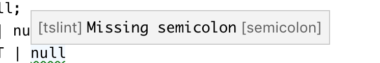
Another problem: changing source back to css is not nice in problems view. Previously I get:

Now I get:

Good things I miss from previous one:
sourceandcodedisplayed together in the left, the most prominent & easily-scannable place- I'm able to see the
codeeven in half screen, whereas if the message is long, I lose thecodeat the end
 octref
on 2 Nov 2018
octref
on 2 Nov 2018
source and code displayed together in the left, the most prominent & easily-scannable place
While that is true, isn't the real question what value the code attribute has at all? Usually this is a number and for css its seems to be a close variant of the message. Are people reading/understanding diagnostics like: "Oh error TS33165, I better not assign a boolean to a string" or do they understand the message "Type boolean cannot be assigned to type string" better/faster? For me the code is something I would use when googling a problem I don't understand by reading the message and therefore the least important piece of information.
 jrieken
on 5 Nov 2018
jrieken
on 5 Nov 2018
@jrieken
I see your point, but there are also cases when, say, a user is enforcing some new linter rules throughout a codebase. He would want to see which errors/warnings are caused by exactly these rules. He might also add pragmas to disable certain rules for some lines, when the rulename is useful.
From an extension author point of view, he doesn't care about passing in semantically correct info. He only knows the messages displayed on hover and problems are ${code} ${message} ${source} ${range}, and he tries to make best use of that format. We see that with HTML all the time, don't we...
octref
on 5 Nov 2018
which errors/warnings are caused by exactly these rules.
That sounds a little artificial but if that is the case, then I would probably search for that specific error code using the filter box on the upper right. (actually I wouldn't use the UI at all but I'd use the command line)
jrieken
on 5 Nov 2018
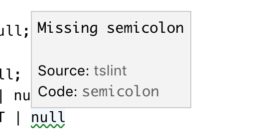
Inline widget renders the source and code similar to Problems view.
Hover renders the source and code as suggested in description
Example 1:

Example 2:

@jrieken @joaomoreno @misolori Feedback is welcome.
 sandy081
on 13 Nov 2018
sandy081
on 13 Nov 2018
I think having source and code on separate lines gives them way more attention than they should have. And to my eyes it also looks ugly. What again is wrong about the inline rendering and why is it only wrong in the hover?
jrieken
on 13 Nov 2018
Since it is a suggestion from @joaomoreno I would request him to reply for above comment.
sandy081
on 13 Nov 2018
Pushed changes in inline view - made source and code less prominent just like in problems view.
sandy081
on 13 Nov 2018
Error Code than Code would be more explicit and easy to understand in the inline hover. The [2551] (417, 98) in the problems view is mystic and hard to understand. Just my 2 cents.
octref
on 13 Nov 2018
Made Hover consistent with Inline and Problems view

This is the best can be done before introducing more UI changes. I would not invest more as the current approach is OKish and do not see complains from users.
sandy081
on 15 Nov 2018
Since some of us does not like how the current metadata is shown in the hover I am proposing following options. Each option shows hover for single line and multi line errors.
- Option 1 (Current)

- Option 2 (As suggested in description)

- Option 3 (Do not show metadata)

@Microsoft/vscode Please give the option you like
sandy081
on 20 Nov 2018
I vote for Option 3. Imho a user is not interested in the source and of course not the code.
I would always render source and code in the problems panel such that users who are interested in this can go to the view that provides more details. Similar analogy is debug hover, gives you minimalistic information, if you want more please open the debug viewlet.
If we decide to go with option 2 I suggest to right align it so it is less noticable and less space between it and the actual error.
 isidorn
on 20 Nov 2018
isidorn
on 20 Nov 2018
If we decide to go with option 2 I suggest to right align it so it is less noticable and less space between it and the actual error.
Yeah, if we have
- Minimal width of the diagnostics
- Right align the source/code
- Give source/code a smaller font size (maybe with a fading grey color too)
This would look great to me.
Option 3 would mean "I should not follow the semantics of the Diagnostic interface", because I need the source and code presented to users. Look at issue like https://github.com/vuejs/vetur/issues/261.
I also hope code can be a link for use cases like https://github.com/vuejs/vetur/issues/849. Otherwise the only way I can do it is to append code to message as a MD link.
octref
on 20 Nov 2018
I think first we have to decide whether the metadata should be shown at all, or whether it should be configurable to be hidden, etc. Then, if it's shown, how it should be displayed.
I think it should be shown because if I have multiple extensions contributing diagnostics, I want to know where a message is coming from. The error code is also useful, e.g. if you want to know which rule in a tslint.json is associated with an error message. I prefer option 1.
 roblourens
on 20 Nov 2018
roblourens
on 20 Nov 2018
Another thought is a hybrid of option 1 & 3 where we have some way for a user to expand the additional information but it's hidden by default (similar to the suggest widget info box).
 misolori
on 21 Nov 2018
misolori
on 21 Nov 2018
@roblourens @octref Source and code information are hidden only in hover. If you want you can find them in Problems view. Is not that enough and helpful?
sandy081
on 21 Nov 2018
Source and code information are hidden only in hover.
That's what I currently resort to:

If you want you can find them in Problems view. Is not that enough and helpful?
I need to open panel, find the matching message (hard if I have many errors) and read the error rule id. It's not my workflow.
Plus, this makes it much harder for people to write inline pragmas such as /* eslint-disable [ruleId] */.
octref
on 21 Nov 2018
This is what I meant:

- Code/Source are displayed but do not command too much attention
code, often the ruleId, should be linkable. That's https://github.com/Microsoft/vscode/issues/11847 but not https://github.com/Microsoft/vscode/issues/54272.
octref
on 21 Nov 2018
I think source and code on two lines takes up too much vertical space. Could there be a dedicated single line for "metadata"?
Source: ts | Code: 2430
(but possibly done with CSS background/border instead of just a textual pipe character)
 glen-84
on 21 Nov 2018
glen-84
on 21 Nov 2018
I didn't realize that @sandy081... slightly better but personally would still prefer it in the hover for the same reasons @octref stated.
roblourens
on 21 Nov 2018
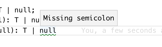
This is how it looks when I align it to right. Not sure right alignment looks good for all. May be it is better to go with left alignment?

sandy081
on 23 Nov 2018
I would decrease the font and make it more opaque, @misolori might have more ideas
I am still not convinced that we need to show them. Why don't we discuss this at the next UX meeting?
isidorn
on 23 Nov 2018
Another idea from (@glen-84) is to have everything in single line and left aligned. Some realtime examples:


Edit: Credits to @glen-84 :)
sandy081
on 23 Nov 2018
I would prefer either show or not show them but not configurable (through setting or action) as it is not worth.
I personally think above approach is the best out of all where metadata is not prominent and rendered nicely.
Sure. Let's discuss in the next UX meeting.
sandy081
on 23 Nov 2018
Another idea is to have everything in single line
I feel so ignored. 😄
glen-84
on 23 Nov 2018
Another suggestion from @egamma is to inline the source and code with the message without labels


sandy081
on 28 Nov 2018
Closing this with above inline approach
sandy081
on 28 Nov 2018
There's no consistency.
Problems View:
- Square bracket for source
- Paren for range
Inline View:
- Source has no bracket
- Paren for code
I also don't like the code/source appended to the last line's message. If not on a new line, I hope they can be right-aligned.
octref
on 28 Nov 2018
@octref I do not like to make it right aligned because it looks ugly as I showed it already.
Regarding consistency, I think its not a big issue. (like status bar and problems view are inconsistent). If you strongly feel so, I would change the line and column rendering similar to in status bar.
sandy081
on 29 Nov 2018
How about always using top right corner?
Sick paint skills:

 usernamehw
on 29 Nov 2018
usernamehw
on 29 Nov 2018
There have been too many iterations done on this and thanks to all for the suggestions. Since it is highly individual opinionated, I would collect more feedback on the current approach before changing and going in circles.
sandy081
on 29 Nov 2018
Yes, the comment 6 days ago https://github.com/Microsoft/vscode/issues/62370#issuecomment-441257120 got most upvotes and everyone seems to like it. That looked great:

but suddenly you changed it to the current form.

I don't know what's the reason we can't have one extra line for the source/code. It's easy for user to locate and read, and it's always aligned. Vertical space is not limited for diagnostics hovers, are they?
And the new design generates inconsistencies. User now will be confused for "what's inside a parenthesis" and "what's inside a bracket". This goes against our effort to "make errors/hovers consistent". /cc @joaomoreno @misolori for input.
octref
on 29 Nov 2018
In the UX call yesterday we discussed both of those options and even though we all liked both versions, we all agreed that we liked the cleaner look of last one (the one that's now on insiders).
misolori
on 29 Nov 2018
@octref To be fair, the option to not show any additional information is actually the one with the most likes and it is what Visual Studio does too.
https://github.com/Microsoft/vscode/issues/62370#issuecomment-440323548

@roblourens https://github.com/Microsoft/vscode/issues/62370#issuecomment-440459469
I think it should be shown because if I have multiple extensions contributing diagnostics, I want to know where a message is coming from. The error code is also useful, e.g. if you want to know which rule in a tslint.json is associated with an error message. I prefer option 1.
Note that the hovers in vscode are clickable. If said information is not shown, what about clicking the hover and having it shift focus to the full diagnostic in the problems view? Personally, I think it would make sense as most people eventually get an idea of where a diagnostic is coming from an no longer need that data.
 mattacosta
on 29 Nov 2018
mattacosta
on 29 Nov 2018
Fixes for his have caused regression for https://github.com/rust-lang/rls-vscode. We used backtick-enclosed strings for types and since everything is escaped now to render a custom hover window, the error messages are illegible now, for example:
current output
note: expected type std::option::Option<std::string::String> found type std::option::Option<&std::string::String>
previous output
note: expected type std::option::Option<std::string::String> found type std::option::Option<&std::string::String>
See https://github.com/rust-lang/rls-vscode/issues/479 for more details.
 Xanewok
on 31 Dec 2018
Xanewok
on 31 Dec 2018
Suffering the same issue as @Xanewok in https://github.com/nwolverson/vscode-ide-purescript/issues/115 - diagnostics are rendering fine in problems and tooltip but replaced by displayed HTML entities in the hover
 nwolverson
on 3 Jan 2019
nwolverson
on 3 Jan 2019
Related issues
 v-pavanp
·
3Comments
v-pavanp
·
3Comments
 VitorLuizC
·
3Comments
VitorLuizC
·
3Comments
 ryan-wong
·
3Comments
ryan-wong
·
3Comments
 omidgolparvar
·
3Comments
omidgolparvar
·
3Comments
 biij5698
·
3Comments
biij5698
·
3Comments
Most helpful comment
I vote for Option 3. Imho a user is not interested in the source and of course not the code.
I would always render source and code in the problems panel such that users who are interested in this can go to the view that provides more details. Similar analogy is debug hover, gives you minimalistic information, if you want more please open the debug viewlet.
If we decide to go with option 2 I suggest to right align it so it is less noticable and less space between it and the actual error.