Vscode: Icons are hard to see in selected states
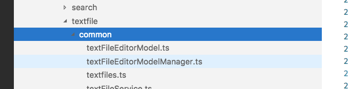
The new list/tree selection color in light theme does not work well for me. The dark blue color looks off compared to the (probably unchanged) focus color. And worse, I feel I can no longer see the twistie in this case:
 bpasero
All 16 comments
@misolori I think we should change the color of the twistie to white though, that is the same macOS seems to do:

bpasero
on 7 Aug 2018
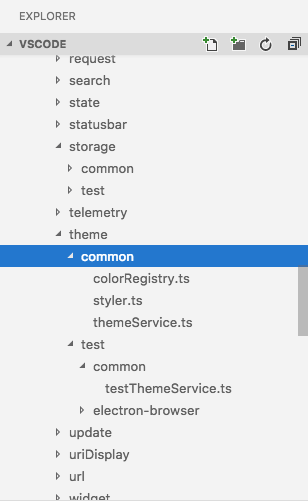
@bpasero yes, would love to do this! I'll need to investigate how to do this, here's a quick mockup:
 misolori
on 7 Aug 2018
misolori
on 7 Aug 2018
@misolori looks good
bpasero
on 8 Aug 2018
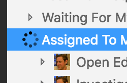
@misolori also looks like we need to take care of this guy:
bpasero
on 15 Aug 2018
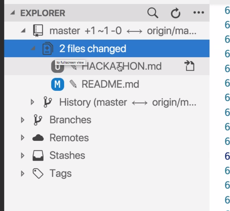
Also an issue for our octicons for extensions it seems:
bpasero
on 16 Aug 2018
Just also noticed our Git actions in dark having a bad contrast now:

bpasero
on 17 Aug 2018
@bpasero I've got a branch misolori/light-theme-icons-selection that fixes majority of the issues:
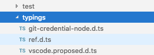
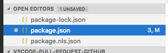
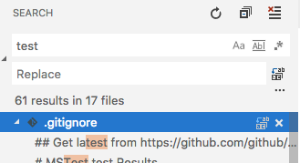
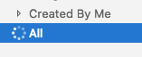
However, I've only been able to fix these via CSS, which means they aren't future-proof as it requires specific CSS Rules for each icon (which doesn't work for extensions that use the list widget).
I think the solution would be better done via JS to specifically use the appropriate icon on selected items in the list widget (a little beyond what I can do at the moment). We can also think about applying the list.activeSelectionForeground on the icons when selected.
Thoughts?
misolori
on 21 Aug 2018
We can also think about applying the
list.activeSelectionForegroundon the icons when selected.
I think that is probably the right solution using the same webkit-mask trick we already use to allow to set the foreground color of activity bar icons.
/cc @joaomoreno
bpasero
on 22 Aug 2018
@joaomoreno would you be able to help out with this? I think we'd want to make all of the icons in the list widget use the webkit-mask trick so they're consistent.
misolori
on 22 Aug 2018
The only icons the tree has are: twistie and loading indicator. All other icons belong to the many users of the tree.
 joaomoreno
on 24 Aug 2018
joaomoreno
on 24 Aug 2018
Made some progress on this, though I've ran into a few critical issues when I tried converting the icons into a -webkit-mask:
- This assumes that all list widget icons are non-images, which means contributions with avatars will break (i.e. github pr extension)
- This assumes that all icons are the same single color, which means multi-colored icons will visually break
- Adjusting the list widget actions (like search and scm list actions) touches other areas (editor toolbar) which means it forces those icons and contributions to also inherit the issues above
So I can make a PR that will fix the basic list widget icons that we own (twisties and loading indicator) but am unsure of how to solve the rest of the issues above.
misolori
on 19 Sep 2018
I think this is a bit better with the new icons.
Though maybe the contrast could still be better. So ping @misolori
 isidorn
on 19 Jun 2019
isidorn
on 19 Jun 2019
Not much has changed in terms of color but since the icons are thin now they may be improved a bit:
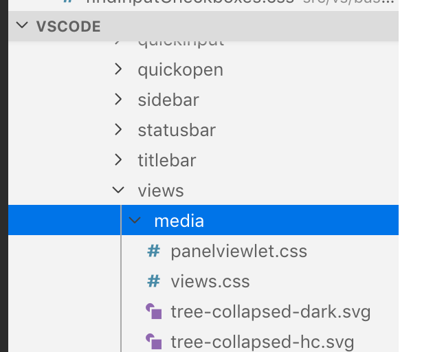
We still need to do the heavy work by styling our icons dynamically that I'm hoping will happen after we update our icons.
misolori
on 19 Jun 2019
Verification steps:
Ensure that the icons in the tree widget inherit the foreground color changes from their elements like so:
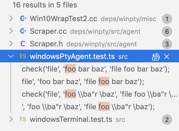
_Note: this does not include icons from contribution points like extensions + SCM actions_
misolori
on 26 Sep 2019
Awesome! The twistie is lovely
isidorn
on 30 Sep 2019
Great 👍
bpasero
on 1 Oct 2019
Related issues
 ryan-wong
·
3Comments
ryan-wong
·
3Comments
 curtw
·
3Comments
curtw
·
3Comments
 villiv
·
3Comments
villiv
·
3Comments
 NikosEfthias
·
3Comments
NikosEfthias
·
3Comments
 sijad
·
3Comments
sijad
·
3Comments
Most helpful comment
I think that is probably the right solution using the same
webkit-masktrick we already use to allow to set the foreground color of activity bar icons./cc @joaomoreno