Vscode: New settings editor feedback
This is a general issue for discussing the new settings editor. The feedback button in Insiders links here. Please leave any feedback here!
 roblourens
All 182 comments
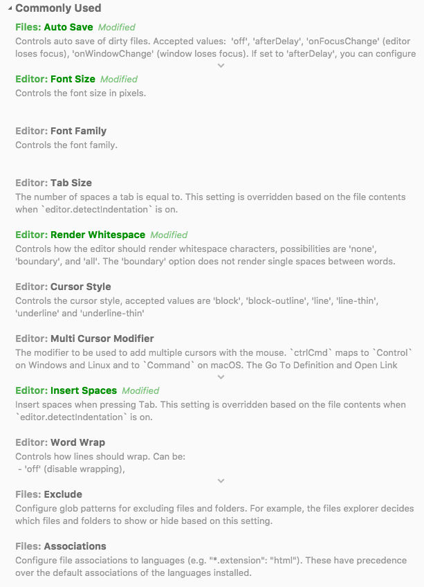
One thing that wasn't very intuitive to me is that a setting that is already set to the default value in settings.json still shows up as _Modified_, but then clicking the "Reset" button doesn't change the toggle state of the checkbox. Here's an example:
"haxe.enableCodeLens": false

In that case, the reset button still has a purpose (it removes the line from settings.json), but it doesn't seem right to label the setting as "modified".
 Gama11
on 22 May 2018
Gama11
on 22 May 2018
In that case, the reset button still has a purpose (it removes the line from settings.json), but it doesn't seem right to label the setting as "modified".
That's right, and I've been thinking a lot about how to show this in UI. My original language there was "configured" since it's true that the setting hasn't actually been "modified" from the default, but I think that's also unclear.
roblourens
on 22 May 2018
Another thing: it would be nice if basic oneOf settings were supported in some way. In the Haxe extension, we have a very simple one that is either "auto" or an integer. It could just be a regular text field to start with.
"haxe.displayPort": {
    "description": "Integer value for the port to open on the display server, or \"auto\". Can be used to --connect Haxe build commands.",
    "default": "auto",
    "oneOf": [
        {
            "type": "integer"
        },
        {
            "type": "string",
            "enum": [
                "auto"
            ]
        }
    ]
}
Right now it just refers you to settings.json:

The same seems to be true for _all_ settings of "type": "object". I assume support for those is planned somewhere later down the line?
Gama11
on 22 May 2018
Yeah, I'm not sure what to do there. In JSON, there is a difference between "3" and 3 which wouldn't be captured by a single text input for integer and string types.
And then working in the enum, that would work better as a dropdown or radio option.
There are different ways that we could show an edit control for multiple value types, but that's not going to happen right away.
Also see #3355 for history and context, but I don't plan to support any arbitrary "object" type. I want to provide a good experience for common configuration use cases, and for more complex use cases, users can still fall back on the JSON file. For common object-type settings like files.exclude, I would like to add a different control which is specific to that setting.
roblourens
on 22 May 2018
Really torn on the new UI. Part of me likes the organization, but 99% of the time that I open up my settings, it's to toggle something I had changed (e.g. such as "trim trailing spaces" when I'm changing a large/legacy/file I don't own). In this UI it's _extremely_ difficult to find such settings since I don't necessarily recall which "group" it's in. I'd likely prefer that the "Show modified only" setting remove the groupings, or at least (1) remove the groups you don't have settings modified for (bug I assume since they get removed if you click them), and (2) auto-expand all groups so it's easier to scroll and find.
 duncanhorn
on 23 May 2018
duncanhorn
on 23 May 2018
I agree @duncanhorn, and I have this issue to improve that: https://github.com/Microsoft/vscode/issues/50369
roblourens
on 24 May 2018
As I can see the title of the settings are generated by splitting the original property name at word boundaries and pascal casing all the distinct words. It maybe looks OK in English-only environments, but it looks very bad when using a localized version. These titles should be translatable or it should show the original property name, so users won't think that the settings editor is missing translations.
(P.S.: I do not see any added value of this transformation even if I use the English localization.)
 qcz
on 24 May 2018
qcz
on 24 May 2018
Feedback: Please keep a way for easily open the "User settings json` file as well. Like a "power mode" if you wish. It's much easier to quickly edit settings in there. I usually keep multiple settings (i.e. for themes) but commented in my user settings JSON and quickly switch them there based on my needs (like light theme when outside/presenting etc..)
 juristr
on 24 May 2018
juristr
on 24 May 2018
I agree with @juristr ... I couldnt easily find a way to toggle between the JSON settings and the new editor. I often enjoy just editing the JSON directly. I see value in the new format, but would like an easy way to get back and forth between them (not a split pane tho, as that limits viewable area)
 johnpapa
on 24 May 2018
johnpapa
on 24 May 2018
These titles should be translatable or it should show the original property name, so users won't think that the settings editor is missing translations.
Good point
Please keep a way for easily open the "User settings json` file as well
Did you see the button at the top of the page to "open the original editor"? You can also run the "Open User Settings" command or change the keybindings.
roblourens
on 24 May 2018
Did you see the button at the top of the page to "open the original editor"? You can also run the "Open User Settings" command or change the keybindings.
@roblourens sure, but I guess this is a temporary link during the preview phase. Would be great if it remains though even later 🙂
juristr
on 24 May 2018
maybe an easy way to go between the guided tour and the power user mode.
johnpapa
on 24 May 2018
Just a reflexion on your great work.
I think the settings still seem too complex because of the documentation that remains visible all the time.

For me looks more simple then
Less noise, less space. I prefer documentation when I want to see it (white a little icon or on hover or...)
Too much information kills information.
 paror
on 24 May 2018
paror
on 24 May 2018
sure, but I guess this is a temporary link during the preview phase. Would be great if it remains though even later
Yes, I definitely plan to keep an easy way to switch back. Just like we have in the keybindings editor. "For advanced customizations, open and edit settings.json".
@paror What if we only show one line of the description instead of two?
roblourens
on 25 May 2018
Compact mode, where all descriptions are hidden and mouse hover indicator for each line.
 bigopon
on 25 May 2018
bigopon
on 25 May 2018
Sorry if this is documented somewhere and I missed it, but is there a setting for completely disabling any UI for settings and going straight to the JSON editor? I am in the camp of either straight up JSON or automatically built UI based on all settings' properties and their types, this in between screen won't work for me.
 TomasHubelbauer
on 25 May 2018
TomasHubelbauer
on 25 May 2018
To change the keybinding back to the previous editor:
{
    "key": "cmd+,",
    "command": "workbench.action.openSettings"
},
Or run the command Preferences: Open User Settings
roblourens
on 25 May 2018
Or we could probably remap cmd , to the old command , right?
johnpapa
on 25 May 2018
Yes that's what that keymapping does.
To be clear this change is only for getting feedback in Insiders, the old default will remain in Stable for 1.24.
roblourens
on 25 May 2018
If this doesn’t make it to stable in the future I hope there is a new command for it instead of replacing the current behavior. That’s my vote :)
johnpapa
on 25 May 2018
It's a bit buggy for me.
Windows 10 Home, May update
1) When trying to change number value of some setting (i.e. integrated terminal font size) the form loose focus after first char and I see warning popup Cannot read property 'toString' of undefined
2) Edit in settings.json link simply do not work (no effect)
Except that impression is ok (I like the green highlights of modified and reset option, layout could be more compact). Personally I feel I'm more used to json configs, but I think it's good to offer gui alternative for those who prefer it.
 vadistic
on 26 May 2018
vadistic
on 26 May 2018
How can I have the original settings editor by default (ctrl+.) ?
Feedback about the new one : less efficient and less informative IMO. It's harder to find the settings I want to change due to the less dense presentation. It's a bit like terminal vs UI: terminal is less "pretty and easy" but when we know the thing, it's way more efficient.
Anyway, the good thing would be to be able to choose between old and new. Maybe also to be able to change the density of settings on the screen (font size AND inter-setting padding).
 mprevot
on 27 May 2018
mprevot
on 27 May 2018
Totally disliked the new UI. Also, when clicking "Edit in settings.json" for Files: Exclude, it didn't do anything so I had to go back to the original editor.
Actually the original editor was way better. If you want to do something nice, replicate VS2017's settings menu, improve it a bit like Eclipse or Android Studio does, add the search functionality and for the love of God keep it compact. It's so HUGE. WTF MS?
Also, bad UX on the input fields at the right, your eyes have to travel back and forth between the setting name, documentation and the input value to see what option has been set. The input box is also small, like, ugh, it seems like this UI was done in a rush by someone unexperienced in UI/UX and just wanted a quick & dirty way of changing the settings... less efficiently than the original JSON+Search alternative.
 darkguy2008
on 28 May 2018
darkguy2008
on 28 May 2018
I know it's under development but if I change a setting and then turn it back to the default value, the settings.json file still contains the default setting. That doesn't happen on reset. Is that intentional?
 ahmadawais
on 31 May 2018
ahmadawais
on 31 May 2018
Yes, those cases are different. I might set a setting to the default value in workspace settings so it overrides a different value in user settings. "reset" changes it to not be modified at all in that scope.
roblourens
on 31 May 2018
When I search for a setting, I think the matched text should be highlighted. I tried searching for a setting but got lost with the screen changing the whole time but what I was looking for didn't pop out to me.
In general it feels difficult to "discover" settings IMO
 Rukenshia
on 1 Jun 2018
Rukenshia
on 1 Jun 2018
We actually left that out of this version on purpose. Settings search also shows you settings that are good matches but don't contain the exact words in your query. We found that when users see a list of results where some have highlighted words and some don't, they would sometimes skip over results that don't have highlighted words.
Ideally they would find the most relevant results at the top of the list without needing to look at highlighted words.
But on the other hand, when a result does match exact words from the query, a highlight can help you notice the reason it matched. Maybe a more subtle highlight than what the old editor has would be helpful.
roblourens
on 1 Jun 2018
@roblourens You could use two colors highlight, one for exact match, another for almost exact (eg, out of order match, presence match/partial absence match)
mprevot
on 2 Jun 2018
If you type too fast in a string input field, stuff you type gets overwritten.
This clearly has to do with autosave. I do have a rather slow 5400 RPM hard drive and a Core 2 Duo, so it takes about a quarter of a second for VSCode to save and reload the file.
If I type at a relatively fast pace and outspeed the autosave, this happens.
Watch me try to type "/usr/local/bin".
This could probably be fixed by waiting until the user stops typing before trying to save.
MacBook (13 inch, mid-2009) — MacBook5,2
Illegally on macOS 10.13.4 via High Sierra Patcher
4 GB RAM
2.13 GHz Intel Core 2 Duo
Western Digital Scorpio Blue 1 TB 5400 RPM 8 MB cache (WD10JPVT)
Code Insiders 1.2.4.0-insider (92754223624dcbe9aca0e5ca3ba8a53808b122b6)
 easyaspi314
on 4 Jun 2018
easyaspi314
on 4 Jun 2018
Yes the text input is a little messed up - https://github.com/Microsoft/vscode/issues/50708
roblourens
on 4 Jun 2018
Just my two pence worth, the new layout is cool, but I like being able to see the json representation, could we have both? So instead of a non-editable section on the left and the json on the right, it'd be cool to see the new version on the left and the json output on the right.
 smadgerano
on 4 Jun 2018
smadgerano
on 4 Jun 2018
@smadgerano I agree, but the layout has to be done right or it will look bad on small screens.
The current JSON settings layout is just pushing the "cramped" threshold.
Other feedback:
- "For advanced customizations open and edit settings.json" should be "For advanced customizations, open and edit settings.json."
- Underscores should also be turned into spaces.
- Native checkboxes look entirely out of place on macOS.
- The settings keys should have their raw version in a bubble next to the prettified name like in the Extension Gallery.
- The layout doesn't scale well horizontally:
easyaspi314
on 5 Jun 2018
I don't get why you guys don't use a UX member at MS to work on this (but please, not any of the Metro/Acrylic staff). Come on, this is getting ridiculous. Why not to use the same slim, nice 'n dandy settings menu you have in VS2017? It's great, it's slim, it's short, you can use search, the settings are correctly grouped, there's no HUGE spacing like Ubuntu used to be (and the reason why Unity and Gnome 3 sucked so much)... I don't know, come on, I know you guys are better than this.

See? Nice and to the point. Maybe you can improve it by making it taller and to match VSCode's style/theme.
darkguy2008
on 5 Jun 2018
That probably would work if the settings structure was different, but right now, we only have one level of categorization.
easyaspi314
on 5 Jun 2018
I am trying to edit a first c++ file. The help page for the include path is telling me to execute a "C/Cpp: Edit Configurations" which does not exist. Also the file c_cpp_properties.json that is suppose to be in .vscode does not exist. I am about to give up on this thing.
 ljreder
on 6 Jun 2018
ljreder
on 6 Jun 2018
It sounds like you're trying to use the C++ extension. Make sure it's installed. Otherwise file an issue on their repo.
roblourens
on 6 Jun 2018
@easyaspi314 One level? there's various levels, there's settings for the editor, for the terminal, for the formatters... there's about the same kind of categories as with VS2017
darkguy2008
on 6 Jun 2018
The git.path is not recognised by VS code..
What I mean by this is that the user.setting 'git.path' is an unknown configuration setting to VS..
Typing 'git' in the command palette also has no matches like.. 'Git Clone'
The path to git has been install correctly..
5 Developers have looked over this problem and no one has come up with a solution..
Really hope you can help!
Tom


 Muppet-training
on 7 Jun 2018
Muppet-training
on 7 Jun 2018
I hope it's planned to leave direct access to JSON, for people that prefer that way of editing settings.
 PerpetualWar
on 7 Jun 2018
PerpetualWar
on 7 Jun 2018
Having the possible font family names be suggested could be a low priority nice-to-have feature.
 cideM
on 7 Jun 2018
cideM
on 7 Jun 2018
The editor isn't displaying choices for EOL. Probably need to escape \r and \n.

 renkejr-pkwy
on 7 Jun 2018
renkejr-pkwy
on 7 Jun 2018
Good catch @renkejr-pkwy, fixed in 19b0e3c6a64d8b484cb505734e2ed0dbc73dfe91
roblourens
on 7 Jun 2018
Please, please don't waste your time with this! I LOVE the current way of editing settings - using JSON. We're developers, we can type! We don't need more inneffective UI and bloated code to handle something that is already so simple and efficient. Do not repeat the mistakes of Visual Studio. It's a total waste of your time and effort. Please direct that extra energy into improving the C++ debugger :-)
Thank you for your consideration!
 ftrofin
on 7 Jun 2018
ftrofin
on 7 Jun 2018
Way too much padding/margin around the new settings view and like others have said there should be a way to see the actual JSON file for your settings.
 wldcordeiro
on 8 Jun 2018
wldcordeiro
on 8 Jun 2018
Could the new UI also automatically sort the settings file alphabetically? Since it is changing the file anyway, it could just sort the entries before displaying/writing them.
 totkeks
on 9 Jun 2018
totkeks
on 9 Jun 2018
Few things
- Section and settings names should have larger font than description. Graying out descriptions isn't enough. Still too messy. With old json view font is larger.
- Old version with json source still should be there.
- Won't show number of settings in each section.
- Doesn't show changes of switched off extensions (unknown settings)
- Should not have fixed width, as most string values just won't fit and will cut.
- Some settings says - go edit it in settings.json
- Rectangle around sections isn't nice. It was better the old way.
- Reset is probably better to be right or left of value as some icon to reduce spacing.
- Some sorting, including sorting with grouping.


 regs01
on 10 Jun 2018
regs01
on 10 Jun 2018
Could the misalignment be fixed by adding more padding to the left/description column? Also, I second @smadgerano's idea of implementing some sort of peak feature to examine the json.
 ghost
on 11 Jun 2018
ghost
on 11 Jun 2018
+1 @ftrofin and @PerpetualWar, I really like the current way of dealing with settings. I don't mind if a GUI is added as an additional mean to edit the settings, but I hope the JSON settings files will still be just as easy to reach (and edit). They are great to configure settings just for a project, or to pass on your settings to your colleagues or between your machines. As a comparison, configuring Eclipse, with their huge mess of a menu, is a nightmare.
 AC4BB21B
on 11 Jun 2018
AC4BB21B
on 11 Jun 2018
I understand why to work on GUI for settings is ongoing (regardless of whether I think it's a good thing or whether the GUI is good), but I'd like to suggest there is a first-time experience flow so that people who want to see the GUI settings default to them from that point on and people who don't don't have to see them more than once.
The way I think it should work is the settings editor, when opened for the first time after installation, would prompt the user with a choice of the settings experience and remember it for all the next times the settings editor is open.
Also, please make the JSON-based editor the default for existing installations, make the GUI one enabled in new installations.
TomasHubelbauer
on 11 Jun 2018
When the 'Show modified only' filter is on, clicking 'reset' makes the setting immediately disappear from the list.
This makes it hard to discover if the setting now has a new value or not (as the default might be the same as the current value), or even what setting was changed (e.g. if clicked accidentally).
I was only able to discover what I'd changed by switching back to the old settings editor and using Undo.
Perhaps a 'recently changed' settings section with undo actions, or just a message showing the last change (with undo) or just logging the changes somewhere.
The 'reset' action could say what the value will be reset to before it is clicked.
One other suggestion would be to add a 'expand/collapse all' groups.
 gtaylor1981
on 12 Jun 2018
gtaylor1981
on 12 Jun 2018
I think it would be cool if extension specific settings would show up in extension view.
What I mean should be clear from the image.
Obivously it wasn't clear.
I mean you could change extension settings straight from a new "Settings" tab in extension view.
Or make them changeable them in "Contributions" tab.

 zurkoxxx
on 13 Jun 2018
zurkoxxx
on 13 Jun 2018
Isn't that part of the 'Contributions' section?
easyaspi314
on 13 Jun 2018
Why do debug.toolBarLocation and debug.showInStatusBar look like enums, but they can't be edited in the new settings editor?


Maybe it's a good chance to fix varies schema problems with setting entries.
 yume-chan
on 14 Jun 2018
yume-chan
on 14 Jun 2018
@Muppet-training
The git.path is not recognised by VS code..
Did you disable the built-in Git extension.
I tried to disable it and I got the same result as you.
yume-chan
on 14 Jun 2018
Good catch @yume-chan, those two settings don't specify their types the same way as other enums. Fixed.
roblourens
on 14 Jun 2018
Can I leave feedback even if it's not constructive?
I just wanted to say thank you and that I appreciate the new settings view, it's really nice.
 GavinRay97
on 14 Jun 2018
GavinRay97
on 14 Jun 2018
This is nice to look at what options are available, and at the same time - code editor is for programmers. The JSON editor view should be a quickly available to switch between settings editor.
 pappu687
on 15 Jun 2018
pappu687
on 15 Jun 2018

I'm not sure if this was intentional or not given some of the other screenshots, but checkboxes just look weird in their current position (and add a lot of wasted space).
 mattacosta
on 19 Jun 2018
mattacosta
on 19 Jun 2018
That would not be intentional. I don't see that in the latest Insiders (from an hour ago)
roblourens
on 19 Jun 2018
This might be a personal view that doesn't apply to others, but I find the weighting and colour of the fonts combined with the highlighted boxes difficult to scan through.
If I'm scrolling through the settings looking for something, my eyes seem naturally drawn the highlighted section with the setting value in, rather than the title of the setting itself.
Not sure exactly why that is, perhaps the highlighted box around a regular font sticks out more than the bold title font on the plain background? Or maybe it's because the editable sections aren't a uniform width and draw attention more.
Like I say, this could just be me.
smadgerano
on 20 Jun 2018
Can you keep the setting when the user didn't select an item of dropdown?
I think the setting should not be configured when the user just wants to check the item of dropdown.

 EbXpJ6bp
on 20 Jun 2018
EbXpJ6bp
on 20 Jun 2018
@smadgerano Are you using a dark theme? If so, that makes perfect sense because your eyes are always drawn to brighter objects, which in this case would be the large grey value box when paired against a black background. If you switch to a light theme where the value box and background are the same, everything should generally look better since the box wouldn't compete with the title and description text (which also has better contrast).
Here's what happens if we correct that in the dark theme:

Note how the setting title and value (and dropdown arrow) now compete with each other. The value should now slightly "win" for most people since it is not as grey as the setting title. Ideally that would be switched around too.
It may also help to increase the font size of setting names by 1 or 2 points to further draw your attention and make them easier to scan through.
On a totally different subject, I'm not a fan of clicking to reveal the entire description of a setting, but it's something that I can live with if I have to.
I would also greatly prefer if the checkboxes were next to, instead of below each setting (and yes updating did remove the indent from my previous comment).
mattacosta
on 20 Jun 2018
@mattacosta yes, I think it's one of the standard dark themes that ship with VSCode...

But I think it's maybe a little different to that, in the "old" settings every element has a colour assigned to it, the description is green, the actual setting was blue, and the values are orange or lime depending on type, this made it super easy to scan through. Everything is white, or at least a very similar scale of grey in the new version.

But I know this could be subjective and my eyes are just used to the old way of doing things.
smadgerano
on 20 Jun 2018
The editor from the last version looks a bit more acceptable than the first one, however there's still a lot of dead space at the sides and the full descriptions make the settings too cluttered. VSCode was made simple/minimalist from day one, so why the settings window can't follow the same scheme?
Also, when you have the terminal open, it covers the settings window. I was expecting it to be a dialog of sorts, either inside the window or as a separate one.
darkguy2008
on 20 Jun 2018
@smadgerano Yeah, the settings editor definitely has a 50 shades of grey thing going on, and while adding color is based on the same principles, it would also be harder to do right, so I wouldn't be surprised if that ends up being a trade-off with the new UI.
mattacosta
on 20 Jun 2018
Would it be possible to add a file picker when editing some items.
We have a number of paths that can be configured in the python extension.
 DonJayamanne
on 21 Jun 2018
DonJayamanne
on 21 Jun 2018
@EbXpJ6bp I filed a bug for that, thanks!
@mattacosta I like that idea, we were discussing something similar to help distinguish between types of controls. Like give enum a dark background, and keep the background on the text input.
@DonJayamanne I like that idea. Would be easy to support a 'file' type with a filepicker button.
roblourens
on 21 Jun 2018
Would be easy to support a 'file' type with a filepicker button.
I'm assuming this is one of those scenarios where the schema would be extended to support this type. Awesome.
DonJayamanne
on 21 Jun 2018
The most recent build of Insiders has made the Setting preview look really cool, Im not sure if you remember my issue about categorising settings, and this is basically it!
Maybe a possible idea is to have a new Settings API in which extensions can have their own settings, and that would be its own sub-category under 'Extensions'?
Another idea is please make the checkboxes look nice and fit in too, other than that, looks AWESOME
EDIT: Reset button seems kinda unfitting and hidden, maybe make it more like a button with hover effect?
 beastdestroyer
on 22 Jun 2018
beastdestroyer
on 22 Jun 2018
UX bug: If you click on the category's name it expands/collapses, but since it's the parent option it should not expand/collapse unless the arrow is clicked. I.e. I clicked "Window" to see the Window settings and it collapsed, I clicked it again it expanded, so I clicked "New Window" and some options at the right were removed, which leads me to think that there are more options under "Window" but it's not good UX to expand/collapse at that point. Do you get what I mean?
darkguy2008
on 22 Jun 2018
@beastdestroyer You have a knack for making the right suggestions at the right times because the checkboxes are exactly what I'm working on this morning! Thanks for the feedback.
@darkguy2008 I noticed that too. I'm still deciding whether the category rows should collapse at all. But in this case they definitely shouldn't.
roblourens
on 22 Jun 2018
@roblourens Just a few more aesthetic features I think should be added:
Make categories in the main viewing area (not the list of settings) collapsible - Just one for the people who like to click or scroll but not have it take a while?
I notice that there is a small white border when selecting a settings' box, however the padding - especially for headings and text is very off
i) In text headings, the text looks like it is offset to the bottom, so the top has more padding, which looks quite odd
ii) Similarly to setting boxes themselves, the padding issue does remain but it's more subtle since the font size is smallerFor settings with longer descriptions, make the implicit 'Show all' toggleable, so people can just click on it and hide it again
It also doesn't look like the GUI supports smooth scrolling, at least for me it is jagged scrolling. (Not lag though)
Also, the dropdown boxes seem oddly long although they only contain values that barely fit it, possibly shortening the length to make it fitting, or making it auto-scale eith the value selected? This also ties in to my earlier comment about the 'reset' buttons being more obscure too.
Possible bug I found:
The sub-category 'Keyboard' under 'Application' has a dropdown marker, but nothing shows and. instead, it scrolls to the. section.
Thanks, eager for progress!
beastdestroyer
on 23 Jun 2018
I think settings are hard to read.
Some suggestions:
1 - add an option to hide documentation.

2 - put the checkbox before the label (its the most common design)
3 - select box with the same size then text input (a small and a large one)

4 - I like outline but not so close to settings. What about this?

Thanks
paror
on 23 Jun 2018
@paror
- I would also like that option too, it'd be good to have a more minimalistic GUI if we want to.
- True, but in this case it would break the design pattern of the GUI in my opinion, since all the stuff is after the description, suddenly having checkboxes before the options would seem weird, I would say, to match with the pattern is to have it after
- Definitely this!
- Does look much cleaner, but then I'd stretch the container of the actual settings wider to match the widths of the titles and stuff, so it doesn't look like there is pointless white space
- What theme are you using? Just curious
Have a great day!
beastdestroyer
on 23 Jun 2018
I understand that long-term it would be ideal to extend the scheme to allow extensions to take advantage of different GUI modes in settings, but it would be great to add a fallback in the GUI - having to re-search for any option that you can't edit in it gets tedious.
I think when 'Edit in settings.json' is clicked, it shouldnt switch views to the text editor, and instead create an inline input box that only contains the setting that is referred to (If it isnt already there, create an empty setting in the User / Workspace settings file), allowing the user to edit the setting they want to without the clutter of the text file.
I also think the extension-specific settings being available in the Extensions view would be amazing, it feels under-utilized at the moment, and allowing settings to be edited there would be great. If the isolation of settings like I described for the GUI menu isn't too hard, I think a text settings editor for each of them would be great too.
The more I think about this, the more it makes sense to overhaul the way the settings are laid out.. even just for finding the settings you want in the JSON editor, explicit objects for each extension would be very useful
 Ayplow
on 23 Jun 2018
Ayplow
on 23 Jun 2018
Just for illustrate my proposition.
Before

After

@beastdestroyer My theme: Atom one light with some workbench.colorCustomizations
paror
on 23 Jun 2018
@paror In your illustration, tyour idea seems perfect, however, what about with descriptions? Or with full expanded descriptions? And thx for the theme
beastdestroyer
on 23 Jun 2018
Thanks everyone for the feedback! Let me try to respond to all of this...
@beastdestroyer
- Make categories in the main viewing area (not the list of settings) collapsible - Just one for the people who like to click or scroll but not have it take a while?
This is what the list of categories on the left is for. If someone wants to jump ahead, they can click a category.
- I notice that there is a small white border when selecting a settings' box, however the padding - especially for headings and text is very off
I actually tuned up the padding a bit yesterday, it will be a little better in Monday's build.
- For settings with longer descriptions, make the implicit 'Show all' toggleable, so people can just click on it and hide it again
The model is that you're selecting a row in a tree, so you have to click somewhere else or press esc to deselect the row and collapse it. Some people might prefer having something to click on to collapse the row... will think about it.
- It also doesn't look like the GUI supports smooth scrolling, at least for me it is jagged scrolling. (Not lag though)
The rendering is not nearly as optimized as it could be. It's smooth on my laptop, but thanks for letting me know.
- Also, the dropdown boxes seem oddly long although they only contain values that barely fit it, possibly shortening the length to make it fitting, or making it auto-scale eith the value selected? This also ties in to my earlier comment about the 'reset' buttons being more obscure too.
I like the visual effect of having all them all line up. The native controls are sized to the width of the longest option in the list, not the selected option, which makes them look randomly sized.
The sub-category 'Keyboard' under 'Application' has a dropdown marker, but nothing shows and. instead, it scrolls to the. section.
Should be fixed, thanks.
@paror
I think the documentation is important for understanding what the settings are.
2 - put the checkbox before the label (its the most common design)
I actually just did that yesterday. Here's a sneak preview:

We decided to put it next to the description instead of the title. If it's next to the title, we can either let it hang into the margin or let it push the title in. I don't like the way the second option makes the title not line up with the other setting titles. Both options make those settings stand out next to other settings, just like @beastdestroyer says in the next message. I think this is a fair compromise that fits in with the rest of the UI so we'll try it to see how it goes.
3 - select box with the same size then text input (a small and a large one)
I talked about this above
4 - I like outline but not so close to settings. What about this?
If the settings list is centered, I think the category list needs to be anchored to the settings list. It feels weird to have a centered element and a left-aligned element on the same page.
@TomSputz Good suggestions, at first I'm focusing on the most common scenarios for new users so I'm not working too much on improving editing complex settings. Extension groups will show up under the "Extensions" category though.
roblourens
on 24 Jun 2018
Add the option to collapse the settings of each extension, it's quite hard to scroll to the bottom and it will give more space.
 mittalyashu
on 26 Jun 2018
mittalyashu
on 26 Jun 2018
In tomorrow's update, there are individual categories in the table of contents for each extension 😁
roblourens
on 26 Jun 2018
Not able to set the font size in points.

mittalyashu
on 26 Jun 2018
@mittalyashu good catch, fixed
roblourens
on 26 Jun 2018
@roblourens YEEEES :D
beastdestroyer
on 26 Jun 2018
Ctrl + Z and Ctrl + Y doesn't work properly.

mittalyashu
on 29 Jun 2018
Any idea why the .monaco-tree-rows div is so wide as 1394px? Also, the property descriptions should be wrapped by the window edge, IMHO.

 ryenus
on 29 Jun 2018
ryenus
on 29 Jun 2018
@ryenus If you get a bigger screen (more apparent in screenshots if you scroll up this thread), you'll see the settings GUI more centered, perhaps this is to aid readability since naturally us humans prefer reading vertically than horizontally
At first I had a similar query but with my screen width being 1360px,i didn't really complain since it was very readable
beastdestroyer
on 29 Jun 2018
@mittalyashu Good point, I opened https://github.com/Microsoft/vscode/issues/53347 for that
roblourens
on 29 Jun 2018
@roblourens Weird issues on my end with the Settings GUI (2018-06-29), My screen resolution is 1360x768, and with the file explorer (or any menu from the sidebar open), the settings outline looks oddly left-aligned:

With the sidebar menus closed, it looks alright, but there is still this odd gap between the outline and actual settings, was this intentional? If so, could you please center-align it on smaller areas?
Another weird issue, it's small butnoticeable, not sure if you can see in this screenshot, but the outline box seems slightly lower down as you can tell by their box-shadows:

Bug: If you close the explorer and then reopen it in the settings gui tab, it auto switches back to the last code file; I couldn't take any GIF or anything (I'm dumb and don't know how to lol) but you can reproduce yourself; if it was intentional, cool, I get it, since if you click on explorer probably means you want to start coding again right?
Some other very minor things:
- "Show modified only" checkbox doesn't use your beautiful checkbox!
- "Keyboard" sub-category under "Application" has a dropdown marker, yet nothing comes from it
Also, quick question: is there a way to make this GUI come up by default, or do we still have to go by the JSON editor, although it's still in preview, would like it so I can use it as my daily driver and test it more!
beastdestroyer
on 2 Jul 2018
I did add an extra margin between the TOC and the settings list, which makes it look more natural on larger displays, but I agree that it doesn't look great with that window size. I will keep tweaking it.
You're right, I didn't notice that before. Now I can't stop noticing it. Thanks.
Yeah I guess that's the explorer trying to sync its selection to the editor pane, I'll fix that.
Good point on "Show modified only". I didn't get to that in time. I thought I'd fixed the "keyboard" issue. I need to look at that again.
And you can change the keybinding yourself with
{
        "key": "cmd+,",
        "command": "workbench.action.openSettings2"
},
@roblourens Thanks! Time to test it all the way!
beastdestroyer
on 3 Jul 2018
@roblourens for medium and small screens (laptops), possible to show the descriptions
wrapped when too long?
Usually the users already have to scroll vertically to navigate through all the settings,
and scrolling both vertically and horizontally doesn't feel nice.

ryenus
on 4 Jul 2018
Here's a little issue I found:
I had both a file and the settings tab in a single pane, and had already collapsed some of the navigation and had "Cursor" selected:
Then I moved the Settings tab to the right pane, and the navigation was reset:

I hope this helps!
 thevictorlopez
on 5 Jul 2018
thevictorlopez
on 5 Jul 2018
Suggestion: I would like to see what options are the default instead of just a reset button. Knowing what the default is and what I have changed it to helps me understand why I made the decision in the first place.
 pbarnum
on 5 Jul 2018
pbarnum
on 5 Jul 2018
While this last screenshot looks nice, I still think that the descriptions make the screen too noisy, it makes the whole screen hard to read. Also, why centered? I read some comments but it makes no sense to me, that might look pretty on web, but not on an app, I still think it should be left-aligned instead (or provide an option to...)
But yeah, the descriptions make it too cluttered.
Scratch that. Centered doesn't look too bad now that it has the category list at the left, but yeah the descriptions still make it look too cluttered... maybe they should be hidden/toggable somehow or even dimmed a bit more?
darkguy2008
on 5 Jul 2018
There are a bunch of comments already! If I repeated someone else's it is purely accidental. :)
Tested Settings Preview on this machine/setup:
Version: 1.25.0
Commit: 0f080e5267e829de46638128001aeb7ca2d6d50e
Date: 2018-07-05T13:11:58.697Z
Electron: 1.7.12
Chrome: 58.0.3029.110
Node.js: 7.9.0
V8: 5.8.283.38
Architecture: x64
Settings Preview Comments
- It might be nice to have a quick way to collapse all setting nodes, exactly like the folder explorer toolbar.
- It is nice to have a way to quickly copy the settings.json until there is an ideal way to sync settings between installations.
- It would be good to default to the new settings editor but keep the quick link to open the raw settings.json file as you have now in the preview.
- Have a setting to allow choosing a default editor mode. Json Editor/GUI Editor
- After selecting an editing control, like a text input, tabbing inside the form doesn't move to the next or previous input control. Fix tabbing on the settings editor form.
- Drop down list input controls are set to fill the available width. Optimize the width to the widest item in each list.
- Word wrap the description text for settings instead of using the ellipse + click to read more experience. I want to always see the whole description.
- Please fix the header black line above each vertical scrollable area by replacing both with a single line that is vertically aligned all the way across the top and visible at all times. Currently, the horizontal lines do not line up.
Looks nice!! 👍
 anewton
on 6 Jul 2018
anewton
on 6 Jul 2018
Sorry if this was suggested, I really breezed through most of these responses.
I'll happily make the switch to the new UI, but would really like to see language specific settings implemented some how. It would be mighty neat-o if there were a drop down next to the "Show modified only" checkbox that would allow you to select a language and show a filtered list of the subset of language specific settings.
 saltyjohn
on 9 Jul 2018
saltyjohn
on 9 Jul 2018
With 1.25 new UI looks very overloaded. Single-row phone UI is not good for desktop. Values should be moved back to right side.
Also most descriptions won't fit into single line. They should be multi-line.
There is no longer a way to restore default option.
regs01
on 9 Jul 2018
@ryenus You shouldn't have to scroll horizontally. If you click on the setting row, it will become selected and show the full multiple description lines.
@thevictorlopez thanks for pointing that out.
@pbarnum Yes I think we need to label defaults
@darkguy2008 I think the descriptions are important to browse/understand the settings but I will keep thinking about that point, thanks.
roblourens
on 9 Jul 2018
@anewton
It might be nice to have a quick way to collapse all setting nodes, exactly like the folder explorer toolbar.
You mean the index nodes on the left? I am still not sure whether they should be collapsible at all. What do you want to collapse all of them for?
It is nice to have a way to quickly copy the settings.json until there is an ideal way to sync settings between installations.
You can still open the settings.json and copy it.
It would be good to default to the new settings editor but keep the quick link to open the raw settings.json file as you have now in the preview.
This is the long term plan
Have a setting to allow choosing a default editor mode. Json Editor/GUI Editor
You can change the keybinding yourself for now. But yeah a master setting for the keybinding and menus might be a good idea.
After selecting an editing control, like a text input, tabbing inside the form doesn't move to the next or previous input control. Fix tabbing on the settings editor form.
The model is, you can select a row and use the arrow keys to move to different rows. Then tab or press enter to edit the selected row. We need this concept of row selection to expand the description. It's optimized for browsing vs editing.
Drop down list input controls are set to fill the available width. Optimize the width to the widest item in each list.
I like the even and consistent look of giving controls a fixed width, rather than the jagged and random-looking widths that they'd have by default, where they take the width of their widest available option (not necessarily the selected one).
Word wrap the description text for settings instead of using the ellipse + click to read more experience. I want to always see the whole description.
Some descriptions are very long, and I want to keep as many settings in the viewport as possible.
Please fix the header black line above each vertical scrollable area by replacing both with a single line that is vertically aligned all the way across the top and visible at all times. Currently, the horizontal lines do not line up.
Fixed! 👍
roblourens
on 9 Jul 2018
@saltyjohn
Right now I'm considering language-specific settings an "advanced" option that users can use the json editor for. Showing that in the GUI will get complicated when settings are configured differently in a few languages.
But I do need a ui hint that settings are configured in some language.
roblourens
on 9 Jul 2018
@regs01
I moved the controls to the left for a few reasons. Some controls need to be much wider than they can be on the right and this gives us flexibility. Checkbox controls would always look odd out there on the right. And it's a better use of space in small viewports like in a grid layout.
You can click the setting row to expand the full description.
If we don't bring back the "reset" button, we do need to indicate the default value...
roblourens
on 9 Jul 2018
I have no idea what any of the blue text says :)

smadgerano
on 11 Jul 2018
We are changing the default link colors, I'll make sure it's readable here.
roblourens
on 11 Jul 2018
Changing icon theme is redirecting to json (cause of possible null?). Expected a select element.

In any way, json editor has a pencil marker with a list which is what I expected to see in settings GUI.
 usernamehw
on 11 Jul 2018
usernamehw
on 11 Jul 2018
Yes, it's because the icon theme can be 'null'.
This is interesting, clearly we want to support this case. For settings that are enum|null, we could add a 'none' option to the dropdown.
roblourens
on 11 Jul 2018
I haven't looked much yet. But is there a way to change the width of this settings editor? I'm in love but it feels like a 00's webpage.
On further looking, I've found that this is not possible. Oh well, the fixed width of the actual settings is my only problem with it for now.
 MathiasKandelborg
on 12 Jul 2018
MathiasKandelborg
on 12 Jul 2018
I'm not seeing all the options for a given extension being displayed. First glance is it only pulling the settings for an extension that have a default value configured? An example extension I was working with to see how the preview worked: knisterpeter.vscode-github
 wsmelton
on 12 Jul 2018
wsmelton
on 12 Jul 2018
(Not sure if all issues about new settings are written here...) Here's mine:
I have several modified items, after select 'Show Modified only' to filter out, I was not able to select the last option. There seems no enough flexible space to pop up the drop down options.

 joannazheng
on 13 Jul 2018
joannazheng
on 13 Jul 2018
How do I turn this off? This is painful to use.
 jacobchurch
on 17 Jul 2018
jacobchurch
on 17 Jul 2018
@jacobchurch just click on "For advanced settings customization open and edit settings.json"
For myself, I can't even use this feature, I must have some weird config or something.
Here is a gif of when I try to scroll or interact with the UI at all. It doesn't seem to react normally at all, I can't really tell what it is doing or what I am supposed to be seeing.
https://cl.ly/0Z472N1h0n2I
I'm using the insiders build and updated to latest version and restarted a few times.
 nicholas-devlin
on 17 Jul 2018
nicholas-devlin
on 17 Jul 2018
Tried it with 1.25, nice try but i don't buy it.
Don't get me wrong, i appreciate the effort, but i'd rather have preferred that you concentrate on development workflow, addressing something like a diff merge tool (#5770) that's a serious lack for a product of this class and at the moment is the feature i most miss.
While i immediately grasped the usage of old user settings editor since its first usage and i find it fast, simple and intuitive to use, i find the new gui distracting and difficult to use.
While in the old editor i immediately hit what i'm looking for, in the new gui i discovered that often i scroll up and down more than once over the setting i'm looking for, without seeing it.
I find especially distracting the fact that in the gui, the settings are displayed differently from how they are referred in the doc.
For instance, workbench.quickOpen.closeOnFocusLost is displayed as is in the old editor while in the gui is Quick Open: Close On Focus Lost which makes difficult for my brain pattern matcher to immediately recognize it.
For sure it is my problem, but i forced myself to use the new gui for a few days and i discovered that i developed a pattern of usage that brought me to always hover on the displayed setting name to read the real name in the tooltip, because i was never sure if it really was what i was looking for.
In a few words, i'm not asking that you change anything in the gui, i'm sure that many appreciate it the way it is and i won't be using it anyway.
I find the old editor wonderfully simple to use and it completely fills my needs, so i'll stick with it.
But PLEASE don't even think to substitute it with the new gui.
 garu57
on 17 Jul 2018
garu57
on 17 Jul 2018
Since there appear to be settings that still need to be manipulated directly in the json file, I'd prefer a way to set the standard editor to one or the other. Frankly, I prefer the json editor over the GUI. I did a quick look, but didn't want to dig through all of the settings for the editor preference. Long-short: Provide a tick box option on the new editor and a commensurate json settings to show the json editor as default (or the new one if preferred).
 tmknight
on 20 Jul 2018
tmknight
on 20 Jul 2018
@roblourens
I feel that to aid accessibility, for settings where there is an extended description, a '...' of some sort should be shown, to indicate that there is more to read
The settings outline still looks ugly when sidebar is activated/ small screen size, there should be a viewport breakpoint somewhere which center aligns it.
Some headings (other than 'Commonly Used') when clicked on, the black outline makes it look very off-centre. (I have a feeling it's due to the extra whitespace to separate the sections, possibly something else? Like thin rulers to denote an end of a section?
Bug: 'Show Modified Only' checkbox not styled
beastdestroyer
on 22 Jul 2018
The settings entries need more distinction / structure
Current:

Just adding a background + margin:
 samdenty
on 24 Jul 2018
samdenty
on 24 Jul 2018
I think that too!
beastdestroyer
on 24 Jul 2018
I also feel like the header section is too cramped

I often miss the User vs Folder vs Workspace toggle
 eamodio
on 25 Jul 2018
eamodio
on 25 Jul 2018
My $.02 on this new settings approach -- it feels wrong for the target audience. This is an approach you take with when you are trying to dumb down settings for end-users who don't want to understand technical details. That's not developers. The more abstracted developers are from code and settings, the less they feel like they know how things work. Good developers don't want magic more than we have to tolerate it. I don't need a drop-down to force me to enter one of 3 correct answers. Just list those options in the comments, and trust me to fill in the right option I want.
 kobenauf
on 26 Jul 2018
kobenauf
on 26 Jul 2018
@kobenauf maybe it's because I'm a bad developer, but I love when the interface helps me. The drop down is the correct UI tool to prevent a common error, why not use it?
 agos
on 26 Jul 2018
agos
on 26 Jul 2018
VSC has come in and stolen the thunder of IDEs like Sublime and Atom. Those were greatly appealing because they didn't dumb things down like this. If VSC wants to server the audience of entry-level developers looking for a click-and-assemble approach, this is a good step, but VSC risks that "better" developers will find other IDEs.
kobenauf
on 26 Jul 2018
@kobenauf I would argue that sublime's success happened _despite_ it not having a graphical settings editor, not _because_ of it, and Atom has ad a GUI to change the settings since at least four years ago. Configuring the editor should be as easily as possible, and saying that only entry-level developers would benefit from it is gatekeeping. You are not a good programmer just because your tools are harder to use than they could be.
agos
on 26 Jul 2018
The point is not that tools being harder is itself a noble goal. It's about the right level of abstraction. Abstraction and magic always remove developers from understanding the implementation, and the further you are from the implementation, the more fuzzy your understanding is of what's actually happening. There has to be a good gain to justify the abstraction. In this case the gain is either efficiency in finding/editing the right setting or stability in guiding the developer to making the right changes. I don't think this new settings approach improves either of those for the target audience sufficiently to justify the fact that it removes us just that much more from implementation.
kobenauf
on 26 Jul 2018
settings.json
line 663
Property expected
 acrixl
on 27 Jul 2018
acrixl
on 27 Jul 2018
Global search is not working at win10
 hopeDeng
on 27 Jul 2018
hopeDeng
on 27 Jul 2018
In 1.26.0-insider, Open settings.json cannot open settings.json
 Yuch3nE
on 28 Jul 2018
Yuch3nE
on 28 Jul 2018
@lyc8801 for me, I would select Edit in settings. json from one of the actual settings themselves, that's what I done and it worked
beastdestroyer
on 28 Jul 2018
@roblourens Found a bug, if you select something in the Settings table of Contents, the editor bar seems to randomly shrink, I'm currently using the 'Custom' Title Bar Style (I tested and also works on the native version). I would open an issue but currently, I've only seen it in the settings, could you take a look at this screenshot to see?

EDIT: Also happens if clicking a box of one of the actual settings (not the inputs, dropdowns and stuff)
EDIT #2: To fix it, just open a new editor, however, I also foudn that for some reason, it stuck nearly permanently: I browsed some of my files in the sidebar, then went to a file, the bug remained. Didn't disappear until I reopened settings
Some Info:
Windows 10, 1803 v17134.167
Version: 1.26.0-insider
Commit: dae69dbf00357ff8a3fe740a1f211d66b0b4681c
Date: 2018-07-27T05:17:55.890Z
Electron: 2.0.5
Chrome: 61.0.3163.100
Node.js: 8.9.3
V8: 6.1.534.41
Architecture: x64
beastdestroyer
on 29 Jul 2018
@lyc8801 That's not working in Windows, will be fixed in tomorrow's build.
@beastdestroyer Also a bug, will be fixed in tomorrow's build. Also, I am working on a '...' indicator.
I'm late to the party, but to respond to some of the feedback above... Many power users are comfortable with a .json config file, I personally still prefer it and know a lot of other people who do too. The json files will never go away, and anyone who prefers them will always be able to use them. But what we've heard over and over is that experience is unfamiliar and off-putting to many new users who are more comfortable with a GUI. We want these users to feel comfortable in vscode right away without having to understand the json config model. Maybe they graduate to the json files, maybe not. Ideally we can make everyone happy.
roblourens
on 29 Jul 2018
@roblourens maybe a good compromise would be to have an easy to toggle "always use json" or "always use UI" option.
kobenauf
on 29 Jul 2018
I have a malformed autogenerated serttings.json file. See screenshot.


The same thing happens if I open workspace settings. Goes away after closing them.
 rardoz
on 30 Jul 2018
rardoz
on 30 Jul 2018
That will be fixed in the next Insiders update @rardoz
roblourens
on 30 Jul 2018


Descriptions for window.openFilesInNewWindow, window.openFoldersInNewWindow and window.openWithoutArgumentsInNewWindow contains two versions of value description?
yume-chan
on 1 Aug 2018
Yes, we are in the process of cleaning all of these up. Should be fixed before the release.
roblourens
on 1 Aug 2018
Not a big fan of the new settings UI to be honest, even with the search bar it's harder to navigate and "eyeball-scan" compared to JSON representation. Also I can't use text edit features like my vim keybindings for searching stuff.
It would be better to improve upon the old idea (have a JSON text view, but "enrich" this with visual clues and UI elements (similar to the popup color picker when editing CSS).
As it is now it feels like a worse version of the Visual Studio settings dialogs, which are terrible for navigation, finding options and generally exploring what options exist.
 floooh
on 1 Aug 2018
floooh
on 1 Aug 2018
@flooh Honestly, the GUI is fine for me. For basic ones I can just do a few clicks (maybe a scroll) and boom just edited my settings, of course for more customisation I use JSON. I do feel sometimes the font and visual cues of the GUI isn't clear and/or accessible enough so I'll half-agree with you there.
With your JSON idea, I'm assuming something like a more flexed out autocomplete like in the editors themselves, and yes that would be really cool. This idea exists but it doesn't do it during typing (for values at least) so definitely want this, especially for JSON power users.
Honestly, comparing to VS2017, I find this UI much better, though both have advantages and disadvantages. For example, for editing colours and themes, VS2017 has the upper hand as it shows the future result, but for accessibility, VSCode wins out more. But I think it has improved overall in VSCode
beastdestroyer
on 1 Aug 2018
After using this for a few months now, I really miss the simplicity of editing the JSON file. Through the iterations it has gotten more difficult to get to the json file. Once it was a link click ... now it is in the triple dot menu, then select the json file.
I can see value in this new view, but after reading many of the comments here and asking folks I interact with in the community, I think it would be useful to have a way to have 2 new features (some which are suggested above):
Make getting between the settings json and the new UI 1 click.
Allow the user to set a preference for going directly to the JSON file . This feature would mean the experience (on a mac) would be to hit CMD+, and it woudl open the .json file.
johnpapa
on 3 Aug 2018
Thanks for the feedback @johnpapa
We moved the .json link to clean up the visual clutter in the header, although I agree that I liked having it just one click away. Will definitely keep thinking about it.
I am planning on having some kind of setting like what you describe. e.g. https://github.com/Microsoft/vscode/issues/55375#issuecomment-409325408
roblourens
on 4 Aug 2018
Agree with @johnpapa. My first reaction when I read about the new visual settings editor a few months ago was "why?"; it's just a different view of the already well-readable and searchable JSON (the remote-service-powered search is awesome!).
_However_, I was similarly skeptical when I read about GitLens' settings "guification" (introduced in 8.0) but I was wrong. The visual editor provides so much value by actually previewing what the change would look like that I prefer it over editing JSON files.
If VSCode settings are heading in that direction, all is fine by me. At this point, I prefer JSON and any means to navigate there quickly are appreciated. For example, I was thinking that when I select a setting in the visual editor (it is expanded, has a subtle outline, etc.), maybe there could be a link to locate the line in the JSON file.
 borekb
on 6 Aug 2018
borekb
on 6 Aug 2018
I hate to pile on here, because I know how much work has gone into this, but I also agree with @johnpapa.
I find the new UI overwhelming in ways that editing the JSON doesn't. I think part of it is scan-ability -- I can only scan a few settings at a time in the UI because of all the other text and the inputs. I think there are a few things that can help here:
- Increase the size of the setting name -- its not distinct enough from the description imo
- Decrease the contrast of the description (when not selected) to further separate it from the setting name
- Turn modified into an indicator dot at the start of the setting name
- maybe hide the input when not selected and put the value to the right of the setting name? Or move the whole input to be on the right of the setting, with the description below it?
I also think it could be helpful if the groups were visually distinct and maybe if the header stuck at the top of the screen. The groupings also seem odd when you see them in the TOC style (at least imo). Why does Text Editor contain Text Editor, Text Editor.Format would be better as Text Editor.Formatting, Text Editor.Files doesn't feel like the right name for that group, etc.
Overall though, I feel like the approach of trying to programmatically generate the UI from little structured information is the crux of the problem. Rather than the UI being a replacement for the JSON, I feel like it would be better served by augmenting it. Granted I'm quite biased as that is the approach I took with GitLens' settings UI, but imo thinking about the UI serving the most common needs in the most friendly way and then providing guidance of where to go for more advanced options would yield a better result. But that's my 2c.
eamodio
on 7 Aug 2018
I'm late to the party, but to respond to some of the feedback above... Many power users are comfortable with a .json config file, I personally still prefer it and know a lot of other people who do too. The json files will never go away, and anyone who prefers them will always be able to use them. But what we've heard over and over is that experience is unfamiliar and off-putting to many new users who are more comfortable with a GUI. We want these users to feel comfortable in vscode right away without having to understand the json config model. Maybe they graduate to the json files, maybe not. Ideally we can make everyone happy.
The text-first model is beautiful, it's one of the reasons I love VSCode compared to traditional IDEs. I think you should stay true to your roots and make the visual editor an (easily discoverable) option. For example, provide a link to the visual editor or even create a setting to make it the default option for a user but for a clean VSCode installation, _just open JSON_. ❤️
borekb
on 7 Aug 2018
The high-contrast theme does not render the "checks" in checkboxes - there is nothing to distinguish checked from unchecked.

 robfallows
on 8 Aug 2018
robfallows
on 8 Aug 2018
Thanks for the feedback. Some comments
it's just a different view of the already well-readable and searchable JSON
Well, yes, but I think "well-readable" is debatable. We've gotten plenty of feedback to the contrary. I prefer JSON too but we need something else for a different type of user.
@eamodio I sort of agree, I've been thinking about some similar things. Unfortunately we can't play with contrast much without breaking minimum color contrast rules for accessibility. The "modified" label was originally a dot, but it looked too much like the unsaved file indicator.
Or move the whole input to be on the right of the setting, with the description below it?
That was also the original layout 😁 but we decided the left-justified format is better, especially for long values.
maybe if the header stuck at the top of the screen
I think highlighting the entry in the TOC is a good replacement for that. "Format" vs "Formatting" is a good point, I will fix that. "Text Editor > Text Editor" is also not great but I haven't decided exactly what to do with the settings that don't fit under another subcategory. This was easier implementation but I'll probably just move them up a level under the top "Text Editor" or something.
Anyway I can't disagree that the JSON editor is superior for power users or that covering _all_ settings generically is hard and leads to some unnatural situations. But we've got to listen to what users are telling us and avoid scaring them away.
@robfallows thanks, good catch!
roblourens
on 10 Aug 2018
The width widens when click. (.monaco-tree-rows.show-twisties)
Also, word-break: keep-all; is probably be necessary for languages that don't have the Word divider

EbXpJ6bp
on 12 Aug 2018
I just came to say ty for window.titleBarStyle :1st_place_medal: for linux
 peon501
on 14 Aug 2018
peon501
on 14 Aug 2018
The setting window does not fill the whole screen, and I think it should. But maybe it is just my opinion.
 amirhosseindavoody
on 14 Aug 2018
amirhosseindavoody
on 14 Aug 2018
Dropdowns in settings do not close when clicking outside of a dropdown within the parent pane.
 cmccormack
on 15 Aug 2018
cmccormack
on 15 Aug 2018
Typing quickly seems to block input as the view loads content. Is there a way to mimic the way the extension view loads so that input is run asynchronously? The UI finally looks great and I really want to use it over the .json but I can't seem to get over how annoying it is to search for results when rendering is blocked every other keypress.
There's also this problem:

Edit: Problem 1 has been fixed.
ghost
on 15 Aug 2018
@roblourens
I moved the controls to the left for a few reasons. Some controls need to be much wider than they can be on the right and this gives us flexibility. Checkbox controls would always look odd out there on the right. And it's a better use of space in small viewports like in a grid layout.
Never single row UI is better for desktop. It's worst of any other layouts. It's bloated.
There were problems because control was placed on description row. It should have been moved to title row, which is much shorter.
| Title                                             Control |
| Description                                               |
-------------------------------------------------------------
You can click the setting row to expand the full description.
Too much clicks. Especially when you are searching for something.
regs01
on 16 Aug 2018
Just to pitch in with my two penneth on the JSON vs UI debate - these days I am in the JSON camp. The main reason is that you can make your changes to your workspace settings, then diff that and commit to source control.
In Visual Studio, we often change something in the UI (for example, in a project or solution's properties) and then struggle to relate that to what we see when diffing the affected files. Sometimes we just have to shrug and hope the IDE is doing sensible things.
A best-of-both worlds approach would be something like the WPF XAML editor in Visual Studio, with two (collapsible / hidable) panes showing the same settings, one in the UI view and one as JSON. If you make a change in the UI, the JSON view updates to show how that setting is actually applied.
 JohnLudlow
on 17 Aug 2018
JohnLudlow
on 17 Aug 2018
I can see the UI has been updated with latest Insider release.
Version: 1.27.0-insider
Commit: b00ab5288f314f6ef8d82923d89a0555ad15eb06
Date: 2018-08-16T09:38:37.976Z
Electron: 2.0.7
Chrome: 61.0.3163.100
Node.js: 8.9.3
V8: 6.1.534.41
Architecture: x64
However unchecking an item does not persist it. I can click away to another area of the page and it immediately checks it back. So how are we supposed to save the changes so they persist?
wsmelton
on 17 Aug 2018
Hey @wsmelton, it should persist the change immediately. What OS? Does that happen every time? Can you check the JSON to see whether it's actually written to the file? And, could you open the developer tools to check for errors?
roblourens
on 17 Aug 2018
@roblourens It does seem to update the settings.json file properly but it is not being displayed correctly in the UI.
I've tried this on two devices, both are Windows 10 Pro.
Ah, ok...figured out what the problem is checking the developer tools. I'm working with the setting to turn off parameter hints and I have the older version of the setting in my settings.json file. "editor.parameterHints": false, Unchecking the setting in the UI will add the proper one to my settings file but because I have the older version of this as well it seems to be throwing off the UI.
It is showing up in the console logs of the developer tools as a conflict.

You should be able to duplicate this by adding the following two lines to the settings.json file:
"editor.parameterHints.enabled": false
"editor.parameterHints": false
I'm not sure whether I should create a new issue or give feedback here, but here's an idea I had while reading #56747 :
It would be great for settings that requires paths (such as these) get to use a file picker to extract the path of such executables more easily for people preferring a visual UI (isn't that the point of the UI Setting editor anyway?) and would then be a much better UX (again, for people using the new setting editor).
I feel like you should still be able to edit a text box for the path , and therefore, maybe keeping the text box and adding a button next to it "Open file explorer" to add the path to the text box would be a preferrable option.
 V-ed
on 20 Aug 2018
V-ed
on 20 Aug 2018
@wsmelton Thanks for pointing that out! I filed #56768 to handle that better.
@V-ed That's a good suggestion, I opened https://github.com/Microsoft/vscode/issues/56834
roblourens
on 20 Aug 2018
Apropos of @johnpapa 's remarks about a setting for JSON versus GUI... it would be less necessary to promote the UI out of the ellipsis menu if you _remember the change_.
Whatever the user specifies, continue to show that until further notice.
Something else you might do to surface this better without clutter is put two entries in the cog menu on the main UI
- Settings (GUI)
- Settings (JSON)
Others have observed that a GUI can support conveniences like a file browser. Another similar case would be connection editors (eg for SQL Server connection string) and this implies an extensions API for the Settings GUI. Maybe that already exists, I haven't written any extensions.
 PeterWone
on 21 Aug 2018
PeterWone
on 21 Aug 2018
What we have in Insiders now is a setting, workbench.settings.editor that lets you pick your preferred editor. Then the keybinding, menu items, etc will all use that editor. There are also commands to open a particular type of editor if you want to use the command palette or set a new keybinding.
I think this fits how I expect people to use it - they have one preferred editor and can still open the other one on demand when needed.
I don't have any way for extensions to customize their view yet.
roblourens
on 21 Aug 2018
I have the insider build on my home system, I'll look for it. Thanks.
Sent from my Windows 10 phone
From: Rob Lourens notifications@github.com
Sent: Tuesday, August 21, 2018 2:17:36 PM
To: Microsoft/vscode
Cc: Peter Wone; Comment
Subject: Re: [Microsoft/vscode] New settings editor feedback (#50249)
What we have in Insiders now is a setting, workbench.settings.editor that lets you pick your preferred editor. Then the keybinding, menu items, etc will all use that editor. There are also commands to open a particular type of editor if you want to use the command palette or set a new keybinding.
I think this fits how I expect people to use it - they have one preferred editor and can still open the other one on demand when needed.
I don't have any way for extensions to customize their view yet.
—
You are receiving this because you commented.
Reply to this email directly, view it on GitHubhttps://github.com/Microsoft/vscode/issues/50249#issuecomment-414544649, or mute the threadhttps://github.com/notifications/unsubscribe-auth/AFPoOLsJ7HFraAzijbIxvMNxuLrUytfHks5uS4nggaJpZM4UHv_9.
PeterWone
on 21 Aug 2018
Would it be possible to add a tag for recently added/updated settings? Often, settings are added and the only way to be notified is to go through all the settings to check if something has changed. A better way to communicate recently introduced settings in the GUI would be very appreciated.
ghost
on 21 Aug 2018
@nealot That is a really nice idea, and one where GUI starts to add value even for people who prefer JSON like me 😀.
borekb
on 21 Aug 2018
@nealot @borekb shouldnt that also make sense in the form of a json ? search:recent for example
bigopon
on 21 Aug 2018
Edit in settings.json link is not working for me, I have to open User Settings json file manually
 rimoslav
on 21 Aug 2018
rimoslav
on 21 Aug 2018
@rimoslav can you open a new issue with some more details? It works for me. Make sure you're on the latest insiders.
re: "new" settings. We actually experimented with this last week, but ended up removing it.
roblourens
on 21 Aug 2018
@roblourens This has been happening for a while, but the ToC still has black outlines when clicked as visible in these screenshots:

This one, the whole container of ToC is selected, gives black outline

This one, (each) individual buttons still have black outlines
With the removal of these outlines in the Settings themselves, I'd have thought these been removed too.
Some other stuff too:
- Application > Proxy > Proxy doesn't make sense, in my opinion, it should be something like Application > Proxy > Default Proxy since it's description is "The proxy setting to use", ie: the one you wish to default to.
- Many settings (specifically ones that take in arrays as parameters) don't have the same functionality as the
Files: Excludesetting, which shows a list of editable and removable excludes. You should be able to click a button (Maybe something like "Add value" rather than "Add pattern" since pattern doesn't apply to all) and then, like in the Excludes, modify and add. Maybe you're still experimenting with it and that I understand (have some more comments about these too), and I'm happy to help search for settings which take arrays and that you could modify?
- Also, accessibility is still somewhat of a concern for me, this is especially true for people with problems seeing colour:
- The hover on each item is barely noticeable (and probably even worse or none for more colour-deficient viewers)
- Similarly when it's selected, just about noticeable.
- It seems to me that colour palette is taken from somewhere such as the File Explorer, but that works since it has a dark background and is easier to see. You might have to lighten the colours a bit or change the background.
- Could probably have a limit on max list items to view at once (since if you have a lot of values, you don't want to have to scroll more than you need to), and then a button that says "View more" which uncollapses the list and allows you to see, then collapse them back up. OR just have a scrollable container which doesn't change its height
- The gear icon should have a hover effect, maybe a colour change like the gear in the bottom left
- Organize "Extensions" into
Language Extensions(since they are the ones by default, installed) andMarketplace Extensionsto differentiate, possibly? (Although I understand it may add unnecessary nesting) - Blue links should also have underline
- Here's a big one: for applicable settings (say ones which are visible in the editors for example), have a little gif that comes up when you hover over each option, to preview changes?
- I've also noticed that as you scroll, the ToC also changes to see where you're at, Nice! But it only seems to change category once the WHOLE previous section is gone. I think this should be reduced to say 3/4 of the previous container's height for it to change, or maybe something smaller, but it shouldn't have to be completely off.
- Please adapt scrolling when Smooth Scroll is on? I wish that for other GUI views too
Thanks for your hard work on this! I basically don't even care that much which editor I use lol.
PS: Quick Question: What happened to Workspace Settings in JSON and GUI? Those being worked on or..?
beastdestroyer
on 21 Aug 2018
- The outlines on TOC items are here to stay since you need to know where focus is
- The setting key is
http.proxyso that won't change, but I don't really understand the feedback. The setting is the proxy to use. - Yeah I would like to use the files.exclude control in other places too.
- Colors are up to your theme, and the colors are the same as what's used in other lists. The keybindings editor already using those colors on the same background. Which theme is that?
- Yes good point on the gear hover color. I filed an issue.
- There are different types of extensions installed by default, but I don't want to put our extensions on a pedestal because they are just extensions at the end of the day
- I think the links should have an underline just on hover, I filed https://github.com/Microsoft/vscode/issues/56928
- A better way to preview settings' affects would be cool but will take some thought.
- It just shows whichever section is at the top, but I don't know where the user is looking. If the top section is partly scrolled off, you can't see its section header, but you can see the section headers of the following sections. So I think highlighting the top one in the TOC is the most useful to orient yourself.
Thanks for all the feedback!
roblourens
on 21 Aug 2018
@roblourens
- Alright fair enough
- True, and I do get where it's coming from if you do leave it as Proxy, but just to clarify, I said
Default Proxy(maybe add "to use" at the end?) because it's the one you want VSCode to automatically use when you do whatever, and to me that means it's the default one to go to and use, so I was thinking with that, it should be calledDefault Proxyinstead - Would it help if I saved you time and just listed the settings for ya? I got loads of time to kill so I'd be happy to! I'll ignore all extensions (maybe file issues in their respective places but we'll see) except the default ones (the language ones)
- Looks like I forgot the most important thing: research and yes it's theme specific, using One Dark Pro (specifically vivid but looks the same regardless), should I file an issue in their repo?
- Fair enough, it just looks quite cluttered, especially mine, but at the end of the day they are easy to get to so yh
- Ah I see what you mean
Just a few questions too:
- I've noticed in extensions, some of them aren't named or cased properly to their actual extension name: eg instead of
ESLintin the extensions panel, it'sEslint, (inside the settings themselves, not the titles) was it intentional? Or does it relate to the extension itself? - Many of my installed extensions say "configuration options" at the end, this sounds more intentional, but wouldn't people know it's the options considering they know they are in settings?
- And the question that I didn't get an answer to: What happened to Workspace Settings in JSON and GUI?
- Some extensions which display code like vetur don't have the monospaced font for the code parts, is this extension specific again?
beastdestroyer
on 21 Aug 2018
- Thanks, but if I do anything else for string array settings it will probably be for all settings of some type, not a specific set. No plan to work on this in the near future anyway. And I have to solve issues with that control first.
You could file an issue on One Dark Pro, it looks like they are going for the extremely low contrast look anyway. I don't really understand that but 🤷♂️
The setting name format is not customizable by settings right now, need to work on that
- Settings do control the title so that's up to them
- I missed the end of your other post. Not sure what you mean by "what happened to them", they should still be there?
- Yeah extensions need to adopt
markdownDescriptioninstead ofdescription, and that will be up to them to switch over.
roblourens
on 21 Aug 2018
@roblourens
- Previously the Workspace Settings menu was there next to User Settings, and you could click on it to switch to configuring the workspace. Now that option isn't there. I might be stupid and that option could have moved somewhere I can't see but that's my issue.
- I'll file an issue/pull to One Dark Pro and see what they do. I won't file issues but I feel that the
markdownDescriptionshould be emphasized in docs (if it isn't already) and in changelog. Possibly a way to communicate these changes to developers - And coolio, thanks for considering my 2 cents!
EDIT: Feel free to call me out to hunt down those settings for pattern co trol when to you need it!
beastdestroyer
on 21 Aug 2018
- Is it possible that you just don't have a folder open? Nothing should have changed there
- I only made the markdownDescription change a week ago, it will be in the 1.27 changelog.
roblourens
on 21 Aug 2018
And I was being stupid and you're right. I retract all statements related to that, oops~
Can't wait!
beastdestroyer
on 21 Aug 2018
I don't prefer the new settings editor, a little , I don't think it's a flexible way~~
 marchboy
on 23 Aug 2018
marchboy
on 23 Aug 2018
The Search settings field is buggy.
It is not possible to select all or part of the text we entered.
I can provide a screen recording of the problem if required
 sguillia
on 23 Aug 2018
sguillia
on 23 Aug 2018
Hey @roblourens, I am going to work a bit on theming the GUI for One Dark Pro, but in the docs, I can't seem to find a settings. background option, does this exist? Or should I change the colours on hover and. on active for the Pattern option?
beastdestroyer
on 24 Aug 2018
@sguillia please open another issue, I don't see an issue with selecting text.
@beastdestroyer The background of the settings page isn't customizable right now, and the colors for the pattern rows should be the same as for other lists.
roblourens
on 24 Aug 2018
@roblourens What was the reason for removing the "new" settings?
ghost
on 28 Aug 2018
Just that the release notes are the right place for that, not the product itself.
roblourens
on 28 Aug 2018
I will close this, since the new settings editor will be the default settings experience in 1.27 🎉
roblourens
on 29 Aug 2018
'files.trimTrailingWhitespace' is not working now.


Version: Code 1.27.1 (5944e81f3c46a3938a82c701f96d7a59b074cfdc, 2018-09-06T09:14:32.385Z)
OS Version: Darwin x64 17.5.0
CPUs: Intel(R) Core(TM) i7-7660U CPU @ 2.50GHz (4 x 2500)
Memory (System): 16.00GB (4.54GB free)
 Saikiii
on 8 Sep 2018
Saikiii
on 8 Sep 2018
A big problem with the new UI editor is we cannot save comments together with our custom settings.
Our team has lots of custom config, and uses many extensions, and because it gets complicated (what is the impact of this option? what will happen if I turn it off?) we put comments with the settings.
Now that isn't possible. So we still use the json-based editor, but that is no longer supported. :cry:
(The new editor is really nice, but we need to be able to save comments with individual options. It is not yet complete. Think of every important config file - they all allow comments with the config, for good reason.)
 lonix1
on 16 Sep 2018
lonix1
on 16 Sep 2018
The JSON editor experience sure is well hidden considering that this was not (as I understood it) supposed to replace it, but to accompany it.
TomasHubelbauer
on 16 Sep 2018
@TomasHubelbauer I'm not sure what you mean, because we are on the latest bits, but both editors are still available? You can get to the json editor via ctrl-shift-p and then "Preferences: Open settings (JSON)". Also there is a setting to keep the old editor as default: "workbench.settings.editor": "json" (which is what we use, to prevent the new UI from overwriting our settings)
lonix1
on 16 Sep 2018
They are both there but to get to the JSON one, you need to know the shortcut, set the setting for it or find it under the triple dot menu in the GUI editor.
I would like there to be a more direct path to it. Perhaps File > Preferences > Settings (JSON) alongside File > Preferences > Settings (GUI) - so that both menu entries are equivalent and show the shortcut on the right side of the items.
Otherwise the discoverability just sucks, and in a few iterations, new VS Code users will not even be aware there is an option to use the JSON editor over the GUI editor, even though for potentially many of them (VS Code is still used mainly by developers I think), it would have been a superior way to edit settings had they had a chance to discover it.
TomasHubelbauer
on 16 Sep 2018
I learned more about VS Code and how to customize it with my workspace/user environments by exploring and learning how to work with the JSON settings.
Hiding or defaulting away from the JSON editor only to replace it with a snowflake GUI editor harms new users versus helping them in the long run.
 gccmbr
on 18 Sep 2018
gccmbr
on 18 Sep 2018
is this normal size?
Ubuntu 18.4
Editor ver:
August 2018 (version 1.27), update 1.27.2

peon501
on 18 Sep 2018
Related issues
 trstringer
·
3Comments
trstringer
·
3Comments
 NikosEfthias
·
3Comments
NikosEfthias
·
3Comments
 DovydasNavickas
·
3Comments
DovydasNavickas
·
3Comments
 philipgiuliani
·
3Comments
philipgiuliani
·
3Comments
 VitorLuizC
·
3Comments
VitorLuizC
·
3Comments
Most helpful comment
Feedback: Please keep a way for easily open the "User settings json` file as well. Like a "power mode" if you wish. It's much easier to quickly edit settings in there. I usually keep multiple settings (i.e. for themes) but commented in my user settings JSON and quickly switch them there based on my needs (like light theme when outside/presenting etc..)