Vscode: Improve dark colour themes like Monokai for colouration of tabs
When using the Monokai theme or many of the other dark themes, e.g. "Dark(Visual Studio)", it is extremely confusing that all of the tabs are highlighted except for the active one. This is especially problematic when only two files are opened. In such circumstances, I find myself constantly clicking on the darker tab in order to switch the other file, but of course this does nothing because the dark tab is the current one.
What makes this all the more confusing is that the unselected tab colour is almost identical to the selected text highlight background colour.
Sane:
Sublime Text with Monokai and Flatland Dark theme, index.html is the selected file and is highlighted brighter. Furthermore, the selected tab has a curved base which subtly overlaps the non-active tab and ties in with the horizontal bar of the same colour, further visually reinforcing which tab is currently active.

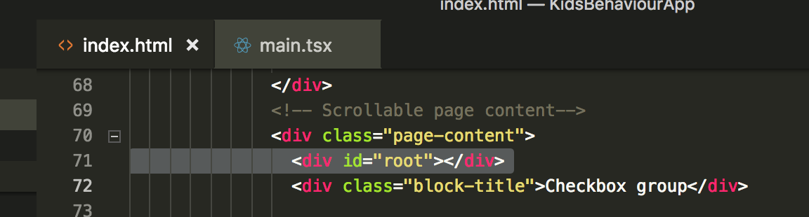
Not Sane:
VS Code with Monokai theme, with index.html on the left as the active tab. It is "highlighted" by being darker than the other tabs. The tabs are completely square and so other than the colour there is no visual cue as to which tab is active. Note similarity between highlighted text and the colour of the inactive tab.
 uglycoyote
All 20 comments
(Experimental duplicate detection)
Thanks for submitting this issue. Please also check if it is already covered by an existing one, like:
![vscodebot[bot] picture](https://avatars2.githubusercontent.com/in/2406?v=4&s=40) vscodebot[bot]
on 8 May 2018
vscodebot[bot]
on 8 May 2018
PR welcome if small.
/cc @Tyriar not sure if you added the theme initially?
 bpasero
on 8 May 2018
bpasero
on 8 May 2018
the following in my user settings improves the situation
"workbench.colorTheme": "Monokai",
"workbench.colorCustomizations": {
"[Monokai]": {
"tab.inactiveBackground": "#2c2e27",
"tab.inactiveForeground": "#ccccc7", // needs to be bright so it's readable when another editor group is focused
"tab.activeBackground": "#494842",
"tab.activeForeground": "#d3d1cc",
}
},
The file defining the colours is here. It does not define "active" tab colours, only inactive colours. So it's possible at the time when the theme was authored the default active colour was brighter and that some point later the default was changed, creating the problem.
I'm not sure if I want to try to make a PR myself, because I'm not really set up for building and testing VSCode from sources and also as I mentioned the problem is present in more than one theme (a broader fix may be needed than just to Monokai). I could fork VSCode and edit the one Monkai config file using the web interface and just submit PR without testing and hope for the best, but I imagine that sort of behaviour is frowned upon.
uglycoyote
on 8 May 2018
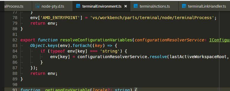
It's "highlighted" as being the same color as the editor, it looks better when there are multiple editors:
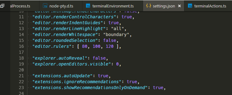
Inverting it as you suggest looks wrong imo:
- @roblourens @misolori
 Tyriar
on 11 May 2018
Tyriar
on 11 May 2018
This was very confusing choice of colors for me also. I really like this monokai-theme, so I solved it like this: (commented colors are the originals)
"tab.inactiveBackground": "#272822", // "#414339"
"tab.activeBackground": "#414339", // "#272822"
"tab.activeBorder": "#f5db19",

This has worked for me, no more clicking on the wrong tabs.
 Fraasi
on 11 May 2018
Fraasi
on 11 May 2018
It's currently not possible to have a bottom-border on the inactive tabs, but no bottom border on the active tab.
Other possibilities include a top-border colour for the active tab, that way it can connect to the page on the bottom, and have a bright colour indicator, e.g. Notepad++ (to some extent)
 Kroc
on 11 May 2018
Kroc
on 11 May 2018
I agree with @Tyriar, the inactive tabs look grayed out and sort of "behind" the active tab/editor.
 roblourens
on 11 May 2018
roblourens
on 11 May 2018
@Fraasi, yes the yellow underline definitely helps to underscore the active tab, I like that.
@Tyriar I disagree that having the tab the same colour as the editor is a good visual indicator that it is the current tab, especially when the inactive tabs are brighter and there is a solid separating line between the editor and the tabs. Though I could start to agree with you if your first screenshot was changed to something like this (photoshopped hack)
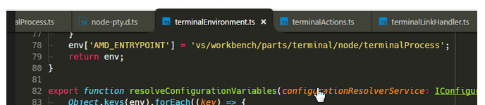
...though sounds like @Kroc is saying that those kind of visual changes for the active tab are not easily possible through the VSCode themes currently, and looking at the theme config files I would agree.
uglycoyote
on 11 May 2018
@uglycoyote the shadow means that there's content to scroll above the top so it seems a little think it still makes sense to keep the shadow. You can see it without the shadow if you scroll to the top:

Tyriar
on 12 May 2018
The shadow could be better used to represent "these tabs are attached to a page that is underneath the current document", whereas light is falling on the document/tab that is on top, uniformly, so there should not be a shadow between the active tab and active document.
These guys are doing it right, IMHO
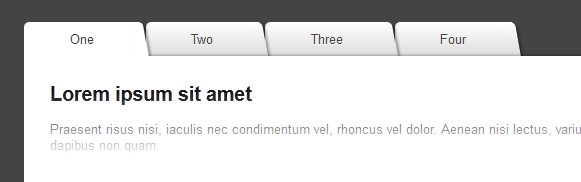
(from, https://catalin.red/css3-jquery-folder-tabs/, a random thing that came up when doing a google image search)
Using a shadow to represent scrolling seems unconventional, unexpected, unnecessarily redundant (I already have a scroll bar and line numbers!), and breaks the metaphor of the tab being "attached" to the active document. (is the active document separating from the active tab and sliding in underneath it?)
If continuity between the active tab and active document are kept then it remains clear that the two are connected regardless of odd colour choices
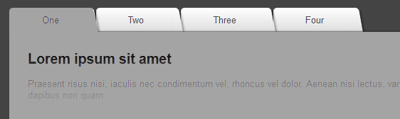
but once you separate the tab from the active document and remove the other visual cues of overlap, it starts to look quite confusing
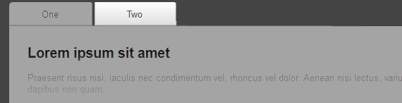
uglycoyote
on 12 May 2018
NB: you can remove the shadow that appears when scrolled by adding this to your settings:
workbench.colorCustomizations": {
    "scrollbar.shadow": "#0000"
}
@Kroc oh cool, I didn't know about that.
Tyriar
on 13 May 2018
We could try reducing the opacity of the inactive tabs (text + icons) so it's more obvious which tab is active:
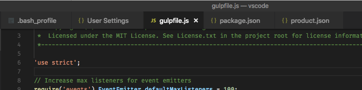
 misolori
on 14 May 2018
misolori
on 14 May 2018
@misolori, There's a comment on this line in the current Monokai theme json:
"tab.inactiveForeground": "#ccccc7", // needs to be bright so it's readable when another editor group is focused
I'm imagining that it was originally darker, and someone added the comment when making it brighter to try to solve the readability problem. I tend to agree with this person, that highlighting the inactive tabs to a brighter grey while simultaneously dimming the text makes for poor contrast, not to mention that it is a mixed message.
In the Explorer window and other left-docked windows, a lighter shade of grey is used consistently to highlight the current item. Having some consistency about what colour represents "selected" seems more important than having colour-coordinating the selected tab with the editor background.
Looking at some other software, it seems other programs solve these issues by having some kind of a "header bar", and having the colour of the header bar and the selected tab be the same.
Chrome (incognito)

Sublime Monokai & Flatland Dark

Thus they have the "selected tab colour matches something below it" property that you desire without forcing the selected tab to be darker than the unselected ones, even though the editor (or main content window in the case of Chrome) is dark.
uglycoyote
on 14 May 2018
For the Monokai theme, the inactive tabs do appear too bright. I'd suggest reducing the background color from #414339 to #34352f.
Before
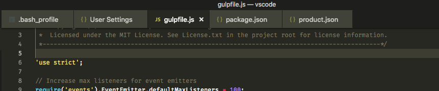
After
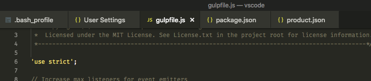
This pattern where the inactive tabs are grayed out works well with the rest of our dark themes:
One Dark Pro
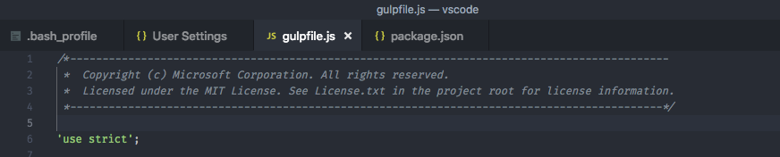
Flatland Monokai

Absent (Rainglow)
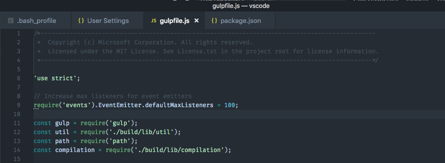
misolori
on 14 May 2018
@misolori I agree that does look better, I think we should probably concern other places like the status bar to use that color as well. Then #414339 can still be used primarily for selection?
Tyriar
on 15 May 2018
I like that darker color for inactive tabs, but I would keep the same color other places like the status bar. I like the status bar brighter to contrast with the editor background. It's used for list.inactiveSelectionBackground, but that should also stay brighter so it stands out in the list.
roblourens
on 12 Sep 2018
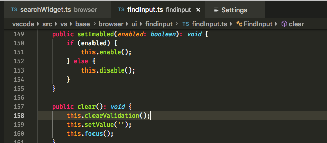
Also, the breadcrumbs bar under the tabs kind of helps with the general tab discussion above...
roblourens
on 12 Sep 2018
We can try this out in Insiders, let me know if you have any feedback...
roblourens
on 12 Sep 2018
I think it'll be much better if the background color of the inactive tabs is the same as the tab gutter:
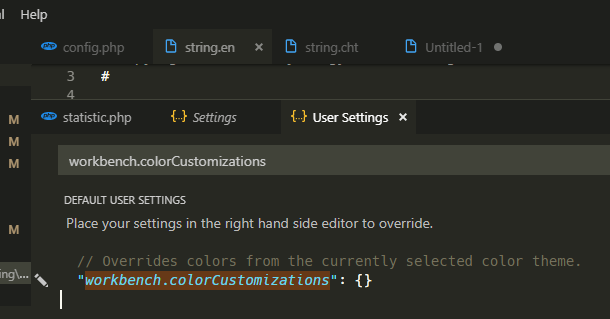
    "workbench.colorCustomizations": {
        "tab.inactiveBackground": "#1E1F1C",
        "tab.inactiveForeground": "#AAAAAA",
        "tab.activeForeground": "#FFFFFF",
    }
 howar31
on 3 Oct 2018
howar31
on 3 Oct 2018
Related issues
 NikosEfthias
·
3Comments
NikosEfthias
·
3Comments
 trstringer
·
3Comments
trstringer
·
3Comments
 lukehoban
·
3Comments
lukehoban
·
3Comments
 sirius1024
·
3Comments
sirius1024
·
3Comments
 vsccarl
·
3Comments
vsccarl
·
3Comments
Most helpful comment
NB: you can remove the shadow that appears when scrolled by adding this to your settings: