Vscode: Blue icon can't be seen in title bar when blue accent color is being used in Windows
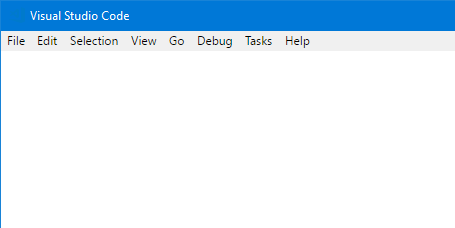
The new blue icon, introduced in 1.18, can't be seen in the title bar when the Windows 10 accent color is set to blue (which I bet lots of people are using). See the screenshot below.
I suggest using 2 colors (blue + black), just like the icon in the Start Menu which doesn't have this problem.
 Eldaw
Eldaw
All 13 comments
It also not very contrast in taskbar.
Old one with white outline worked fine.
Orange one worked fine.
On mostly dark environment I'd prefer white outline to black fill.
_Personally, I'm fine with orange and would've preferred if devs insisted on keeping orange color despite initial kickback._
 KillyMXI
on 9 Nov 2017
KillyMXI
on 9 Nov 2017
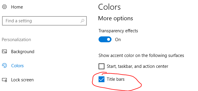
Here's a bit of extra information. You probably don't encounter this problem unless you've got this specific Windows color setting turned on:
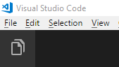
When VS Code is unfocused, it's OK:
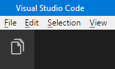
But when VS has the focus, you can't see it:
If I remember correctly, the original blue icon had a small white outline around the logo, and was also filled with white. I'm not sure you could really fill the new one (there's only one closed section), but it should be possible to add a small white outline to it to make it stand out more.
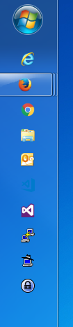
Here it is on the taskbar (next to VS 2017):

I think it looks OK as-is on the taskbar (and matches VS 2017 nicely), so I don't think it needs a white outline there.
 reduckted
on 10 Nov 2017
reduckted
on 10 Nov 2017
Worst case for taskbar:


Normally I'm using Navy Blue and transparency on. So it looks like this for me:

Still it is notable change for worse compared to previous icons.
Any mono-colored icon can have it's own worst case, VS too. It's just happen that blue is kind of default background color. Some ways to increase contrast better be considered for all the icons across product family. (In taskbar, thick black outline might work as well as thin white outline, probably.)
Title bar icon I can barely see:

But thankfully I don't need to look for it as often as for taskbar icon.
KillyMXI
on 10 Nov 2017
@KillyMXI Ah, I see what you mean about the taskbar now.
reduckted
on 10 Nov 2017
I liked the orange one A LOT. In a task bar filled with blue or blue~ish icons it stands out and that was such a nice change. Then they changed it back to blue because people didn't like it.
Now, you know people who don't like it, but how about people who actually like it?
 katexue-cm
on 10 Nov 2017
katexue-cm
on 10 Nov 2017
There is currently no plans to change the icons, but thanks for your interest. See also https://code.visualstudio.com/blogs/2017/10/24/theicon
 bpasero
on 10 Nov 2017
bpasero
on 10 Nov 2017
@bpasero So you don't care that the icon is invisible in the title bar on what's basically a default Windows installation?
Edit:
I mean, if you don't care that you can't see the icon, that's fine I guess. I just want to make sure you understand what this issue is about. We're not suggesting that the icon be changed _again_. We're simply suggesting that the icon becomes visible on the title bar instead of being almost exactly the same colour as the default Windows title bar color.
reduckted
on 10 Nov 2017
Say what you will about the old logo, but it universally worked. White background? Black? Blue? No problem. My biggest gripe with this new logo (thank you for bringing back the blue) is how the infinity symbol is now... finite. I totally understand the design choice to match the perspective of the Windows logo, but did you really need to hack off a significant portion of what has been an iconic symbol for software developers for ages? And is that big border thing really necessary?
 karai17
on 10 Nov 2017
karai17
on 10 Nov 2017
The shape of the logo is irrelevant for this discussion. This issue is about the fact that you can't see the logo on a blue title bar. That is all.
reduckted
on 10 Nov 2017
Great! Now the Code icon is practically indistinguishable from VS2017! 👎 😞

 DanAtkinson
on 10 Nov 2017
DanAtkinson
on 10 Nov 2017
Seconded. The original icon was perfect. without the white outline around the new one, it is very difficult to see it against many other colors in the background
This is a screenshot of my desktop. the new logo is barely visible against my wallpaper:
 badri18
on 11 Nov 2017
badri18
on 11 Nov 2017
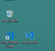
This also affects Windows 7's taskbar when the icon overlays a correctly coloured bit of desktop background. It happens for me with the default win 7 background, the icon is before VS2015's:
A white border like it used to have, or anything to give it some contrast against whatever colour background, would be extremely useful.
 martinwilkerson-scisys
on 13 Nov 2017
martinwilkerson-scisys
on 13 Nov 2017
@bpasero This is a problem for people still on Windows 7 (company computers). Even discounting the status bar thing, it's very difficult to see on the task bar in Windows 7. How can you say this is fine?


 mhco
on 13 Nov 2017
mhco
on 13 Nov 2017
Related issues
 curtw
·
3Comments
curtw
·
3Comments
 shanalikhan
·
3Comments
shanalikhan
·
3Comments
 sijad
·
3Comments
sijad
·
3Comments
 trstringer
·
3Comments
trstringer
·
3Comments
 vsccarl
·
3Comments
vsccarl
·
3Comments
Most helpful comment
This also affects Windows 7's taskbar when the icon overlays a correctly coloured bit of desktop background. It happens for me with the default win 7 background, the icon is before VS2015's:

A white border like it used to have, or anything to give it some contrast against whatever colour background, would be extremely useful.