Vscode: Toggle button focus is difficult to determine
- VSCode Version: Code 1.17.2 (b813d12980308015bcd2b3a2f6efa5c810c33ba5, 2017-10-16T13:57:00.652Z)
- OS Version: Linux x64 4.10.0-35-generic
- Extensions:
Extension|Author (truncated)|Version
---|---|---
terminal-tabs|Tyr|0.1.1
Active + not focused:

Active + focused:

 Tyriar
All 17 comments
@misolori This is same for all our check boxes for eg in Search and Find widgets. Any suggestions would be appreciated here.
 sandy081
on 14 Sep 2018
sandy081
on 14 Sep 2018
This is totally a bug imo, we have the theme keys, we just don't have any contrast at all between active and focus in our themes:

Currently we're using two things to show state changes in the buttons:
- Weight: focus, active or hover
- Border: focus and active
This is different to the icons on the right of the find widget (next/prev match, find in selection, close), note that only find in selection has an active state here:
- Background change: hover (except find in selection which is wrong, related https://github.com/Microsoft/vscode/issues/50825)
- Border: focus
It's only in these toggles that we use border to indicate active which is why we see this issue. I propose we streamline all these icons to work the same:
- Weight: focus, active, hover (this isn't really needed)
- Background: active, hover
- Border: focus
This would come with the perk (con?) of not drawing so much attention to these toggles. Alternatively we could use a darker blue on dark themes and a lighter blue on light themes to indicate active/hover.
Tyriar
on 14 Sep 2018
- @roblourens since this also applies to the search viewlet.
Tyriar
on 14 Sep 2018
We talked about this in https://github.com/Microsoft/vscode/issues/48855, we decided to handle it with https://github.com/Microsoft/vscode/issues/8017. What do you mean by "weight" here? The foreground color?
I'm not sure about getting rid of the border, I think it should be obvious when these toggles are on or off.
 roblourens
on 14 Sep 2018
roblourens
on 14 Sep 2018
This is also related to #52161 where the "active" state can be confusing to decipher.
 misolori
on 14 Sep 2018
misolori
on 14 Sep 2018
What do you mean by "weight" here? The foreground color?
Yes the foreground color.
I'm not sure about getting rid of the border, I think it should be obvious when these toggles are on or off.
It's an accessibility issue though that focus and active look the same, and the border is what we use everywhere to indicate focus.
Tyriar
on 14 Sep 2018
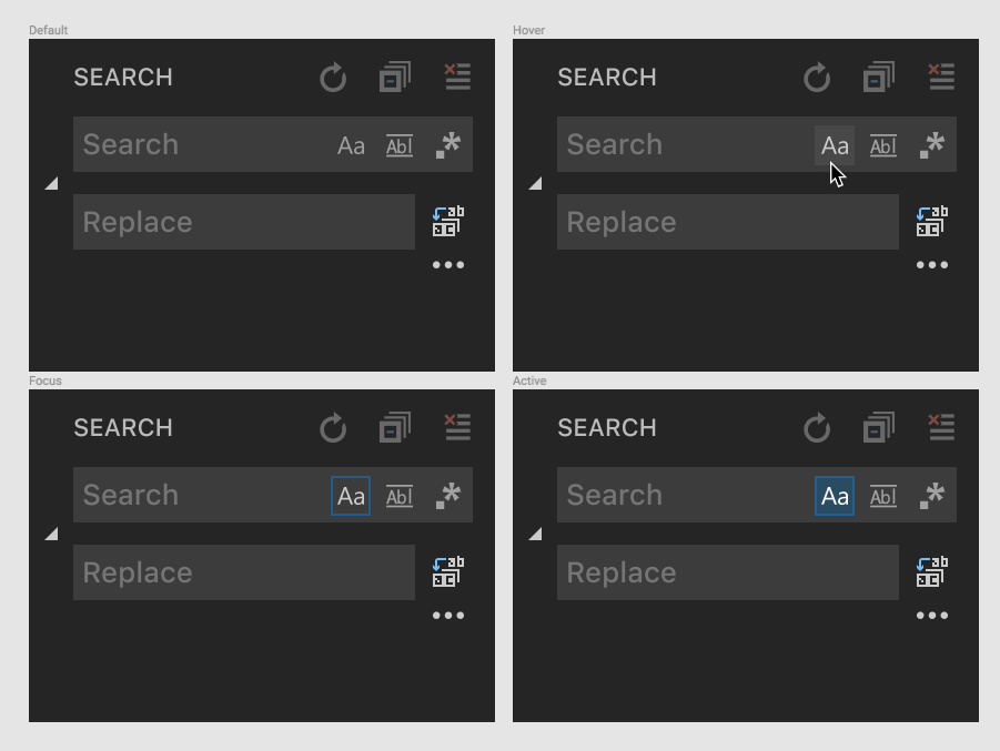
@Tyriar do you think something like this would work?
misolori
on 14 Sep 2018
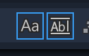
@misolori that's fine for hover, but focus/active states are the main problem. Which one of these is focused with the keyboard?
Tyriar
on 14 Sep 2018
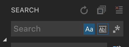
@Tyriar my screenshot above has the various states (default, hover, focus, and active). And I totally agree that focus/active are a problem, my suggestion was to add a background for active to help differentiate it from the focus border:
misolori
on 14 Sep 2018
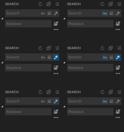
Here's a gif that shows the keyboard interactions:
misolori
on 14 Sep 2018
@misolori doh, I didn't even notice the background on the bottom right, yeah that looks good. The duller blue would probably be better than the really bright one (and be more obvious when the focus isn't on).
Tyriar
on 15 Sep 2018
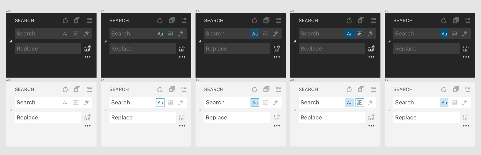
Update status: during our UX sync today, we decided that we are going to try out using a background color for an active state and use the outline for only the focus state.
We'll try and re-use the focusBorder color and change the opacity (dark: #0E639C @ 60% opacity, light: #007ACC @ 20% opacity`). This will be applied to all toggle states (find widget, find in selection, exclude settings, etc.).
That will end up looking like this:
@roblourens @sandy081 let me know if there is anything else you need from me
misolori
on 11 Oct 2018
@misolori looks great!
Tyriar
on 11 Oct 2018
Looks good
sandy081
on 12 Oct 2018
@misolori @Tyriar has this been improved with the new icons?
 isidorn
on 18 Jun 2019
isidorn
on 18 Jun 2019
No, nothing has changed about how they are focused/highlighted.
roblourens
on 18 Jun 2019
@roblourens thanks
There are too many people assigned here.
@misolori assigning to you. It would be great if we can tackle this some time in the future. Since we are changing icons, this might go well with it.
isidorn
on 19 Jun 2019
Related issues
 v-pavanp
·
3Comments
v-pavanp
·
3Comments
 curtw
·
3Comments
curtw
·
3Comments
 lukehoban
·
3Comments
lukehoban
·
3Comments
 trstringer
·
3Comments
trstringer
·
3Comments
 villiv
·
3Comments
villiv
·
3Comments
Most helpful comment
Here's a gif that shows the keyboard interactions:
