Vscode: Intellisense suggestions should display an horizontal scrollbar if needed
- VSCode Version: 1.13.0
- OS Version: macOS Sierra 10.12.5
Steps to Reproduce:
- install java extension
- open java file
- type
import o, wait for suggestions to show up
suggestions are truncated because the package names don't fit in the suggestion window, there's no way to scroll horizontally
See https://github.com/redhat-developer/vscode-java/issues/249
Reproduces without extensions: Maybe
 fbricon
All 40 comments
I am not sure how well a horizontal scroll bar would work. How difficult would it be to increase the width to accomodate these longer strings, if the string is longer than would fit in the default width?
The problem with the scroll bar is that once you scroll to the right, you need to scroll back to the left if you arrow down and the next item is much shorter in length. A solution to that would be to auto scroll back to the left after making another selection but then that could run into problems if the list looks like the screenshot above.
 stevencl
on 16 Nov 2017
stevencl
on 16 Nov 2017
The problem with the scroll bar is that once you scroll to the right, you need to scroll back to the left if you arrow down and the next item is much shorter in length
This is the behaviour I see in Eclipse. With a trackpad, it's absolutely manageable.
I think this would give users less surprises than trying to autoscroll back when changing the selection.
A better solution would probably be to scroll left only if the selection text size is lower than the x-position of the currently visible pane, but that's probably too complicated
fbricon
on 16 Nov 2017
One of my colleague shows me that, in the css that drives the suggestion list, there is a width:50% that is set. when forced to 100%, the width of the suggestion list is then ok (no cropping). It could be great if the suggestion-list max width could be parameterized directly in the workspace settings
 hdorgeval
on 16 Nov 2017
hdorgeval
on 16 Nov 2017
Here is a screenshot of this css rule:

When I set the value to 70%:

hdorgeval
on 16 Nov 2017
I have also discovered that if you reduce the width of the VS Code editor window, then suddenly there is no more cropping as shown by the following sceenshot:

hdorgeval
on 16 Nov 2017
This is definitely a usability issue and please take care of it. I am pretty sure you can solve it in a good way. Also as @fbricon said in eclipse and others there is horizontal scroll bar appears if horizontal scroll bar needed. Also you can resize the suggestion bubble with catching it and dragging from bottom right corner.
 emeentag
on 24 Dec 2017
emeentag
on 24 Dec 2017
@hdorgeval mentioned a quick hack, i will try to explain this quick hack until a solution is shipped in later releases. I also want to say that, suggestions became way better for me after this hack, especially while programming in java.
Steps:
- Open VsCode's package contents folder. It is the folder where you installed VsCode on your machine. Could be different for each operating systems.
- In mac i went through this path for the css file:
Your Package Contents/Resources/app/out/vs/workbench/workbench.main.css - Search for this line:
.monaco-editor .suggest-widget.docs-side>.tree - Edit
widthcss property from 50% to 100% - Save and restart vscode. You will get a warning like
Your Code installation appears to be corrupt. Please reinstall.Just ignore it because with doing this way, we broke the md5 checksum of the installation. For me a proper suggestion much more important than this warning.
Before:

After:

emeentag
on 24 Dec 2017
Hi @hopbalabi , for some reason the hack didn't work for me.
- VsCode versio: Version 1.19.3 (1.19.3)
- MacOsX version: 10.13.2
 darkgem666
on 31 Jan 2018
darkgem666
on 31 Jan 2018
@darkgem666 please make sure you are editing workbench.main.css After you change this css you must restart the vscode.
emeentag
on 1 Feb 2018
I did.

darkgem666
on 2 Feb 2018
Hi @hopbalabi. Thanks for the tip. I even set it to 200%. Wish we could customize this using the settings or something.
 Aggror
on 5 Apr 2018
Aggror
on 5 Apr 2018
REALLY NEEDED! +1
At the very least have tooltip hover show the fully value when the mouse is hovering over a item...
or have the full value shown in the details window on the right... Right now there seems to be no way to see the value..
 StephenOTT
on 8 Apr 2018
StephenOTT
on 8 Apr 2018
+1
 poliarush
on 9 Apr 2018
poliarush
on 9 Apr 2018
This hack works for me, but the VS Code version: 1.23.1 seems to have broken something. I want to configure without the hack
 s-shamesmuhametov-parc
on 11 May 2018
s-shamesmuhametov-parc
on 11 May 2018
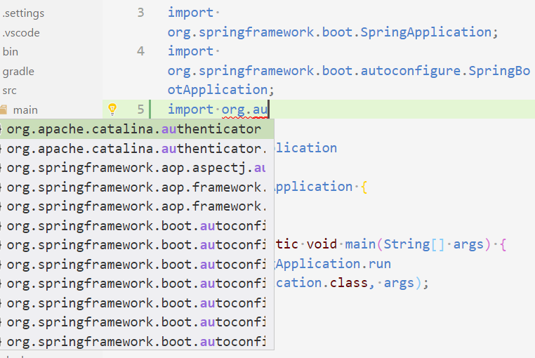
I think a superior fix would be to display attributes hierarchically to avoid rewriting common prefixes. So the window would contain:
x org
x     .apache.catalina
          .authenticator
              .(can't see it in the screenshot)
x     .springframework
x         .aop
              .aspectj.stuff
              .framework
                  .thing1
                  .thing2
          .boot.autoconfig
              .thing1
Rows not matching the typed string (such as org itself, .springframework itself, etc) would be dimmed and not selectable, as marked by a leading x above.
This takes more vertical space, but takes a lot less horizontal space and is a lot easier to quickly skim.
 rben01
on 29 Aug 2018
rben01
on 29 Aug 2018
+1
 LucianoMRrodriguez
on 14 Sep 2018
LucianoMRrodriguez
on 14 Sep 2018
There are 2 sides to this issue
- The data being provided by the extensions is too long
- The widget is not big enough to show long data
I'd like to address the first issue while we figure out the solution to the second.
Note: I am re-using the pictures from the previous comments
In the first scenario for java, when the user has already typed import.org., the completion provider from the java extension should return only the rest of the import in the completions. This is doable because . is a trigger character, meaning when user types ., VS Code calls the completion provider in the extension. The extension at this point knows what is already typed and show only the remaining parts.
I have updated https://github.com/redhat-developer/vscode-java/issues/249 accordingly.
In the second scenario by @hopbalabi, the function signature is being shown inside parenthesis, which makes most of the items have long labels. This is not the suggested way to show the signature in the auto-completion widget. In other languages/extensions, the function signature is shown as part of the docs and not the initial label itself.
@hopbalabi Was your example Java as well using the vscode-java extension? I am asking so that I can log an issue for this in the right repo
 ramya-rao-a
on 14 Sep 2018
ramya-rao-a
on 14 Sep 2018
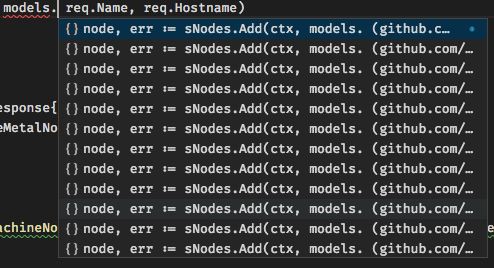
@ramya-rao-a Here is another data point (for Go):
 AlekSi
on 13 Nov 2018
AlekSi
on 13 Nov 2018
@AlekSi Can you open a issue in the vscode-go repo for this? With sample code and your Go related settings? Such long labels seem very unlikely in Go
ramya-rao-a
on 14 Nov 2018
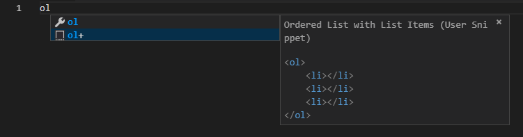
For user snippets, a change that would help tremendously is to change word-wrap from break-word to normal to prevent these kinds of issues:
 thdoan
on 18 Nov 2018
thdoan
on 18 Nov 2018
Two solutions make sense to me:
- Truncate the beginning of the suggestion enough to show the end:
... console.log() - Show the beginning and ends of the suggestion:
window. ... .log()
Probably should be configurable too
 marcoms
on 2 Jan 2019
marcoms
on 2 Jan 2019
@emeentag hi,your solution is great,but I want to ask how to get rid of the word [Unsupported] at the title.As sort of OCD,sufferring from that.
thx!
 JoeyRxy
on 4 May 2019
JoeyRxy
on 4 May 2019
@JoeyRxy You can use the Fix VSCode Checksums plugin
marcoms
on 7 May 2019
Hi all,
Sorry i could not follow the thread for along time. But as i see here i think we are still at the beginning.
@ramya-rao-a it is nice you are trying to identify and solve the issue but what i try to say in here, this is a clear UX failure. And members who want to raise a ticket similar to that problem should not be redirected to the related repos because this is not a problem for extensions. This is a general issue. All extensions using the same interface of VSCODE to display their code suggestions right? So it seems to me hard to accept to make the same error by all the extensions. In here issue is not related with go python or java... Issue is to display some long text not properly inside these suggestion boxes. Once everyone applies this CSS hack then it fixes the issue for every language so then we should accept this is a common issue and should not be handled in different repo(s). This code suggestions is in general format for Java and provided by the language server(as i know) so other IDE or editors covering this issue by adding a scrollbar or making possible to expand suggestion box. And please do not suggest to change displaying those suggestions because they are look like the same since years and years. Hope now we could be on the same page. Better to accept this is a common problem and better to handle in a good UX.
Thx.
emeentag
on 8 Jun 2019
We will take the suggestion of having our extension try to shorten the labels of completions as a good constructive suggestion. In our case this 'workaround' only works sometimes however. If you look at the linked issue https://github.com/spring-projects/sts4/issues/361. We see an example where it indeed would work. And perhaps that is the most common scenario.
We should realize however that is possible in our extension to suggest those same lengthy completions without the user first needing to type the whole prefix in the editor. If you only type a snippet of the property name taken from near its end, the whole length of that property, including all the '.' in between segments will be suggested and will need to be displayed in its entirety.
So, yes, it is a good idea to shorten the labels when it makes sense, and this actually makes the popup generally more pleasant to look at for a user too. So we will do that. But it doesn't mean vscode should not still also provide a proper way to display longer completion labels.
 kdvolder
on 5 Sep 2019
kdvolder
on 5 Sep 2019
The shortening of the texts is a good proposal but I wonder why you can't make the dropdown box the double with anyway to make sure that even longer path parts are displayed fully. What speaks against this if is a simple change in the css?
 escamoteur
on 13 Sep 2019
escamoteur
on 13 Sep 2019
Here to share a related issue microsoft/vscode-java-pack#255. Java classes often have longer full names. And the current completion list is showing ellipsis which omits the most important message, e.g. the class name.

Showing the horizontal scroll bar is definitely a nice workaround. But it would be nicer to ask the language server. Here are two options:
- Vscode asks the language server to provide a short name by specifying the max length.
a. Full name: org.hibernate.validator.internal.constraintvalidators.bv
b. Parameter: maxLength: 50
c: Result: org.hibernate.validator.internal.constraint...bv - Vscode asks the language server to mark the most significant part in the name (with a range), and then generates better short names.
a. Full name: org.hibernate.validator.internal.constraintvalidators.bv
b. Significant part: (54, 56) -> bv
c. Result: org.hibernate.validator.internal.constraint...bv
 akaroml
on 18 Nov 2019
akaroml
on 18 Nov 2019
@akaroml Did you experiment with only using the last part as label, e.g. FooValidatorFactory, and to use the fully qualified name in the detail or description only? I am asking because I think that even adding a scrollbar or label-shorting won't help much with being able to quickly grasp what's showing on the screen. In addition to the short-labels you can still suggest package names, like so
label: FooValidator, detail: org.hip.hop. FooValidator
label: FooValidatorFactory, detail: org.hip.hop. FooValidatorFactory
label: org, detail: package
That would allow to type package names and type names and would make the IntelliSense widget less busy.
 jrieken
on 18 Nov 2019
jrieken
on 18 Nov 2019
@hdorgeval mentioned a quick hack, i will try to explain this quick hack until a solution is shipped in later releases. I also want to say that, suggestions became way better for me after this hack, especially while programming in java.
Steps:
- Open VsCode's package contents folder. It is the folder where you installed VsCode on your machine. Could be different for each operating systems.
- In mac i went through this path for the css file:
Your Package Contents/Resources/app/out/vs/workbench/workbench.main.css- Search for this line:
.monaco-editor .suggest-widget.docs-side>.tree- Edit
widthcss property from 50% to 100%- Save and restart vscode. You will get a warning like
Your Code installation appears to be corrupt. Please reinstall.Just ignore it because with doing this way, we broke the md5 checksum of the installation. For me a proper suggestion much more important than this warning.Before:
After:
The directory structure on v1.40.2 seems to have changed. The css files in the stated directory are named differently. Also setting it to 100% did not work for me. Not sure why.
 muhd-ali
on 1 Dec 2019
muhd-ali
on 1 Dec 2019
@akaroml Did you experiment with only using the last part as label, e.g.
FooValidatorFactory, and to use the fully qualified name in the detail or description only? I am asking because I think that even adding a scrollbar or label-shorting won't help much with being able to quickly grasp what's showing on the screen. In addition to the short-labels you can still suggest package names, like solabel: FooValidator, detail: org.hip.hop. FooValidator label: FooValidatorFactory, detail: org.hip.hop. FooValidatorFactory label: org, detail: packageThat would allow to type package names and type names and would make the IntelliSense widget less busy.
Just tried to put the short name in the front and it looks good enough for me. What do you think? @fbricon

akaroml
on 4 Dec 2019
Further playing with my modification, there is actually a new problem. As I keep on typing "spring" to limit the search scope, the highlighting works in a weird way. I was expecting the term "org.spring" to be highlighted, but only "spring" is. I guess it has something to do with the string match algorithm in vscode.

akaroml
on 4 Dec 2019
In case anyone wants to use the hack above, on Mac and vscode (1.41.0-insider) file name is changed to workbench.desktop.main.css
Steps:
Open VsCode's package contents folder. It is the folder where you installed VsCode on your machine. Could be different for each operating systems.
In mac i went through this path for the css file:
Your Package Contents/Resources/app/out/vs/workbench/workbench.main.css
Search for this line:
.monaco-editor .suggest-widget.docs-side>.tree
Edit width css property from 50% to 100%
Save and restart vscode. You will get a warning like Your Code installation appears to be corrupt. Please reinstall. Just ignore it because with doing this way, we broke the md5 checksum of the installation. For me a proper suggestion much more important than this warning.
```
 hxuanhung
on 10 Dec 2019
hxuanhung
on 10 Dec 2019
What is the situation right now? Also for JS Development this box is pretty small? Resizing the Box with the mouse and remembering the width and hight for the next time would be great...

Or a setting somewhere here: (Workspace and User)

 Hopfenspirger
on 11 Mar 2020
Hopfenspirger
on 11 Mar 2020
A pretty similar issue is with the "auto-import" labels which are way too short:

When you are importing a type with a common name, it's really hard to know which one to import.
 ValentinH
on 20 Apr 2020
ValentinH
on 20 Apr 2020
I actually noticed that if you hover the row, there is an "i" icon.

If you click on it, the description will be shown in a new popup attached to the first one:

The best part is that once you clicked it, it will stay in this mode for the next time.
ValentinH
on 20 Apr 2020
To everyone resorting to the CSS hack, upvote https://github.com/microsoft/vscode/issues/30140 to make bottom suggestion details permanent.
 jayjun
on 19 May 2020
jayjun
on 19 May 2020
To anyone having trouble getting the CSS hack to work, one more detail that finally made it work for me: I had to change the Editor: Suggest Font Size from zero to something smaller than my default font. I had almost given up on getting the CSS hack to work. After I did that the change from 50% to 100% worked. This is on MacOs Catalina.

It seems I can make it bigger, smaller, or zero and the CSS hack now works. Something about changing it made the change start working.
 chetrf
on 14 Jun 2020
chetrf
on 14 Jun 2020
waiting for feature request https://github.com/microsoft/vscode/issues/29126
 Jonathan0wh
on 3 Jul 2020
Jonathan0wh
on 3 Jul 2020
1) Create the following css in your user folder (figure out paths if you are not on Windows):
.monaco-editor .suggest-widget.docs-side{
  left: 32px !important;
  right: 32px !important;
  width: calc(100vw - 64px) !important;
}

  .monaco-editor .suggest-widget.docs-side .tree {
    width: 34% !important;
  }

  .monaco-editor .suggest-widget.docs-side .details {
    width: 66% !important;
  }
2) Install be5invis.vscode-custom-css extension
3) Insert this on your settings.json:
  "vscode_custom_css.imports": [
    "file://C:/Users/jckod/vscode.css"
  ],
  "vscode_custom_css.policy": true
4) Press F1 to get the command palette and run Reload custom CSS and JS
5) Restart VSCode when requested in the notification
6) Ignore the "VSCode install is corrupt"

Nice full screen intellisense, with no jumping.
See? Is not that hard, Microsoft. I don't care if it is not right on the cursor position. I just care about being able to read the f☠ documentation ¬¬
 JCKodel
on 18 Jul 2020
JCKodel
on 18 Jul 2020
The suggestions and the details part are going to be resizable (see https://github.com/microsoft/vscode/issues/29126#issuecomment-716415112). I am closing this as a related/duplicated issue.
jrieken
on 26 Oct 2020
Related issues
 shanalikhan
·
3Comments
shanalikhan
·
3Comments
 biij5698
·
3Comments
biij5698
·
3Comments
 borekb
·
3Comments
borekb
·
3Comments
 v-pavanp
·
3Comments
v-pavanp
·
3Comments
 villiv
·
3Comments
villiv
·
3Comments
Most helpful comment
@hdorgeval mentioned a quick hack, i will try to explain this quick hack until a solution is shipped in later releases. I also want to say that, suggestions became way better for me after this hack, especially while programming in java.
Steps:
Your Package Contents/Resources/app/out/vs/workbench/workbench.main.css.monaco-editor .suggest-widget.docs-side>.treewidthcss property from 50% to 100%Your Code installation appears to be corrupt. Please reinstall.Just ignore it because with doing this way, we broke the md5 checksum of the installation. For me a proper suggestion much more important than this warning.Before:

After:
