Vscode: can't create breakpoint on current line because light bulb is in the way
- VSCode Version: Code 1.11.2 (6eaebe3b9c70406d67c97779468c324a7a95db0e, 2017-04-13T07:56:42.517Z)
- OS Version: Darwin x64 16.5.0
- Extensions:
|Extension|Author|Version|
|---|---|---|
|uncrustify|LaurentTreguier|1.5.1|
|unity-debug|Unity|1.2.0|
|vscode-nuget-package-manager|jmrog|0.0.2|
|cpptools|ms-vscode|0.10.3|
|csharp|ms-vscode|1.9.0|
|vscode-icons|robertohuertasm|7.3.0|;
There has to be a better way. Make room for both? Don't give me the option to extract a method unless I actually have text selected? 9 times out of 10, when I go to set a breakpoint, it's on the current line. so I nearly always have to move the cursor before I can.
 greay
greay
All 42 comments
@greay You can toggle breakpoints using F9 or the F1 command palette
 jrieken
on 24 Apr 2017
jrieken
on 24 Apr 2017
that's great, but there's absolutely no feedback when you do that, because the lightbulb is obscuring the breakpoint mark in the gutter.
greay
on 24 Apr 2017
Yeah, we know that the gutter on the left is not easy to share. Today we have a rule that always respect the icon that came first.
cc @stevencl
jrieken
on 24 Apr 2017
An alternative would be for us to draw the lightbulb in the space between the start of the line and the line number. We currently use at least some of this space to show the block expandos.

 stevencl
on 25 Apr 2017
stevencl
on 25 Apr 2017
We currently use at least some of this space to show the block expandos.
Doesn't that mean we'll have a similar problem, just with expandos vs light bulb?
jrieken
on 25 Apr 2017
No, we would make sure that it fits. I wouldn't want to suggest something that would just make the problem reappear elsewhere. Something like so:

We might also want to fine tune the region lines and expandos so that the expando sits a few pixels closer to the lines.
Basically we would need to spend some time laying out the different pieces of UI so that they fit well without significantly eating into horizontal real estate.
stevencl
on 25 Apr 2017
Unsure, left of the expandos is the dirty diff decoration... Should we than make more room and shift things a little?

jrieken
on 25 Apr 2017
Similar bug in the opposite manner.
Was going to delete a line of code by selecting it from the margin, Did a double click or so and selected it and put a breakpoint down. Tried to get rid of the breakpoint and an unrendered lightbulb kept giving me its context menu instead of removing the displayed breakpoint.
VSCode Version:
Version 1.13.0-insider (1.13.0-insider)
c615b43be67170e166779c9020a249442c4f36fc
2017-05-09T06:02:40.607Z
 crysyn
on 11 May 2017
crysyn
on 11 May 2017
I experience this problem when I've hit the breakpoint and am trying removing, it while still on the same line. Clicking it does not remove the breakpoint or bring up the code actions lightbulb menu. Nothing at all happens.
I'm debugging asp.net core apps on Mac.
 jtlowe
on 13 Jul 2017
jtlowe
on 13 Jul 2017
I have nothing to add but to say that it is really annoying.
 Zammy
on 22 Jul 2017
Zammy
on 22 Jul 2017
We should fix this. An alternative to my suggestion above, which would require shifting things to make room for the lightbulb, we could consider using the space to the right of the breakpoint gutter in the margin. This is currently a hit target for selecting a line but we support triple clicking on a line to select the whole line. This would mean that we would not have to shift anything to make space but it would mean that we would no longer allow you to select a line by clicking that space in the margin when a lightbulb is present. If no lightbulb is present we could still allow the user to click to select a line.
This of course could lead to similar bugs being reported ("Cannot select a line when a lightbulb is present") so another alternative could be that we just simply remove the ability to select the line by clicking in the margin altogether.
Just to be clear, it would look something like this:

I don't know how popular clicking in the margin to select a line is compared to triple clicking inside the editor.
stevencl
on 11 Aug 2017
@bpasero made a good point today about that space to the left of the line numbers being reserved for three digit (or more) line numbers. So we might need to consider shifting things over to make room regardless of which solution we go with (placing the lightbulb to the left or right of the line numbers).
@alexandrudima - what are your thoughts? Are there other options available to fix this?
stevencl
on 16 Aug 2017
IMHO clicking on a line number should select the line, which it does today and we should not change that. We are building first and foremost an editor and I believe that is what the vast majority of our users expect from a code editor.
IMHO we have two directions we can take:
- Keep both toggle breakpoint and lightbulb in the glyph margin, where they are today, but solve the clicking. i.e. when the mouse goes in that area, these two need to move around a bit so a click can be clearly registered on either one of them (sort of like an expose).
- Move the lightbulb out of there and show it in the hover, and/or in the context menu, and/or in the error list in the error panel. I personally find the lightbulb sits in a way too prominent place and once I learn
ctrl+.shows the list with actual code fixes, I never want to see the lightbulb icon again. It is also a lot of "marketing" for some disappointing actions. Perhaps this belongs to a Refactor context menu rather than popping up in the gutter:
e.g. js:

 alexdima
on 23 Aug 2017
alexdima
on 23 Aug 2017
Unsure, if I can make it to the meeting today... My 2 cents are that we should probably look for a long-term solution (option 1 from @alexandrudima reply) because this isn't just lightbulb vs breakpoint. We have opened up that area for extensions. The below screenshot is from an extension that previews images in css files. While we don't debug css-files, we might have quick-fixes. Or an extension might render control flow icons into a JS file etc.

Short term we can tweak how aggressive the light bulb shows, e.g only when being on an error or warning, making it a quick-fix-light-bulb, not code-action-light-bulb. I'd also like to point out that the light bulb initially was inside the editor but there were issues with squiggles, the Intellisense widget, etc. Super short term we can add an option to not show the light-bulb...
jrieken
on 23 Aug 2017
What are the downsides to handling this like Visual Studio does, with the light bulb floating over the line numbers? Is this one of the issues you mentioned @jrieken?
For those that aren't familiar with how Visual Studio handles this:
- An indicator bar to hold the breakpoint icon.
- The line number column has a little more padding on the right side.
- The lightbulb menu hovers partially over the line number, with plenty of room to click on the line number.

jtlowe
on 23 Aug 2017
Why not show the light bulb in the editor area like IntelliJ does, instead of the gutter?

 Gama11
on 30 Aug 2017
Gama11
on 30 Aug 2017
@jtlowe - we considered that (see earlier in the thread) but we wanted to first look for a solution that wouldn't require that we reduce the editor space in order to make more room for the lightbulb.
@Gama11 - as it happens, the lightbulb used to be positioned in the editor. It would be placed next to (or as close to) the piece of code that the action applied to. That meant that it would often end up obscuring some piece of code and just simply get in the way as the user moved the cursor around the editor. So it was moved to the gutter as a result.
We discussed the different options and constraints available and wanted to explore @alexandrudima's suggestion above of stacking the decorator icons on top of each other.
Here's an animated gif showing one proposal that keeps the lightbulb, breakpoint and other decorators in the same gutter but allows the user to invoke the relevant commands from each decorator when there are more than one on any line. Notice that decorators that are added by extensions don't expose actions so they do not respond to clicks:

stevencl
on 30 Aug 2017
@Gama11 @stevencl Yeah, IntelliJ does actually the following (and we could consider that as well). Generally it shows the lightbulb right of the line number and usually there is place because code gets indented. On lines that aren't (e.g. line 6 in the animation above) the lightbulb shows above/below. So, the position is still mostly stable, less likely to overlap with other widget (IntelliSense, Param-hints, etc), and won't use the breakpoint space anymore.
Line isn't indented -> lightbulb shows above

Line is indented far enough -> lightbulb shows inline

jrieken
on 31 Aug 2017
Yep, due to indentation it's quite rare that light bulbs in IntelliJ actually end up obscuring text. It can happen for imports, but it doesn't seem like a big issue there (and even then, it's a line above the line where the cursor is positioned in):

Gama11
on 31 Aug 2017
It doesn't look so good when it overlaps but if we can do this, let's go for it.
stevencl
on 31 Aug 2017
I can give it a try
jrieken
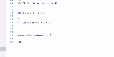
on 31 Aug 2017
Some quick changes showing how it would look and feel
jrieken
on 31 Aug 2017
Will tackle the lightbulb early September, work happens here #33682
jrieken
on 1 Sep 2017
This is a BAD design choice. The lightbulb more often than not shows up OVER the code text, making it hard to see. See my issue for screenshots - https://github.com/Microsoft/vscode/issues/33895
(and I'm not sure that IntelliJ is the model that should be followed - maybe take a look at Visual Studio?)
As @jtlowe showed, put the lightbulb BETWEEN the line numbers and the code. There's plenty of space there.
Having the bulb not on the line that has a problem is very confusing.
 jtsom
on 7 Sep 2017
jtsom
on 7 Sep 2017
Case in point...
I clicked on the red underlined code, and not only is the lightbulb slammed right up against the code - which is indented, it is not on the line that has the problem it is trying to indicate. If a user is distracted, or moves away and back, it's disconcerting looking at the bulb and wondering why there's a problem on a line that doesn't indicate an issue.
As was mentioned above - I'd rather sacrifice a little space to fit the icon between the line number and the code, than try to figure out where the bulb is trying to indicate the problem is.
jtsom
on 7 Sep 2017
lightbulb slammed right up against the code - which is indented, it is not on the line that has the problem it is trying to indicate. I
The lightbulb compares the indent with its own width and if it fits in will show inline, otherwise above, on the first line, below. Leaves the question what your indent settings and indentation is? Do you use tabs, what is the tab width configured to be? How are bodies of your functions/methods indented?
jrieken
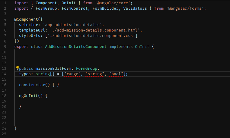
on 7 Sep 2017
The .editorconfig for this project (a standard Angular CLI project) has:
indent_style = space
indent_size = 2
The whole file is shown below.
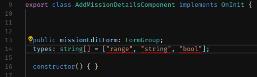
Why would the bulb show above the line that has a problem, in this case? Both the problem line (line 14) and the one above are at the same indent level (2 spaces in from the margin).
jtsom
on 7 Sep 2017
Why would the bulb show above the line that has a problem, in this case?
The lightbulb doesn't fit (on both lines with 2 spaces margin) but the reasoning goes that information on the line of the error shouldn't be covered by the lightbulb. Would you prefer the lightbulb to overlay the types: string... line?
jrieken
on 7 Sep 2017
There is the same space between the line numbers and the text on both line 13 and 14 - how do you mean that it won't fit?
I don't want it to overlay ANY text, and ideally appear on the line in question. Again, sacrificing a little space between the line numbers and the text isn't the end of the world (in these days of wide, hi-res monitors)
jtsom
on 7 Sep 2017
how do you mean that it won't fit?
The space right of the line numbers and left of the text area is for the collpase/expand buttons. If we put the lightbulb over/below that we'll have the same conflict as with the breakpoint buttons today. Adding yet another column might make the lines look disconnected from the line numbers.

So, yes this is a compromise but I still believe that most code happens to be indented far enough because most code is in method/function bodies, not class/member declarations.
jrieken
on 7 Sep 2017
Sometimes the location is a bit unexpected:

 weinand
on 7 Sep 2017
weinand
on 7 Sep 2017
I don't think the solution is to have it be dependent on code indention, have it positioned above the line, or have it overlap code that isn't indented. The light bulb icon will need to be positioned thoughtfully to accommodate other file types with many non-indented lines (markdown linter for example).
@stevencl I understand experimenting to look for a solution other than reducing editor space. The proposals so far don't feel like they're there yet. Can we just put the bulb between the line numbers and folding icon for now? If you're willing to give up 14px from the editor, maybe this would work:
- Add an extra 10px to the .scrollable-editor left property
- Then tighten code folding icon up closer to code, maybe by adding an extra 14px to the .folding left property. The icon can sit two pixels left of the editor's code line.
jtlowe
on 8 Sep 2017
The new lightbulb UI confused me when I saw it in the Insiders build. Our C++ extension frequently will have a code action on 2 consecutive lines and the lightbulb appearing on a different line is confusing as to which line the code action is being run for. I also sometimes/randomly am unable to click the lightbulb on the different line because a hover tooltip covers up the lightbulb. I would prefer doing what Visual Studio does -- putting the lightbulb to the right of the line number (left of the outline expander).
 sean-mcmanus
on 8 Sep 2017
sean-mcmanus
on 8 Sep 2017
It feels a bit strange to me too

 Tyriar
on 8 Sep 2017
Tyriar
on 8 Sep 2017
I have to agree. The IntelliJ method just seems too clunky and it doesn't solve the issue of custom decorators.
Personally I think the safest bet is probably something like stevencl's gif above. Alternatively, biting the bullet and sacrificing some space for the Visual Studio method still seems like a relatively safe option to me too.
Just to spitball other random ideas:
- What about using the space allocated for the line numbers somehow? Maybe the number of the line that the cursor is on could become a button, menu, or list of icons?
- Would one of those VS-style hover buttons solve anything here?
 mattacosta
on 12 Sep 2017
mattacosta
on 12 Sep 2017
One idea is that when the user hovers over a region of text containing a suggestion, to show the lightbulb to the left or right of that region (depending on space available) inside the editor, pretty much like VS does.
stevencl
on 22 Sep 2017
Just a point of info.. with the way it is now, with the lightbulb showing up almost anywhere - in front of the line with the issue, above the line, below the line, I keep thinking the issue is where the lightbulb is - more often than not above the actual line with the problem... and I more often than not see the bulb over/obscuring text.
The screenshot that @Tyriar posted is a great example - it's hard to know where the issue is, not to mention with the lightbulb plopped on top of the text, it is very confusing and almost gets lost.
jtsom
on 22 Sep 2017
Update: With the Insiders build and our pending 0.13.0 C++ extension update, I frequently get the tooltip for the current line covering up the code action for the current line.
 . The tooltip error can be fixed via the code action, but the tooltip makes the code action hidden/unclickable. Please fix this scenario ASAP. If anything, force the code action (light bulb) and tooltip to not overlap.
sean-mcmanus
on 22 Sep 2017

This is a rough sketch of how it would look and feel when showing the lightbulb in the hover. I believe it has potential tho needs to much polish for a quick change (in September). Things that should be improved with
- only show on errors/warnings
- don't show two light bulbs
- show the light bulb message next to the error message
jrieken
on 25 Sep 2017
That's not bad, but I think the position of the lightbulb itself is the issue. In your picture, if there was any code on line 58, the lightbulb would be drawn over that code, potentially causing confusion as to where the problem is, or even lose the bulb in a mass of text (see @Tyriar 's graphic above)
jtsom
on 25 Sep 2017
if there was any code on line 58, the lightbulb would be drawn over that code,
Yes, I already understood that the first time you mentioned it. Note that I wrote: "Things that should be improved...don't show two light bulbs"
jrieken
on 25 Sep 2017
The light bulb isn't in the gutter anymore but inside the text. That's the new design which as proven to be working best, albeit some issues.
jrieken
on 12 Sep 2018
Related issues
 v-pavanp
·
3Comments
v-pavanp
·
3Comments
 vsccarl
·
3Comments
vsccarl
·
3Comments
 villiv
·
3Comments
villiv
·
3Comments
 trstringer
·
3Comments
trstringer
·
3Comments
 ryan-wong
·
3Comments
ryan-wong
·
3Comments
Most helpful comment
Some quick changes showing how it would look and feel