Vscode: Outline matching selections instead of highlight
- VSCode Version: 1.10.1
- OS Version: macOS 10.12.2
Steps to Reproduce:
- Highlight a selection with multiple instances.
- Look how hard it is to distinguish which instance is selected.


There are three fundamental issues that this request entails:
When you make a selection and there are multiple instances, it's extremely hard to distinguish which one is actually selected. This image shows VSCode's standard Monokai theme. This is not a "theme" issue, users should be able to use any theme that is available in the marketplace.
When you make a selection, matching instances shouldn't be highlighted at all. Being highlighted indicates that they are also selected, which is not the case. So when I double click on a single word to select it, all the matching instances get highlighted too, creating the appearance that they are all selected.
The check that looks for matching instances should be _case sensitive_, so that when I select
contract, a camel-case instance ofnewContractshould not have that instance of contract highlighted.
 bkentdev
All 10 comments
+1 for the change
 Schw2iizer
on 3 Mar 2017
Schw2iizer
on 3 Mar 2017
+1
 kenhoward
on 3 Mar 2017
kenhoward
on 3 Mar 2017
Agree, It would be nice to let us choose the right setting (outline or selection).
 csalv5
on 8 Mar 2017
csalv5
on 8 Mar 2017
+1
 dpitsko
on 20 Mar 2017
dpitsko
on 20 Mar 2017
There are three fundamental issues that this request entails:
When you make a selection and there are multiple instances, it's extremely hard to distinguish which one is actually selected. The theme in the attached image above is a VSCode's standard Monokai theme. This is not a "theme" issue, users should be able to use any theme that is available in the marketplace.
When you make a selection, matching instances shouldn't be highlighted at all. Being highlighted indicates that they are also selected, which is not the case. So when I double click on a single word to select it, all the matching instances get highlighted too, creating the appearance that they are all selected.
The check that looks for matching instances should be _case sensitive_, so that when I select
contract, a camel-case instance ofnewContractshould not have that instance of contract highlighted.
(Just providing a little more clarity on this issue)
bkentdev
on 3 Apr 2017
Is there currently a way to deal with this now, because I can't seem to disable the highlighting matches in settings...?
 JacobMGEvans
on 7 Dec 2017
JacobMGEvans
on 7 Dec 2017
+1 for just outlines like in original post
 brunobely
on 9 Feb 2018
brunobely
on 9 Feb 2018
Isn't this already achievable?
"workbench.colorCustomizations": {
    "editor.selectionHighlightBorder": "#61AFEF",
    "editor.selectionHighlightBackground": "#fff0",
}
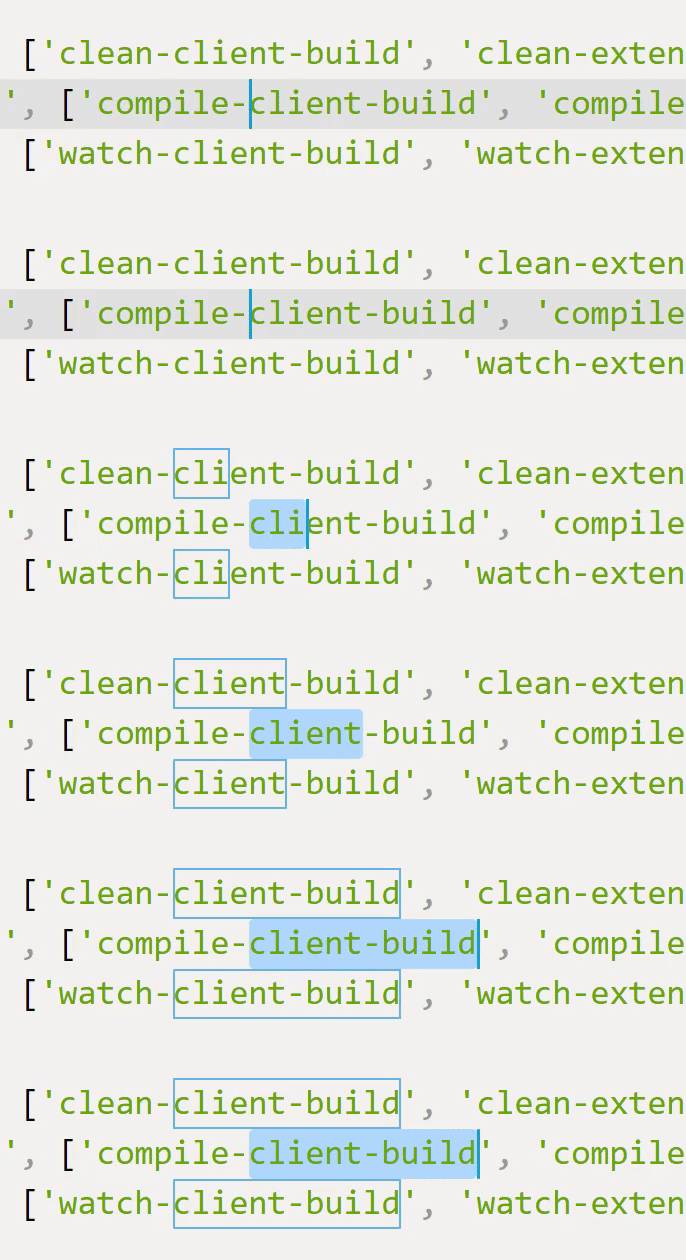
A bunch of other borders can be configured too:
https://code.visualstudio.com/docs/getstarted/theme-color-reference#_editor-colors
 usernamehw
on 8 Dec 2018
usernamehw
on 8 Dec 2018
Copying this here from #30793 (closed/duplicate) to provide additional context.
+1
This would make it much easier to create a high-visibility style for the active selection.
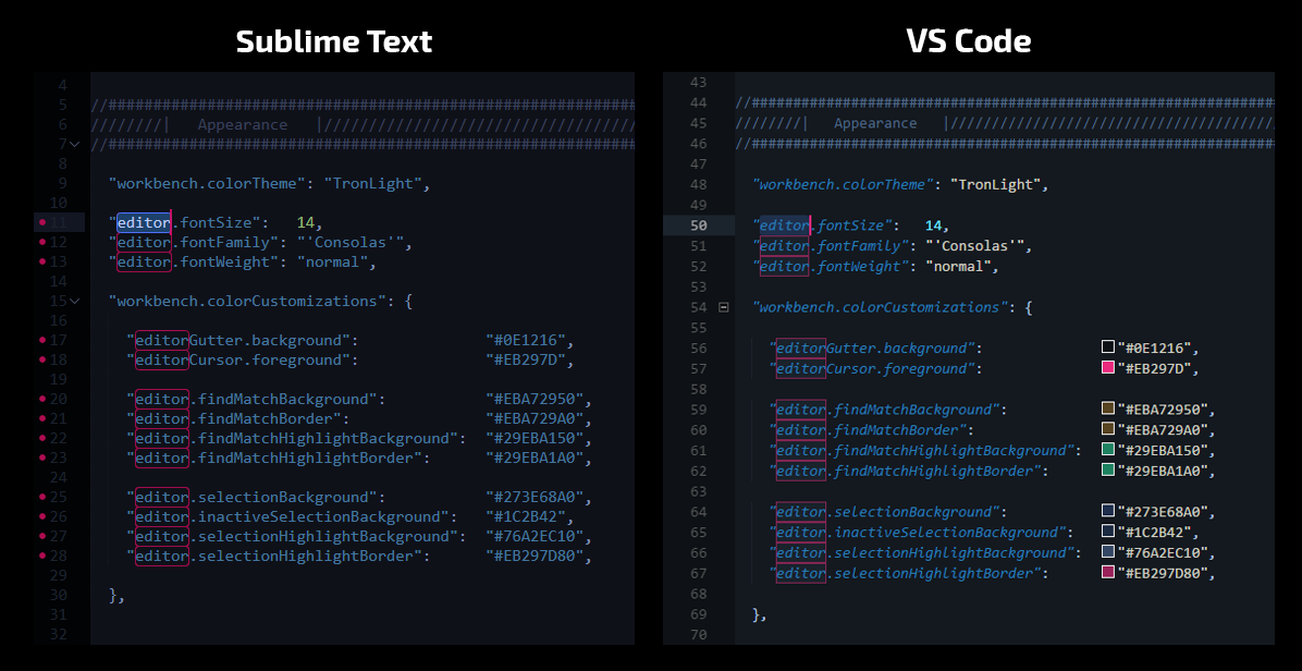
On a related note, the lack of selectionForeground for non-high-contrast themes is definitely a detriment to achieving the same effect.
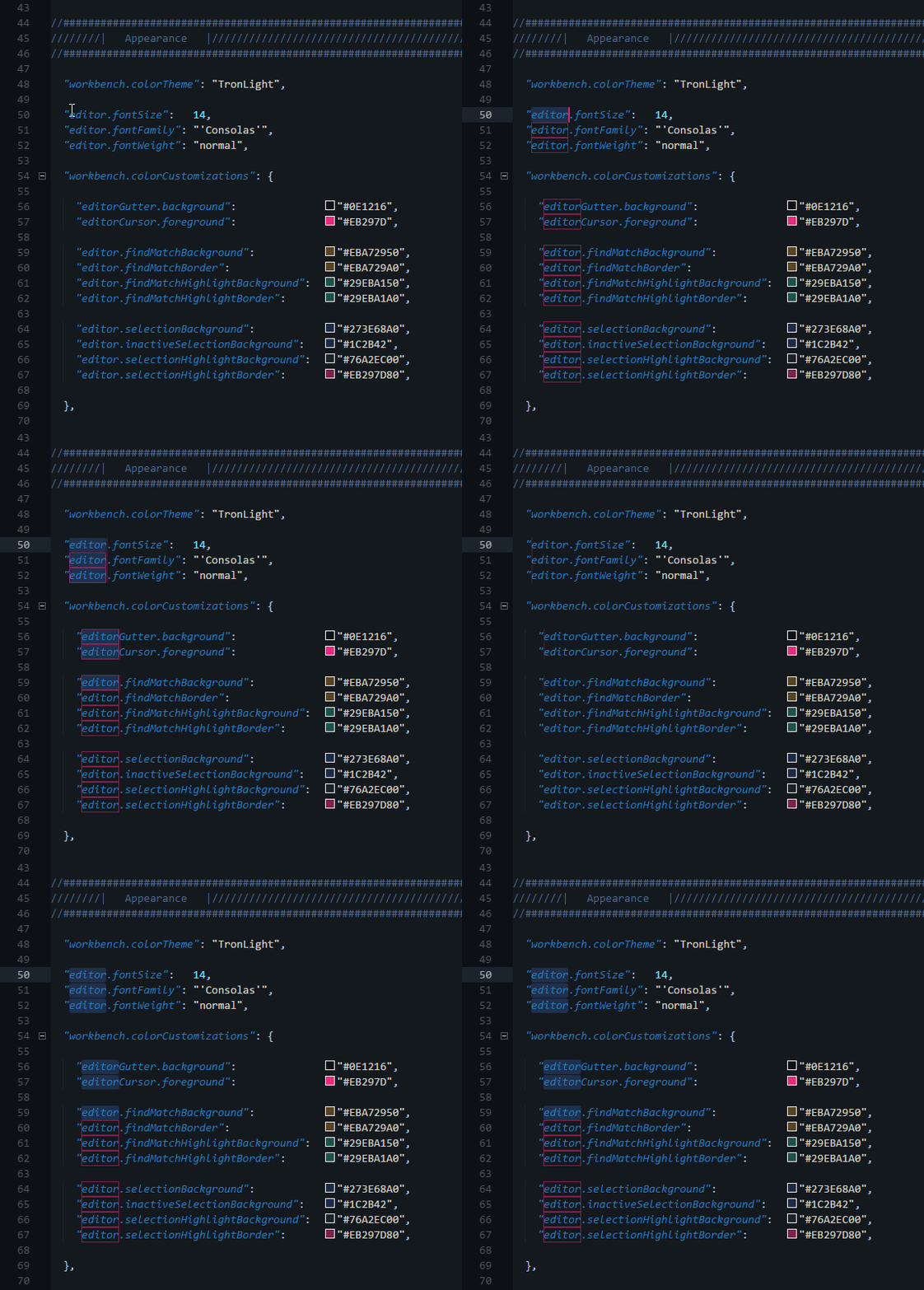
Also, I just noticed that the selection & selectionHighlight properties have kind of an odd behavior in relation to addSelectionToNextFindMatch.
When using addSelectionToNextFindMatch, the selection & selectionHighlight properties are both applied to each additionally selected match. I would expect selection properties to activate and selectionHighlight properties to deactivate in this case. The expected behavior is exhibited in the second half of the GIF, when multiple selections are made simultaneously.
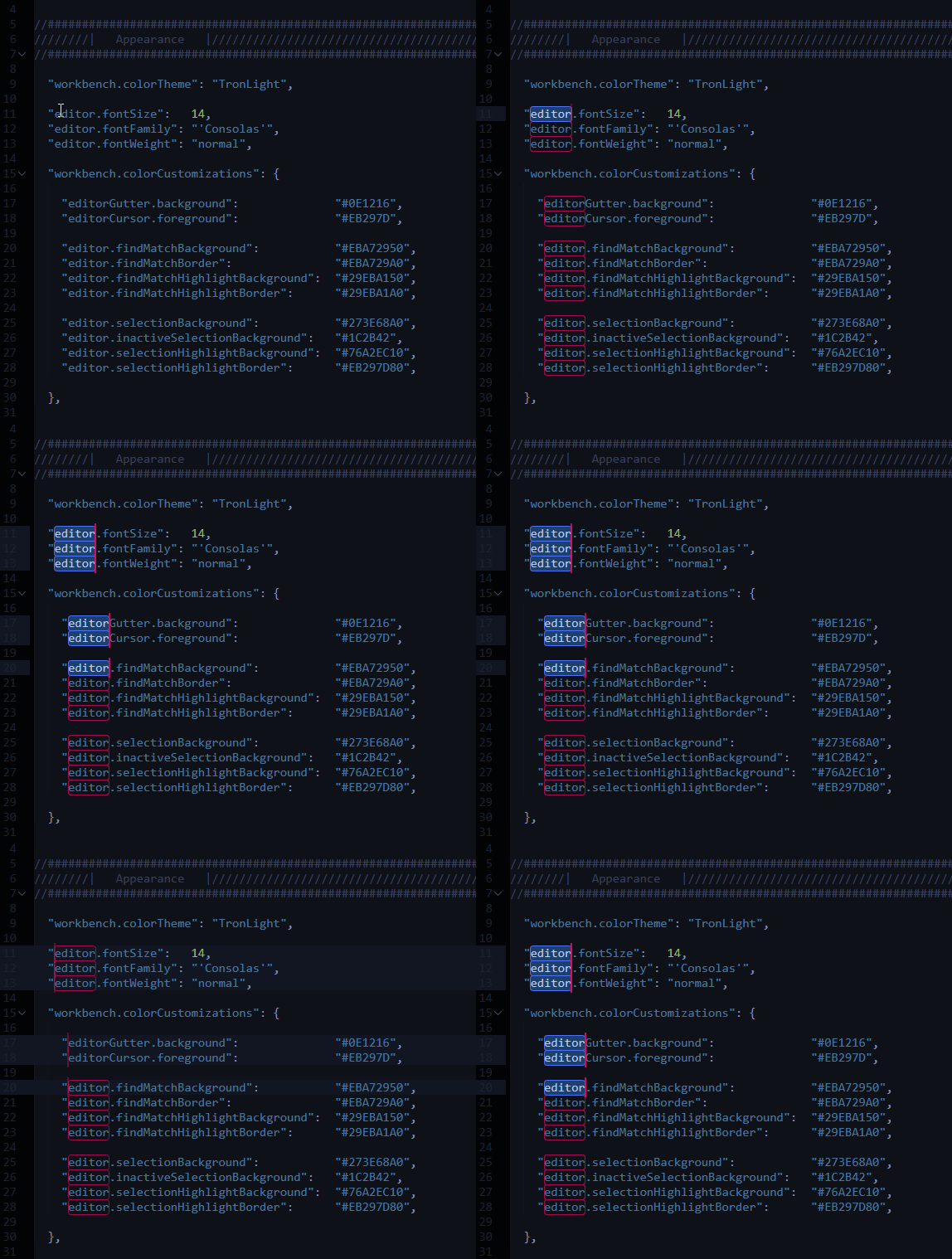
Here is the same sequence of actions in SublimeText:
 Enteleform
on 5 Nov 2020
Enteleform
on 5 Nov 2020
On a related note, border width & radius options would be super nice to have.
Enteleform
on 5 Nov 2020
Related issues
 mrkiley
·
3Comments
mrkiley
·
3Comments
 sijad
·
3Comments
sijad
·
3Comments
 sirius1024
·
3Comments
sirius1024
·
3Comments
 trstringer
·
3Comments
trstringer
·
3Comments
 lukehoban
·
3Comments
lukehoban
·
3Comments
Most helpful comment
On a related note, border
width&radiusoptions would be super nice to have.