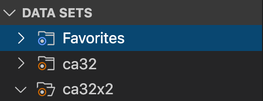
Vscode-extension-for-zowe: Favorites icon: Change the icon for Favorites to show a star icon.
It is common to use a star icon for favorites. This would be more immediately recognizable.
 jelaplan
All 17 comments
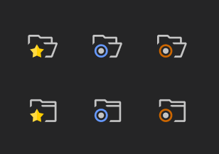
Do we have access to someone with UX skills who can create svg icons please (16x16) I have tried but not my forte.
 Colin-Stone
on 20 Nov 2019
Colin-Stone
on 20 Nov 2019
Do we have access to someone with UX skills who can create svg icons please (16x16) I have tried but not my forte.
I will ask Patrik Bubak who is a UX designer to create a SVG star icon.
jelaplan
on 21 Nov 2019
That's great thanks John and maybe we would want to develop our own family of icons in the future
Colin-Stone
on 21 Nov 2019
That's great thanks John and maybe we would want to develop our own family of icons in the future
That would be possible. If you need icons created then me and Patrik can most likely create them.
jelaplan
on 21 Nov 2019
Is it possible to acquire the original SVG for the icon that I could change?
 bubpa01
on 22 Nov 2019
bubpa01
on 22 Nov 2019
Hi Patrik. If you look in resources/dark and resources/light there are all of the icons. I originally took these from VSCode minimal set which seemed to work well and then tweaked them.
Colin-Stone
on 22 Nov 2019
bubpa01
on 22 Nov 2019
Thanks for the responses guys.
I'm hosting the icons in Figma - our official web-based collaborative design tool. You should be able to see them via this link.
bubpa01
on 22 Nov 2019
Thanks Patrik
jelaplan
on 25 Nov 2019
@Colin-Stone are there other icons that you are concerned about?
jelaplan
on 25 Nov 2019
Thaks for the offer. This will be ongoing work so no rush but I would like to have some more document icons at some stage that possibly using decorators subtley represent some z/OS specific concepts.
- Binary file
- Archived or Migrated dataset file or folder
- A dataset alias
- A job
- A job spool
- Possibly Type specific ? asm, cbl, pli, copybook etc
And at the risk of sounding ungrateful/ungracious can I have both light and dark versions please ;-)
Colin-Stone
on 25 Nov 2019
@Colin-Stone
I've been talking with @bubpa01 about the icons. What do you think of the idea of putting a label in the header right aligned to indicate the file type? This contrasts with showing a file extension like see in the USS panel for files types, such as file.txt or file.jpg. An upside is that it looks tidy and we can show three characters. A downside is that that space is usually reserved for action icons.
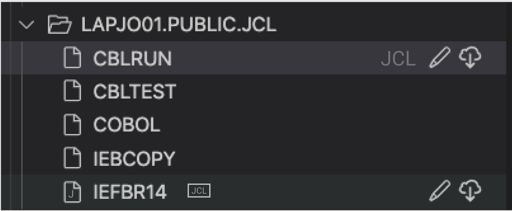
For file icons, we might standardize on icons that add markers to to a base icon. Trying to put text into a 16x16 icon or in the case of the doc icon, more like 12x16 does not offer much flexibility. I show a sketch here with a J in the file ad as a marker. Note that Patrik did some of this work - not to steal his thunder.

jelaplan
on 21 Jan 2020
Wow there are several concepts on show here. Thanks guys for looking at this and proposing some great ideas.
My favorite so far is this but I notice you don't really talk about it so am I right that we can't do it?.

Indeed one of my frustrations has been that I want to be able to create a VSCode TreeItem label that combines different elements for example, here I want to combine details of the root location with a profile identifier. Ideally these would be two distinct elements, preferably different color and/or font. Hence why your image above struck a chord with me. However I cannot see how it could be achieved in VSCode.

It sounds however that we could have an indicator over on the right and this is a definite step forward albeit with the caveat that we may be encroaching into an area reserved for action items. Does this mean at the expense of being able to add Action items as I don't think that ideal particularly with options for the Zowe Explorer to be extended or are we just saying a bit cluttered?.
Letters in the icon is still a possibility.
I agree a 16x16 icon does not lend itself to adding characters however I have seen several VSCode themes that simply use the suffix or a specific visualisation of that. For example

..which is why I like the top one for JCL in a box (albeit not 16x16 of course)
The wider effect (dilema)
Some of the examples for VSCode icons generally available have reasonable graphical metaphors for the types of files they represent but maybe too much for what we need and potentially make things look untidy. Up to now I have generally been thinking of Datasets with JCL, Cobol or Assembler but should we be considering the Zowe Explorer USS and Jobs sections too?. The USS section could use some of the VSCode specific icons for C, Java etc but should we go that route or try and keep all three sections with the same look and feel?.
- Jobs as covered earlier is simpler and would have just two graphics. The ubiquitous cog to represent a process/job and log graphic for the spool files maybe?.
- USS is maybe not such a big issue since the suffix is included in the filename anyway.
So how about...?
- If it is possible could we go with the label enhancement or additional label on the right hand side. Generally this would only apply to a PDS (or folder). There isn't any additional value of indicating every member as being JCL if the folder already highlights this. Yes there may be individual PS files which we may want to highlight too but by mainly adapting the folder tree elements we don't usually have action items associated. Thinking futures... What if the label is the action item which would allow a user to specify the association from a preselectable list of icons?.
Colin-Stone
on 22 Jan 2020
Allow me to post some examples here and explain why what could work and why not,
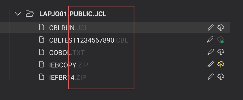
The above image isn't ideal for a number of reasons, mainly:
- information fluidity with items that are not organised is disrupted
- hinders the possibility to sort items based on their suffix (if such a feature would be desired in the future)
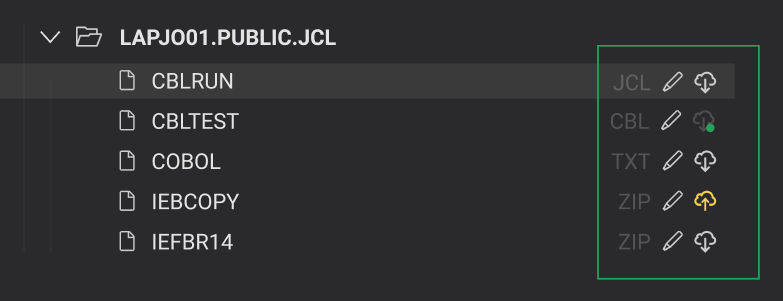
The example above demonstrates consistency through a clearer structure and allows the user to find all pieces of information in one place, respectively.
This should eliminate concerns in the future about character limit in filenames. All actionable items along with the file type are easy to access to the right.
bubpa01
on 22 Jan 2020
About the icons
I would strongly advise against complexity, especially in the case of our icons that are very small (averaging on 16 pixels). The above works well on 100%, but with some compromises:
- had to refrain from adding additional icons into the green dot. The icon now (hopefully) conveys an item has been pulled. Instead, I went with lowering opacity and include only a small green dot to say: 1) item has been pulled, 2) operation was successful
- choosing to place the filename text into an icon or making it smaller or both would render it illegible
Off-topic: don't mind the suffixes, they are just examples.
bubpa01
on 22 Jan 2020
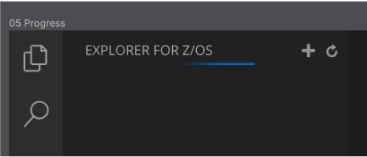
Here is how VS Code handles status bar. It is an animated line that moves back and forth across the header. That is a possible way to show the file is downloading from the MF. That is instead of a file icon that blinks or something like that. I'm concerned with trying to do too much with an file icon by showing it both pulled, unpulled, and animated while downloading. If VS Code already has a standard way to show status or background activity is happening, then I'm inclined to go with that.
jelaplan
on 24 Jan 2020
If VS Code already has a standard way to show status or background activity is happening, then I'm inclined to go with that.
I've just implemented https://github.com/zowe/vscode-extension-for-zowe/pull/465 which wraps the call in a progress status in the bottom right
Colin-Stone
on 24 Jan 2020
Related issues
Colin-Stone
·
4Comments
 travatine
·
4Comments
travatine
·
4Comments
 phaumer
·
5Comments
phaumer
·
5Comments
 jellypuno
·
5Comments
jellypuno
·
5Comments
 AHumanFromCA
·
3Comments
AHumanFromCA
·
3Comments
Most helpful comment