Vocabulary: The hover state of button component is not correct
Describe the bug
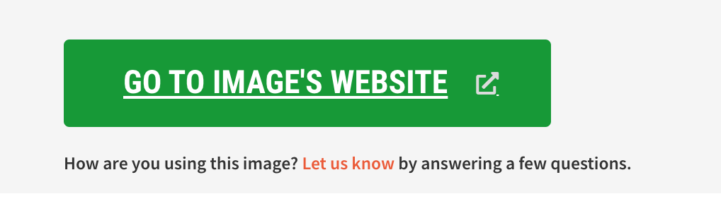
The button has a different background color and it has an underline style during the hover state. In the default state, the icon has an incorrect color.
Expected behavior
- It should not have an underline style
- The background color should be the interaction color defined in the Design Library.
- The icon should be white with 50% opacity in default and hover state.
Screenshots
 panchovm
All 17 comments
@brenoferreira I see you are transferring the issue but I'm curious as to know why . Although I just started contributing yesterday so I have a little understanding .
 LarrySul
on 15 May 2020
LarrySul
on 15 May 2020
@panchovm has the issue been assigned yet ? Would like to work on it 😊
LarrySul
on 15 May 2020
@LarrySul you can work on it but only after you've resolved the other issues assigned to you.
 dhruvkb
on 15 May 2020
dhruvkb
on 15 May 2020
@panchovm could you help with the value of the defined background color ? @dhruvkb noted !
LarrySul
on 15 May 2020
Here is the Design Library. Page Color.
- Background color, default state:
ForestGreen - Background color, hover state:
BrighterForestGreen
panchovm
on 18 May 2020
@panchovm alright ...
LarrySul
on 18 May 2020
@dhruvkb @LarrySul I would like to work on the issue.
 Dishebh
on 26 May 2020
Dishebh
on 26 May 2020
@Dishebh please go ahead with it ...
LarrySul
on 26 May 2020
@panchovm @LarrySul can you please tell how do I replicate the issue? All the buttons I see in the repo do not have any style underline on hover. I also don't see the button (given in PR description) in the project website.
Dishebh
on 27 May 2020
@Dishebh that's more reason I wasn't able to make a PR to close the issue so I thought I probably wasn't doing something right, so I wanted to let someone else try it out ... Everything seems okay to me tho . I guess someone else already fixed this from another PR that was merged
LarrySul
on 27 May 2020
@panchovm I guess the issue has been resolved.
Dishebh
on 28 May 2020
Let me tag @dhruvkb since he is more aware of all ticket's progress.
panchovm
on 28 May 2020
@Dishebh this issue arises because of a feature that allows anchor links to be styled as buttons. None of the Button stories on Vocabulary demonstrate this feature (which is a shortcoming of the docs that you should ideally address when solving this issue).
To see the issue, you can see the underline by hovering on the "Go to image's website" button on CC Search.
To reproduce this issue, style an anchor tag like so:
<a class="button is-success" href="#">
  I'm pretending to be a button
</a>
@dhruvkb so should I make a separate section under buttons that have both buttons as buttons and anchor tags styled as buttons, and then correct the styling of the anchor buttons (as per this issue description)? Because, as you mentioned, there are no anchor tags (currently in the storybook) styled as buttons having class .is-success. Please let me know if we are on the same page here. Thanks!
Dishebh
on 28 May 2020
@Dishebh you can just add the corresponding anchor-tag buttons in all the stories of the button-tag buttons but fix their styling so that they work exactly the same?
dhruvkb
on 28 May 2020
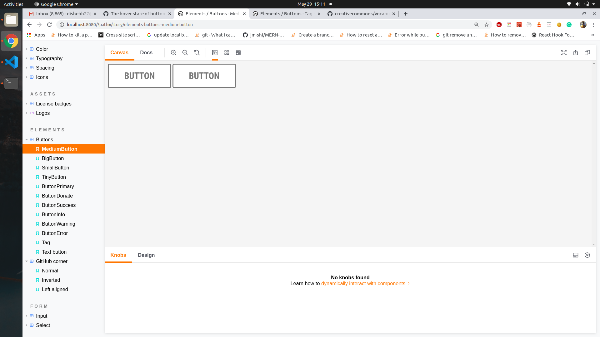
@dhruvkb something like this? (Both having the same styling)
Dishebh
on 29 May 2020
I guess these issues are fixed.
 Dhruvi16
on 13 Aug 2020
Dhruvi16
on 13 Aug 2020
Related issues
panchovm
·
3Comments
 obulat
·
5Comments
panchovm
·
5Comments
obulat
·
5Comments
panchovm
·
5Comments
 zackkrida
·
3Comments
Dhruvi16
·
4Comments
zackkrida
·
3Comments
Dhruvi16
·
4Comments