Virtualc64: Add the Dark Mode support for macOS 10.14 [Mojave]
Good morning
Could you add the Dark Mode support for macOS 10.14 [Mojave] ?
 dada08ms
All 39 comments
It's on my list, but as I don't participate in the beta program, I can only look into it when 10.14 has been released.
 dirkwhoffmann
on 9 Jul 2018
dirkwhoffmann
on 9 Jul 2018
I like this new Apple OS dark mode !
Thank you for this emulator, now AppleOs users can have a great and fine C64 emulator.
I have seen the add on and the bugs to remove, I hope tha VirtualC64 2.4 came out very soon, this 2.4 version with more cartridge support, the really needed second 1541 drive and a VICII selectable (6569/8565 -6566/6567/8562) will be the best ever seen on a Mac...!
 puleyo
on 20 Jul 2018
puleyo
on 20 Jul 2018
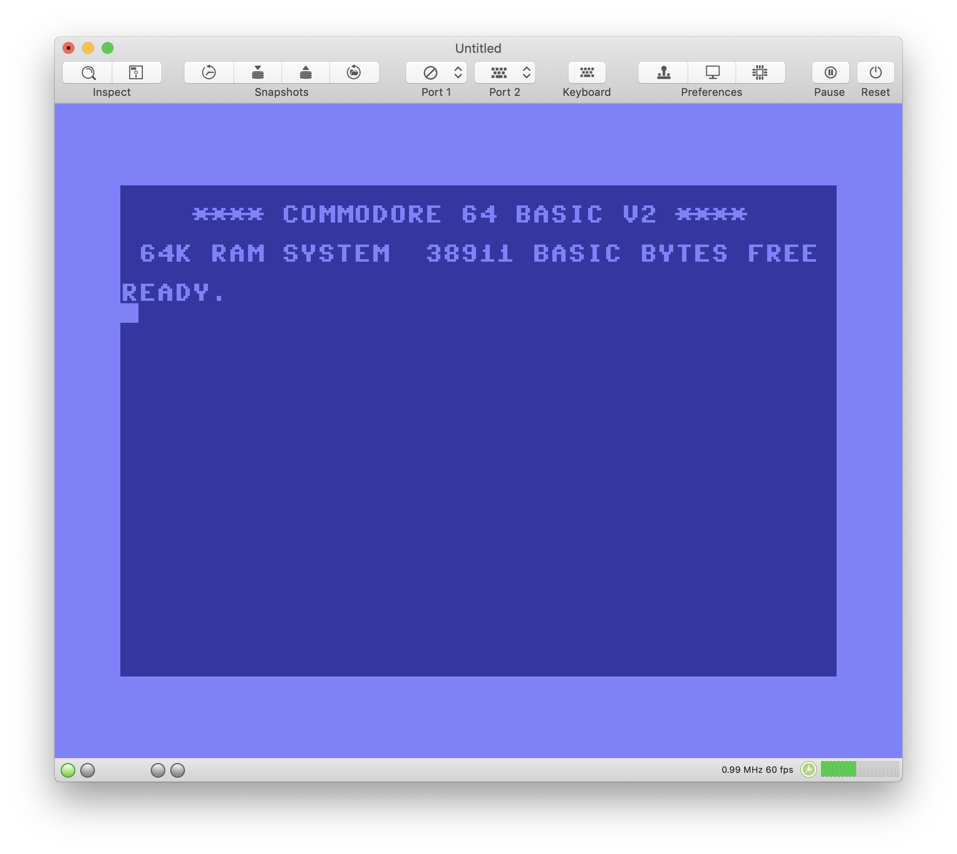
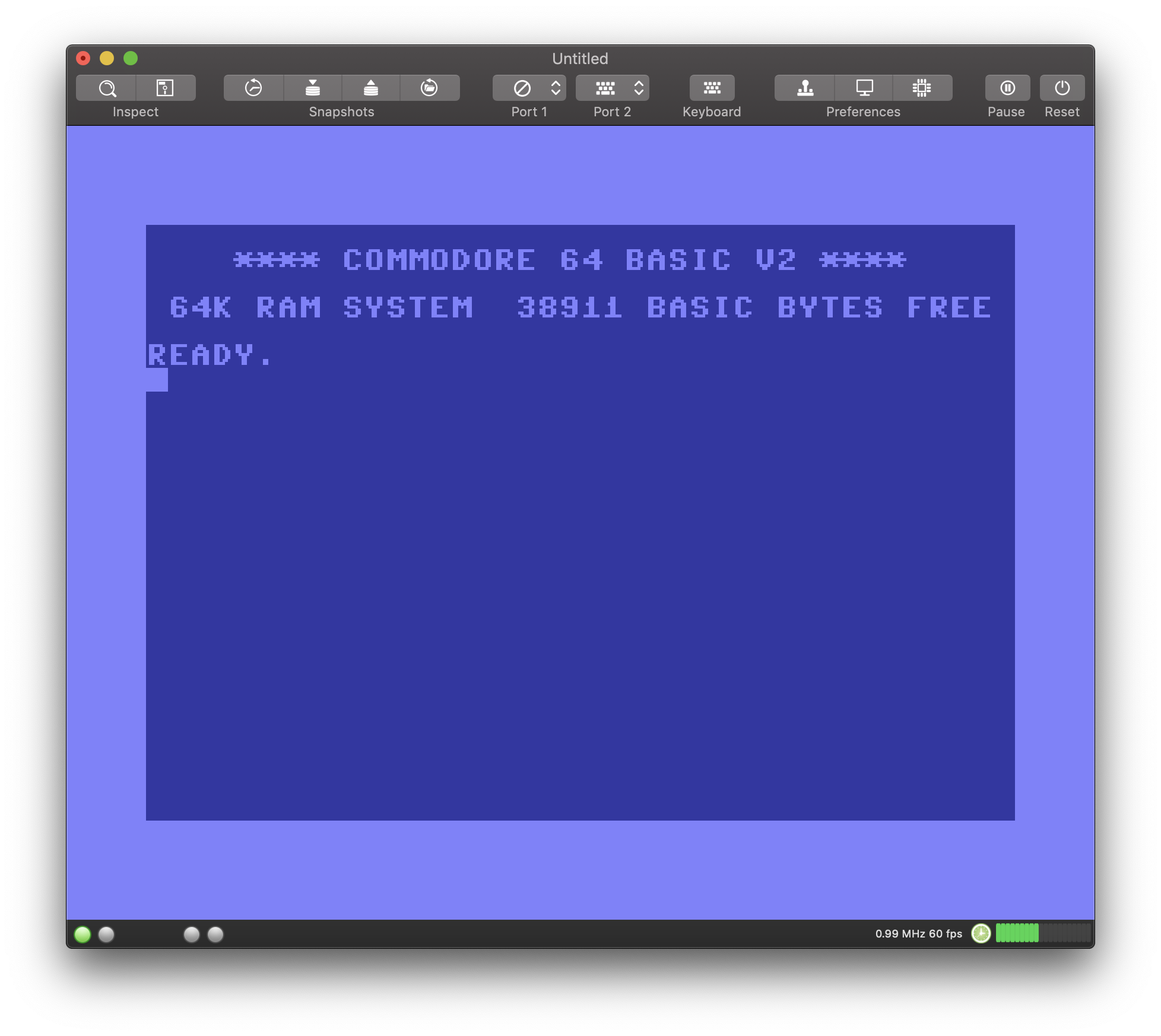
Compiling VirtualC64 with XCode 10.0, dark mode works out of the box:
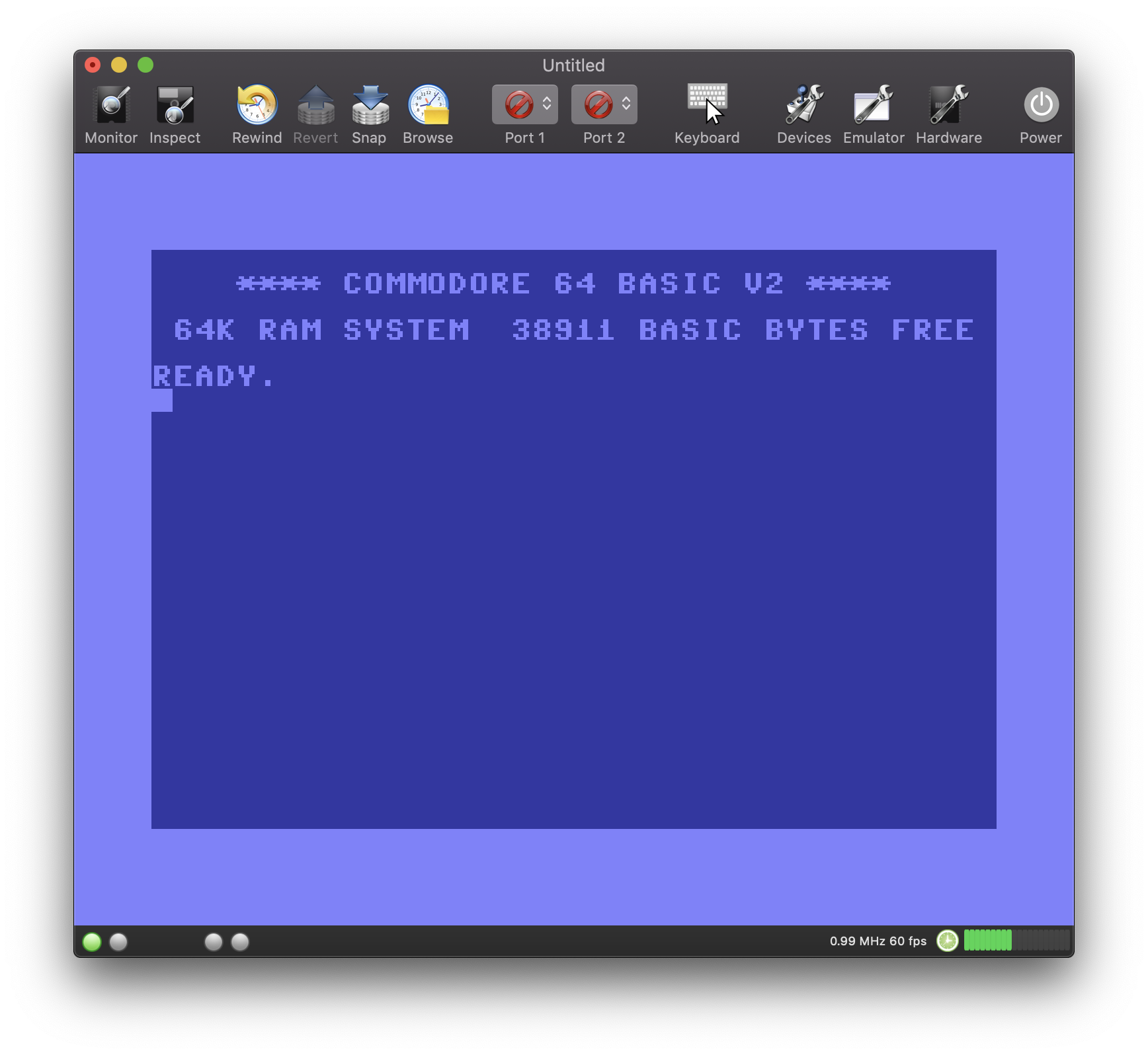
There are some minor text coloring issues though:
I don't know what you think, but I'm personally pretty disappointed with the new dark mode up to know (just another marketing hype?). Since I installed the latest OS release a couple of hours ago, I tried several of Apple's native apps and for nearly all apps, standard mode appeared much clearer to me and most UI elements were easier to find. I think I'll switch back to standard mode.
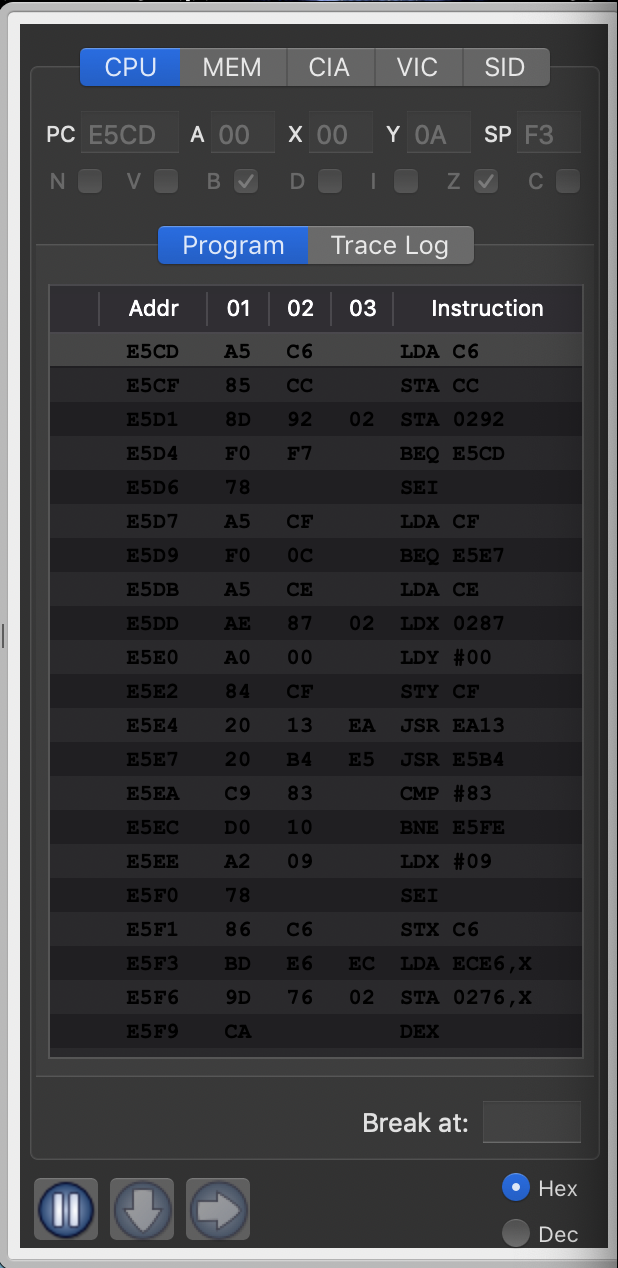
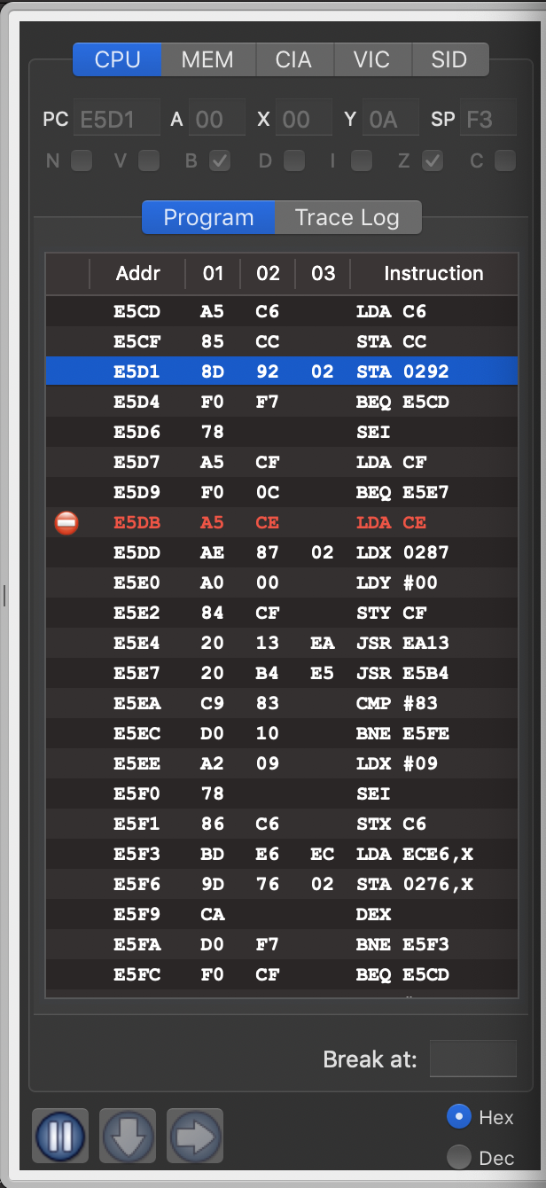
Another problem with dark mode is it's incompatibility with windows drawers (which are used by the debugger). The drawer surrounding remains gray and is not darkened. Drawers have been deprecated by Apple a long time ago, so this won't be fixed by Apple. Eventually, I will have to replace the drawer by something else which is sad, because I think that this (deprecated) UI element perfectly fits the needs for the debugger.
dirkwhoffmann
on 25 Sep 2018
Personally I did not appreciate this dark mode and not all applications make it good in this version. I will keep the normal normal mode on my MBP.
On the VirtualC64 I think the debugger problem is soluble changing the font color (try them with a light gray or green tone).
... I like VirtualC64 in the standard mode and I do not think many users will keep this dark mode ...
 Alessandro1970
on 25 Sep 2018
Alessandro1970
on 25 Sep 2018
The text color issue is a no brainer. It only looks wrong if the color is hard-coded (which I did several times 🙄). When complying to coding standards (i.e., NSColor.textColor is used instead of NSColor.black) it looks correct both in dark mode and standard mode:
Code fix for the color issue is already checked in on the master branch.
dirkwhoffmann
on 25 Sep 2018
I like the dark mode and I also like the VirtualC64! In dark mode, the only thing I do not like the icon of the joystick in the toolbar (the square with a light black background). The background of the joystick square icon would have made it light gray in contrast with the black of the toolbar.
 mortinus
on 25 Sep 2018
mortinus
on 25 Sep 2018
The white and red debugger's fonts are fine. I have no problem in reading them.
Alessandro1970
on 25 Sep 2018
In fact, the icons in the black toolbar are lost a little
Alessandro1970
on 25 Sep 2018
"the square with a light black background". I'm not 100% sure, but I think the light gray background cannot be influenced by the programmer. It seems to be the default background for combo boxes in the toolbar. The icons itself, e.g. the red round icons, are all transparent.
dirkwhoffmann
on 25 Sep 2018
I now understand why it took Apple so long to offer a second UI theme. It causes a lot of trouble for programmers (second image sets, etc.), but it doesn't seem to pay off for the user that much. Mathematicians may call the benefit an "Epsilon".
dirkwhoffmann
on 25 Sep 2018
... we should get used to maybe ... to keep the beautiful normal mode ...
But I think that all in all the VirtualC64 goes well even in dark mode: the debugger is readable and black lovers will appreciate it.
Alessandro1970
on 25 Sep 2018
Black lovers ...
the reality is that there is a need for a second set of icons based on lighter colors
mortinus
on 25 Sep 2018
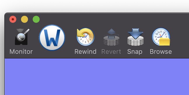
You could normalize the icons in a circular Yosemite style (even for the size so as to have an ordered arrangement), so that the outer circular crown color will contrast with the dark tool bar while the icon will make it good in its original background color.
I like the icons arranged with the same centering and the same size and this system seems more ordered (if all the icons were inserted in circles like the Word one), but it's just my idea.
Alessandro1970
on 25 Sep 2018
Alessandro is right the circular icons REWIND and BROWSE are in fact well seen as that of WORD even if that of Word (a bit larger) would make better.
Circular icons are good in the normal mode too, just like the apple bottom bar...
mortinus
on 25 Sep 2018
For the circular border icons inside have their original background, if you put the Monitor icon in a circular icon with the gray background it will be seen well in the dark mode as in the normal one...
There in a program in the applestore that convert icon into circular.
mortinus
on 25 Sep 2018
I have one of them it is called Image2icon and the full version (I do not the free one) make also circular yosemite icon form a normal PNG or JPG.
I have bought it last year from the appstore.

If you want I can try to convert all the icons of the VirtualC64.
Alessandro1970
on 25 Sep 2018
...but I think that your combo boxes color problem will remain in the toolbar
Alessandro1970
on 25 Sep 2018
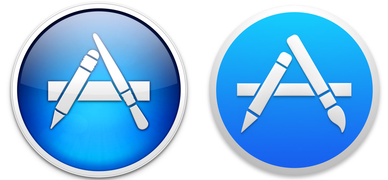
Round icons are mainly meant for application icons. In their own apps, Apple is using toolbar icons of the following style:

Maybe VirtualC64 should get similar looking icons.
dirkwhoffmann
on 25 Sep 2018
Maybe VirtualC64 should get similar looking icons.
Yes, that would be the solution !

Alessandro1970
on 25 Sep 2018
Ok, for me too !

mortinus
on 25 Sep 2018
This one is good

 rossimariolee
on 25 Sep 2018
rossimariolee
on 25 Sep 2018
Shrinking the icons and inserting them into small rectangles is the most pleasant solution for me too.

puleyo
on 25 Sep 2018
This is the Dark-Mode I like a lot !
For me ok this solution !
Thanks

 DaitarnIII
on 25 Sep 2018
DaitarnIII
on 25 Sep 2018
Shrinking the icons and inserting them into small rectangles
Ok!
Alessandro1970
on 25 Sep 2018
I like this kind of little rectangular icons for VirtualC64 for the Dark-Mode.
Thank you

dada08ms
on 25 Sep 2018
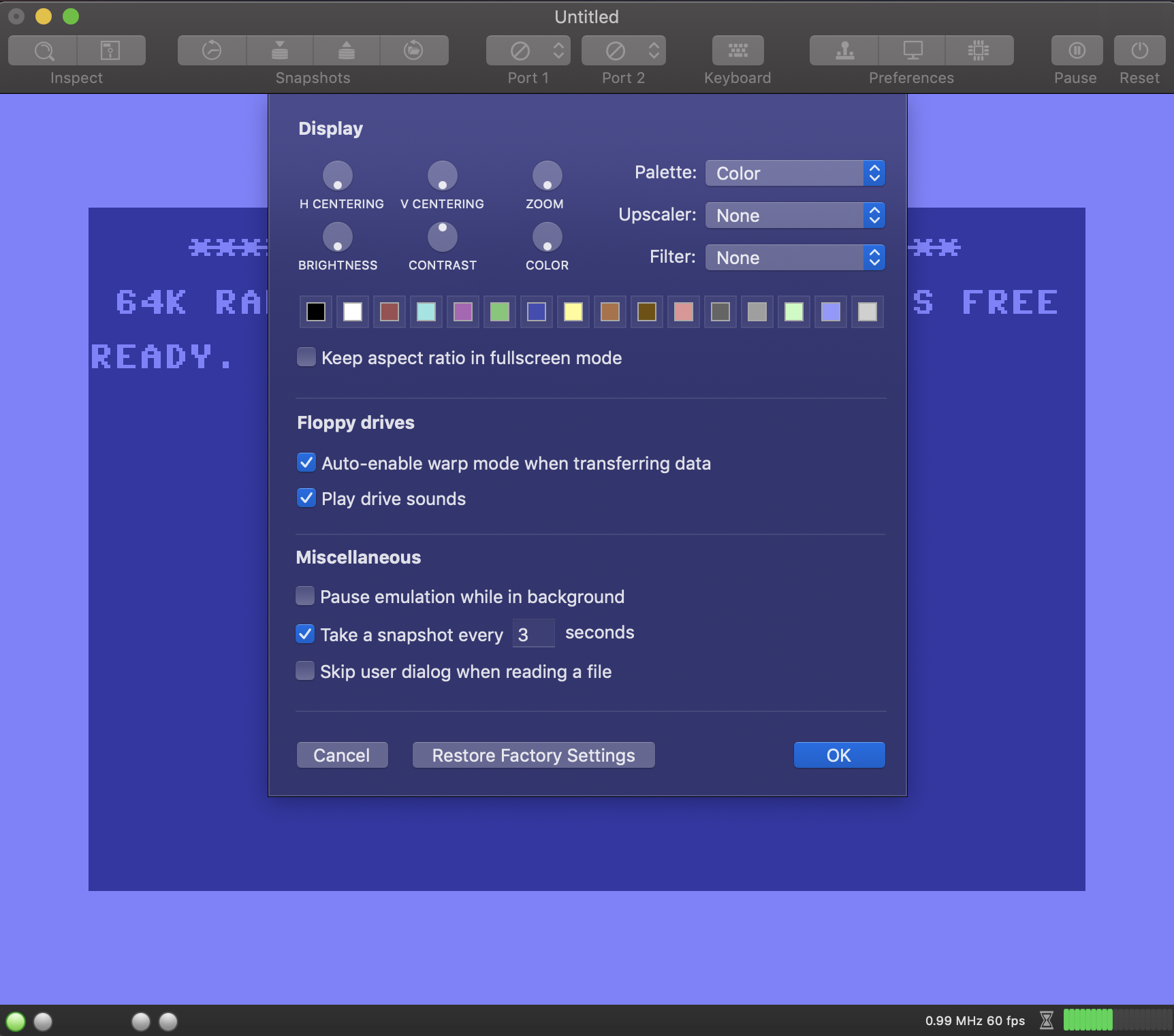
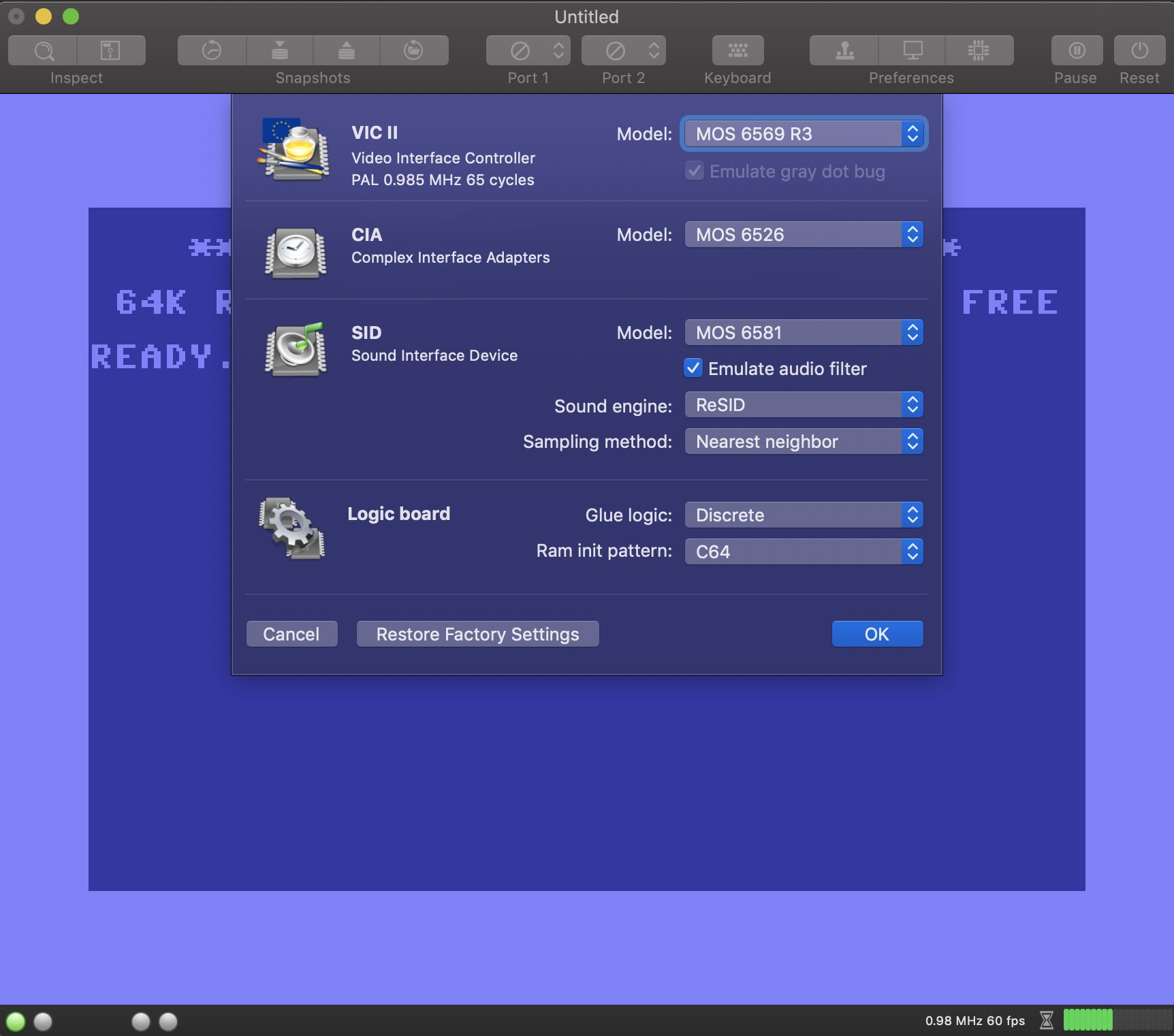
Here comes a visual prototype of V2.6:
Im summary, there will be so many changes in 2.6 that we'll need definitely need a beta phase. It would be a surprise if nothing has been broken.
dirkwhoffmann
on 26 Sep 2018
I've deleted the icons from the emulator preferences window, because they didn't look that nice in dark mode.
Shall I delete the icons in the hardware dialog as well? One the one hand, my hard would bleed, because it took me a long time to assemble them. On the other hand, it would be more consistent with Apple's new simplistic design philosophy.
Because of the large variety of visual changes, I think it might be best to call the new version 3.0. What do you think?
dirkwhoffmann
on 27 Sep 2018
I'm sorry for the time you've lost for the old icons, but I think removing thems would be the best choice with this new spartan look.
I think it's right to go to version 3.0 ... in fact the VirtualC64 is now another thing (for the better).
In 3.0 is it possible (please) to add the support of the cartridges that have been asked by others members ?
Alessandro1970
on 27 Sep 2018
All right, you could start with version 3.0 jumping the previous but adding the support of the new CIAs and new 2 cartridges.
The simplistic design is good and professional for me, great emulator!
Thanks
 Alvarez81
on 27 Sep 2018
Alvarez81
on 27 Sep 2018
With all these changes it is better to move to version 3.0.
I'm very much in touch with the stingy points:
1) yes to the simple look
2) the ver. 3.0 should have the support of the new CIA so there are no more hardware additions to do, so it makes more sense (for me) to "close a chapter"
3) even wait a few more days and go to 3.0 with all the required cartridges supported (Warpspeed/Stardos)
In doing so after 3.0, only bugs will be considered in the future ...I think (The VirtualC64 works well)
dada08ms
on 27 Sep 2018
Yes, close issues 2.6 and 2.7, add the new CIA support and upgrade to version 3.0 (all in one) with a simplistic look (which I like a lot).
 UgoCaneFifone
on 27 Sep 2018
UgoCaneFifone
on 27 Sep 2018
Hei !? Is not that with the NEW CIA support you are asking too much ? :laughing:
However, the part underneath in bold should be removed !!! :rofl: :rofl: :rofl:
TO BE REMOVED:
Although the emulator has not yet reached the impressive compatibility of VICE or Hoxs64, VirtualC64 has evolved into a full-blown C64 emulator over the years.
Alessandro1970
on 27 Sep 2018
Does this mean? :laughing:
DaitarnIII
on 27 Sep 2018
...Picasso ! :roll_eyes:
puleyo
on 27 Sep 2018
Shall I delete the icons in the hardware dialog as well?
for my taste you could leave them as they are. They are beautiful!!!
I try to be bold now ;-) Version 3.0 should have support for EZ-Flash Cartrigde (EasyFlash). Reason: almost all of the newer stuff (for example new enhanced speedball2 with icecream speach synthesis) from https://csdb.dk/ _(thec64 Scene Database)_ are made in that .crt format as it has a capacity of 1MB.
 mithrendal
on 27 Sep 2018
mithrendal
on 27 Sep 2018
Toooo bold :laughing:

Alessandro1970
on 27 Sep 2018
... too bold.! ..or maybe not ?
In my opinion Dirk has already implemented the support for the new CIA!
Alessandro1970
on 27 Sep 2018
In my opinion Dirk has already implemented the support for the new CIA!
...in this case, version 3.0 can support the 2 new cartridges .... so!
mortinus
on 27 Sep 2018
Hei Waterloo, you're going a bit too far !
:wink:
Alessandro1970
on 27 Sep 2018
Related issues
rossimariolee
·
4Comments
Alessandro1970
·
6Comments
Alessandro1970
·
3Comments
dirkwhoffmann
·
5Comments
 PakkunKinoppi
·
4Comments
PakkunKinoppi
·
4Comments
Most helpful comment
Here comes a visual prototype of V2.6:
Im summary, there will be so many changes in 2.6 that we'll need definitely need a beta phase. It would be a surprise if nothing has been broken.