Vimr: feature request: option to set a dark theme for tool panes
Obviously low priority request here, but I thought it would be nice to be able to set the tools to have a dark background. I normally use a dark color scheme in neovim and the contrast is a bit distracting.
 mattsawyer77
All 15 comments
+1 from me.
I use Solarised Light for the editor window and [given the choice] would use Solarised Dark for the file browser pane. The white BG seems glaring to me, even next to the Solarised Light BG colour. So I can 'feel @mattsawyer77's pain', if he's trying to work with a dark theme in the editor.
While you're sorting that one out, the ability to set a separate colourscheme for the markdown preview pane would be a nice touch too.
 madranet
on 10 May 2017
madranet
on 10 May 2017
Yes, this would indeed be a very nice feature. However, there are more pressing matters... Let's see...
 qvacua
on 10 May 2017
qvacua
on 10 May 2017
+1, would absolute love for a way to theme the sidebars to be darker.
 robertbenjamin
on 11 May 2017
robertbenjamin
on 11 May 2017
I'm currently thinking about to completely use the selected color theme for the file browser. Is there any Vim-color-scheme-expert who can tell me which color I should use for which part? 😉
qvacua
on 15 May 2017
@qvacua don't know if this would help, but you might consider looking at NERDTree as a guide.
mattsawyer77
on 15 May 2017
Don't forget to eliminate the thin 1px border too ;)
(A common oversight)
 jordwalke
on 15 May 2017
jordwalke
on 15 May 2017
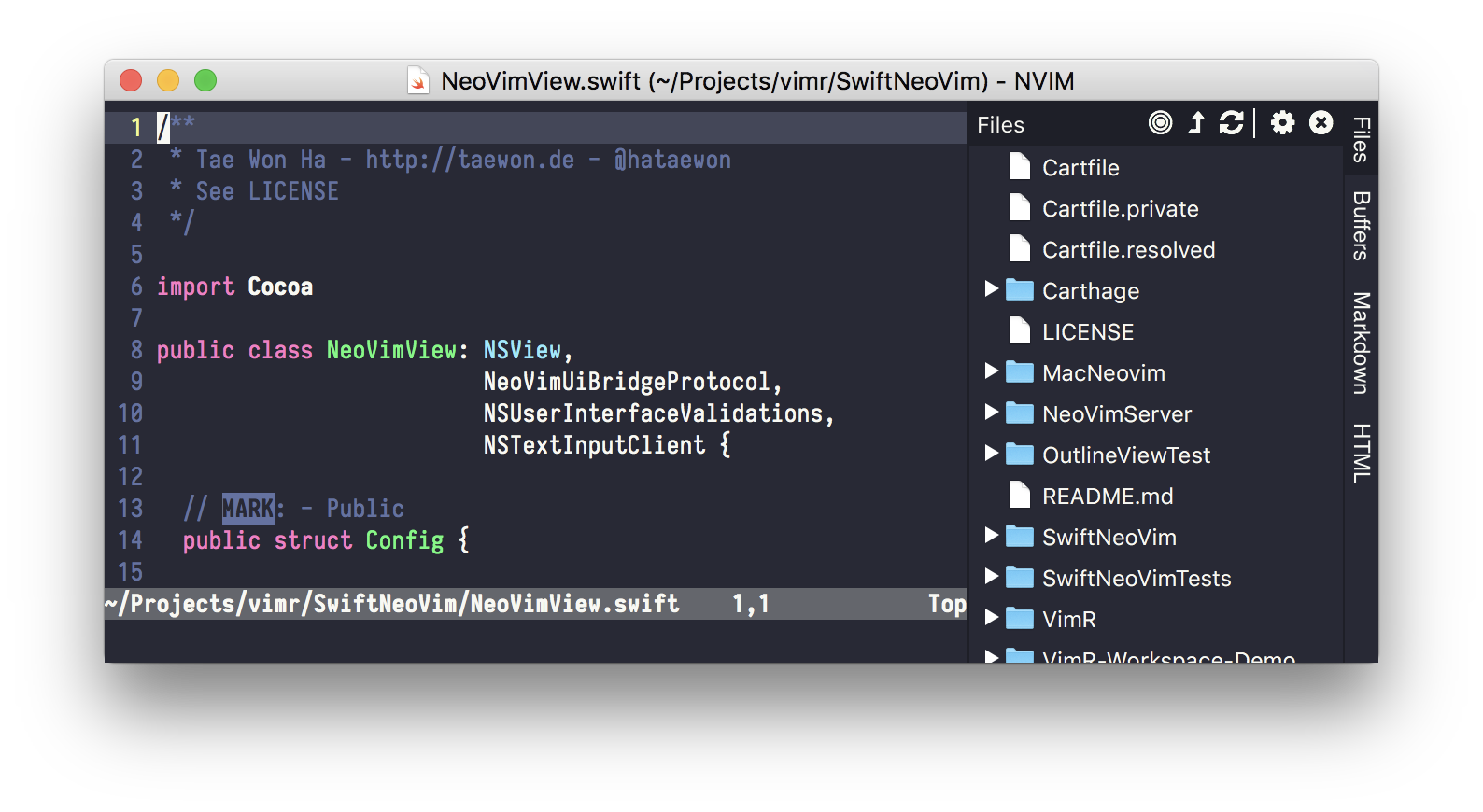
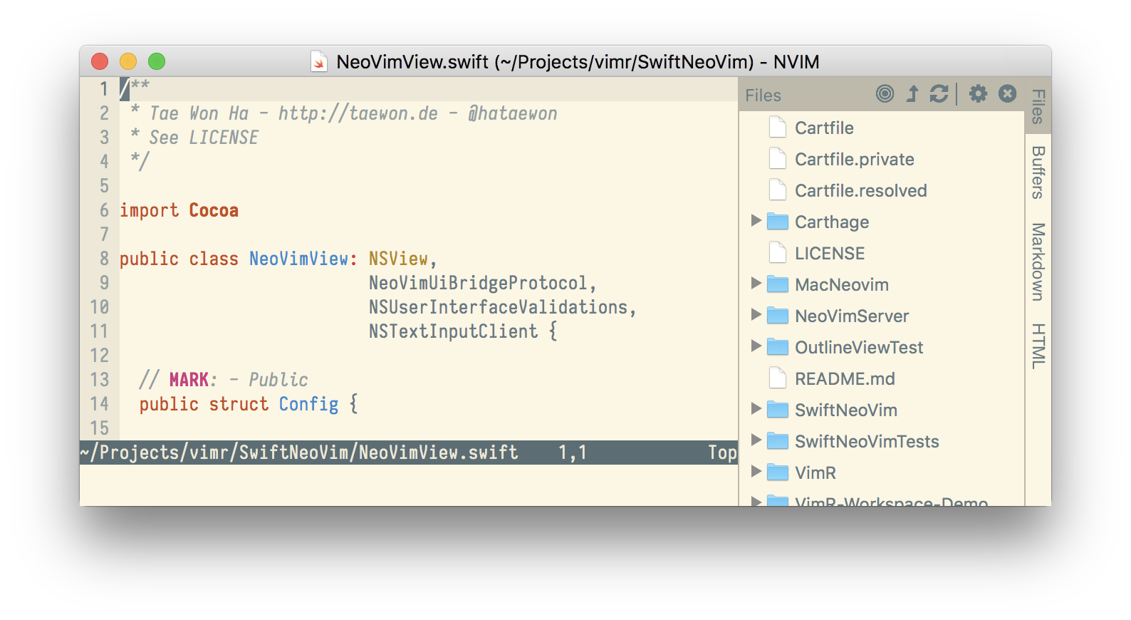
Making some progress:
qvacua
on 25 Jun 2017
looks great.
mattsawyer77
on 26 Jun 2017
Looks great! How can you customize the colors? Or, which colors are reused? It would also be awesome to be able to customize the folder/file icons, or until then possibly disable them. I like the direction!
jordwalke
on 26 Jun 2017
@jordwalke I'm trying to use the colors defined in the color scheme, eg the foreground and background (and 15% darker version of the background 😀).
I didn't quite get your previous comment about eliminating 1px border; Do you mean the border between the Vim view and the file browser?
qvacua
on 26 Jun 2017
Please try https://github.com/qvacua/vimr/releases/tag/snapshot%2F209 and report the bugs here! 😬
qvacua
on 27 Jun 2017
I didn't quite get your previous comment about eliminating 1px border; Do you mean the border between the Vim view and the file browser?
Yes, I meant that a lot of editors like Idea for the longest time wouldn't let you customize the border between the two and it ended up looking pretty bad on many color schemes. I think your default here (15% darker) is a good starting point.
jordwalke
on 28 Jun 2017
The latest snapshot https://github.com/qvacua/vimr/releases/tag/snapshot%2F211 uses the directory color for folders in the file browser: what do you guys think? I'm not quite sure...
qvacua
on 29 Jun 2017
Works great for me!
robertbenjamin
on 29 Jun 2017
I've tried your new version. It's very beautiful
 iuunhao
on 30 Jun 2017
iuunhao
on 30 Jun 2017
Related issues
 numbcoder
·
3Comments
numbcoder
·
3Comments
 hakamadare
·
4Comments
qvacua
·
7Comments
hakamadare
·
4Comments
qvacua
·
7Comments
 nornagon
·
3Comments
nornagon
·
3Comments
 selaselah
·
7Comments
selaselah
·
7Comments
Most helpful comment
Making some progress:

