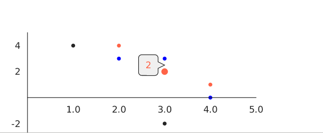
Victory: tooltip doesn't show at current possition when setting orientaion to "left".
 alishir
All 14 comments
Seems to be caused by the default padding of 10 on the style object for labels. Setting the padding to 0 fixes the issue, but causes gridlines to show up. codesandbox.io/s/30mnr18pj1 😕
 narinluangrath
on 7 Dec 2018
narinluangrath
on 7 Dec 2018
Setting dy on labelComponent fixes this.
<VictoryTooltip orientation="top" active dy={0} />
I believe the default rendering above the target might have been intentional. Many of the examples exhibit this behavior. Although briefly looking at the source it appears that the dx and dy attributes are calculated in victory-tooltip/src/victory-tooltip.js#L243. So perhaps it is not calculating them correctly.
 gitjeff05
on 12 Sep 2019
gitjeff05
on 12 Sep 2019
Hello, I just discovered your excellent library and am attempting to tackle this issue:
It looks like the default label (padding: 10) in baseLabelStyles, from victory-core/src/victory-theme/grayscale.js...
// *
// * Labels
// *
const baseLabelStyles = {
  fontFamily: sansSerif,
  fontSize,
  letterSpacing,
  padding: 10, //<<<<<<<<<<
  fill: charcoal,
  stroke: "transparent"
};

scatter: assign(
    {
      style: {
        data: {
          fill: charcoal,
          stroke: "transparent",
          strokeWidth: 0
        },
        labels: baseLabelStyles //<<<<<<<<<<
      }
    },
    baseProps
  ),
...gets applied to dy in victory-core/victory-util/label-helpers.js in the getOffset(props, datum) function, based on getPadding(props, datum) call...
function getOffset(props, datum) {
  if (props.polar) {
    return {};
  }
  const padding = getPadding(props, datum);
  return {
    dx: padding.x,
    dy: padding.y
  };
}
For a proposed fix, I added check in getPadding(props, datum) so that if the label component is VictoryTooltip, don't use the default padding...
(original lines commented out below)
function getPadding(props, datum) {
  datum = datum || {};
  //const { horizontal, style } = props;
  const { horizontal, style, labelComponent } = props;
  const labelStyle = style.labels || {};
  //const defaultPadding = Helpers.evaluateProp(labelStyle.padding, props) || 0;
  const defaultPadding = Helpers.evaluateProp(labelComponent.type.name, props) === "VictoryTooltip" ? 0 : Helpers.evaluateProp(labelStyle.padding, props) || 0;
  const sign = datum._y < 0 ? -1 : 1;
  return {
    x: horizontal ? sign * defaultPadding : 0,
    y: horizontal ? 0 : -1 * sign * defaultPadding
  };
}
As a check, in my App.js, I am not adding dy=0 to the VictoryScatter component, and tooltip works properly with orientations (top, left, right, bottom). If I remove labelComponent alltogether, the static label correctly gets the default padding applied and the label appears above the point.
<div>
    <VictoryScatter
    style={{ parent: parentStyle }}
    labelComponent={
        <VictoryTooltip
        //dy={0}
        orientation={'left'}
        />
    }
    labels={({ datum }) => `hi #${datum.x}`}
    size={({ active }) => (active ? 5 : 3)}
    data={[{ x: 3, y: 3 }]}
    />
</div>
Proposed fix:
https://github.com/FergusDevelopmentLLC/victory-issue-801/blob/master/src/victory-core/src/victory-util/label-helpers.js
update the getPadding(props, datum) function
Github repo with the proposed fix: https://github.com/FergusDevelopmentLLC/victory-issue-801
Codesandbox: https://codesandbox.io/s/github/FergusDevelopmentLLC/victory-issue-801
 FergusDevelopmentLLC
on 15 Oct 2019
FergusDevelopmentLLC
on 15 Oct 2019
@FergusDevelopmentLLC
Thanks for taking an interest and looking into this issue! I think your solution is not quite right, however, and would introduce a breaking change for folks who are expecting padding to alter the dy of their orientation="top" labels. I think the better solution would be to alter either the getPadding function in label-helpers so that when there is an orientation prop is given, the padding is only applied on the proper side. Right now, there is a check for the horizontal prop that but I think there also needs to be a check for orientation. Does that make sense?
 boygirl
on 21 Oct 2019
boygirl
on 21 Oct 2019
Thank you for responding. I think I understand what you mean and tbh, I was not keen on relying on labelComponent.type.name to be "VictoryTooltip". I will take a closer look soon.
FergusDevelopmentLLC
on 22 Oct 2019
Hi,
I took a look again and wanted to be clear on the breaking change introduced by the proposed fix that you mention. But, I can't seem to find and issue when altering dy of "top" oriented labels with the proposed fix in place. Here is what I see:
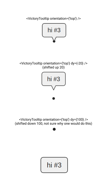
These seem to be behaving correctly, as the dy override is followed. I also checked that other 3 orientations behave in the same manner. That being said, I still plan to approach again with your suggestion of an additional orientation prop because I think this prop could eliminate reliance on labelComponent.type.name === "VerticalTooltip" in the proposed fix.
Also, when you mention 'orientation="top" labels', you are referring to a <VictoryTooltip>, not a <VictoryLabel>, correct? Reviewing the docs, it appears that the orientation prop applies to <VictoryTooltip>, not <VictoryLabel>. I see there is labelPlacement on a VictoryLabel, but that doesn't seem to be the same.
Thanks!
Here is my VictoryScatter, that contains the VictoryTooltip:
<VictoryScatter
  style={{ parent: parentStyle }}
  labelComponent={<VictoryTooltip orientation={'top'} dy={100} />}
  labels={({ datum }) => `hi #${datum.x}`}
  size={({ active }) => (active ? 5 : 3)}
  data={[{ x: 3, y: 3 }]}
/>
@alishir the breaking change would be the padding no longer influencing the dy value for tooltips. So there are a few different things going on here:
1) "left" and "right" orientation tooltips are getting vertical rather than horizontal padding. This is a bug that should be addressed by checking for the orientation prop and changing which padding is applied. I would not consider the fix for this bug a breaking change.
2) It's not clear whether padding should alter the tooltip dy position at all. Currently it does, but maybe this is undesireable. I think I'm convinced of that, and willing to change that behavior, but this will be create a small breaking change, and will need to be addressed in the next major version bump. we tend to batch our breaking changes, and if we introduced this one, I would want to take the opportunity to look at label padding and positioning more generally.
I think thing 1 is what this issue was originally about, but we can also talk about cleaning up the confusion around padding vs dy/dx more generally if you're interested.
boygirl
on 24 Oct 2019
@boygirl I think I understand what you mean with the orientation prop. I will take a closer look this way. Also, definitely interested to help clean up confusion. Do you prefer connecting on the Spectrum chat or continue here?
FergusDevelopmentLLC
on 25 Oct 2019
Let's continue chatting here for now. I'll do some thinking about the more general label padding confusion.
boygirl
on 25 Oct 2019
I took a closer look, and I think I have a fuller understanding now. I understand the purpose of the horizontal prop, and I can see that the default 10px padding is intentional and should follow the horizontal and orientation props.
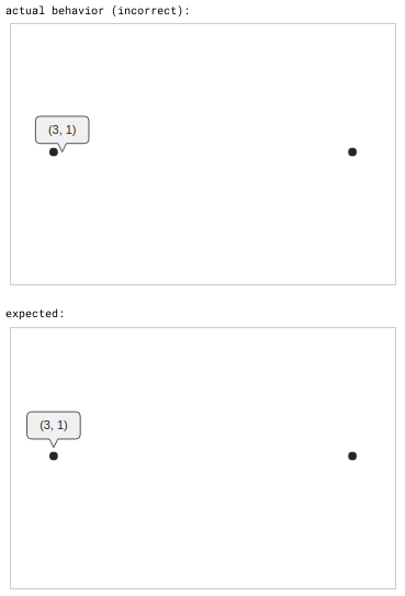
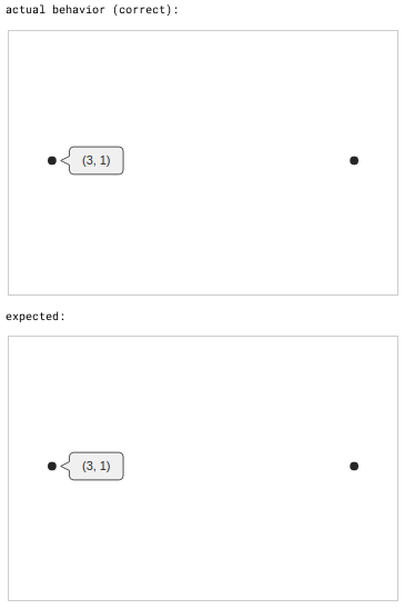
Can you confirm in the actual/expected examples below, that my expected versions are the same as you expect?
Note...
- The previous proposed fix code was not included when producing examples below.
- The expected screenshots below were produced by overriding dy/dx.
- I did not capture my cursor when capturing the screenshots for clarity.
thanks!
- orientation on VictoryTooltop labelComponent = ‘top’
VictoryScatter horizontal = false
<VictoryScatter
  size={5}
  labelComponent={<VictoryTooltip orientation={'top'} />}
  labels={({ datum }) => `(${datum.x}, ${datum.y})`}
  data={[{ x: 3, y: 1} , {x: 3, y: 2 } ]}
  horizontal={false}
/>
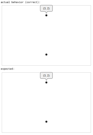
- orientation on VictoryTooltop labelComponent = ‘top’
VictoryScatter horizontal = true
<VictoryScatter
  size={5}
  labelComponent={<VictoryTooltip orientation={'top'} />}
  labels={({ datum }) => `(${datum.x}, ${datum.y})`}
  data={[{ x: 3, y: 1} , {x: 3, y: 2 } ]}
  horizontal={true}
 />
- orientation on VictoryTooltop labelComponent = ‘left’
VictoryScatter horizontal = false
<VictoryScatter
  size={5}
  labelComponent={<VictoryTooltip orientation={'left'} />}
  labels={({ datum }) => `(${datum.x}, ${datum.y})`}
  data={[{ x: 3, y: 1} , {x: 3, y: 2 } ]}
  horizontal={false}
 />
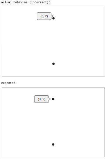
- orientation on VictoryTooltop labelComponent = ‘left’
VictoryScatter horizontal = true
<VictoryScatter
  size={5}
  labelComponent={<VictoryTooltip orientation={'left'} />}
  labels={({ datum }) => `(${datum.x}, ${datum.y})`}
  data={[{ x: 3, y: 1} , {x: 3, y: 2 } ]}
  horizontal={true}
 />
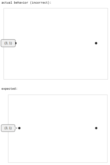
- orientation on VictoryTooltop labelComponent = ‘bottom’
VictoryScatter horizontal = false
<VictoryScatter
  size={5}
  labelComponent={<VictoryTooltip orientation={'bottom'} />}
  labels={({ datum }) => `(${datum.x}, ${datum.y})`}
  data={[{ x: 3, y: 1} , {x: 3, y: 2 } ]}
  horizontal={false}
/>
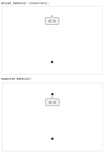
- orientation on VictoryTooltop labelComponent = ‘bottom’
VictoryScatter horizontal = true
<VictoryScatter
  size={5}
  labelComponent={<VictoryTooltip orientation={'bottom'} />}
  labels={({ datum }) => `(${datum.x}, ${datum.y})`}
  data={[{ x: 3, y: 1} , {x: 3, y: 2 } ]}
  horizontal={true}
 />
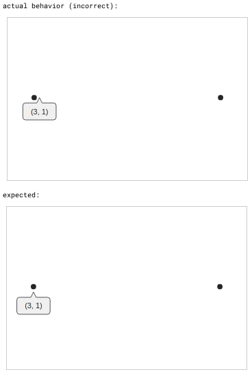
- orientation on VictoryTooltop labelComponent = ‘right’
VictoryScatter horizontal = false
<VictoryScatter
  size={5}
  labelComponent={<VictoryTooltip orientation={'right'} />}
  labels={({ datum }) => `(${datum.x}, ${datum.y})`}
  data={[{ x: 3, y: 1} , {x: 3, y: 2 } ]}
  horizontal={false}
 />
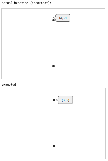
- orientation on VictoryTooltop labelComponent = ‘right’
VictoryScatter horizontal = true
<VictoryScatter
  size={5}
  labelComponent={<VictoryTooltip orientation={'right'} />}
  labels={({ datum }) => `(${datum.x}, ${datum.y})`}
  data={[{ x: 3, y: 1} , {x: 3, y: 2 } ]}
  horizontal={true}
 />
FergusDevelopmentLLC
on 28 Oct 2019
@FergusDevelopmentLLC Yes, all of the expected behavior you show looks correct. Thank you for including all the screenshots. They add a ton of clarity!
boygirl
on 28 Oct 2019
@boygirl
I have a new proposed fix:
https://github.com/FergusDevelopmentLLC/victory-issue-801/
https://codesandbox.io/s/github/FergusDevelopmentLLC/victory-issue-801
The fix is still in label-helpers.js, in the getPadding method, here:
A slew of tests can be seen here, all show expected behavior. I added barPlot tests, as the horizontal attribute makes more sense with that type.
I have a few concerns though...
1. I looked deeper at how the horizontal prop is set, and see that it works by setting the horizontal value to true if any child components have the the horizontal prop set to true. I believe this is to catch the situation where you would have a <VictoryScatter horizontal={true}> inside of a <VictoryChart> and want the labels/tooltips to pay attention to the horizontal = true. I was first thinking to mimic this logic with an orientation property on a <VictoryScatter> or <VictoryBar> but this seemed not correct, as we are looking for the orientation property on the component passed as the labelComponent to a VictoryScatter (or VictoryBar, or other).
So, in getPadding, if I add labelComponent to the props object destructuring on line 44...
const { horizontal, style, labelComponent } = props;
I can get the passed orientation value by looking at the orientation prop of the labelComponent on line 47:
const orientation = labelComponent.props.orientation;
Are there issues with getting the orientation value in this manner?
2. Related to 1 above, the next issue is with the commented out line 46:
//const orientation = Helpers.evaluateProp(labelComponent.props.orientation, props);
This line produces the same orientation value as line 47:
const orientation = labelComponent.props.orientation;
I am not sure exactly what Helpers.evaluateProp() does. Should I use it here to get the orientation value in the same way that defaultPadding is obtained?
3. Lastly, I still have a check for labelComponent.type.name === "VictoryTooltip" present on line 53, which I am not keen on. This check prevents incorrect behavior if a VictoryLabel is passed as the labelComponent with an orientation prop set, illustrated below:
<VictoryScatter
  data={[{ x: 3, y: 1} , {x: 3, y: 2 } ]}
  size={5}
  style={{ labels: { fill: "black", fontSize: 14} }}
  labels={({ datum }) => `(${datum.x}, ${datum.y})`}
  labelComponent={<VictoryLabel orientation={'left'} />}
  horizontal={false}
/>
Without the check on line 53 in place, a VictoryLabel follows the orientation property incorrectly, producing this result:
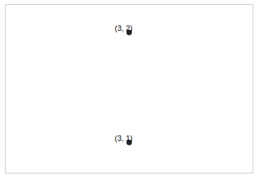
The following tests show the orientation property correctly ignored on VictoryLabels:
https://l9jpo.codesandbox.io/#test09
https://l9jpo.codesandbox.io/#test10
https://l9jpo.codesandbox.io/#test11
https://l9jpo.codesandbox.io/#test12
I can see where an orientation property would make sense on a VictoryLabel, but it is not currently a valid property according to the docs. I added this check to pay attention to orientation only if the labelComponent is a VictoryTooltip.
Perhaps there is a better way to make this check. Or, perhaps VictoryLabel should follow the orientation property as well. The padding issues shown in the incorrect result above could be resolved in that case.
Thanks again!
FergusDevelopmentLLC
on 29 Oct 2019
@boygirl any thoughts? I would really like to help with this issue or another one. Thanks again for a great library.
FergusDevelopmentLLC
on 6 Nov 2019
Apologies folks, but I believe this is fixed in the most recent version
boygirl
on 8 Jul 2020
Related issues
 dinnayu
·
3Comments
dinnayu
·
3Comments
 purplecones
·
3Comments
purplecones
·
3Comments
 iffy
·
5Comments
iffy
·
5Comments
 seddonm1
·
5Comments
seddonm1
·
5Comments
 danielberndt
·
4Comments
danielberndt
·
4Comments