Vega-lite: Improve timeUnit positioning
(Copied from slack)
@jheer:
I have a temporal domain with timeUnit
yearmonth. I want to show a histogram with bars for each month. If I use abarmark this works but the bars have a fixed size. I want them to scale to fit the known timeUnit, just like numerical bins do. Do we have any support for this? (Note that I don’t want to switch to anordinaldomain, as then empty/missing time units get dropped.)
@kanitw:
The way to do this in Vega is probably offset the
x2by the smallest unit (a month foryearmonth)
In fact, I think this should even be the default behavior.
The tricky part for this is that months have uneven number of days
@jheer
Yeah, I think the solution is to treat time units as bins. If no time unit is given (just type
T) I think the current behavior is reasonable — it’s just like plotting bars over aQdomain. For a given time unit, we could calculate start/stop boundaries that are specific to the time unit, just like binning.
Happy to look at Vega modifications to achieve this. I also added a Vega issue to perform imputation for time units (https://github.com/vega/vega/issues/1764), so that ordinal scales over proper time domains could also work.
 kanitw
All 10 comments
FYI, this would work by deriving another field for month_end (just like bin produces two fields).
The trick is to add +1 at the smallest unit that we care about.
{
          "type": "formula",
          "as": "month_date_end",
          "expr": "datetime(0, month(datum[\"date\"]) + 1, 1, 0, 0, 0, 0)"
        }
Full vega spec.
kanitw
on 18 Jun 2019
Note that the grid is a bit off somehow -- probably an instance of https://github.com/vega/vega/issues/1837 (commented).
kanitw
on 18 Jun 2019
The question now become what should be the default for line. Should the position be:
a) in the middle of the band (band=0.5)
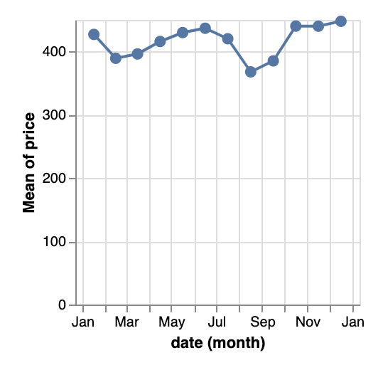
or b) the beginning of the band (basically current VL behavior, which doesn't have month_date_end):
a) would make a smoother transition between bar and line
However, b) would be a less breaking change.
In any case, users should be able to switch between the two. If that's the case, how should they be able to specify it?
cc: @jheer @domoritz @arvind
kanitw
on 18 Jun 2019
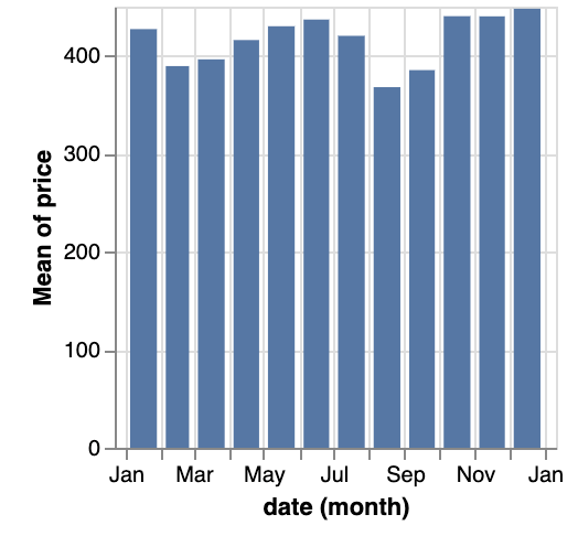
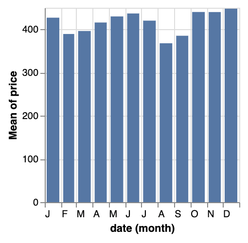
I don't like bin-like labels for time Unit as much, though. I'd usually label a whole bar as being June, rather than saying it's the bar from June to July.
 domoritz
on 18 Jun 2019
domoritz
on 18 Jun 2019
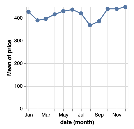
Align left with labelBound would help:
kanitw
on 18 Jun 2019
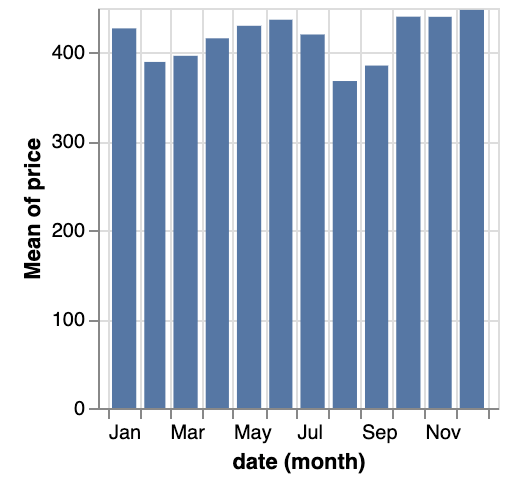
This one uses x-scale padding=0 and month initials instead:
kanitw
on 18 Jun 2019
Adding a voice to this, perhaps favoring using bin-like axis labels.
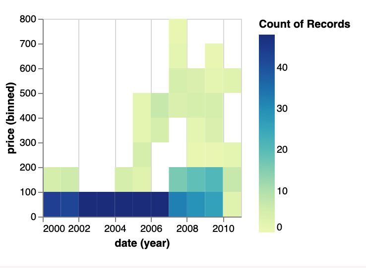
Shouldn't it be possible to create a contour plot using temporal x temporal or temporal x quantitative?
This chart isn't great, without some override to use bin-style axis, for example.
 willium
on 22 Jul 2019
willium
on 22 Jul 2019
Will be fixed in #5096
kanitw
on 27 Jul 2019
@willium -- Thanks for mentioning the case.
For the specified chart, it might better to just use rect mark and color.
With #5096, it will look nice like this.
The problem with the point mark is that it can't scale differently vertically and horizontally. Thus, even if we treat timeUnit more like bin, it still doesn't completely solve the problem. There might be a way to set scale range based on the timeUnit (similar to how we do it for bin in https://vega.github.io/editor/#/examples/vega-lite/circle_binned). However, such logic is definitely beyond the scope of this issue. I'm creating https://github.com/vega/vega-lite/issues/5245 as a separate issue, but I don't plan to tackle it anytime soon.
Note that the plot you point out isn't exactly a contour plot though (but it shows similar information).
kanitw
on 28 Jul 2019
I don't like bin-like labels for time Unit as much, though.
I'd usually label a whole bar as being June, rather than saying it's the bar from June to July.
Anyone know a way to achieve this now?
 hoclun-rigsep
on 9 Oct 2020
hoclun-rigsep
on 9 Oct 2020
Related issues
kanitw
·
3Comments
kanitw
·
4Comments
 ijlyttle
·
3Comments
ijlyttle
·
3Comments
 fuglede
·
4Comments
fuglede
·
4Comments
 swanderz
·
4Comments
swanderz
·
4Comments