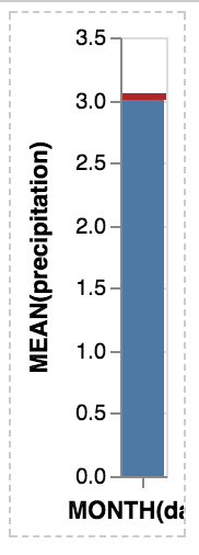
Vega-lite: Interactive example for the front page
Build on
{
  "$schema": "https://vega.github.io/schema/vega-lite/v2.json",
  "data": {"url": "data/seattle-temps.csv"},
  "mark": "bar",
  "encoding": {
    "x": {
      "timeUnit": "month",
      "field": "date",
      "type": "temporal"
    },
    "y": {
      "aggregate": "mean",
      "field": "temp",
      "type": "quantitative"
    }
  }
}
But add a way to select along x and show the mean of the selected data.
 domoritz
All 15 comments
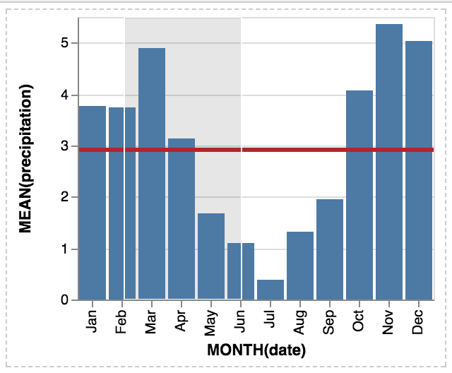
Here is a proposal
{
  "data": {"url": "data/seattle-weather.csv"},
  "layer": [{
    "selection": {
      "brush": {
        "type": "interval", "encodings": ["x"]
      }
    },
    "mark": "bar",
    "encoding": {
      "x": {
        "timeUnit": "month",
        "field": "date", "type": "temporal"
      },
      "y": {
        "aggregate": "mean",
        "field": "precipitation", "type": "quantitative"
      },
      "opacity": {
        "condition": {
          "selection": "brush", "value": 1
        },
        "value": 0.7
      }
    }
  }, {
    "transform": [{
      "filter": {"selection": "brush"}
    }],
    "mark": "rule",
    "encoding": {
      "y": {
        "aggregate": "mean",
        "field": "precipitation", "type": "quantitative"
      },
      "color": {"value": "firebrick"},
      "size": {"value": 3}
    }
  }]
}
I like it because it
- is useful
- shows off selection, composition, and unit specs
- shows off selection filters and conditionals
Unfortunately, something with the layout is broken
domoritz
on 9 Aug 2017
Without opacity, it works fine
domoritz
on 9 Aug 2017
 domoritz
on 9 Aug 2017
domoritz
on 9 Aug 2017
Fantastic example, @domoritz!!
 arvind
on 9 Aug 2017
arvind
on 9 Aug 2017
Thanks! I'm a bit worried that the spec is too long. Do you think there is a simple way to put an annotated example on the front page to break down the features? Or maybe we can fold the code to only show the non-interactive spec (but render the interactive example) by default.
domoritz
on 9 Aug 2017
Here is a shorter example that shows the brushing on a scatter plot and changes the horizontal rule for that selection. Is short enough to be an option for the front page and shows composition, selection, filter and conditions. Also scatters are more interesting for statistical plots than bars.
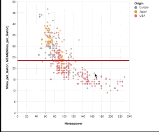
See full block here: https://bl.ocks.org/amitkaps/a484b94a7e1e0705c5ec865ba31f463c
See concise code below:
{
"data": {"url": "data/cars.json"},
"layer": [{
"selection": {"pts": {"type": "interval"}},
"mark": "circle",
"encoding": {
"x": {"field": "Horsepower", "type": "Q"},
"y": {"field": "Miles_per_Gallon", "type": "Q"},
"color": {
"condition": {
"selection": "pts", "field": "Origin", "type": "N"
},
"value": "grey"
}
}
}, {
"transform": [{"filter": {"selection": "pts"}}],
"mark": "rule",
"encoding": {
"y": {"field": "Miles_per_Gallon", "type":"Q", "aggregate": "mean"},
"color": {"value": "red"}
}
}]
}
 amitkaps
on 10 Aug 2017
amitkaps
on 10 Aug 2017
In hindsight, not very different from @domoritz example. But we do save on four additional parameter definition (after removing opacity), so should be shorter -
// In selection
"encodings": ["x"]
// In encoding x, layer - bar
"timeUnit": "month",
// in encoding y, layer- bar
"aggregate": "mean",
// In layer - rule
"size": {"value": 3}
I think all of these are nice examples "to show features" -- but wonder if analysts would really do any of them in analysis practice? (It's not surprising that the mean value of the group you brush is right over the area you select.)
Thus, I wonder if it is better to show a SPLOM or a crossfilter example?
 kanitw
on 10 Aug 2017
kanitw
on 10 Aug 2017
@kanitw Fair point. SPLOMs are easy to do in (static) tools and crossfilter is really neat, but too long for a starter example. In my experience, most stats people are looking at easier ways to do brushing & linking or input bindings. So here is attempt number 2: Showing nearest selection and two-way input binding. Still short, but does not show composition.
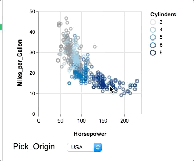
{
"data": {"url": "data/cars.json"},
"selection": {
"Pick": {
"type": "single", "on": "mouseover",
"nearest": "true", "fields": ["Origin"],
"bind": {"input": "select", "options": ["Europe", "Japan", "USA"]}
}
},
"mark": "point",
"encoding": {
"x": {"field": "Horsepower", "type": "quantitative"},
"y": {"field": "Miles_per_Gallon", "type": "quantitative"},
"color": {
"condition": {
"selection": "Pick",
"field": "Cylinders", "type": "ordinal"
},
"value": "grey"
}
}
}
I liked @domoritz's original example because it answers a question analysts might realistically have (an "interactive moving average" if you will) via an interaction that I haven't seen in the wild but Vega-Lite makes straightforward to construct. Common interaction techniques (brushing & linking, query widgets, etc.) are well-supported elsewhere, and so don't highlight what's unique about Vega-Lite multiview + interaction grammar approach. The positioning of the mean line itself is more surprising than with the raw scatterplot as the histogram is aggregated over timeUnits. Moreover, the example highlights how expressive the language is while remaining high-level, concise, and semantic (e.g., at a glance, and without knowing much about Vega-Lite, I could imagine potential users being able to map between the spec and the resultant visualization).
I'm not too worried about the length of the example, particularly with a short sentence or two description (as is already exists on the current homepage). We could gain some lines by having more than one property per line (example below). Alternatively, we could also build up the example in a carousel-like display: (1) Histogram of mean precipitation by month; (2) Layer the yearly mean line; (3) Make the mean line interactive.
{
  "data": {"url": "data/seattle-weather.csv"},
  "layer": [{
    "selection": {
      "brush": {
        "type": "interval",
        "encodings": ["x"]
      }
    },
    "mark": "bar",
    "encoding": {
      "x": {
        "timeUnit": "month",
        "field": "date",
        "type": "temporal"
      },
      "y": {
        "aggregate": "mean",
        "field": "precipitation",
        "type": "quantitative"
      },
      "opacity": {
        "condition": {
          "selection": "brush", "value": 1
        },
        "value": 0.7
      }
    }
  }, {
    "transform": [{
      "filter": {"selection": "brush"}
    }],
    "mark": "rule",
    "encoding": {
      "y": {
        "aggregate": "mean",
        "field": "precipitation",
        "type": "quantitative"
      },
      "color": {"value": "firebrick"},
      "size": {"value": 3}
    }
  }]
}
@arvind Agreed and carousel idea of showing how it is built is great.
These interaction may be easy to do in a visual tool like Tableau. But, don't underestimate how hard simple interactions are in coding based analysis language. In python, currently this is non trivial to do, even within plotly or bokeh. HoloViews addresses this currently but is still nascent. And Altair eventually will with support of Vega-Lite 2! In R, the gold standard for viz in statistical tools, layering is part of ggplot2 but interaction is hard. ggvis does this, but has not been updated for some time. And other vis libraries, requires using flexdashboard or shiny (with R server) to make this stuff happen within HTML pages.
I know, I am 'preaching to the choir' here! But just sharing my (limited) experience with doing interactive viz for data analysis as a practioner... And that is one of the reason, I am excited about even simple interaction baked in Vega-Lite 2. Thank you for your great work here.
amitkaps
on 11 Aug 2017
@amitkaps Thanks for your comment!
@arvind I like the idea of carousel too.
Btw, let me expand on why I think "interactive moving average" is less valuable as compared to brushing and linking.
Basically, in the "interactive moving average", users can pretty much infer the moving average by eye even without the interaction we provide. On the other hand, when brush and link between concatenated plots that show different variables, we can reveal interesting relationships between the variables that would not be possible to know without the interaction.
For this reason, I think brushing and linking still serves as a better example from an analysis standpoint although it is more commonplace. Plus, even though we see a lot of brushing & linking examples in D3, it is not well supported in a higher-level tool (like @amitkaps mentioned).
In addition, while a lot of high-level languages already support layering already, but not many offers multi-view composition operators (esp. concat and repeat) in a unified language. Thus, I think showing brushing and linking between concatenated views or SPLOM would be more interesting than showing that we can "layer".
I also suspect that we don't even see this moving average example much in the wild (and in visualization lectures), partly due to its less value compared to more traditional interaction we common see. It's not really harder for a D3 expert to implement the "interactive moving average" example in D3 as compared to making a brushing and linking view. (Of course, both of these are way easy to do in VL.)
kanitw
on 11 Aug 2017
I also suspect that we don't even see this moving average example much in the wild (and in visualization lectures), partly due to its less value compared to more traditional interaction we common see.
My purpose in raising this issue wasn't as a measure of how difficult or not the technique is to implement in other languages, but rather that Vega-Lite makes it clear that it is a valid/possible interaction technique at all! I certainly hadn't thought of it apriori, so it's difficult for me to take lack of examples as a value judgement.
With that said, I'm fine with a simple (e.g. two unit) brushing & linking example as well. We can always including the moving average as an example in the editor.
arvind
on 11 Aug 2017
Basically, in the "interactive moving average", users can pretty much infer the moving average by eye even without the interaction we provide.
It's not that easy if you consider that different months have different lengths ;-). Also, I think that it's a feature that viewers can immediately make sense of what is happening. We will have awesome crossfiltering examples in the example section. But I think for the front page, we want something simple, that doesn't take up too much space, and something that makes you think about how you might extend it or how difficult (while not being impossible) to implement in a different tool. The crossfiltering example may be a bit overwhelming as the first visual on the front page.
I really like the example because it makes sense and uses all major features we want to show off (timeUnit, layer, selections, rules, transforms, ...).
Also, I really like the carousel idea!
domoritz
on 11 Aug 2017
simple, that doesn't take up too much space
True. Small & simple is the pro of this example.
So if you two prefer the layer example, I'm fine with that.
Just wanna make sure we consider the raised concerns. :)
kanitw
on 11 Aug 2017
Related issues
 learnwithratnesh
·
4Comments
kanitw
·
3Comments
learnwithratnesh
·
4Comments
kanitw
·
3Comments
 iliatimofeev
·
3Comments
iliatimofeev
·
3Comments
 ijlyttle
·
4Comments
kanitw
·
4Comments
ijlyttle
·
4Comments
kanitw
·
4Comments
Most helpful comment
I liked @domoritz's original example because it answers a question analysts might realistically have (an "interactive moving average" if you will) via an interaction that I haven't seen in the wild but Vega-Lite makes straightforward to construct. Common interaction techniques (brushing & linking, query widgets, etc.) are well-supported elsewhere, and so don't highlight what's unique about Vega-Lite multiview + interaction grammar approach. The positioning of the mean line itself is more surprising than with the raw scatterplot as the histogram is aggregated over timeUnits. Moreover, the example highlights how expressive the language is while remaining high-level, concise, and semantic (e.g., at a glance, and without knowing much about Vega-Lite, I could imagine potential users being able to map between the spec and the resultant visualization).
I'm not too worried about the length of the example, particularly with a short sentence or two description (as is already exists on the current homepage). We could gain some lines by having more than one property per line (example below). Alternatively, we could also build up the example in a carousel-like display: (1) Histogram of mean precipitation by month; (2) Layer the yearly mean line; (3) Make the mean line interactive.