valkyrie-windows-2.2.00b crashes while playing a scenario without the required content
I've found two problems in the valkyrie-windows-2.2.00b in the scenario 'Stress and Strain'.
I'm not sure if it's a general problem of just with the scenario. It's a general problem. I've just tried to run 'A Little Night Music' scenario. Right after I clicked 'Continue' on the starting screen, the app crashed.
First of all, the app crashes if you don't select the required content in the 'Select Content' menu for a scenario.
Additionally, I've just found a strange behaviour on the course of events in the 'Stress and Strain' scenario. Read more further in 6..
Scenario:
- Download the scenario.
- Make sure you don't have expansions required for the scenario selected in the 'Select Content' menu.
- Start the scenario. The number of players doesn't matter.
- Interact as follows: sight token on the right, sight token at the bottom, explore token at the bottom, attempt to break in.
- If you pass the test (you open the door): the game crashes instantaneously. _It's caused by the lack of a tile's or a monster's image._
- If you fail the test: at first the token becomes unresponsive (click on it and check). If you go to the Mythos Phase 'funny' things starting to happen. In the beginning, click Continue. And now... As many times you clicked the unresponsive button, the number of times you will see the 'unresponsive button' event's text. After that, the game comes back to normal. I presume there is something wrong with the audio played after you fail. _The failure is caused by appearing of a monster which's image exists only in an expansion._
- If you failed the test, you can go back to 5. and crash the app.
Valkyrie Version
valkyrie-windows-2.2.00b
Attach Save, Quest or Scenario
Log File for the Stress and Strain:
output_log.txt
Log File for the A Little Night Music:
output_log.txt
 chrismaliszewski
All 32 comments
Stress and Strain requires MoM1eT and MoM1eM.
The explore token you mention is placing the MoM1e furnace tile.
Its crashing because you don't have mom1e or RN selected, this is expected behaviour. It should not let you start the scenario. This is a major bug imo.
Where are you starting the scenario from? In the editor or from the downloaded scenario screen?
The behaviour of the save&test was changed to use selected content in 2.2. which means you could have this issue there
If it's from the downloaded scenarios screen then it's a problem that needs fixing before release.
 scrubbless
on 14 Feb 2019
scrubbless
on 14 Feb 2019
@scrubbless, I agree, it's a major bug. Especially since I start it from SE as a normal player would do.
But the behaviour isn't expected - the app should not ever crash. I remember playing other scenarios to which I didn't have expansions without the app crashing in v2.15.(_Bad memory..._)
The expected solution would be either:
A. As you said, not letting a user to run a scenario at all. But I don't like the idea for a few reasons.
- If you don't allow a user to run a scenario, why would you allow to download them in the first place? Shouldn't the download option be disabled then too?
- If you don't allow a user to play a scenario, why would you allow to display it in SE and would be there any reason to have the filter option 'Hide scenarios'? Or in other words, if you allow a user to display scenarios which they 'can't' play, let them play them or check them just for fun.
- If we go with the idea, it'd be good if it was implemented in the SE instead of a scenario's splash screen so a user immediately sees that the scenario is not playable as it's now in the original MoM's app. But, I think simply disabling the play button (and/or the download button) is not enough as a user may think 'why can't I download/play this scenario?!' because there won't be enough info to answer the question 'why?'. In the original app, there is the information such as 'Physical Product Required' but here there is no place for that.
B. Displaying extra information (i.e. message box) when a user wants to start a scenario that he/she doesn't have the required expansions but if he/she still wants to play, it's possible and the app won't crash as it was before in v2.15.
chrismaliszewski
on 14 Feb 2019
It's expected behaviour as in, that's how it has always been in Valkyrie.
If the app tries to place a tile from an expansion that is not in the library the app crashes. It's always done that.
I remember having this same crash in 1.6 when I forgot to add a test to check for an optional expansion only variation.
It would be nice for it not to be how it operates and error message would be better, for example.
A strain on reality only requires base. However it has lots and lots of events that will run if expansions are in a players content library. In any of those events I forget to put for example test - SoA == 1, you could expect it to randomly crash when playing in 2.1.5.
scrubbless
on 14 Feb 2019
@scrubbless, I'm sorry, you're right about being unable to play a scenario without the required expansions in the previous versions. I had a false memory. I must have turned them on apparently before playing the scenario or I was playing it in the editor.
chrismaliszewski
on 14 Feb 2019
I've noticed that 2.2 will show expansions in red if you don't have then. However it really should not allow you to play a scenario when the content is not selected.
scrubbless
on 15 Feb 2019
Off-topic: Yeah, I've noticed that too. An expansion's icon changes to black if you have the expansion selected in the 'Select Content' menu. It's a nice feature which I really like! There is one more thing that would be nice which is described here https://github.com/NPBruce/valkyrie/issues/1061.
chrismaliszewski
on 15 Feb 2019
I have an idea:
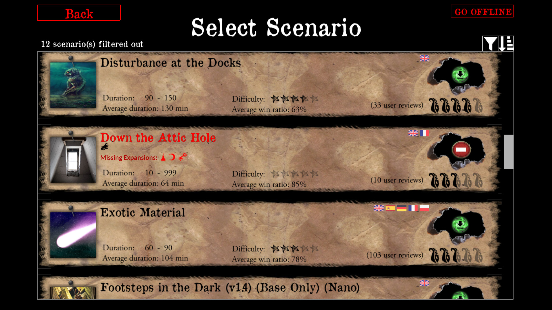
- Creating a simple button that says something in between 'STOP' and 'you shall not pass' which does nothing but being displayed.
- Add a clear indication what is wrong with the scenario; i.e. in this instance display a 'Missing Expansions' label and all missing expansions' icons next to it (note: all other expansions which are already activated are displayed in black in a line above). In the future, this method could be used to indicate any other problems with a scenario, i.e. that a scenario file is corrupted etc.
- Change the font colour of each scenario with a problem. I think the font colour should differ from the 2. label.
So, 1. is a resolvement of the bug, 2. and 3. are enhancements which would be good to implement at the same time. As I said before, creating https://github.com/NPBruce/valkyrie/issues/1061 would also be nice.
chrismaliszewski
on 15 Feb 2019
I like this idea @chrismaliszewski
scrubbless
on 15 Feb 2019
There is no room for additional text there, it's already used by synopsys. I could add a text on the quest details screen though.
 BenRQ
on 15 Feb 2019
BenRQ
on 15 Feb 2019
You're right. I forgot.
So instead it could look like that:
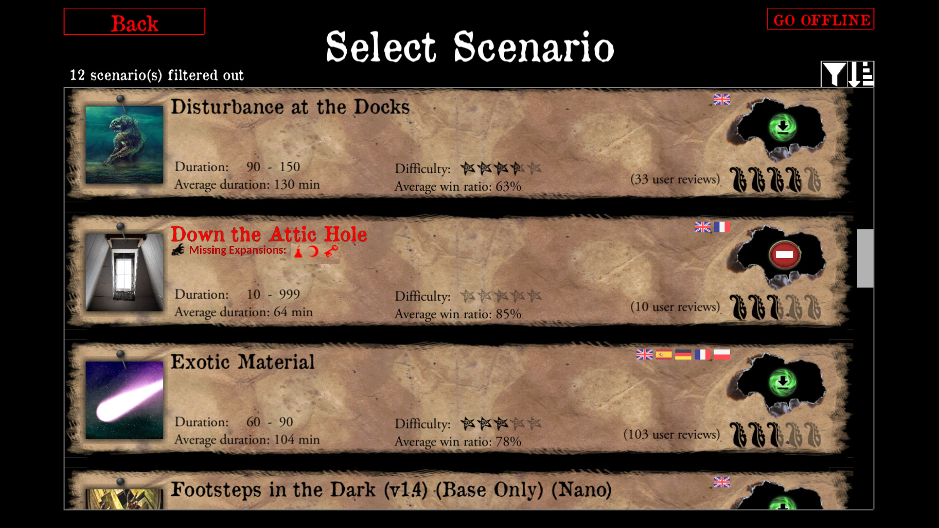
I don't like the idea of clicking the 'Play' button and going to a splash screen to get to know that I can't play a scenario and I need to go back. It should be clear from the very beginning.
Instead of 'Missing Expansions', simple 'Missing' should be enough.
chrismaliszewski
on 15 Feb 2019
There is also this warning symbol: ⚠
 redwolf2
on 15 Feb 2019
redwolf2
on 15 Feb 2019
I just want to make sure the major issue in this thread isn't getting lost.
At present you can start a scenario even if you don't have the required content selected.
The rest is cosmetic.
scrubbless
on 15 Feb 2019
@redwolf2, could you create the red button similar to the one you've already created here https://github.com/NPBruce/valkyrie/issues/1042 (https://github.com/NPBruce/valkyrie/files/2824450/play_button.zip)?
An alert icon could be that one https://commons.wikimedia.org/wiki/File:Android_Emoji_26a0.svg.
I think the hue shift which looks good is -116,3.
I'm not familiar with GIMP. I don't know how to create shapes as you did. Otherwise, I'd create it myself.
The button could be used to in the proposed solution. @BenRQ could create a simple piece of code that shows it if there is any problem with a scenario to prevent a user to play the scenario.
As @scrubbless said, the rest (the red scenario title, 'Missing Expansions' label etc.) are new things which, if not done now, can be put into a separate ticket as an enhancement for the future release.
chrismaliszewski
on 15 Feb 2019
I'm fine with your latest proposal @chrismaliszewski .
Regarding the picture I personally prefer the sign "no-entry" rather than "warning".
Warning means something is wrong, so it may be misleading.
BenRQ
on 16 Feb 2019
First try:
- Red is probably too strong
- Title in red is maybe too much
- Picture should be improved
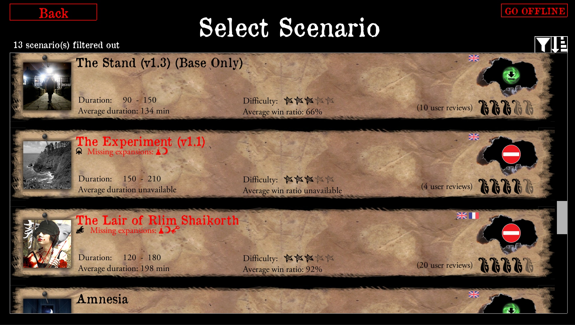
Please tell me what you think.
BenRQ
on 16 Feb 2019
Waiting for a red swirl with a white line in it ;)
scrubbless
on 16 Feb 2019
I checked the title colour and I think black should be fine as the red-ish colour below it stands out more. If it's not enough, it could be easily changed later on.
The text below is #af0806, instead of pure red.
I exported @redwolf2's project to PSD
play_button.zip
and modified it in PS to create a new button
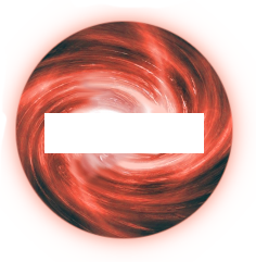
@scrubbless, it's centered 99.999% :).
So the current proposition is:
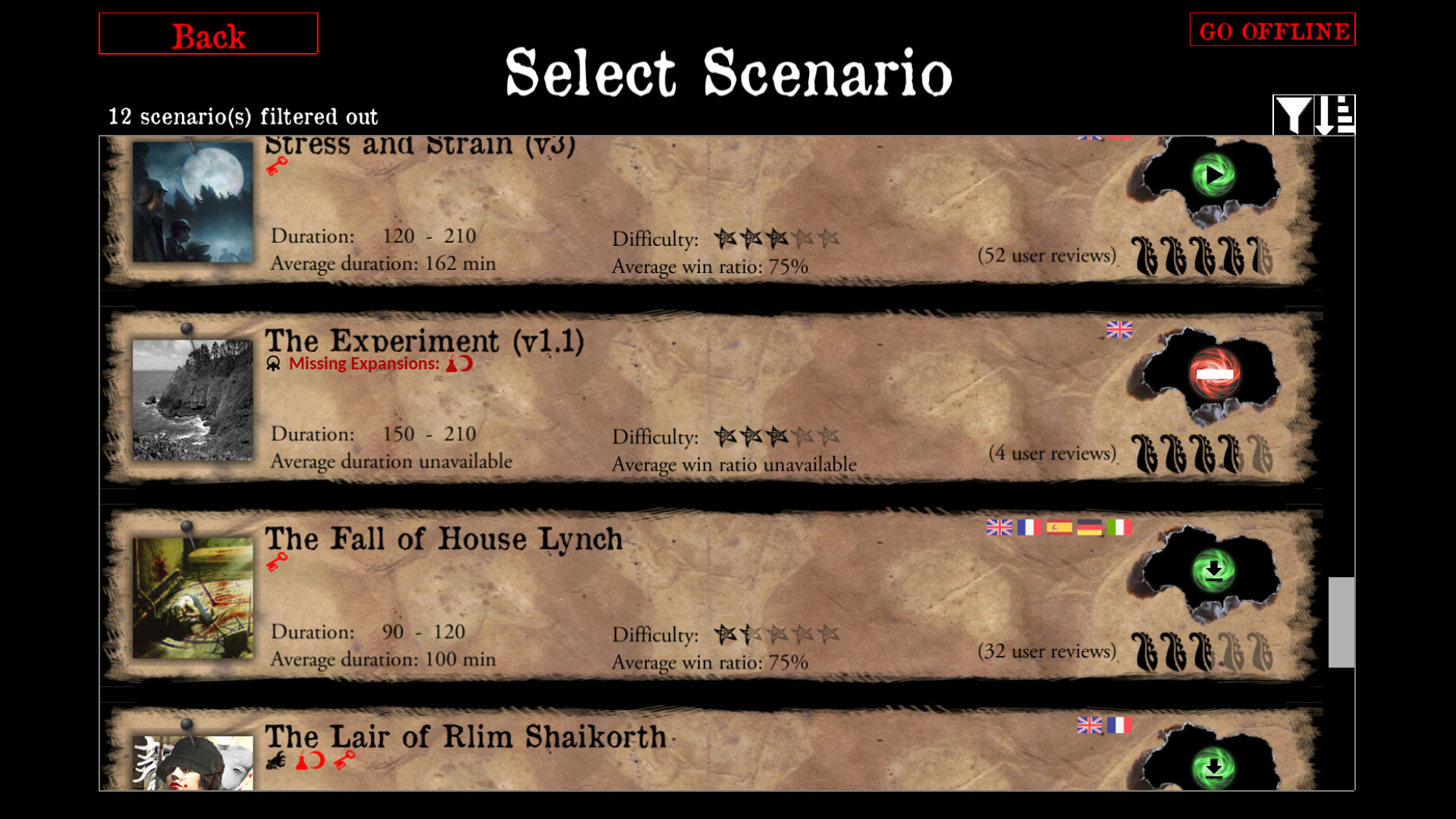
chrismaliszewski
on 16 Feb 2019
All great, but maybe make the bar in the middle transparent.
redwolf2
on 16 Feb 2019
I don't think it's a good idea but below is the transparent version
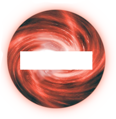
And here is a comparison:
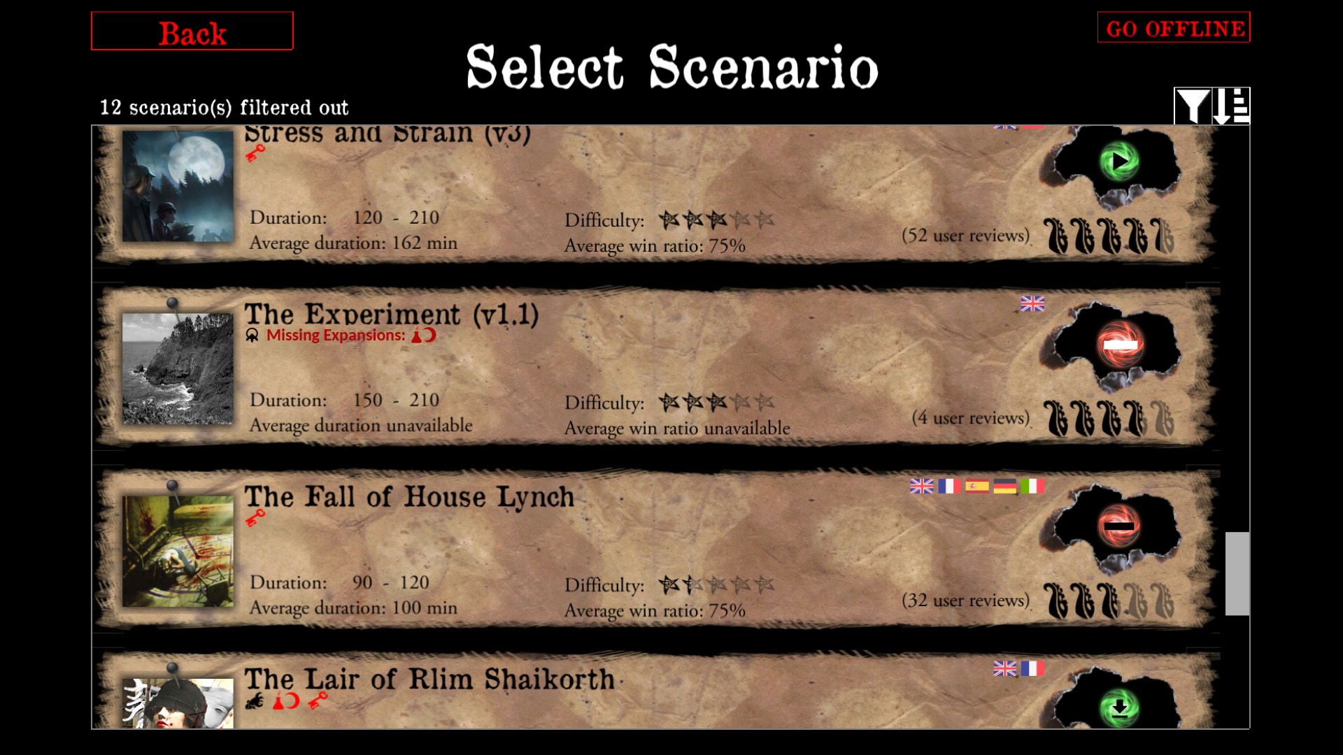
I prefer a white strip version. Do you agree?
chrismaliszewski
on 16 Feb 2019
Yeh its more true to purpose. The black (transparant) looks odd
scrubbless
on 16 Feb 2019
Alright, but then the other buttons should also have a white core.



redwolf2
on 16 Feb 2019
For the red text, it could be a bit darker maybe?
I like the no entry sign with white line.
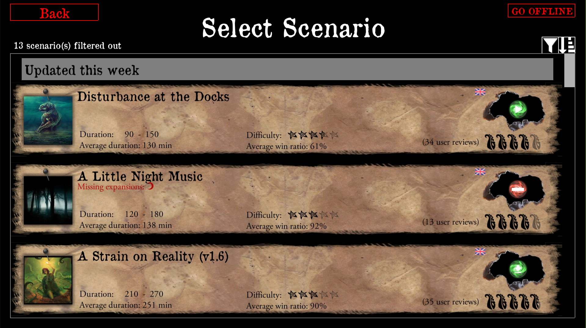
I think the download and play button look better in black though, easier to read.
I don't think it would be a problem to keep them in black : see capture below.
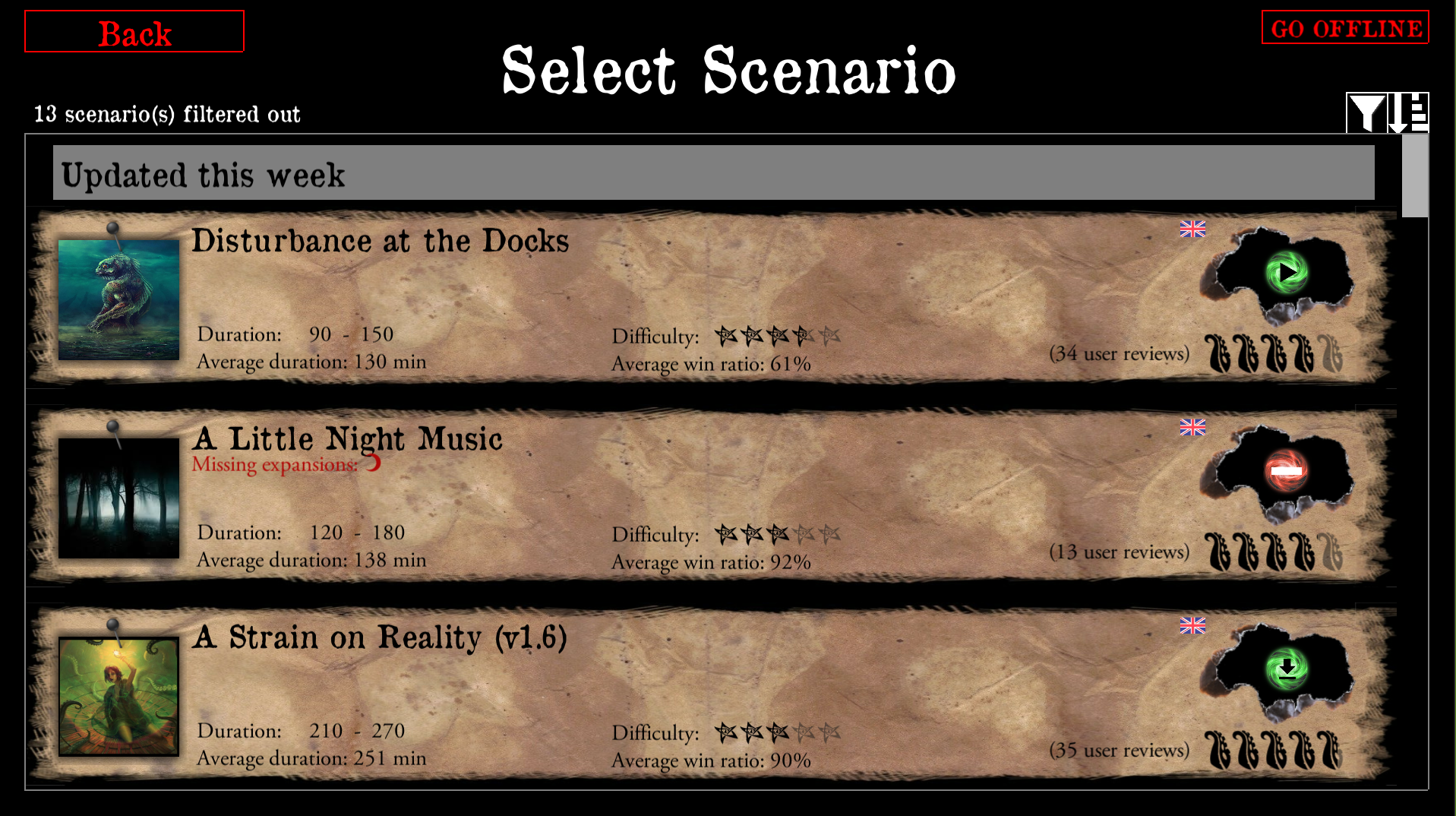
BenRQ
on 17 Feb 2019
Also I would need some translations for
MISSING_EXPANSIONS,Missing expansions:
BenRQ
on 17 Feb 2019
Ok, keep them black, otherwise constrast may be a problem from afar.
redwolf2
on 17 Feb 2019
OK I've committed this change. I will keep it open a while so you can share the text translation.
BenRQ
on 17 Feb 2019
PL
MISSING_EXPANSIONS,Brakujące rozszerzenia:
I think it'd be better to just translate 'Missing Expansions' and hardcode ':'.
chrismaliszewski
on 17 Feb 2019
For the red text, it could be a bit darker maybe?
@BenRQ, have you tried the #af0806 red colour? It is a bit darker as shown here https://github.com/NPBruce/valkyrie/issues/1065#issuecomment-464371803. And if it's still not enough, you could try making the font bold.
chrismaliszewski
on 17 Feb 2019
@BenRQ, have you tried the #af0806 red colour? It is a bit darker as shown here #1065 (comment). And if it's still not enough, you could try making the font bold.
Yes the latest captures use this colour.
BenRQ
on 17 Feb 2019
Ok; didn't check that one. I like what you've shown in the last screenshot.
Before showing previous propositions, I tried different colours and I like the one. I think going darker may not be a good idea but let others speak if they have other opinions.
chrismaliszewski
on 17 Feb 2019
I assume the no entry button will not start the scenario now?
scrubbless
on 17 Feb 2019
Yes, button is deactivated.
BenRQ
on 17 Feb 2019
Commit Polish translation and closing.
BenRQ
on 19 Feb 2019
Related issues
 asn-d6
·
6Comments
chrismaliszewski
·
6Comments
asn-d6
·
6Comments
chrismaliszewski
·
6Comments
 cowistree
·
7Comments
chrismaliszewski
·
3Comments
cowistree
·
7Comments
chrismaliszewski
·
3Comments
 antontimmermans
·
8Comments
antontimmermans
·
8Comments