 danicatalan
All 7 comments
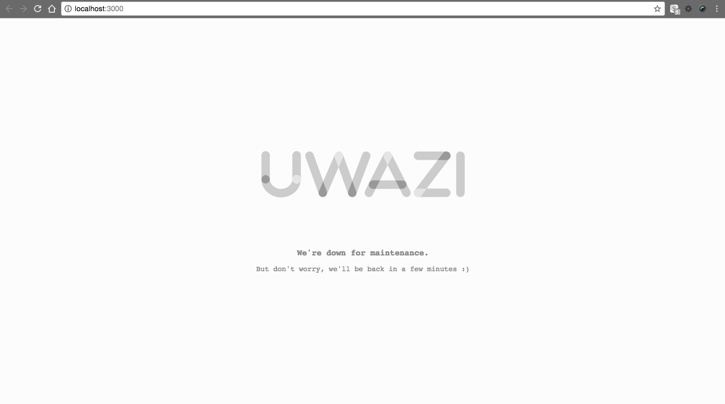
This is the design for our maintenance page. As talked with Albert, it must be a plain HTML so I injected a couple of simple styles and the svg inside the HTML.
I will wait until tomorrow to sent it to Albert, so you can check it and propose some feedback about the message.
cc/ @kjantin @txau
danicatalan
on 20 Jul 2017
I think is great.
 txau
on 20 Jul 2017
txau
on 20 Jul 2017
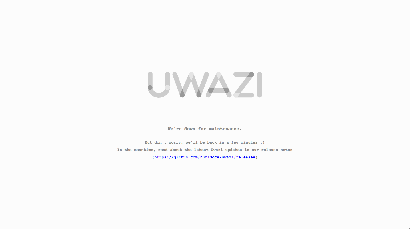
looks great. the only thing I could imagine adding that might make it more informative is something like this:
In the meantime, read about the latest Uwazi updates in our release notes (https://github.com/huridocs/uwazi/releases)
....so they can see all the things we're updating when we take down these sites for maintenance.
 kjantin
on 20 Jul 2017
kjantin
on 20 Jul 2017
Ready!
danicatalan
on 20 Jul 2017
We could use the color logo too?
txau
on 21 Jul 2017
Absolutely we could, but making the logo on grey feels more like a maintenance page.
PS: Also we keep the link highlighted so with a little luck someone will be interested and will read our release notes!
PS2: We can rename that link "_7 breathtaking features that we are deploying right now_" to improve performance and click ratio 😎
danicatalan
on 21 Jul 2017
PS2: Lets go for a real click bait "We were releasing new features and you won't believe what happened next...".
txau
on 21 Jul 2017
Related issues
 vorburger
·
7Comments
vorburger
·
7Comments
 RafaPolit
·
6Comments
danicatalan
·
5Comments
RafaPolit
·
6Comments
danicatalan
·
5Comments
 fnocetti
·
4Comments
fnocetti
·
4Comments
 fititnt
·
4Comments
fititnt
·
4Comments