User.js: development: an online interactive real-time user.js [prototype]
Thorin Edit: prototype is here: https://nwmviewer.shinyapps.io/ghacks_userjs/ .. I have to say this is becoming super exciting and has huge potential, thanks @overdodactyl :kiss: :+1: but needs a lot more thought on desired outcomes, data quality and content, and prettifying, linking back to this repo etc
Would there be any interest in having an online interface for the user.js prefs? I was thinking, if done right, it might be an easier way to browse all the great info provided in the user.js file. I have a tiny example below that's more of a proof of concept than anything.
The prefs along with there value and description are listed, then additional info can be accessed via tooltips/popups (settings, notes, hidden pref info, Bugzilla links etc.).

If there's any interest, there's obviously a ton that could be done outside just improving the styling (I didn't spend much time on this). For example, inactive prefs could be added (dimmed out), row highlighting based on tags, different tabs for Firefox version numbers etc.
 overdodactyl
All 39 comments
Way back in the ghacks days, I also produced an HTML version (light and dark themes), because it was so much easier to visually parse, and urls were linkified
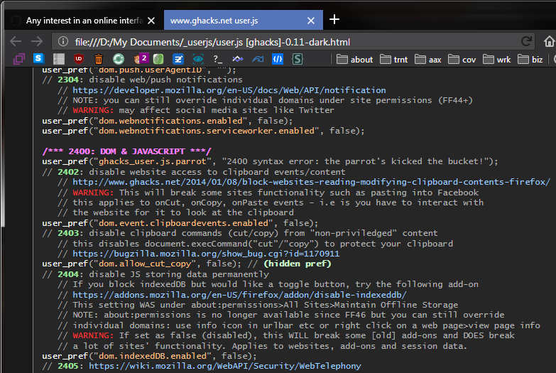
I had a basic set of rules of search and replace rules to convert the js content into html. Links were all target blank, and this was the only hard part, I did it manually, because I couldn't find a decent Linkify script.
I went with pastel colors with a <style type="text/css"> in the html header.
body {background-color: #1a1a1a; color: #b3b3b3; font-size: 12px;
        font-family: Consolas,"Liberation Mono",Menlo,Courier,monospace;}
h1 {color: white; font-size 16px; text-align: center; padding-top: 10px;}
table {background-color: #262626; width: 800px; padding-top: 10px; border: 1px solid #808080; }
td {padding: 0px 0px 0px 10px}
a {color: #99ccff}
p {line-height: 120%}
.head {color: #ff80ff; font-weight: bold}
.user {color: #ffffff}
.pref {color: #ffbf80}
.warn {color: #ff3333}
.xtra {color: #98E498; font-weight: bold}
.xsub {color: #C6F3C6; font-weight: bold}
^^ not saying we use those colors
The user.js has changed so much since then, actually better in terms of tags, FF version references, Settings info, [number] for references, [-] for deprecated, (hidden pref) info, // default for items we enforce, etc. And if we add the index in the user.js, we can anchor sections.
I actually had ideas for this (when ConfigFox used it), about adding multiple tags, and you could dynamically filter based on tags - not saying we need to go that far (yet).
What do you mean by an online interpreter?
 Thorin-Oakenpants
on 3 Dec 2018
Thorin-Oakenpants
on 3 Dec 2018
I didn't know there was an html version in the early days!
What I did here was add the prefs to an excel file (one sheet per section), with the following columns:
- Preference Name
- Value
- Description
- Setting
- Hidden
- Notes
- Bugzilla
Then wrote a little script in R that generates the html tables with the icons, links etc from that.
What do you mean by an online interpreter?
Interface you mean? I just meant having it in website form (part of your .github.io page, or elsewhere), where you can read, search, filter, and so on like you said.
overdodactyl
on 3 Dec 2018
I wouldn't want it to be static. Because it would be out-of-date most of the time. Is there any way for JS to pull the master and manipulate it.
Thorin-Oakenpants
on 3 Dec 2018
Getting a list of active prefs in the corresponding section probably wouldn't be too bad...parsing the comments correctly might be difficult though.
If we wanted a non-JS solution we could probably add to your travis build some configurations to run any scripts and update the tables on each commit.
If there's interest in the idea I can look into it...I just figured I would ask before spending much time.
overdodactyl
on 3 Dec 2018
- Description
That's a :+1: because many people don't know what most of the entries do.
 Atavic
on 3 Dec 2018
Atavic
on 3 Dec 2018
Ummm .. why did you close this? I have ideas...
Thorin-Oakenpants
on 3 Dec 2018
Great coloured css idea, Sir.
Atavic
on 3 Dec 2018
It looks very nice but IDK if it's worth it if you plan to do this manually
 earthlng
on 3 Dec 2018
earthlng
on 3 Dec 2018
I wouldn't want it to be static...Is there any way for JS to pull the master and manipulate it.
^^ I closed because, with that goal in mind, I don't think there's a reliable way to do what I was suggesting. The current structure of the user.js file just doesn't lend itself to being parsed very well.
overdodactyl
on 3 Dec 2018
IDK if it's worth it if you plan to do this manually
Fair enough. I was thinking maintaining the excel sheet wouldn't be toooo much work, I would just need to follow your guys' commits. The html itself in the example above was generated from an R script.
overdodactyl
on 3 Dec 2018
what's an R script?
earthlng
on 3 Dec 2018
R is a language.
Atavic
on 3 Dec 2018
What @Atavic said, it's just a programming language:
https://en.wikipedia.org/wiki/R_(programming_language)
Here's a sample sheet that was used to build the Geolocation table:

overdodactyl
on 3 Dec 2018
A more drastic change/proposal would be to switch the maintenance over to a document like the one mentioned above, and have a script that generates both the user.js file and a website version. I did a quick test and the output looks like this:
/* [Description] disable Activity Stream telemetry
 * [Setting] Home>Firefox Home Content>... */
user_pref("browser.newtabpage.activity-stream.telemetry.ping.endpoint", "");
/* [Description] disable Activity Stream Snippets */
user_pref("browser.newtabpage.activity-stream.disableSnippets", true);
/* [Description] disable Activity Stream Snippets */
user_pref("browser.newtabpage.activity-stream.feeds.snippets", false);
...
/* [Description] disable GeoIP-based search results
 * [NOTE] May not be hidden if Firefox has changed your settings due to your locale */
user_pref("browser.search.region", "US");  // [Hidden Pref]
...
/* [Description] disable Browser Error Reporter (FF60+)
 * [1] https://support.mozilla.org/en-US/kb/firefox-nightly-error-collection
 * [2] https://firefox-source-docs.mozilla.org/browser/browser/BrowserErrorReporter.html */
user_pref("browser.chrome.errorReporter.submitUrl", "");
Automating something like this obviously has some pros (excel sheet may be easier to manage, website could be made, creating a relaxed version would only require the addition of an extra column indicating prefs to exclude, not worrying about syntax errors etc.) and some cons (introducing new complexity when you already have an established system, less flexibility with the file and so on). But maybe it's something to think about ¯\_(ツ)_/¯.
overdodactyl
on 3 Dec 2018
The current structure of the user.js file just doesn't lend itself to being parsed very well.
Pussy! It's not that bad. It can be done (I know, you didn't say that), the question is "Is it worth it to spend all that time on it?". It's worth it to have it, but IMO not worth the effort to make it work - but you're probably a better judge of that than me.
I will say this though... in the old html versions, I only had to do 7 steps of search & replace, and then dump that sucker in between the contents of a pre-made HTML file. That just left a missing linkify script. I do get that my old boring plain html is different to yours e.g columns, tooltips, etc. And an HTML of the content prettified isn't worth it either.
I'll close this, but it's on my mind - an "interactive" (collapsible elements, filterable by tags, etc, and more) online real-time version would be a massive draw - then again, places like privacytoolsio won't even link here for some reason, despite requests to do so (by others) and instead keep endorsing a near 2yr old js. So what's the point in wasting time for a few hundred people or whatever.
Thorin-Oakenpants
on 4 Dec 2018
I'll close this, but it's on my mind - an "interactive" (collapsible elements, filterable by tags, etc, and more) online real-time version would be a massive draw
Here's a link to an extremely minimal start:
https://nwmviewer.shinyapps.io/ghacks_userjs/
All it does is download the latest version of the user.js file from the repo, pull out active prefs, and list them (along with their values), in a sortable/searchable table - i.e. no additional data (description, tags, links etc).
I used RShiny to do this, and to be honest I don't think I personally would be able to invest the time/effort to create something similar from scratch/using a different framework. The biggest implication of that is that it would be hosted on shinyapps.io rather than your github.io page.
With that in mind, if you're interested we can discuss the next steps/features you would want included. We would also need to create a new shinyapps account (free). Currently I'm using the account nwmviewer from a different project of mine, but if we decide to do this we would want to create a ghacks account.
overdodactyl
on 4 Dec 2018
Something to think about for after we get the relaxed/hardened stickies done. I swear .. it's gonna happen .. I'm almost there (tags was parts of it)
Thorin-Oakenpants
on 4 Dec 2018
Alrighty - I'll hold off on doing anything with it unless I hear otherwise from ya 👍. Do you want me to leave that example up to play with/for @earthlng and @claustromaniac to see, or should I go ahead and take it down?
overdodactyl
on 4 Dec 2018
might as well leave it up
Thorin-Oakenpants
on 4 Dec 2018
I'll hold off on doing anything with it unless I hear otherwise from ya
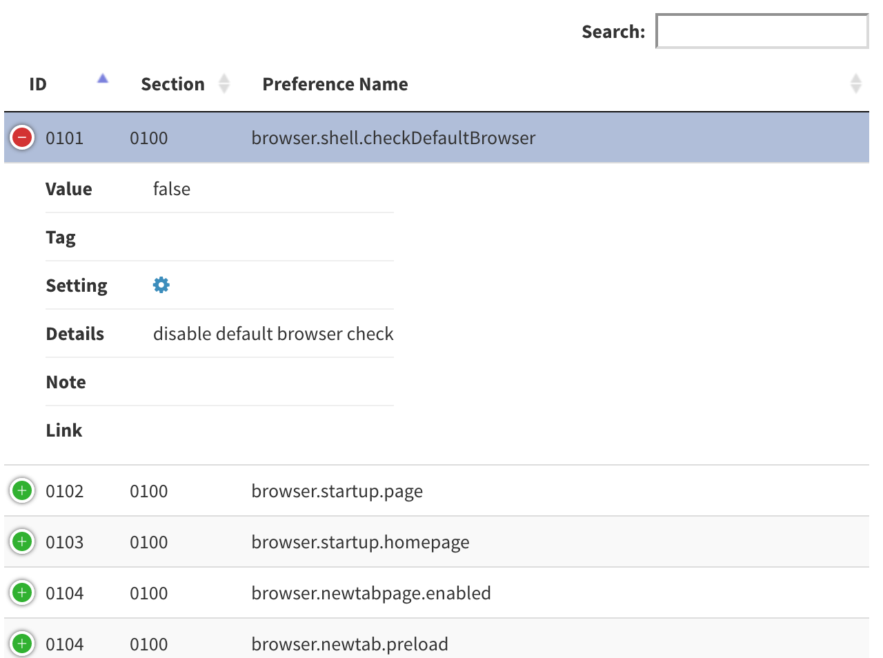
Sorry Pants, couldn't help myself haha. The latest version has columns for:
- ID
- Section
- Tag
- Preference Name
- Value
- Hidden
- Details
- Notes
- Links
all of which are filterable by, and the data is grabbed from the master version in the GitHub repo. Still some kinks, but it's better :)
overdodactyl
on 4 Dec 2018
That's actually F damn good. I have a swag of usability wishes for it, but that can wait. I'd want to focus on data quality first, and we could add more. This might be better handled in a clean shiny issue (we can wait til after 64 beta lands, so remind me)
an example: some prefs are [SETUP*, but only because the section head says so: so we should look at tagging each pref. I wouldn't use code to tag every item in a section on the fly, because eg 0800's, it wasn't meant to be everything (it's just that a lot could be looked at)
But yeah, loving it so far
Thorin-Oakenpants
on 5 Dec 2018
Sounds good! Glad you're liking it - I'll keep working on it a bit, but feel free to let me know of any issues/changes you'd like to see
overdodactyl
on 5 Dec 2018
Well, there's quite a few things, but I don't want to jump the gun. And we're prototyping .. which is horrible (but fun) way to build something
One thing I don't like (just ideas) is the sorting (kinda). By that I mean it needs structure at all times, so by always enforcing a section title (and for readability, some sort of line breakage), and always enforcing sections to be in numerical order - and sorting only sorts within each section. But hey, I get it that it's all in a single table right now.
default sort (by section then by number)
0200 GEO
   0201 geo.enabled
   0202 browser.search.region
0900 PASSWORDS
   0905 signon.autofillForms
   0907 security.insecure_password.ui.enabled
sort by name becomes
0200 GEO
   0202 browser.search.region
   0201 geo.enabled
0900 PASSWORDS
   0907 security.insecure_password.ui.enabled
   0905 signon.autofillForms
The other is the width. With all columns displayed it's a tad wide. So something like:
0200 GEO
   0202 browser.search.region, description, etc
     icon1, icon2, icon3, [tag1], [tag2], [tag3]
where the icons are for enforcing default, has settings info (which can popup selectable text) , etc, and the tags would just be stylized text like the labels here in github.
Not sure how feasible all this is (look, we can do almost anything with code, the Q is what exactly do we want, and is the time worth it - which is why we should probably draw up a design first - work backwards from the desired result).
Thorin-Oakenpants
on 5 Dec 2018
Those all sound pretty easy to do - do you like the idea of just doing separate tables for each section then instead of the one big one?
overdodactyl
on 5 Dec 2018
Oh man, you're gotten the prototyping bug :grinning:
It depends on what others think this should achieve. Only being able to sort within sections might be undesirable (to me it's not, because pref names on their own are not meaningful, and search can be used to find something - eg ctrl-F). Per section tables would then fit with having the index (and later on anchoring). It would also remove a column from the table.
Edit: but sorting ALL by other items would be desirable - BUT, that's what a filter can do (reduce the content to manageable numbers). We probably to design this properly. end edit
This is getting exciting. We'd still need some work on data quality (eg those [setup tags) and user.js content tweaking
Thorin-Oakenpants
on 5 Dec 2018
Oh man, you're gotten the prototyping bug
Haha sorry, I know I'm getting ahead of things here 😅
I'm kinda liking the idea of separate tables, remove the column filters (the ones below the sorting column headers), and add in global filters that would filter in all tables.
We'd still need some work on data quality
Agreed
overdodactyl
on 5 Dec 2018
I edited OP with a quick foreword. I'm starting to all wet with anticipation.
OT: I can see that with :cat2: 's scripts (compare, prefcleaner etc) the updater scripts (awesome work guys with all the improvements), E's troubleshooter, the VERY SOON relaxed and hardened stickies, and other stuff .. and now this ... that... well, a ghacks article is long overdue - and it's always good exposure. I mean how many people are even aware of all the cool shit we do? I feel underappreciated!
I'm not an expert on promoting / SEO or whatever - but effectively, sans ghacks.net, this has always been word of mouth, and IMO it is hands down the best. We should have massive traffic (maybe we do, it hovers around a thousand unique visitors per fortnight - but no-one really links to us), since even mainstream web sites are now publishing (click-baity?) news that they wouldn't have a few years ago - privacy awareness and data breaches, corporate surveillance etc.
Wouldn't it be nice if someone like Wired or ArsTechnica did a write up on all our cool shit.
Thorin-Oakenpants
on 5 Dec 2018
do you like the idea of just doing separate tables for each section then instead of the one big one?
This decision would affect other features / code possibilities? It doesn't have to be multiple tables, if you always enforce ORDER BY id first then apply secondary sort fields. I know this isn't sql, so you tell me. But yeah, if we aren't going to break section ordering, then whatever works
section number & title
PREF ROW 1: number: pref: value, description (searchable and sortable only)
PREF ROW 2: [enforces default], [setting, eg cog with tooltip], [warning] etc (filterable only)
Do away with showing hiding anything? Or maybe a global switch to hide row 2?
Some sorts would probably need secondary sorting, or thought sections are fairly short anyway (rather than trying to remember the last sort), eg:
- sort by pref (all pref names are unique), so all it needs is sort by
id, pref - sort by value (values are not unique), so it would be sort by
is, value, pref
Row 2, we would want icons in columns as well, so all [hidden] icons line up, etc.
Does any of that make sense?
Thorin-Oakenpants
on 5 Dec 2018
I'll need look into sorting options a little closer, but in terms of rows 1/2, the library I'm using has a "responsive" option that can collapse/hide columns when the screen size is too narrow. That might be a good way to go...it's both easy and would work for all screen sizes. Example at two different widths:
Edit: we might want to consider collapsing/removing some of the original, now less relavant comments so people who want to add in some opinions don't feel so overwhelmed with all the comments
overdodactyl
on 5 Dec 2018
personally I'd rather not hide anything (or collapse), because that just creates extra clicks to be able to see information. Two rows makes it easy (reduces width and I know you can set a max width for a colum etc - and icons save space). And to reduce the amount of info, people should search and/or filter. That's my basic take on it.
Thorin-Oakenpants
on 5 Dec 2018
@overdodactyl that is very good where this is going. :+1:
 crssi
on 5 Dec 2018
crssi
on 5 Dec 2018
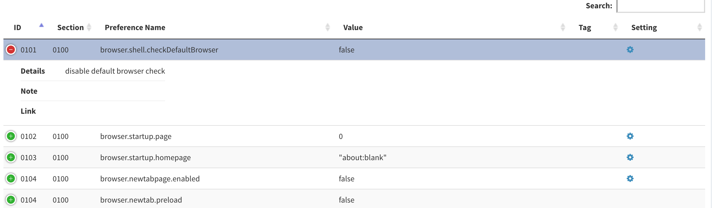
Ideally I think I'd like to stick to 1 row for each pref, if possible - see what you think of the latest version.. the full thing fits on screen even for my laptop.
You lose a little bit of sorting with some of the categories merged, but I don't think we are really loosing anything practical (e.g. is there any reason to sort by notes?).
Additionally, you can use the search box to filter (e.x: hidden shows only hidden prefs, warning shows warning tags etc.), and we could add additional filter buttons as we see fit.
Thoughts?
And thanks @crssi!
overdodactyl
on 5 Dec 2018
Some good stuff added - I see [Notes] get truncated at end of first line? Kinda swamped with other issues and 64 diffs is waiting. The data collection/quality is improving, but the UI needs work. The UI can wait. I will do a mock up at some stage to show you what I mean. It needs to be super easy and intuitive. Trying to filter for various tags or hidden settings etc right now is not clear, at all.
PS, right hand side needs some padding or something
PPS: :kiss: not criticizing .. loving it.. and brainstorming, throwing out ideas. FYI: part of my background was 10+ years in data reporting - designing real time reports and UI for generating them - which is exactly what this is. Data must be relevant, timely, and accurate. And the report must be meaningful, well laid out etc, and easy to understand =- all the tricks, indents, bold, white space, alignments etc.
So I think of this as the very top is the UI I would build, and bottom is the report itself. So the top would have checkboxes for filters for static items (settings, enforcing default if we want to build that in, warning tag, etc), and a search (which is really just another filter). The output itself I would design in at least two rows, and I would break up the flow with section titles.
Like I said, I could do a mock up in a word doc or just create one in photoshop or something. A pic is worth a thousand words (I'm trying to type that many!)
Thorin-Oakenpants
on 5 Dec 2018
I see [Notes] get truncated at end of first line?
I saw that as well - will have to find a better way to determine when a note ends
Kinda swamped with other issues and 64 diffs is waiting
No worries! I'll keep working on it as time permits, but don't feel any pressure to do anything for it
but the UI needs work
Definitely agree, just haven't really gotten to that stage of things yet
overdodactyl
on 5 Dec 2018
edited my last post BTW, rambled some MOAR :grin:
What we should do is decide WHAT items do we want in this? Then we can modify the user.js to enable you to easily pull the data out (eg you have problems with [notes]). Do we want to include inactive items as a filter that is off by default. Etc
Once we know all the fields we are going to show, and we have successfully been able to pull them all thru, THEN we can work on layout and presentation and using icons etc - including what to hide behind icons.
You know how it goes. SDLC's and all that shit
Thorin-Oakenpants
on 5 Dec 2018
not criticizing .. loving it.. and brainstorming, throwing out ideas.
Always appreciate feedback and suggestions! Not hard feelings at all...I know there's a lot of improvements to be had :)
Creating additional filtering options should be pretty painless and easy to add in. I think the biggest challenge/decision to be had is how to distinguish/separate different sections (both from a theoretical and implementation standpoint).
I think you're right though that we first need to decide on the info that we want to present. Just jotting down some notes...
Right now what we have, for active prefs:
- [x] ID (text)
- [x] Section (text)
- [x] Preference Name (text)
- [x] Value (text)
- [x] Description (text)
- [x] UI Setting (icon)
- [x] Hidden Pref (icon)
- [x] Links (~icon)
- [x] Tags (icon)
- [x] Notes (icon)
- [x] Tests (icon)
Things we could consider adding data/icons for:
- [ ] Inactive prefs
- [ ] Firefox version specifics (i.e. FF55+, FF57+ ...)
- [ ] OS specifics (e.g. Windows only)
UI elements we could add:
- [ ] Filters
- [ ] Links and refs to this repo
- [ ] Downloads for the updater scripts
Current issues:
- [ ] Multi-line notes
- [ ] Tags that are indicated by section header only
- [ ] Prefs that don't have a user_pref (see 0902/0903)
Feel free to edit list (or maybe a fresh issue would be nice, I don't know)
overdodactyl
on 5 Dec 2018
BTW, I'm using DT for the tables, just for reference of what type of features are available with it:
overdodactyl
on 5 Dec 2018
Start a new issue (you do it, so you can edit OP) called "Project X: Stage 1 [Data Collection]", add paste in your previous post with the current, consider, issues etc. And we'll close this, since it's getting outta control :)
Purpose of new issue is to solely focus on data quality, collection. When that's sorted out, we can close it and move on to Stage 2: Building the filter/search/sort options and Stage 3 [The UI/page itself]
Thorin-Oakenpants
on 5 Dec 2018
^^ see new issue
Thorin-Oakenpants
on 5 Dec 2018
Related issues
earthlng
·
78Comments
Thorin-Oakenpants
·
108Comments
 vertigo220
·
64Comments
vertigo220
·
64Comments
 claustromaniac
·
72Comments
claustromaniac
·
72Comments
 RoxKilly
·
60Comments
RoxKilly
·
60Comments