Use-package: Icon/logo for use-package?

All 77 comments
Something that looks like a package with an Emacs logo on the side would be nice.
 jwiegley
on 7 Dec 2017
jwiegley
on 7 Dec 2017
We could use this, changing the text on the side to use-package and sticking an Emacs logo on the left:
https://publicdomainvectors.org/en/free-clipart/Cardbox-package/40846.html
jwiegley
on 8 Dec 2017
I was thinking we could have a simple cube with purple outlines and possibly the Emacs E on the front side, which would be a flat square. Or it could even be an open box similar to the Dropbox logo but with the old emacs logo's pen in the box.
 nickmccurdy
on 8 Dec 2017
nickmccurdy
on 8 Dec 2017
@nickmccurdy Sounds good too! Wanna add it to the site?
jwiegley
on 8 Dec 2017
I cannot design or tweak an icon (you can see why I just used the Org mode logo for ox-hugo :)), but if you can provide me the SVG, I can convert that to favicon and relevant metadata in the site HTML headers.
 kaushalmodi
on 8 Dec 2017
kaushalmodi
on 8 Dec 2017
@nickmccurdy Do you want to take on this task of finding us a good logo?
jwiegley
on 10 Dec 2017
@kaushalmodi , I'll try to network with some friends to produce some svg icon files for use-package. Will try to post something up on this thread by Tuesday / Wednesday. Will try to get several options (option a, b, c, d, etc).
Just following up on reddit emacs subreddit thread @jwiegley.
 agsdot
on 11 Dec 2017
agsdot
on 11 Dec 2017
@jwiegley, @kaushalmodi and @nickmccurdy, here are several idea's being currently drafted by reddit user Chelache -- sorry no github/bitbucket/gitlab account as of yet. An acquaintance from work drafted these designs over the past several days. In addition, this individual may also have more designs in the pipeline.
According to my coworker, these two present draft designs "(are just) some quick designs… (and) I need to re-fine colors and details…" They were produced in both png format and svg format (but github markdown only allows the upload and presentation of png files).
Please do provide some feedback @jwiegley, @kaushalmodi, and @nickmccurdy.
Logo A

Logo B

Enjoy!
agsdot
on 14 Dec 2017
Nice colors! I like the second one more personally, I think the E makes more sense when it's in the same style as the Emacs logo.
nickmccurdy
on 14 Dec 2017
@nickmccurdy I'm on the opposite end of the spectrum (pun intended).. I personally would have preferred less range of colors and the instead have the Emacs purple the prominent color as in its official logo:

Design-wise, I liked the first option as it looks as a package, as in:

I think the E makes more sense when it's in the same style as the Emacs logo.
That's true too! May be have have logo on that box somehow? :)
Again.. just my opinion..
kaushalmodi
on 14 Dec 2017
@agsdot Thanks for getting back with these proposals!
but github markdown only allows the upload and presentation of png files
You can upload the .svg files anywhere else (dropbox, your github, Google Drive, etc.) and just link it here.
kaushalmodi
on 14 Dec 2017
Hm, how about @agsdot's logo B with the E on the lower right side of the box and purple sides? Also I would add three lines in the middle since it doesn't really look like a package at first.
nickmccurdy
on 14 Dec 2017
Here's the Emacs logo SVG for reference: https://github.com/emacs-mirror/emacs/blob/master/etc/images/icons/hicolor/scalable/apps/emacs.svg
nickmccurdy
on 14 Dec 2017
Thanks for the great feedback @nickmccurdy and @kaushalmodi. It is much appreciated. @jwiegley, can we get your feedback too, as the creator of the use-package package as well as one of the current GNU Emacs maintainers. What are your thoughts on the two logo designs currently present.
Chelache and I have already discussed a few things that @nickmccurdy and @kaushalmodi brought up. However, if you'd like to suggest even a third design scheme or a re-iteration of the two present designs, please do so.
I look forward to seeing use-package have a brand identity for it's documentation pages like Indium and Spacemacs. Having a strong logo and visual identity just makes a project that much more memorable and distinct.
Indium has a light blue and peach'ish color theme going for it, as well as the whole periodic science table feel. Spacemacs has a very strong purple / violet hue theme present in it's logo and documentation. When I recall "doc pages" I think "Oh yeah, jquery has those blue themed pages" and "spacemacs has those purple themed pages" along with of course the iconic logos of both projects.
cc'ing @NicolasPetton and @syl20bnr . If you have any thoughts and suggestions on forming a strong marketing and brand identity, please do so provide feedback.
Lastly, @jwiegley thanks for being a fantastic use-package creator and maintainer, and creator of so many more emacs packages (often shared on github), and also serving as a GNU Emacs maintainer. The work you @jwiegley and @Eli-Zaretskii do as GNU Emacs Maintainer's is greatly appreciated. Both on a technical front and on a community building front -- the communications and social efforts on reddit -- are greatly appreciated.
agsdot
on 14 Dec 2017
Hi @agsdot, I prefer the shipping box shown above, but would love it if the Emacs logo could be embossed on the side somehow. Thanks for doing this work!
jwiegley
on 16 Dec 2017
I like the concept of Logo B as it can be read in two different ways, both of them make sense. I love this.
First read is the hexagonal shape which puts the E inside a box with straight lines which contrasts so well with the original logo which is circular: it gives me the idea of a different structure for our Emacs configuration. This is one of the strong benefit that use-package brings to the table —> a new organization / structure for Emacs configs —> a new shape for the logo.
Second read is the shipping box and this one is simple to interpret, although use-package is not a package manager, the shipping box fits with it as it directly refers to the package word.
The first read is what makes it so strong for me.
I would change the colors to keep the purple theme of the Emacs original logo.
 syl20bnr
on 16 Dec 2017
syl20bnr
on 16 Dec 2017
Thanks for the feedback @jwiegley and @syl20bnr on both logo design preferences. I will coordinate further with Chelache on getting a reiteration of Logo B produced or an alternatively new Logo C. Expect a design by later next week (Wed/Thurs/Fri).
Before I ask for clarification on the feedback for Logo B, and a proposed Logo C. I would just like to express support/preference that @jwiegley have the deciding vote, so to speak, on which Logo design is chosen. He is the creator and maintainer of use-package, and he one of the current GNU Emacs Maintainer. In previous PR and Issue posts he has indicated that use-package will soon be integrated into Emacs or GNU ELPA Packages -- see https://github.com/jwiegley/use-package/issues/282. @jwiegley holds a bigger/broader picture of the branding of use-package and Emacs in light of his role in both projects.
Ok, so here we go, feedback as to the recent comments:
Regardless of logo design choice that is picked, I think a crucial question is "What color schemes will be consistent and promoted by BOTH the logo and the documentation." Designing use-package logo with the Emacs iconic purple logo being prominently featured sounds great. Now I'm wondering, in the documentation what other colors will be "highlighted" and used in the html h1/h2/h3 and bold/strong/code blocks. Spacemacs documentation has a purple white and black theme running strong throughout the docs page. jQuery, a blue theme. Indium, the blue and peach-ish color theme used consistently in both the logo and the documentation.
I'm going to discuss with Chelache from a design perspective (Chelache works as a User Experience Designer, and regularly designs the interfaces for mobile apps, websites, and print layouts) what colors look good together (whether its two colors, three colors, four colors, etc).
I'd like to match the color schemes of the logo with whatever future documentation in produced. @kaushalmodi thank you for putting in the pull request to add the static site use-package documentation. I'm guessing that you're also going to be the lead on the html color themeing of the site (whether it's purple and black, or purple brown and black, or some other color scheme (e.g. lightblue, teal, magenta, yellow of the first iteration of Logo B -- which will be modified as per feedback from @nickmccurdy and @syl20bnr!)
@jwiegley and @syl20bnr, I uploaded two photos in the following Github Issue update to accompany the following two sections/questions for each of you.
@syl20bnr, I'm glad you like Logo B. You suggested it being modified to be purple. Now, here's my next question :) . How many variations of purple should be on the logo if we go on that one? The border has three seperate tones/colors, and there is the interior yellow tone, and the white emacs lettering. Five colors in all. In light of the previously uploaded sketch/picture of the current Logo B. Should i, ii, iii still be three colors, but just three different shades of purple, or perhaps two colors or even one? For iv should this section still be yellow'ish or perhaps another color? Generic colors and hexadecimal color codes would be appreciated if we go through with this design.
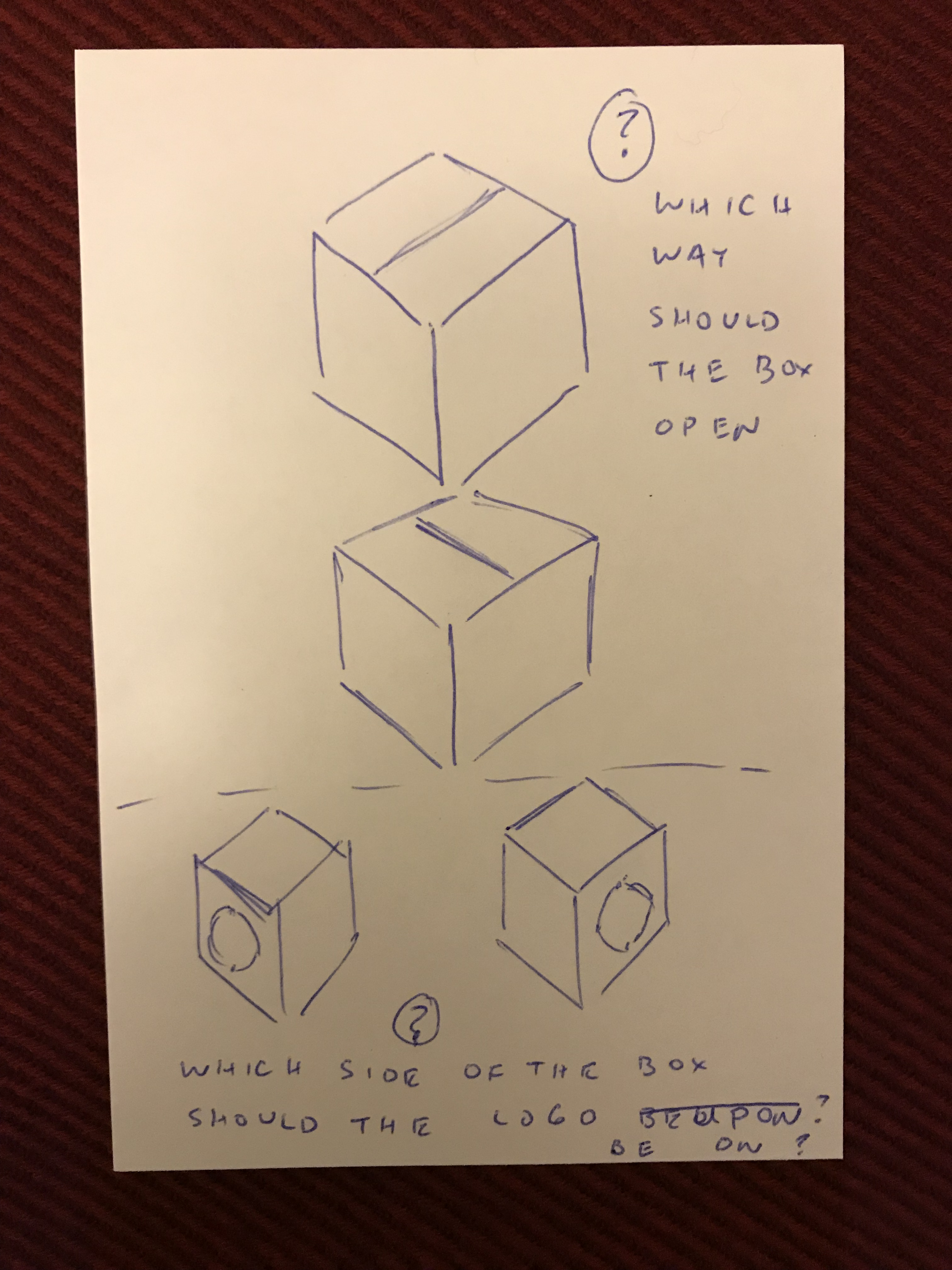
@jwiegley, if we go with Logo C, do you want the actual documentation text to be just black and purple... reminiscient of Spacemacs documentation, found on http://spacemacs.org/doc/DOCUMENTATION.html? Or will it be include one other color (brown? blue? etc). I do not think it would be good if the use-package documentation pages use the exact same purple, white, black color scheme that Spacemacs is using. Use-package should have a differentiator such that when someone sees Indium, or Spacemacs, or JQuery, or Use-Package, they know immediately they are on a totally distinct project. Also, if we go for Logo C, I need clarification on how you want the logo produced. The attached photo "draws" out the differences, in brief: which way should the box open, and which side of the box should have the emacs logo on it?
My main concern is that there is and should be a coherency between the colors of the logo and the colors of the documentation. Depending on the logo, that will affect what colors should be decided for the documentation. Since the logo hasn't been decided, I'd like to brainstorm and think of what would be a distinctive style / color scheme for the documentation and work backwards from there (and as such affect the color choices for the logo).
So those are my thoughts for now, until next week when I will speak with (Chelache about the design feedback on this use-package Issue-577.
agsdot
on 17 Dec 2017
Logo B questions:
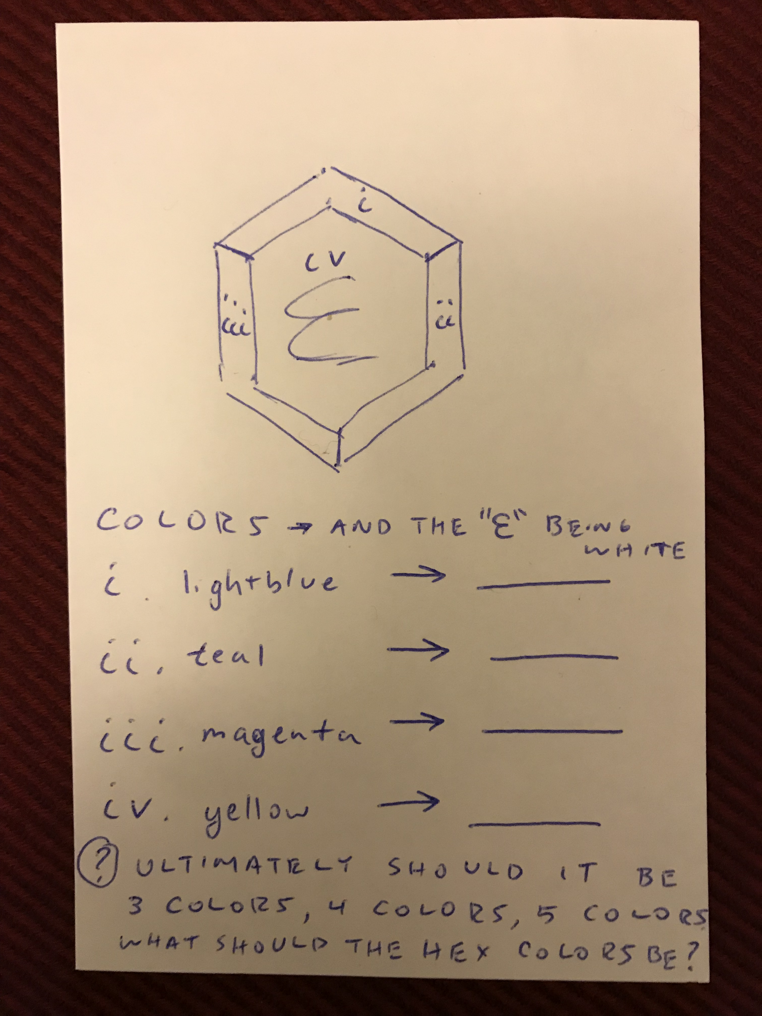
Logo C questions:
agsdot
on 17 Dec 2017
Hi!
Regarding the colors, when I made the new logos and homepages of Emacs and ELPA, I went for a strong gradiant each time (purple for Emacs, bordeaux for ELPA). I also made sure that the "E" of Emacs was prominently displayed in both designs. To be consistent with that choices and give Use-package a coherent design, I would pick a warm color (probably some shade of orange), and make a large gradient of it where the Emacs "E" letter is displayed.
Just my 2 cents :)
 NicolasPetton
on 17 Dec 2017
NicolasPetton
on 17 Dec 2017
I'd like to match the color schemes of the logo with whatever future documentation in produced. @kaushalmodi thank you for putting in the pull request to add the static site use-package documentation. I'm guessing that you're also going to be the lead on the html color themeing of the site
Of course. Once the logo is finalized, I'll set the doc site theme to the prominent logo color.
kaushalmodi
on 17 Dec 2017
@jwiegley, please provide feedback on the logo you prefer. Logo A, Logo B, Logo C (please see the rough sketch I proposed above).
Chelache has a couple more iterations on designs based on Logo B and Logo C (from the previous 20 something github issue comment threads, it sounds like Logo B and Logo C are the favored ones).
With regards to color schemes, @NicolasPetton suggested a bordeaux / wine / maroon color. Thanks for the excellent feedback @NicolasPetton! We definitely want design coherency and a strong visual identity for major GPL / FSF licensed pieces of software.
@jwiegley, if we go with the Logo C design you proposed ( a box or package with the emacs logo on one side of it), do you want the emacs logo (with it's current violet/purple hue circled background also imprinted on the bordeaux / maroon colored box? The distill the question, give me the hexadecimal color scheme. Color 1 = bordeax, Color 2 = (white? transparency?), Color 3 = ( give me a third hexadecimal code).
Chelache and another colleague UX/UI Designer are ideastorming concepts for color schemes (a two part color scheme, a three part color scheme -- P.S.A. color.adobe.com is fantastic for playing and messing around with mixing and matching ideal colors together). Both Chelache and my other colleague would like to know your feedback @jwiegley and @NicolasPetton on color schemes you like with bordeaux.
Lastly, this is the most IMPORTANT question, that I would like to solicit feedback from the whole use-package community but especially: @jwiegley, @kaushalmodi, @nickmccurdy, @syl20bnr, and @NicolasPetton. Chelache requested that I post this question. It makes a design difference in that different colors, curvatures, textures, angles can be selected accordingly. This question about three adjectives tries to derive what the "essence" that the use-package logo should convey.
Please use three adjectives to describe use package community. For example, “professional, calm and precise, “”warm, welcoming and friendly,” or “playful, happy and adventurous.”
Happy Holidays everyone.
P.s. Chelache will be working on producing a logo today (Thursday PST) and on Friday. I would like to have a logo (svg / png file shared) by Thursday or Friday and posted to this thread. However, due to the Holiday festivities and the New Years celebration, there is the possibility that I may get back at this thread with the new Logo B / Logo C iteration after January 8th. (business week Monday Jan 8 through Friday Jan 12).
agsdot
on 21 Dec 2017
P.S.A. (perhaps I'm butchering the capitalization or the punctuation) defined is "Public Service Announcement." I saw that acronym used occasionally on reddit and other internet forums/comments.
agsdot
on 21 Dec 2017
@agsdot I like Nicolas' suggestion of bordeaux / wine / maroon color, but again would love to see the logo having that one dominant color theme instead of having all primary colors thrown in.
Please use three adjectives to describe use package community.
I am not sure how that would help.. Are you using that as a basis to pick warm vs cool colors?
I think of use-package as "warm, precise, and adventurous" :)
- warm because you get a warm fuzzy feeling that once you have set a package to load using
use-package, it will just work - precise because I can configure
use-packageto do exactly what I want to do - adventurous because the development of this package is taking in all the suggestions from the community (in a good way!), and personally @jwiegley accepted my suggestion for the doc site :)
kaushalmodi
on 21 Dec 2017
@kaushalmodi, thanks for the rapid feedback! I just clarified and edited the prior post.
Chelache asked me to post that question, and I thought it to be the most important question in that in marketing / business development / sales, one does not sell an item based on just specification but on emotions.
Samsung and Apple don't just sell hardware specs--and Apple definitely doesn't. There logo's, commercials, visual prints in magazine ads evoke a certain emotional response from the reader and viewer. They want the viewer to "feel" something, and have a "positive connotation" of their product with a great emotion.
agsdot
on 21 Dec 2017
Logo C is fine with me; I'll leave color and placement decisions up to you!
jwiegley
on 21 Dec 2017
Thanks @jwiegley, I'll coordinate with Chelache about using Logo C. Thanks for "(leaving the) color and placement decisions" up to @agsdot and Chelache.
Will discuss with Chelache and others about the ideal logo color (2 toned, 3 toned) schemes to use, and what the accompanying docs / readthedocs / ox-hugo style guide should be for h1/h2/bold/italics color theming should be. After the new iteration of Logo C is shared. The style guide (the two tone or three tone) hexadecimal codes will be shared with @kaushalmodi.
agsdot
on 22 Dec 2017
would love to see the logo having that one dominant color theme instead of having all primary colors thrown in.
For whatever an additional opinion is worth, I'd like to chime in to say I like this idea - I think it's more consistent with the Emacs/Elpa logos and that feels right if use-package is to be included in emacs core.
 dieggsy
on 22 Dec 2017
dieggsy
on 22 Dec 2017
Thanks for sharing @dieggsy! Your opinion is much appreciated.
agsdot
on 22 Dec 2017
Update: Logo C will be shared on this thread on the business week of January 8 - January 12.
agsdot
on 23 Dec 2017
@jwiegley, here is a revised iteration of Logo C. I am attaching a png file. Both png files and svg files can later be shared -- @kaushalmodi where is the best place to share svg files online (imgur for png and gif files, but where for svg files)?
@chelache / Chelache can you share what hexadecimal color codes were used for the logo?
Thanks @jwiegley @chelache @kaushalmodi!

Thanks for providing feedback as to if more iterations and revisions are needed, and how to best share the svg file so that it can be used on the ox-hugo based use-package documentation site.
P.s. @jwiegley another concern, is the FSF copyright and licensing responsibilities that are to be done. I did not make or create the logo's, @chelache did. I know that for Emacs and most of the ELPA projects the GPL / GNU / FSF paperwork has to be done for code contributions. What is the method by which graphic arts contributions are to contributed to FSF projects? Both @chelache and I look forward to seeing the new logo incorporated in use-package, and have no issue with the required paperwork.
agsdot
on 12 Jan 2018
I randomly stumbled upon this issue and haven't contributed to use-package but as a fellow user, the fact that the white line in the middle doesn't go all the way down is mildly-infuriating.
 justinjk007
on 12 Jan 2018
justinjk007
on 12 Jan 2018
Color Hex codes from the darkest to the lightest bordeaux are: 783A46 -> AE8990 ->BEA1A6.
 chelache
on 13 Jan 2018
chelache
on 13 Jan 2018
Looks like a great logo to me. I'd e-mail [email protected] directly to ask them about the licensing question.
BTW, my favorite color is purple, if that means anything. :)
jwiegley
on 13 Jan 2018
@agsdot @chelache
Can you update the icon with these 2 fixes:
- Have the white line in the middle go all the way down as @justinjk007 noted.
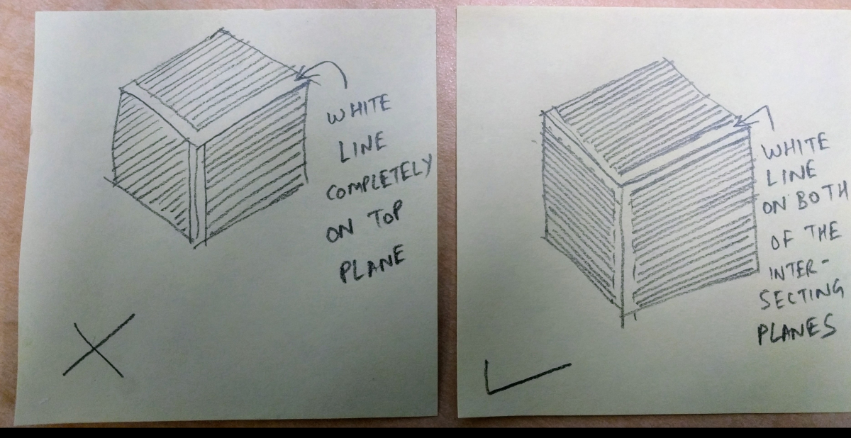
- The white line in the middle seems to be at the center of the 2 panes that intersect to form it. But the top 2 white lines seem to lie on top of the top plane, and not at the center of the intersecting planes.
I am trying to explain the second point above using this crude picture:
kaushalmodi
on 15 Jan 2018
@jwiegley Thank you for the feedback. I am glad you like the logo.
@kaushalmodi @justinjk007 Your suggestions on the design are appreciated. To address your concern regarding the middle white line, it doesn't go all the way down because the bottom part of the logo represents a letter "U" for use-package.
chelache
on 18 Jan 2018
@jwiegley, I will coordinate and contact/email [email protected] with regards to the question of licensing of visual images and logos. I'm glad you like the logo and that the bordeaux color scheme coincides with your favorite color of purple.
@jwiegley, what are your thoughts as to the recent comment from @chelache. What are your thoughts with the logo.
There was some thoughts shared by @justinjk007 about the middle white line. @chelache shared that the "bottom part of the logo represents a letter 'U' for use-package." Several people gave "thumbs up" reaction to that comment. What is the final decision @jwiegley , which proposed design would you like better?
@kaushalmodi, interesting insight! I did not notice that subtle yet intriguing visual detail about the "planes" of the image. I will coordinate with @chelache as to modifying the existing design.
agsdot
on 26 Jan 2018
I gave a thumbs up to @chelache comment because he explained why the line didn't go all the way to the bottom and he appreciated my comment. I still think it looks weird and a design that has to be explained is not the best design IMHO(I mean I don't see the U lol). Also thinking about what @kaushalmodi is pointing out, I think unlike the picture he is drawing if you make the white shade on the bottom too, it will just look disproportionate, because unlike the textured rough draw on paper, the image has plane colors on all sides, this is what I mean. But this is just my opinion.

justinjk007
on 26 Jan 2018
I like the proposal, I'm waiting for a purple version or maybe I did not understand correctly what @jwiegley meant. Not sure if a purple version will be proposed.
I'm with @justinjk007, I don't see the U no matter how hard I try. All my brain sees is an arrow pointing downwards or some kind of V. But the letter that stands out the most for me is a white Y.
But overall I like the concept.
syl20bnr
on 26 Jan 2018
@justinjk007
unlike the picture he is drawing if you make the white shade on the bottom too, it will just look disproportionate, because unlike the textured rough draw on paper, the image has plane colors on all sides,
I didn't follow.. in your illustration, you have the vertical white line thinner. If all 3 white lines are equal widths, it should look good.
Also, the implied U using the shorter vertical line is not evident to me too. It might be interesting to see an alternative icon that:
- Has purple tones
- All white lines of equal lengths and widths
- With the plane offset fixed that I mentioned earlier.
kaushalmodi
on 26 Jan 2018
@kaushalmodi
Oh yeah you are correct.
justinjk007
on 26 Jan 2018
At least to my eyes, Bordeaux looks like a shade of red...
jwiegley
on 27 Jan 2018
@jwiegley, should @chelache coordinate it such that the three color pallet appears more purple?
I'm keeping in mind the color schemes and themes of the gnu emacs and the elpa website. Frankly, I'm also trying to keep in mind the restrictions of color and thematic coherency of having use-package blend in well with the themes for the gnu emacs website as well as the elpa website.
@jwiegley and @NicolasPetton (the creator / maintainer of the gnu emacs website and the elpa website), what are your thoughts on the "U" in the present use-package design. It's subtle, but @jwiegley, make the call.
agsdot
on 30 Jan 2018
@agsdot I prefer the designer to be happy. If you guys like this color, run with it!
jwiegley
on 30 Jan 2018
@agsdot Where is this "U"?
jwiegley
on 30 Jan 2018
like this it would be possible to get an U and still have a package (just a quick "sketch" with, cough, powerpoint):

 hubisan
on 20 Feb 2018
hubisan
on 20 Feb 2018
@hubisan I like your iteration, but the light lines are too thin for the logo to be displayed in small sizes.
NicolasPetton
on 20 Feb 2018
@NicolasPetton Yes, the line needs to be thicker :-) Would like to hear if anyone likes the sketch first. Can work on it afterwards and come up with some variants.
hubisan
on 20 Feb 2018
@hubisan This looks great!
I was wondering is a more flat design would look good. i.e. get rid of the edge lines completely and use a 2-tone design to distinguish the box planes.
Let's say you have 2 tones of the purple color: P1 and P2.
Then:
- Left part of U in P1
- Right part of U in P2
- Left white part in the plane where the left part of U is, in P2
- Similarly P1 in the right white portion.
We should not need the edge lines then.. how would that look?
kaushalmodi
on 20 Feb 2018
And then to stick with the flat design, may be keep the top plane of the box completely white or may be a third tone of purple P3? i.e. don't let the tips of U continue on the top plane.
kaushalmodi
on 20 Feb 2018
@hubisan I love it!
jwiegley
on 20 Feb 2018
@jwiegley nice to hear :-)
@kaushalmodi did some more iterations including your idea, didn't like it when compared to having a line
@NicolasPetton made line a tad thicker, tried even thicker lines, but didn't like those
After some iterations (winner of each round on left) I almost ended (last line) where I started :smirk: ... almost:
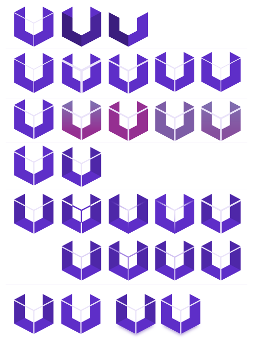
Those are my final candidates. It's also nice to use drop shadow (versions below) unless the logo needs to be small (favicon ...):

Do you guys like it? Then choose between
- left or right and
- drop shadow at bigger sizer yes or no.
hubisan
on 21 Feb 2018
Somehow I'm tending towards the right version, but it's a close call.
hubisan
on 21 Feb 2018
@hubisan I could go either way, your call.
jwiegley
on 21 Feb 2018
@hubisan These are great! Thanks for trying out my suggestion.
kaushalmodi
on 21 Feb 2018
@hubisan FWIW, it think left with drop shadow, minus the thin lines would look ncie
dieggsy
on 21 Feb 2018
@jwiegley, wow, I'm really liking how ideas are being developed and evolving off of one another. It's really neat to observe.
Question, how necessary or not necessary is the presence of the Emacs "E" calligraphic logo in the use-package logo? (yes it's necessary / no it's not necessary)
By not using an "E", it gives more artistic and design freedom to how the logo can be created.
agsdot
on 21 Feb 2018
@hubisan great work! All four look good IMO (although I have a personal preference for the one in the bottom left).
NicolasPetton
on 21 Feb 2018
@agsdot was asking this question myself and came to the conclusion that in general using a logo inside a logo has at least those two major drawbacks:
- What happens if the "foreign" logo is changed?
- If you need a small size version of your logo it's impossible to have the "foreign" logo still be really visible unless you make it somehow almost the same size as yours.
Therefore I decided to have a go without the E.
hubisan
on 22 Feb 2018
I like the right side. It's hipper. To additionally hint the box spoils it for me a bit. :smile:
 steckerhalter
on 22 Feb 2018
steckerhalter
on 22 Feb 2018
@hubisan , thanks I didn't think of those things previously. @jwiegley suggested using the emacs logo within the package design and in coordinating with @chelache , we went with this design suggestion.
I like your conclusion about not using the letter E (the Emacs E within the use-package logo design).
One thing I want to give feedback on is, with your current design with the "netting" or "webbing" in the interior of the U, this restricts what kind of background color can be used.
The netting/webbing (sorry, in some ways this reminds me of a certain marvel character from New York City with an Uncle Ben and Aunt May...) produces an area that only safely matches with gray scale colors of the following: white, black, and gray.
Using https://color.adobe.com/ one can find color schemes that go with the light purple shade (e.g. triad monochromatic complementary color schemes) for a background.
agsdot
on 23 Feb 2018
@hubisan, what I mean is that my biggest concern is how flexible your logo is with allowing different background colors and color schemes on a website. White and black backgrounds are somewhat boring. And the current gnu emacs and gnu elpa site have a "peach" and "tan" background color scheme going for them. The logo's on those site are solid and do not have areas with negative space.
agsdot
on 23 Feb 2018
I agree with @steckerhalter (by the way, thank you for creating the excellent quelpa package), your logo is very hip and modern.
The box effect hinting I like.
Of the logo pallet you created @hubisan , these are the two I like the best -- the logos that are completely solid and have no negative space to potentially conflict with varying background color schemes used for the website.

agsdot
on 23 Feb 2018
@jwiegley and @hubisan, I'm liking how this conversation is evolving and we're getting a larger proliferation of great ideas. All that being said, @chelache and I will be responding soon with a revised logo :smirk: :smiley:
agsdot
on 23 Feb 2018
@agsdot I actually thought about the background color already. There are quite a lot colors that can be used as background without any change and for the other cases it's quite nice to draw a box around like so:

Looking forward to seeing your response.
hubisan
on 23 Feb 2018
Top right would be my choice.
justinjk007
on 24 Feb 2018
@jwiegley and @hubisan , I spoke with @chelache. We both like the design that you have created @hubisan . I'm glad that the conversation for the prior suggested design, helped influence the current design.
@jwiegley , let's move forward with the this design.
agsdot
on 27 Feb 2018
@hubisan I still like the logos you created that did not have the netting internally.

1) How will the logo look up close vs from a distance?
2) The netting reminds me somewhat of the Marvel Films Spiderman.
3) Without the netting the background color choice scheme is simpler *.
P.s. I appreciate the four variation pallet you suggested three thread entries up. I'll use geometry coordinates to be more specific in the following description. In quadrant 1 and quadrant 2, with the netting there, one has to use a white backdrop, without netting, two colors are needed or maybe three at most. Requiring the white background may put some design limitations on the future color schemes of the site.
agsdot
on 27 Feb 2018
@hubisan Of the last 4 logos you showed in your comment, I like the bottom-left one the most. I like the white lines that suggest the rest of the box. Without them, like @agsdot just showed, unless you already know that it's a box it's hard to see it.
jwiegley
on 28 Feb 2018
I like the new logo, somehow I want to see a downward arrow when I see it :-)
I'm not really fond of the sharp corners though, I feel that use-package is a warmer and cuter emacs package ahah

syl20bnr
on 28 Feb 2018
@syl20bnr Thanks for the input. Tried to add that arrow but whatever I tried it somehow crippled the U. Rounded corners look nice ("sketch"):

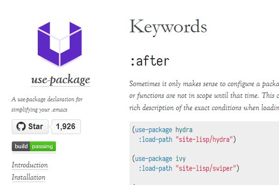
This is how it would look in place (added two color schemes that matches the current page better):
(1)
(2)
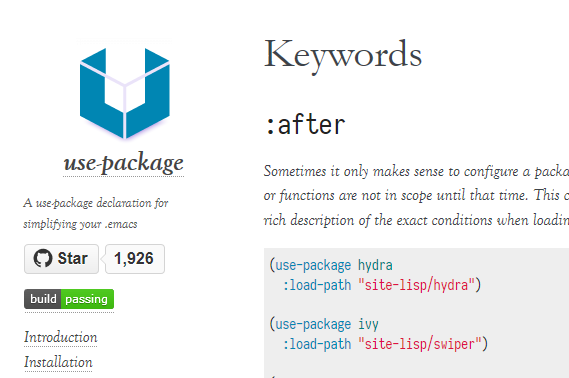
(3)
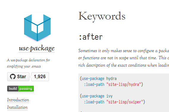
@jwiegley Which color scheme you like the most?
I'll proceed to create a clean version with rounded corners to compare it to sharp corners.
hubisan
on 28 Feb 2018
Nice, I still really like how the first one is looking.
nickmccurdy
on 1 Mar 2018
@hubisan The purple. :)
jwiegley
on 1 Mar 2018
I like the purple one too. @hubisan great logo designs!
agsdot
on 1 Mar 2018
Tried some rounded corner, but didn't like it. So I just polished the purple version from above:

Will make a pull request using a svg version as logo and update the favicon.ico as well.
hubisan
on 4 Apr 2018
Love it. :)
jwiegley
on 4 Apr 2018
@hubisan Nice! I really like it! 😄
agsdot
on 4 Apr 2018
It definitely gives a strong identity and image for use-package
agsdot
on 4 Apr 2018
Related issues
 cswarth
·
5Comments
cswarth
·
5Comments
 sheepduke
·
3Comments
sheepduke
·
3Comments
 jtecca
·
9Comments
jtecca
·
9Comments
 wbolster
·
13Comments
wbolster
·
13Comments
 kirk86
·
6Comments
kirk86
·
6Comments
Most helpful comment
like this it would be possible to get an U and still have a package (just a quick "sketch" with, cough, powerpoint):
