Umbraco-cms: Simplify Drop-files area
Let's simplify the drag n' drop file feature.
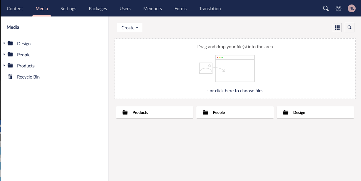
Having a visual space for dropping files is not necessary anymore. Most users know that they can drag and drop a file. Even if they aren't sure they will investigate by trying. Therefore I suggest we remove the box describing the drop-feature, leaving more space for Media overview.
My proposal is to remove the drop-area. But add an "upload"-button for those who still like to click and get the file-browser straight away.
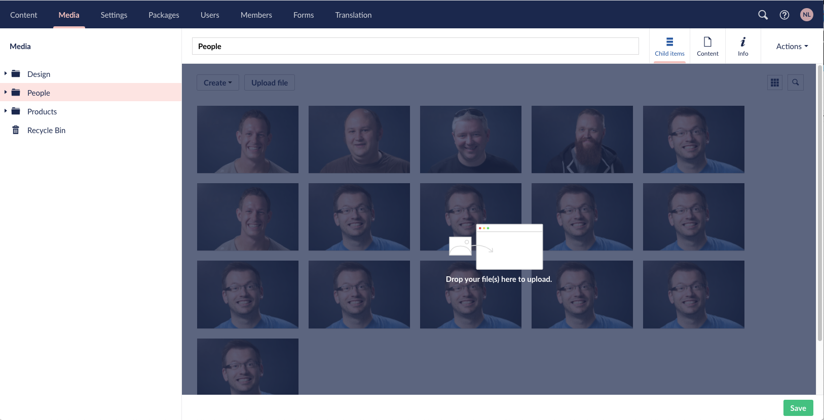
If user drag's a file or files on top of the browser we should show an overlay, describing the drop-feature. Like this:
This line from Nathan describes very well how this could be done in a good way:
"dragging an image into the browser shows the dropzone - image doesn't need to be over the zone before the UI updates. Works in two steps: when the drag enters the browser, the UI updates to show the dropzone in greyscale, then flips to full color when the drag enters the dropzone."
Notice this would be good to align in the Media Picker as well, with a similar experience. https://github.com/umbraco/Umbraco-CMS/issues/8075
Feel free to make this happen in the way you feel is best, or bring your thoughts in the comments.
Thanks
 nielslyngsoe
All 4 comments
Like the idea of making media more propionate, however I do feel you lose some user guidance that they can drag and drop files/folders into the media section.
Maybe the first "image" space could be used as a drag and drop indicator? Or using the whitespace near the upload file button?
Matt
 Matthew-Wise
on 7 May 2020
Matthew-Wise
on 7 May 2020
I like it, and am all for simplicity, but do agree with Matt - the lost user guidance might be an issue.
Outlook web app has a nice UI interaction where dragging an image into the browser shows the dropzone - image doesn't need to be over the zone before the UI updates. Works in two steps: when the drag enters the browser, the UI updates to show the dropzone in greyscale, then flips to full color when the drag enters the dropzone. Pretty slick. No indicator in the UI though that drag and drop exists, so maybe it isn't necessary and users are generally aware they can drag...
 nathanwoulfe
on 8 May 2020
nathanwoulfe
on 8 May 2020
Anyone picking this up should probably take this into account: https://github.com/umbraco/Umbraco-CMS/issues/8040#issuecomment-629108012
 kjac
on 15 May 2020
kjac
on 15 May 2020
I think Nathans take is really good, a great description of how this can be made in a nice way.
I dont think we need to worry about showing a drop-area unless a file is begin dragged. My impression is that most users know they can do so, otherwise they will try it out. And for those who just dont know about it, they can still use the upload-button 🤗
nielslyngsoe
on 18 Jun 2020
Related issues
 sniffdk
·
3Comments
nielslyngsoe
·
3Comments
sniffdk
·
3Comments
nielslyngsoe
·
3Comments
 jesperordrup
·
3Comments
jesperordrup
·
3Comments
 robertjf
·
3Comments
robertjf
·
3Comments
 PullensDennis
·
3Comments
PullensDennis
·
3Comments
Most helpful comment
I like it, and am all for simplicity, but do agree with Matt - the lost user guidance might be an issue.
Outlook web app has a nice UI interaction where dragging an image into the browser shows the dropzone - image doesn't need to be over the zone before the UI updates. Works in two steps: when the drag enters the browser, the UI updates to show the dropzone in greyscale, then flips to full color when the drag enters the dropzone. Pretty slick. No indicator in the UI though that drag and drop exists, so maybe it isn't necessary and users are generally aware they can drag...