Umbraco-cms: Consider Adding an Active State for Expand (...) in the Top Section Navigation
UI/UX Improvement
Umbraco v8+
If you were to log into the Umbraco v8 Backoffice you'd be presented with a top navigation, dark blue, consisting of all the sections you have been granted access to. For an administrator with access to them all, some sections may only be accessible through the expand (...) link.
My suggestion is that if such a section is currently active, that the expand link (...) should have the same active state as other sections.
Step-by-Step | Screenshot
------------ | -------------
Here we have the content section, active by default: | 
And if we have too many sections, they will be hidden behind the expand (...) menu link: | 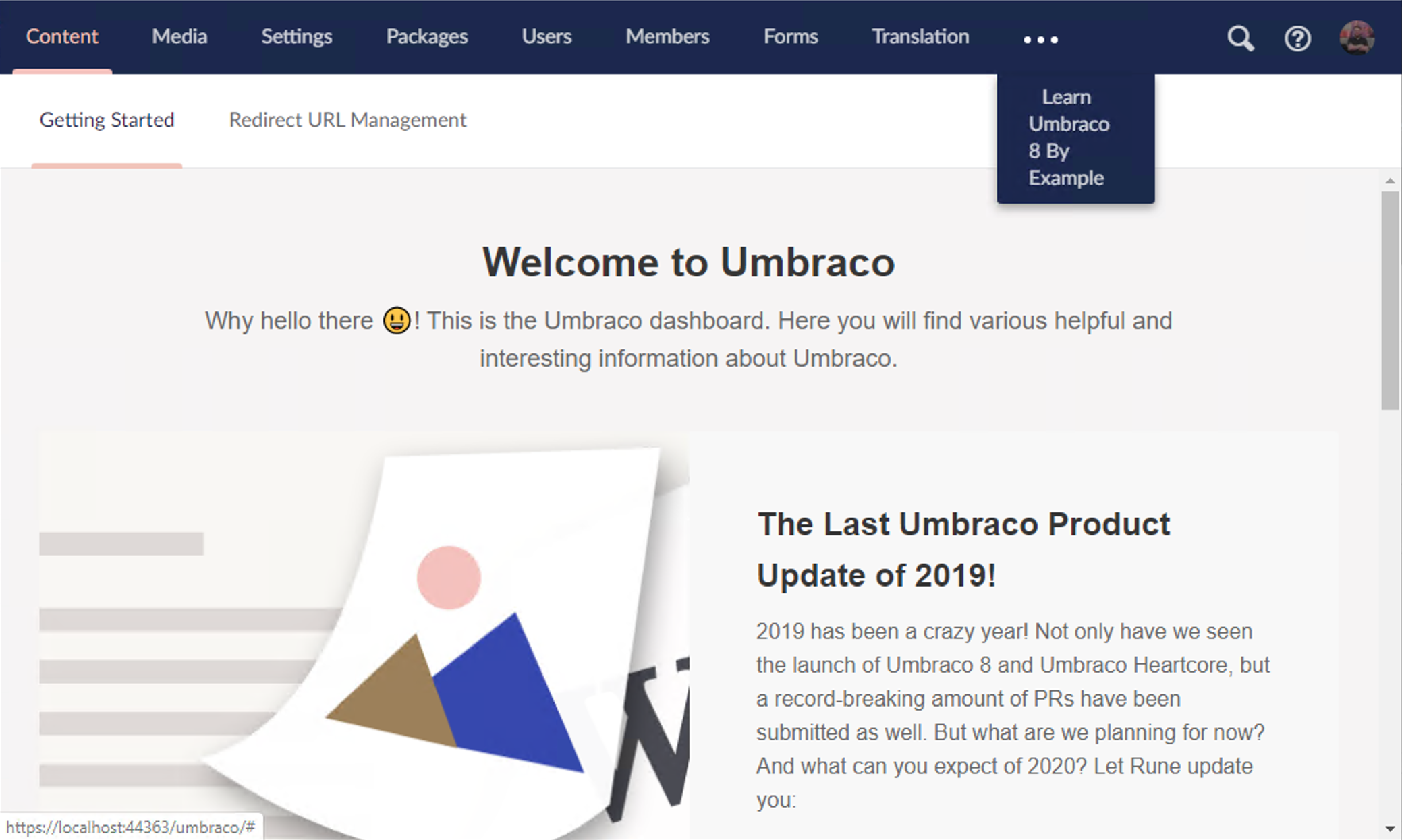
And if we were to navigate to one of these sections, we lose the "active state" from before: | 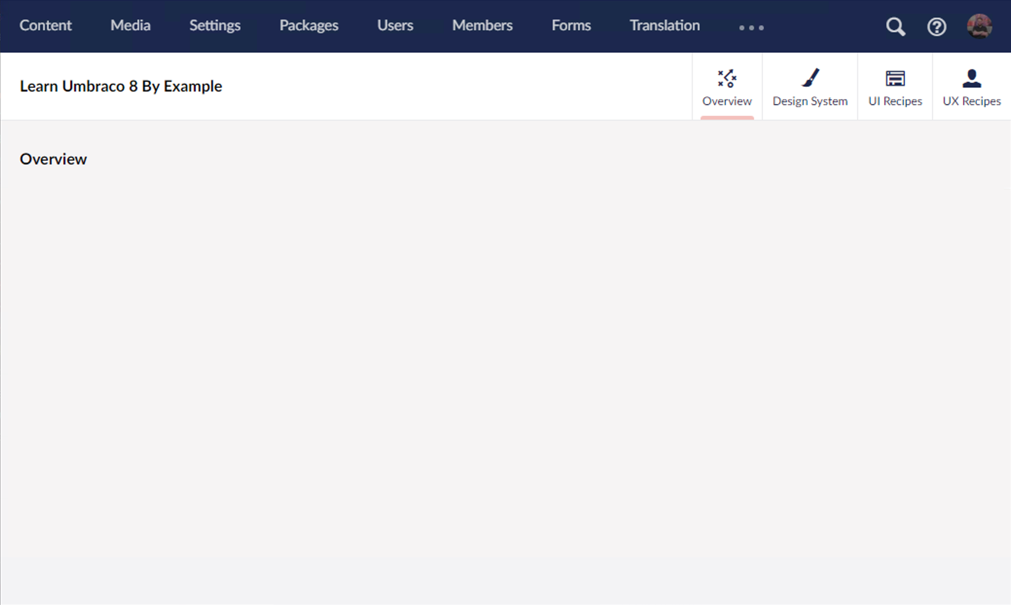
I know this is a trivial, nit-picky, low-value ask – but I propose we apply an active state to the expand (...) menu item in this scenario: | 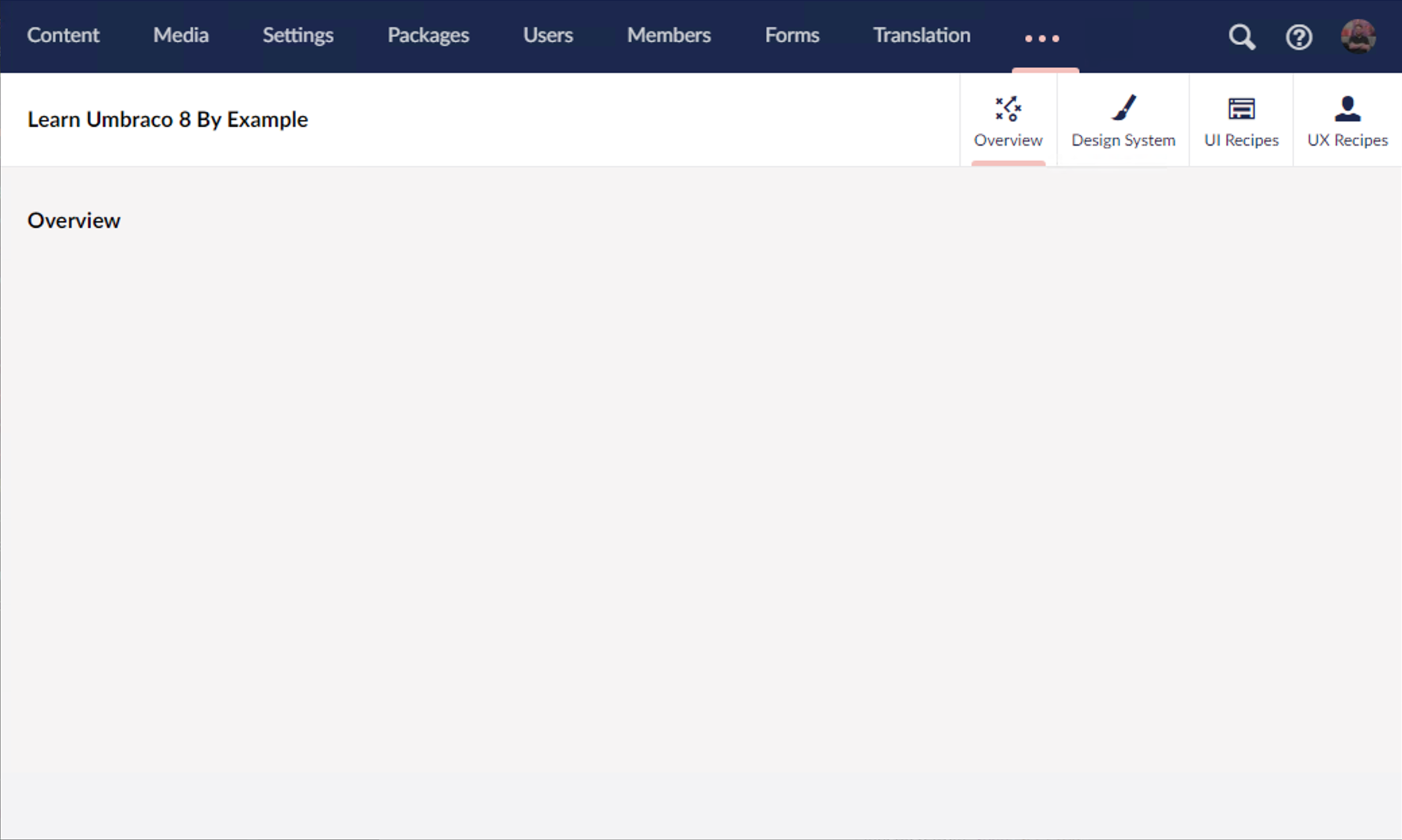
The solution I hope is simple:
- Apply the
currentclass to the expand (...) menu item if a child is currently active. - Update the CSS for the expand (...) link so that if the
currentclass is applied, each dot matches the active color#f5c1bcand the opacity is set to1.0.
 markadrake
All 4 comments
Not nit-picky at all, change provides important context to explain where-the-hell-am-I. UI should be consistent, this would make it so.
 nathanwoulfe
on 18 Jan 2020
nathanwoulfe
on 18 Jan 2020
This makes total sense! If you or someone else reading along would like to pick it up, we'd be happy for the help! 👍
 nul800sebastiaan
on 21 Jan 2020
nul800sebastiaan
on 21 Jan 2020
Hi @markadrake,
We're writing to let you know that we've added the Up For Grabs label to your issue. We feel that this issue is ideal to flag for a community member to work on it. Once flagged here, folk looking for issues to work on will know to look at yours. Of course, please feel free work on this yourself ;-). If there are any changes to this status, we'll be sure to let you know.
For more information about issues and states, have a look at this blog post
Thanks muchly, from your friendly PR team bot :-)
 umbrabot
on 21 Jan 2020
umbrabot
on 21 Jan 2020
Thank you @nathanwoulfe & @nul800sebastiaan,
If in a few days nobody has picked this issue up and ran with it, I'd be happy to make the changes myself. I think this would be a good first-time issue for anyone who's looking to contribute to Umbraco, but for whatever reason hasn't. I'm also happy to provide guidance to them (if you are reading this and want to contribute just message me!).
If I haven't seen movement or interest by next week, count me in!
All the best,
markadrake
on 21 Jan 2020
Related issues
 PullensDennis
·
3Comments
PullensDennis
·
3Comments
 aochmann
·
3Comments
aochmann
·
3Comments
 Frost117
·
4Comments
Frost117
·
4Comments
 nielslyngsoe
·
3Comments
nielslyngsoe
·
3Comments
 junkin77
·
3Comments
junkin77
·
3Comments
Most helpful comment
Not nit-picky at all, change provides important context to explain where-the-hell-am-I. UI should be consistent, this would make it so.