Ultimate-geography: Review and improve maps
- Check quality and file size of all maps and replace the worst ones.
- Prefer SVG or PNG format rather than JPEG.
- Add source URLs and attributions to LICENCE file.
 axelboc
All 22 comments
Experiment with hashes in SVG URLs:
- Select a few regional SVG maps from Wikipedia
- Define a path for each country and give it an ID
- Add
:target { fill: <colour>; }to the CSS of the Anki cards or of the SVGs - Set the
srcattribute of the image in the map field of each note to<regional-map>.svg#<country-id>
This could make the deck a lot lighter, as regional maps would not have to be duplicated. It would definitely guarantee consistency across all maps. It may not, however, be supported by the web view that Anki uses.
UPDATE
😢 This sadly did not work. SVG images with a hash in their path appeared broken. Good try...
axelboc
on 19 Jan 2017
I replaced most of the old, inconsistent JPEG maps with PNGs: 2be14042088cc874de94604353a47952dbced98e
The new maps are from the German Locator map project of Wikipedia's Map workshop. More specifically, they are 500px-wide PNG versions of SVG locator maps from the project's 16:9 regional location map scheme. The SVG maps were too big to be included directly, so I downloaded the PNG versions instead and further optimised them with PNGGauntlet. Here are a couple of the new maps:


Unfortunately, the locator map project is not complete and does not cover some of the maps included in this deck. The maps that still need improvement are:
- The maps of oceans, seas, straits, bays and gulfs. I have my eyes on a category called Locator maps of water bodies which is marked for clean up and may provide a nice, consistent and more exhaustive set of maps in the future.
- The maps of Azores, Balkan Peninsula, Ceuta, Corsica, Galapagos Islands, Java, Kaliningrad Oblast, Melanesia, Melilla, Micronesia, Polynesia, Saint Helena, Sardinia, Sumatra and Zanzibar, which were either absent from the 16:9 set, not in scope of the locator map project, or not good or precise enough to justify their inclusion when compared to the current maps.
- Many locator maps of islands and archipelagos taken from the 16:9 set, which could use a zoom box for added clarity (and to make them more distinguishable from islands in the same region). It would help a lot as well if the borders between territories were represented. Some of the Pacific islands maps could also be a bit more zoomed out to give them more context. Here are a couple of maps that could be improved, followed by one that is satisfactory:


axelboc
on 26 Jan 2017
I was finding it impossible to learn the Lesser Antilles with the UG map set. Wikipedia:Blank maps has some blank SVG maps at different scales we could use instead. I've manually edited a few cards in my personal deck, eg. these two maps to distinguish the Virgin Islands:
UG default (30kb PNG)


Modified Wikipedia SVGs (107kb SVG, rendered as 300 dpi PNG because GitHub doesn't support SVG in comments)


It would be nice if we could replace all the maps with clean SVGs with consistent colours, and a zoom level that responds to the size of the country. I'm not too sure how to do it programmatically though.
 reasonableperson
on 20 Sep 2018
reasonableperson
on 20 Sep 2018
I've created a version of that SVG where each country is on a separate named layer (ie. wrapped in <g id="Country_Name">). This code works in Firefox to highlight it programmatically:
<object id="antilles" data="antilles.svg"></object>
<script type="text/javascript">
    var highlightCountry = function(country, color) {
        var svg = document.getElementById("antilles").contentDocument
        for (var node of svg.getElementById(country).children) {
            if ("style" in node) {node.style.fill = color}
        }
    }
    window.onload = function() {highlightCountry("Antigua_and_Barbuda", "blue")}
</script>
Unfortunately, I couldn't figure out a pure CSS solution and the JavaScript doesn't work in Anki – something to do with attempting to access the contentDocument property on an embedded SVG referenced from a different file. Another method might be to inject a stylesheet into the SVG document rather than manually iterating over its children. I was struggling to figure this out without a debugger, but I've just realised Anki has a debug console, so I'll report back if I make any progress.
reasonableperson
on 24 Sep 2018
window.onload doesn't work in Anki, but you can use:
document.getElementById("antilles").addEventListener("load", function (e) {
  // e.target is <object id="antilles">
})
However, JavaScript execution still halts when I try to access e.target.contentDocument. I suspect that I'm running into this security feature in Qt WebEngine, because when I trap and print the exception I get:
SecurityError: Failed to read the 'contentDocument' property from 'HTMLObjectElement': Blocked a frame with origin "null" from accessing a cross-origin frame.
Qt WebEngine Debugging and Profiling might help here. I was able to get it running on Windows by using the QTWEBENGINE_REMOTE_DEBUGGING environment variable (but not the --remote-debugging-port flag). However, I couldn't get anything useful out of it. I'm not sure why the same origin policy would block access to documents in Anki's media folder.
reasonableperson
on 24 Sep 2018
Problem solved! I have replaced the maps for Anguilla, Antigua and Barbuda, Aruba, Barbados, Bonaire, British Virgin Islands, Curaçao, Dominica, Grenada, Guadeloupe, Martinique, Montserrat, Puerto Rico, Saba, Saint Kitts and Nevis, Saint Lucia, Saint Vincent and the Grenadines, Sint Eustatitus, Sint Maarten, Trinidad and Tobago, and United States Virgin Islands with some JavaScript that highlights the relevant country in a single SVG image, Lesser_Antilles_location_map.svg.
First, I uploaded my edited version of this image, with semantic IDs and classes, to Wikipedia. The image now includes a dormant CSS rule .highlighted path, .highlighted polygon {fill: #f00;}). Then, I added the following script to the end of my copy of the SVG file and copied it to the Anki media folder:
window.addEventListener("message", function (msg) {
    document.getElementById(msg.data).classList = "highlighted"
}, false);
I then set the HTML in the Anki card as follows, specifying the relevant COUNTRY_NAME:
<iframe id="antilles" src="antilles.svg"></iframe>
<script type="text/javascript">
var iframe = document.getElementById("antilles")
iframe.addEventListener("load", function (e) {
    iframe.contentWindow.postMessage("COUNTRY_NAME", "*")
})
</script>
Finally, I added this CSS to the note template:
#antilles {
  width: 100%;
  height: 100%;
  min-height: 50em;
  border: none;
}
I will continue to test this technique out but it seems to work well, and is a big improvement over the standard maps. It should also be possible to use JavaScript to automatically generate enlarged overlays of the very small countries. By adding semantic IDs to 5 or 10 other maps on Wikipedia:Blank_maps#SVG_format, it should be possible to replace all UG maps with a few vector images with consistent colours.
reasonableperson
on 24 Sep 2018
Hey @splintax, sorry for the late reply. I've been keeping up with your work and I'm really glad you managed to improve the Caribbean maps in your deck!
I think the next step would be to make individual locator maps consistent with the ones already in the deck. The example below shows what I'm talking about ; it is a regional map of the Caribbean with a couple of additional features : a tiny world map in the bottom left corner for context, and a zoom box for precision.
I reckon your awesome _Lesser Antilles_ map could help generate those zoom boxes. I need to find the time to dig into the Locator map project's contributing guidelines to get this done once and for all. 😣
axelboc
on 1 Oct 2018
Hi @axelboc, I completely agree! I’ve actually been working on that here and there over the past week, and I’m almost done. I’m on holiday at the moment without access to my main computer, so I can’t share code or screenshots, but the getBBox() method makes most of the work easy: once you have put the country on its own layer, you can easily get the largest bounding box containing the entire country, clone it, and scale it up.
The tricky part is wrapping your head around how the SVG coordinate system works when you apply a scaling transform (the entire coordinate system is scaled, so generally your scaled drawing will move outside of the view box without an additional translation). Moreover, you need to figure out how much to scale and translate. I have taken this approach:
- get the coordinates of the four rectangles that are bounded by the edges of the map and colinear with one edge of the bounding box containing the country of interest,
- get the largest subrectangle of each rectangle which has the same aspect ratio as the bounding box, and select the largest such subrectangle (in the image above this would obviously be to the left of the selected country), and
- scale the cloned country to a fixed percentage (say 70%) of that subrectangle, to allow for some padding.
My code works for most of the countries on this map but breaks when the locator map needs to be to the right of the selected country. I hope to have time to finish it next week.
There is another problem – the iframe solution described above doesn’t work in AnkiWeb or the Anki iOS app. I need to spend more time debugging it but it seems like iframes may not work at all – the image doesn’t even appear without executing the JavaScript. So I was more than a little overconfident when I wrote ‘problem solved’ earlier! For my own deck I’ll probably just use my code to generate JS-free SVGs, but this wastes storage space on AnkiWeb and bandwidth on the mobile network, so it’s not ideal. The SVG maps of Europe are over 1MB.
reasonableperson
on 2 Oct 2018
Yeah, SVG maps are way too big. That's the reason why I've put 500px-wide, optimised PNG versions of the maps in the deck. They weigh at about 35 kB each on average, which is quite light, especially since we won't be adding but replacing maps. Thanks for helping with this, much appreciated! 🚀 Keep in touch 😉
axelboc
on 3 Oct 2018
I've made some pretty good progress on the locator map problem. My locator maps still aren't looking quite as nice as the screenshot you posted above, but at least they can be easily regenerated as the code is improved. Have a look at https://splintax.github.io/locator-map-generator.
The 'download' button will generate an SVG locally with no embedded JS. This isn't very efficient disk-wise, but it's the method I'm using for now in my personal deck, since it avoids compatibility issues. I'm thinking of improving the layout algorithm by trying to make use of empty space in the ocean, and working on the colour scheme. But first, I will try the tool out on some different source SVGs.

reasonableperson
on 13 Oct 2018
I’ve started manually cleaning up File:States_and_territories_of_Oceania.svg so that it has country metadata and shares the same visual style as the Antilles map:

It’s proving to be a more laborious than expected though, and even after trying to ‘crop’ and otherwise simplify the SVG, it's still around 200 KB – twice the size of the Antilles map. There are even bigger problems with File:Blank map of Europe (with disputed regions).svg, which is 799 KB (although it would probably need to be cropped to suit mobile Anki). Theoretically this work only needs to be done once, and all the locator map style and code is now in separate files, so the cleaned up SVGs can be usefully contributed back to Wikipedia. But I am worried about accidentally making cartographical errors as I manually add metadata, and it's not always possible to find the perfect SVG source data on Wikipedia anyway.
So, I think it might be worth automating the generation of the source SVGs as well. This would also give us global location and projection metadata which could be used to optionally add a scale, mark lines of latitude and longitude, or label geographical sub-regions, cities, and other landmarks. By judiciously cropping, simplifying un-zoomed paths, and minifying the result, it may be possible to generate SVGs that are no larger than the existing PNGs. I’m going to check out mapshaper, Polymaps and Kartograph.
Edit: Kartograph apparently implements Visvalingam’s line simplification algorithm, which might be helpful. But Natural Earth Data looks like the perfect public domain data source to generate the images from, and it already comes in multiple resolutions.
reasonableperson
on 14 Oct 2018
Any updates on this? I have now finished the deck, but the small Carribean and Oceania islands maps are killing me. I see a lot of fantastic progress by you lovely people in this thread, but are there finished map files to be imported?
 ohare93
on 17 Jul 2019
ohare93
on 17 Jul 2019
Hey, I hadn't made any progress at all on this, but your message got me motivated again. I've gone ahead and tried adding a zoom box to the map of Guadeloupe by hand with Inkscape. Here is what I did for future reference:
- I started with the Guadeloupe map.
- I copied the zoom box from the Falkland Islands map then positioned it like on the Antigua and Barbuda map.
- I adjusted the size of the red square around the islands of Guadeloupe to include a few more islands for context.
- I copied the corresponding area from the Lesser Antilles map and cropped the island and dividing line that didn't fit completely inside the zoom box.
Here is the result:

I'll add it to the deck asap. I'll do my best to improve some more maps as I find the time and motivation.
axelboc
on 17 Jul 2019
To hopefully avoid duplicated efforts, I'm claiming the addition of zoom boxes to the remaining Lesser Antilles maps.
I've automated* the selection of the "corresponding area" from the Lesser Antilles Map, for any arbitrary box in the X in its region (Caribbean map), which should speed things up.
If I don't finish or give a further update within a week, consider the task unclaimed. :)
* no, I have no idea whether it was worth it...
 aplaice
on 25 Aug 2019
aplaice
on 25 Aug 2019
(And done, in https://github.com/axelboc/anki-ultimate-geography/pull/134.)
aplaice
on 27 Aug 2019
Similarly to before: to avoid duplicated efforts (just in case somebody gets inspired at the same time), I'm claiming the overhauling of the sea maps. (For the moment I'm only claiming the ones "adjacent" to the Atlantic and Indian Oceans to avoid overreach, but since I'm using the almost magical mapshaper for automation, all of them should be easily doable, modulo corner cases like some straits.)
Again, please consider the task unclaimed if I don't update within two weeks.
aplaice
on 11 Nov 2019
How are you doing with this? Maybe don't go too far with the overhaul in case we decide, in #137, that some water bodies need to be removed from the deck (like straits). Anyway, very curious to hear more about how you're using this "almost magical mapshaper" tool!
axelboc
on 17 Nov 2019
I've created the equivalent of the country world map, but with the areas corresponding to all (almost all*) the seas and some lakes also labelled with ids (not just the countries like in the original map), using data (shapefiles) from Natural Earth.
* for some reason, Natural Earth doesn't seem to have the Celtic Sea in the main dataset. Otherwise everything seems to correspond to the 1953 IHO definitions. The seas are sometimes overly-split-up, so there are unnecessary borders, but no incorrect borders (edit: this is not correct, see bottom), which means that getting the correct sea highlighted will be just a matter of selecting several ids. (There's a nice shapefile here, which appears to exactly (one-to-one) correspond to the IHO definitions, and which I've been using for comparison. Unfortunately it's under CC BY-NC-SA which is a no-go if the maps are to be ultimately also upstreamed to Wikimedia (which would be ideal). It's possible that since the shapefiles are essentially data, their license doesn't carry over to a map derived from them, but it might depend on jurisdiction and in any case I'm not keen to test the limits of copyright/copyleft law.)
The map (without any highlighting) looks like this:

(link to the SVG) which is hopefully very similar to the style of the Wikimedia map that we have been using (or more precisely the Wikimedia map from which the country maps that we have been using were cropped).
The main part that remains is, for each sea, to highlight the correct areas and crop/zoom into the right part of the world.
For example, the Gulf of Mexico (WIP — I'll probably zoom in a bit more):

One "stretch goal" is to figure out how to "re-cut" the edges of the shapefiles — they're "pre-cut" at the anti-meridian — so that we could have maps centred at a longitude other than the prime-meridian. (mapshaper goes crazy — having lines crossing the map from edge to edge for any polygons at the edges — when I set a central longitude other than 0° for the Winkel III projection.) This would be particularly useful for the seas near the Pacific Ocean since the Winkel III centred at 0° deforms them considerably.
Mapshaper is "magical" as one can
a) create an SVG map from the shapefiles with a single command, and
b) play around with/inspect the maps interactively
Edit: I was unfortunately overly optimistic about there being no conflict (other than degree of subdivision / excessive splitting up) between the Natural Earth Data and the IHO data (as represented in the shapefiles from marineregions.org). This was the case for the first couple of seas I looked at and (at first sight) seemed to be the case for the rest. However, on closer observation there are often considerable differences.
I'm writing the below mainly for my own future benefit, but it might be useful if somebody in the future wants to improve on my choices...
Since I can't find any better data sources (In addition to the already mentioned marineregions.org I've looked at the following:
International Hydrographic Organization, IHO; Sieger, Rainer (2012) — but the CSV/"tab" version is in an unwieldy format, while the KML version (which should, in theory, be equivalent to the CSV version), when converted to a shapefile with
ogr2ogr, seems to have extremely large divergences from the 1953 IHO specification it's supposed to represent. (The sea, chosen, at random, that I compared was the Coral Sea. The discrepancy was at the completely-out-of-place vertex at Norfolk Island.) I might have given this a better chance if the kml->shapefile conversion were smoother. It might be easier to convert from the CSV version into a shapefile with pyshp. On the plus side the data is CC BY.A New Digital Map of Limits of Oceans and Seas Consistent with High-Resolution Global Shorelines (non-paywall link). According to the paper, the authors were dissatisfied with the above referenced marineregions.org / VLIZ data, and wanted to improve on it. The map/data/shapefile they produced is unfortunately only "freely available for noncommercial use" (inconvenient for wikimedia), and even more importantly not actually available online, (it's supposed to be here but the web server is down, and the URL isn't google-indexed so it's probably not a temporary problem). The most interesting part of the paper was where they discussed the ambiguities and uncertainties in the IHO specification.
) I've decided to stick with the Natural Earth Data and not worry too much about conformity with the 1953 IHO definitions.
After all, the 1953 IHO publication is just a document, even if produced by (arguably) the most "qualified" international body. Also, it might, eventually, be replaced, as there's a 2002 draft replacement for it. Finally, if the above paper is to be believed, the 1953 publication isn't crystal-clear even to professionals, to begin with. (It wasn't crystal-clear to me when I had looked at it, but I'm not a hydrographer, so that's expected.)
I will continue to compare with the 1953 IHO publication for matters like which bay or sub-sea should be considered part of a "parent" sea.
Summarising, I'm still using the Natural Earth Data, despite the discrepancies.
aplaice
on 17 Nov 2019
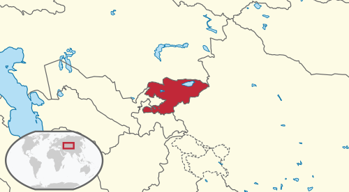
I'm finding some of the Central Asian maps a bit tricky, e.g with Kyrgyzstan I have trouble telling that it borders China which adds a lot of context
 Alexendoo
on 21 Dec 2019
Alexendoo
on 21 Dec 2019
Just had a quick look at all the maps to get an idea of whether this issue is still relevant:
- The following maps are definitely not up to the standard:
balkan_peninsula(done in #258),ceuta,melilla,java,sumatra,saint_helena(done in #258), and the five oceans. Two of these are still provided as JPEGs. Note that some of these notes may be removed from the deck depending on the outcome of #221 and #137. - The maps of the continents differ quite significantly from the other maps, but they look decent enough, in my opinion.
- The locator maps of states and territories are a little inconsistent with one another, but this is really minor. If I recall correctly, they fall mainly into two groups because of a change in the styleguide of the locator maps project on Wikimedia. The ones with thick lines for borders are from the older styleguide, I believe. A few maps also follow a subdivision scheme, like the notes of the UK's constituent country.
- A lot of maps could still use a zoom box, notably those of the Pacific islands. This is the most important point in my opinion (perhaps at a tie with the first point).
- Some other maps could use other forms of adjustment. For instance, the map of Kyrgyzstan mentioned in the previous comment could probably be zoomed out a little.
@aplaice et al, do you think we should close this issue and reopen more specific ones for the points above? Do you think all of them are worth fixing?
I personally feel that this issue has run its course: all the images are properly sourced, the maps of water bodies are fantastic, we've added zoom boxes to all the Antilles maps, ... The maps are light years better than they were when I opened this first ever issue!
axelboc
on 6 Apr 2020
The following maps are definitely not up to the standard: balkan_peninsula, ceuta, melilla, java, sumatra, saint_helena, and the five oceans. Two of these are still provided as JPEGs. Note that some of these notes may be removed from the deck depending on the outcome of #221 and #137.
FWIW (to avoid duplicated effort, just in case somebody becomes inspired) I had been looking into some of these — I have OK-ish replacements for the Balkan Peninsula and Saint Helena, and I've been working on Java and Sumatra (for these two I didn't want to just recolour the Indonesia locator map, as I'm not happy with the central longitude chosen for the projection since it distorts the shape of Indonesia, and in the meantime I discovered a slight bug in my (messy) map rendering script*, so I got stalled).
* fortunately, the resulting glitch (one of the borders not quite reaching the sea) is only visible if you look very closely at the map of the Gulf of Thailand.
@aplaice et al, do you think we should close this issue and reopen more specific ones for the points above? Do you think all of them are worth fixing?
I think it makes sense, for a cleaner discussion. I'm not sure if all of them are worth fixing, but it's probably easier to open issues anyway to discuss whether they need to be fixed, there.
aplaice
on 7 Apr 2020
Alright, I've created individual issues for the remaining improvements.
Let's close this one!! 🎉 🍻 💯
axelboc
on 10 Apr 2020
Related issues
 mighty-cthulhu
·
5Comments
mighty-cthulhu
·
5Comments
 GrimPixel
·
3Comments
GrimPixel
·
3Comments
 siriak
·
3Comments
siriak
·
3Comments
 josealberto4444
·
3Comments
aplaice
·
3Comments
josealberto4444
·
3Comments
aplaice
·
3Comments
Most helpful comment
(And done, in https://github.com/axelboc/anki-ultimate-geography/pull/134.)