Ublock: Missing button icons on popup menu
 MinIsMin
All 13 comments
By design.
 gorhill
on 16 Jun 2017
gorhill
on 16 Jun 2017
Well, the original comment has been deleted...
Is it about this?
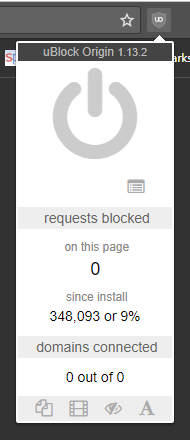
Noticed this as well, came here for issues because it looks broken to me..
Affected: Latest Chrome Stable, Firefox Stable, Firefox Beta, if you open the default home page or the new tab page.
It doesn't look like this if you disable uBo / whitelist a specific site, all icons appear.
OS: Windows 10, but this shouldn't be relevant.
 Hrxn
on 21 Jun 2017
Hrxn
on 21 Jun 2017
if you open the default home page or the new tab page.
There is no point showing element zapper/picker icons on non-http[s] pages, since there is no cosmetic filtering possible on these pages, because content scripts are not injected on these pages. If you go back to 1.12.4, the element picker icon will be there, but will do nothing.
gorhill
on 21 Jun 2017
I realize that..
It's just my initial reaction upon seeing it the first time, somehow rubbed me the wrong way, I don't know, I can only say that my immediate reaction was _"something is broken here"_, before I understood, on a second thought, so to speak, that these elements make no sense here and it could therefore be by design.
I also think that our hypothetical non-technical user, who is not well versed in those things, might reach a similar conclusion, eventually.
I think it would be more intuitive to grey-out the icons (more, or black-out or whatever), similar to how most GUIs handle this. Or strike-through, like text. Or the red symbol with the diagonal strike, etc.
Well, not really a priority issue, obviously, but maybe a bit relevant to weird users like me, who always notice small inconsistencies in any shape or form and freak out easily...
Hrxn
on 21 Jun 2017
@Hrxn Maybe you were put off by a single button being not in the center? Would this look better?
 bershan2
on 21 Jun 2017
bershan2
on 21 Jun 2017
This would definitely be a big improvement, yes.
Although I personally would still prefer something like greyed-out button elements, like other user interfaces do this for any relevant clickable element that is currently in an inactive state.
Hrxn
on 21 Jun 2017
@Hrxn Not sure how you could dim an element that already has the color of a dim On/Off button...
bershan2
on 21 Jun 2017
Yeah, good point.
Maybe something like this as an overlay above the normal icon:

I think this is something that is universally understood as well..
Hrxn
on 21 Jun 2017
That's just visual pollution to me, if something is of no use, last thing you want to do is attract more attention to it by adding complexity to the visual. Removing it from view is unambiguous: the tool can't be used on the page.
gorhill
on 21 Jun 2017
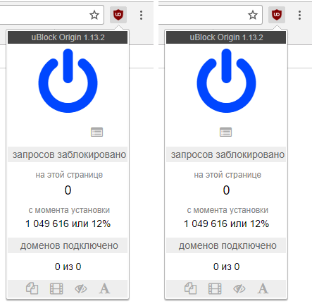
@gorhill I realize this is a rather big redesign, but maybe, the menu is not needed at all?
Since uBO can not block anything on its dashboard, then, as far as I understand the following elements are not needed (since there is nothing to block and since list updates are behind-the-scenes requests):
- the large on/off button (which is still blue "active" on Google Chrome 59) -- does nothing
- the counter of blocked requests for this page-- always displays "0"
- domains connected counter -- always displays "0 of 0"
- all four toggle buttons -- do nothing
- the list of domains that opens upon click on "requests blocked" and "domains connected" badges -- is always empty
The only "working" things are:
- the floating menu title
uBlock Origin [version]as a decoration - the logger link
- the overall proportion of blocked requests
These elements are not really needed because:
- the
uBlock Origintitle is already present on the page in the left top corner. How about including version in the left top corner? Or putting uBO logo in the left top corner anduBlock Origin [version]in the page footer? - the logger link probably can appear as a tab link (not sure if it is a god idea)
- instead of just knowing the overall proportion of blocked requests it would be nice to have a more comprehensive statistics tab. That could include the requests type (floating windows, media, cosmetic, fonts), etc.
Edit: here is a visual:

bershan2
on 21 Jun 2017
"Content scripts" is not webRequest API. The webRequest API can still work on other pages than http[s].
gorhill
on 21 Jun 2017
I realize this is a rather big redesign, but maybe, the menu is not needed at all?
Why do you think it is not needed? I don't get it, to be honest.
Hrxn
on 22 Jun 2017
@gorhill @Hrxn Sorry, I did not mean to leave the "other pages" note in. I started writing a comment about the Zapper and Picker in general, got distracted and ended up looking into the Dashboard only. This might be off-topic, so please tell me if you are not interested in this:
Since the idea is to remove all unnecessary elements, I checked what elements are actually useful on the Dashboard. My observation was (see comment above) -- it is not useful at all (personally for me).
I would rather have it do something different, like switching back to the tab where I was when clicked uBO dashboard link. This is very useful if I have multiple windows and go back and forth between them, without closing uBO dashboard.
bershan2
on 22 Jun 2017
Related issues
 UnicornVariant
·
3Comments
UnicornVariant
·
3Comments
 gitowiec
·
4Comments
gitowiec
·
4Comments
 RoxKilly
·
4Comments
RoxKilly
·
4Comments
 KonoromiHimaries
·
3Comments
KonoromiHimaries
·
3Comments
 rvandermeulen
·
4Comments
rvandermeulen
·
4Comments
Most helpful comment
I realize that..
It's just my initial reaction upon seeing it the first time, somehow rubbed me the wrong way, I don't know, I can only say that my immediate reaction was _"something is broken here"_, before I understood, on a second thought, so to speak, that these elements make no sense here and it could therefore be by design.
I also think that our hypothetical non-technical user, who is not well versed in those things, might reach a similar conclusion, eventually.
I think it would be more intuitive to grey-out the icons (more, or black-out or whatever), similar to how most GUIs handle this. Or strike-through, like text. Or the red symbol with the diagonal strike, etc.
Well, not really a priority issue, obviously, but maybe a bit relevant to weird users like me, who always notice small inconsistencies in any shape or form and freak out easily...