Twin.macro: How to handle conditionals/props?
Hello! I'm loving this macro, thanks for your efforts 👍
I'm struggling however to find a nice way to handle logic within my components. Normally in styled-components I would pass a prop and add styles based on the logic:
https://styled-components.com/docs/basics#adapting-based-on-props
That doesn't seem to work with twin and I've still yet to find a nice way around it. Any suggestions?
 remotealex
All 6 comments
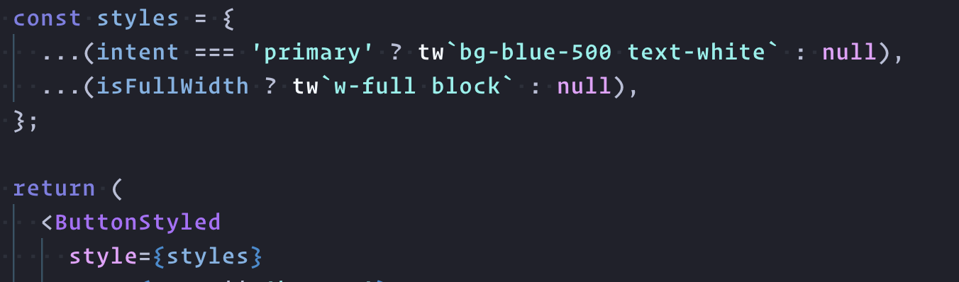
This is what I'm doing at the moment. Adding extra classes:
remotealex
on 15 Mar 2020
Yeah thanks run into similar issues
 gurjit03
on 15 Mar 2020
gurjit03
on 15 Mar 2020
@remotealex I am using styled component and doing like this if it can help
const MenuTopItem = styled.li<{ active: boolean }>`
${tw`py-2 px-3 block rounded text-grey-darker mt-2`}
${props =>
props.active &&
css`
${tw`bg-grey`}
`}
`;
 pradel
on 15 Mar 2020
pradel
on 15 Mar 2020
@pradel Thanks for the snippet. I'd tried that but without the css macro. Seems like quite a heavy way to go about it. I'll stick with what I've got above for now I think 👍
remotealex
on 15 Mar 2020
@pradel You could even shorten that example a tad to:
const MenuTopItem = styled.li`
  ${tw`py-2 px-3 block rounded text-grey-darker mt-2`}
  ${({ active }) => active && tw`bg-grey`}
`;
@remotealex looks like you’ve found a great way already there. Avoiding the null is possible too with something like this:
const styles = {
  ...(intent === ‘primary’ && tw’text-white’),
};
I’m thinking I’ll add more examples in the readme.
 ben-rogerson
on 15 Mar 2020
ben-rogerson
on 15 Mar 2020
I'm switching to your first suggestion as my styles way doesn't support hover options 👍
remotealex
on 15 Mar 2020
Related issues
 owaiswiz
·
4Comments
owaiswiz
·
4Comments
 abhijithvijayan
·
8Comments
owaiswiz
·
3Comments
abhijithvijayan
·
8Comments
owaiswiz
·
3Comments
 denvash
·
6Comments
denvash
·
6Comments
 tettoffensive
·
6Comments
tettoffensive
·
6Comments
Most helpful comment
@pradel You could even shorten that example a tad to:
@remotealex looks like you’ve found a great way already there. Avoiding the null is possible too with something like this:
I’m thinking I’ll add more examples in the readme.