Turing.jl: Doc: more informative visualisation about MCMC
The current figure for MCMC on the landing page looks like:

where MCMC sampling is depicted by loss surface with scattering points. This is not very representative of MCMC IMO. I wonder whether we can find alternative visualisation, e.g.
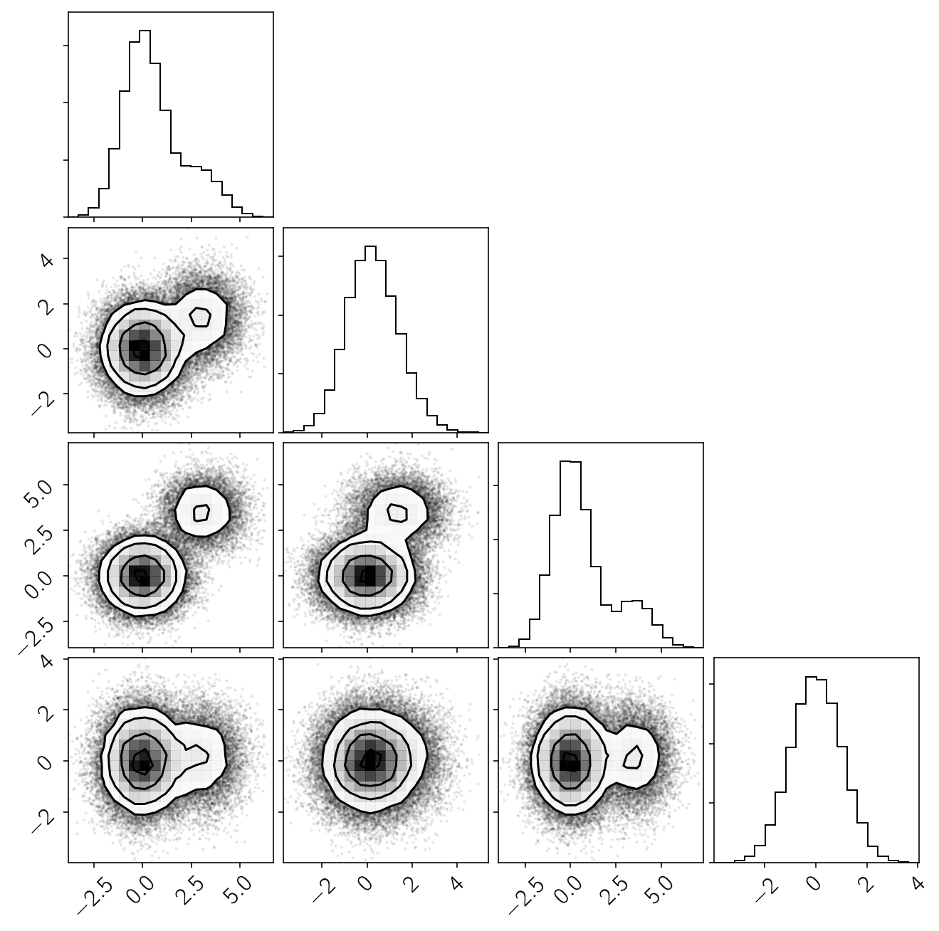
Ref: https://corner.readthedocs.io/en/latest/pages/custom.html
Or, those from https://arviz-devs.github.io/arviz/
 yebai
yebai
All 4 comments
The following image came to me on Google, produced by our own @trappmartin:
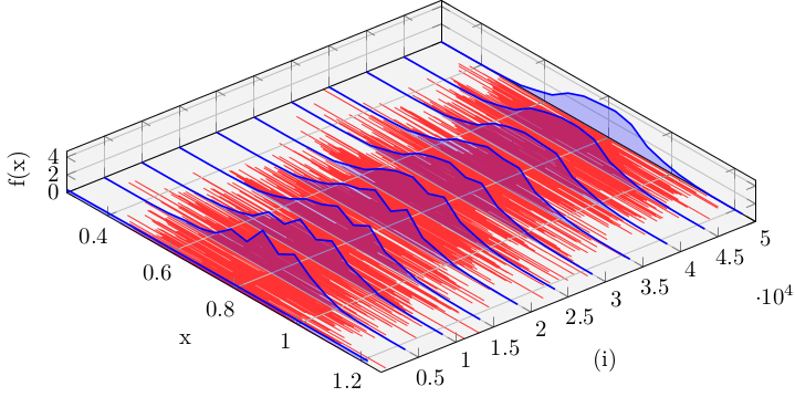
Ref: https://twitter.com/PierreEJacob/status/1240643559247818754
yebai
on 27 Apr 2020
That is 100% rad. @trappmartin do you have the code for that graph handy still?
 cpfiffer
on 27 Apr 2020
cpfiffer
on 27 Apr 2020
Sure, but let me tweak it a little so that it is somewhat modular. The current version is pretty much quick and dirty. 😸
 trappmartin
on 27 Apr 2020
trappmartin
on 27 Apr 2020
@Vaibhavdixit02 is considering doing some visualization in the doc of HMC which is related here.
 xukai92
on 18 Jun 2020
xukai92
on 18 Jun 2020
Related issues
 mateuszbaran
·
5Comments
xukai92
·
3Comments
mateuszbaran
·
5Comments
xukai92
·
3Comments
 skanskan
·
5Comments
trappmartin
·
6Comments
yebai
·
6Comments
skanskan
·
5Comments
trappmartin
·
6Comments
yebai
·
6Comments
Most helpful comment
@Vaibhavdixit02 is considering doing some visualization in the doc of HMC which is related here.