Todo-tree: Improvements to the view in the status bar
A small trifle:
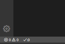
I think it would be better if you remove the colon next to the counting
Now it's look like a emoticon :O 😁
So much better without a colon, look:
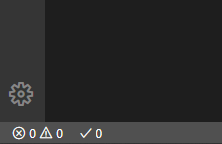
 kanlukasz
All 13 comments
Yeah, I agree - it fits better with the problems icons, etc. too.
 Gruntfuggly
on 29 Apr 2020
Gruntfuggly
on 29 Apr 2020
I saw 0.0.174 . Much better 😻
One last thing - maybe add a small margin between ✔ and 0 - that will be 10000% perfect
kanlukasz
on 30 Apr 2020
I noticed one more thing - if you have some TODOs, there still exist TODO and colon :

kanlukasz
on 30 Apr 2020
That's expected though, because it is showing the number of "TODO" tags. If you also have "FIXME, for example, they are also counted.
It won't show "TODO:" if it is showing the total number of tags.
The tooltip should indicate what is currently being shown.
Gruntfuggly
on 30 Apr 2020
Oh ok I didn't know
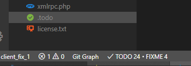
Ok, so, now we have something like this:
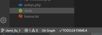
And here is my first idea:
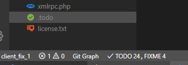
or second idea:
kanlukasz
on 30 Apr 2020
Why do you want to get rid of the colons? I agree the colon next to the icon was pointless, but they still make sense when counting individual tags?
Gruntfuggly
on 30 Apr 2020
From my point of view _(I worked as a designer for many years)_, with colons it is a bit unreadable if you have no any space or margin (too tight)
Maybe adding a space between the colon and numbers is a solution
eg from native Tab Size:

Of course, these are very very very very small details, i know.
Make your choice 😃
kanlukasz
on 30 Apr 2020
Adding a space makes sense - it's inline with the rest of the status bar. If there are multiple, it would then make sense to comma separate them.
I just thought - another alternative option would be to show the icons, which would save space, but could be confusing with the problems status bar item. What do you think?
As you say small details, but worth getting right - I appreciate your input! 😁
Gruntfuggly
on 30 Apr 2020
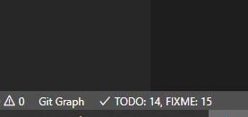
Ok, so the final version:
3pxor4pxright margin for the✔stamp- one space after each colon
- comma separation with one space if there is more than one
tag - no colon & no comma if there is no any
tag
I hope I haven't missed anything
Screenshot with all the above improvements:
Icons - it's an interesting idea and I thought about it, but I'm afraid that it will be too confusing and users will report it.
if I come up with something interesting about it, I'll give you a new ticket
At the moment, I would implement the above arrangements, which we discussed
Have a nice day 😊
kanlukasz
on 30 Apr 2020
That's all OK, except there is no control over the width of the separator between the icon and the text. I can put a space in, but that's it unfortunately - it should look correct though.
Gruntfuggly
on 30 Apr 2020
Putting space should be okay. The VSCode developers did it this way, from what i see here:

kanlukasz
on 30 Apr 2020
Just uploaded a version with fixes for the spacing and commas.
Gruntfuggly
on 14 May 2020
Perfect!
So i think we can close this issue too
kanlukasz
on 19 May 2020
Related issues
 the-vampiire
·
6Comments
the-vampiire
·
6Comments
 Therzok
·
5Comments
Therzok
·
5Comments
 bitjson
·
7Comments
bitjson
·
7Comments
 ghost
·
7Comments
ghost
·
7Comments
 diminutivesloop
·
5Comments
diminutivesloop
·
5Comments