Tocas: Separated Buttons 在 Card 的 Last Child 會沒有右邊框
下面這行 CSS 的影響。
.ts.card .buttons .button:last-child {
    border-right: 0;
}

<div class="right aligned secondary extra content">
    <div class="ts separated buttons">
        <button class="ts link button">
            <h4>NT$790</h4>
        </button>
        <a class="ts negative basic labeled icon button" href="http://www.uniqlo.com/tw/store/goods/400332" target="_blank">
            <i class="external link icon"></i> 前往官網
        </a>
    </div>
</div>
 YamiOdymel
All 5 comments
欸?我要回報的不是這個
我看到的畫面不一樣
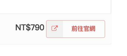
這個是 Card
這個是 Segment
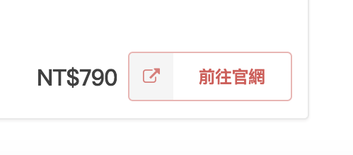
NT$790 在 Card 會偏上,而且跟按鈕的間距怪怪的
另外,看起來陰影的呈現也跟你截圖的不一樣
 goodjack
on 10 Dec 2017
goodjack
on 10 Dec 2017
補一下環境
macOS 10.12.6
Chrome 63.0.3239.84 (正式版本) beta (64 位元)
goodjack
on 10 Dec 2017
@goodjack 在你給的 Codepen 範例中,Card 的用法是:
<div class="right aligned secondary extra content">
    <button class="ts link button">
        <h4>NT$790</h4>
    </button>
    <a href="http://www.uniqlo.com/tw/store/goods/400332" target="_blank">
        <button class="ts negative basic labeled icon button">
            <i class="external link icon"></i> 前往官網
        </button>
    </a>
</div>
跟你在 Segment 的用法有差異,所以我修正改成了:
<div class="right aligned secondary extra content">
    <div class="ts separated buttons">
        <button class="ts link button">
            <h4>NT$790</h4>
        </button>
        <a class="ts negative basic labeled icon button" href="http://www.uniqlo.com/tw/store/goods/400332" target="_blank">
            <i class="external link icon"></i> 前往官網
        </a>
    </div>
</div>
然後就發現了這個可愛的 Issue。
YamiOdymel
on 10 Dec 2017
👍1
哦哦哦
被你這樣一說我好像有遇到這個
以為是用法不同所以就改成跟範例一樣了
goodjack
on 10 Dec 2017
改成跟你寫的一樣之後
間距跟高度都對了 但是左側線也不見了
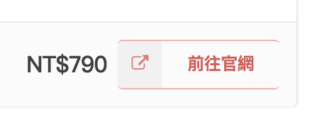
20171227 更新:
我沒改到 a > button
把 button 樣式套到 a 之後就只有右側線不見了
goodjack
on 11 Dec 2017
😕1
Was this page helpful?
0 / 5 - 0 ratings
Related issues
 MiliChang
·
6Comments
MiliChang
·
6Comments
 city8208
·
3Comments
city8208
·
3Comments
 toby3d
·
4Comments
toby3d
·
4Comments
 jet10000
·
5Comments
jet10000
·
5Comments
 gnehs
·
4Comments
gnehs
·
4Comments