GitHub have recently added a new feature to the repository settings known as _social preview_:

Here's the associated blog post.
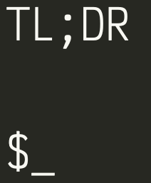
Should tldr-pages have a social preview image? If so, what image or screenshot should we use?
 sbrl
sbrl
All 74 comments
Interesting. We have never really thought of any brand image or logo for tldr. I have zero design skills, but if somebody does, I am game for providing input.
 agnivade
on 8 May 2019
agnivade
on 8 May 2019
Yeah, my design skills are somewhat limited too. I guess we could use the image on the homepage as an interim solution?
sbrl
on 8 May 2019
There's a nice graphic in this blog post about tldr pages. I'm not sure if it's more useful than the screenshot in our homepage and README, but it is certainly less busy and easier to read. Maybe the post's author, @paulredmond, can offer it for us to use?
 waldyrious
on 9 May 2019
waldyrious
on 9 May 2019
There's a nice graphic in this blog post about tldr pages. I'm not sure if it's more useful than the screenshot in our homepage and README, but it is certainly less busy and easier to read. Maybe the post's author, @paulredmond, can offer it for us to use?
We use https://thenounproject.com/ for icons and Eric Barnes owns the copyright for content on Laravel-news.com. My advice when considering using icons for branding/marks be careful to read the TOS in how you can use them.
 paulredmond
on 16 May 2019
paulredmond
on 16 May 2019
I think the graphic @waldyrious mentioned is more appropriate than the picture with a lot of commands. No one will actually try to read something from social preview image?
I can help with a design/redesign.
 Aracki
on 16 May 2019
Aracki
on 16 May 2019
Thanks for the clarification and advice @paulredmond. I couldn't find that specific icon in the Noun Project, but in any case I agree that if we're to use this for our own branding, we might want to design the icon ourselves. @Aracki if you could make a proposal, that'd be great :) something simple, similar to the graphic linked above would work well IMO.
waldyrious
on 17 May 2019
Proposals here ^^
First one is for the social preview, but I suggest we open an extra Issue for changing the beginning of the main README file, which will include a small version of the logo.
Aracki
on 20 Jul 2019
Great stuff ! I like the gray and teal scheme better. I noticed that there are some transparency issues around the edges in the small logos. Is that intended ?
Also, what is that purple icon on top of the >_ icon for in the main preview ?
EDIT: for the small logos, can you show us how it looks if we remove the colored band behind "TL;DR" ?
agnivade
on 20 Jul 2019
- I am not sure about which transparency issue you are referring to.
- A purple icon will not be visible though. (I took the screenshot)
I think you all can view the previews on this link.
All suggestions and critics are welcome. (@waldyrious , @sbrl , @pxgamer, @mebeim , @schneiderl and others as well) 🙂
Aracki
on 20 Jul 2019
Nice work @Aracki. I think the transparency issue @agnivade is talking about is this:
but it only looks like an editing artifact that would be gone in the final image, am I right?
By the way, I definitely like the blue background version better:
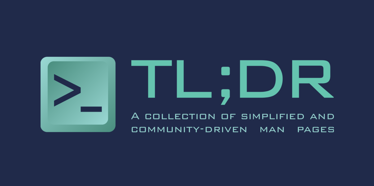
I think this would be cool to have as a social card!
As per the square icons, I'm not entirely sure about them, the logo seems too small compared to the rest. I still like the blue version more though.
 mebeim
on 20 Jul 2019
mebeim
on 20 Jul 2019
Great work @Aracki
As @mebeim I prefer the blue version
 andrik
on 20 Jul 2019
andrik
on 20 Jul 2019
Hey, awesome work @Aracki!
I'm fine with either version - they both look ok to me! Though I'm always an advocate for more colour, so I'd probably say I prefer blue (though the grey looks a bit like a terminal, so it's ok too).
We could potentially update the favicon on tldr.sh too if we all agree on the new logo.
sbrl
on 21 Jul 2019
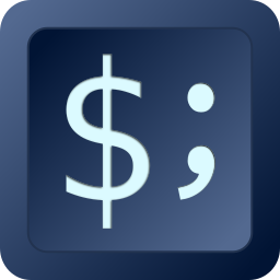
Wait a second though, now that I think about it: the current TLDR logo is composed of these two characters: $;. Could we get a preview of that, with the same format shown above @Aracki? Basically just $; instead of >_, I would like to see how that looks (sorry but I'm not that practical with the website you linked).
Also, for the favicon there should be no text in the logo, so only the >_ "button", is that what you are suggesting as favicon @sbrl?
mebeim
on 21 Jul 2019
@mebeim The logo itself was drawn by my brother. I am just putting it together with different backgrounds. 😕
About the favicon, maybe it would be better to have it without text. My favorite is the third version.
About the social preview, I have added two more examples. third blue version I preffer over the first version, as it is little bit colder and goes better with the logo.
Aracki
on 21 Jul 2019
Favicon looks great.
For the previews, I like 1st and 3rd both. The 1st one stands out a bit more due to more contrast. But 3rd is fine too.
agnivade
on 22 Jul 2019
I like the designs too, and would be fine with either $; or >_ (the former evokes a shell CLI a but more to my eye, though), and with either color scheme.
One thing I'd point out is that we should make sure we use a freely-licensed font, and possible something more legible than the highly square one (especially for the tagline). One of the monospaced fonts in Google Fonts, for instance, would be a good choice. Perhaps Share Tech Mono, or Major Mono Display.
I'd also not use fully justified alignment in the tagline, which makes the word spacing irregular across the two lines. Left-aligned would be fine IMO.
waldyrious
on 23 Jul 2019
Wow nice work @Aracki
The blue background one looks awesome.
 schneiderl
on 23 Jul 2019
schneiderl
on 23 Jul 2019
Perhaps even _Source Code Pro_ would be an option? Share tech looks ok, but I'm not too sure about major mono.
sbrl
on 28 Jul 2019
But AFAIK font converted to vector is not a text or font anymore. It becomes a vector drawing which you can safely use in your logo. Correct me if I'm wrong. I am saying this because I really prefer the old logo versions. PS. The font name from which the vector is made is Bank Gothic.
I would definitely choose _Source Code Pro_ if we are going with Google Fonts. It's in the first four examples.
Aracki
on 29 Jul 2019
I had a go at this myself. In the end I think I definitely prefer the >_ version, but I'm unsure about the current colors. I kind of like it more dark to be honest :thinking: What do you guys think?
$; | >_
-|-
 |
| 
 |
| 
 |
| 
mebeim
on 3 Aug 2019
Personally, I think the dark backgrounds by @Aracki were fine. And my vote is with >_ too.
agnivade
on 3 Aug 2019
Nice, @mebeim! Yeah, a darker background would work better I think.
>_ is my preferred option, too
sbrl
on 4 Aug 2019
Just out of curiosity, for those who prefer >_, what's your motivation for that choice?
I personally think $_ could work well, since AFAIK $ is the most common shell prompt, and _ seems appropriate to represent a blinking cursor that's expecting user input; both together would then convey the notion of a terminal prompt where the user is expected to input command lines.
But this is just a digression -- I don't mean to derail the discussion, just to understand your preferences :)
waldyrious
on 13 Aug 2019
The options were $; and >_. Among the two, >_ seemed better. But I am find with $_ too.
agnivade
on 13 Aug 2019
I agree with @waldyrious
I am not a big fan of ; because reminds me programming languages
andrik
on 13 Aug 2019
Should we make a poll for choosing the final option?
And what others think of font usage discussion?
Aracki
on 14 Aug 2019
Could you show us a sample of how $_ looks ? I think that would help us come to a decision.
Regarding fonts, I like Ubuntu Mono too. Though I will leave it up to you for a final decision.
agnivade
on 14 Aug 2019
Yeah, I think $_ would be fine too
sbrl
on 14 Aug 2019
I don't have "designer powers" to do that on my own. (I already mentioned that design was made by my brother)
About which we agreed in the end? Can we used Bank Gothic font or we need to go with Source Code Pro? What colors the majority prefer?
Aracki
on 23 Oct 2019
So here's a little table of the alternatives from which to choose and the current status (from what I could see from above comments):
| Button text | Button color | Button text color | BG color | Font |
|-|-|-|-|-|
>_, $;, $_ | Cyan, Dark blue, [other?] | Dark blue, White, [other?] | Dark blue, Grey, [other?] | Bank Gothic, S.C. Pro, [other?] |
| TBD: >_ or $_ | TBD | TBD | Dark blue | TBD |
Where "TBD" = To Be Decided.
For the font I would say S.C. Pro but really any decent looking and free to use monospace font does it for me. Another important thing to decide is: do we also want the name inside the logo or not? I personally am not a big fan of having the name repeated in the logo.
mebeim
on 23 Oct 2019
Thanks for reviving this thread. The options on this comment are great.
If it is hard to see how $_ looks, I would suggest to go ahead with one of the options on that comment and come back later to refine it. It is certainly better to have some preview rather than having no preview.
I like the name-less icon in the blue and teal scheme. I think the majority was in favor of the blue and teal scheme. A logo should stand on it's own without needing the name inside it.
agnivade
on 23 Oct 2019
@andrik @schneiderl @pxgamer - what do you think about moving ahead with what we have currently rather than waiting to see other options ?
agnivade
on 24 Oct 2019
@agnivade, I think that sounds good 👍
 owenvoke
on 24 Oct 2019
owenvoke
on 24 Oct 2019
@agnivade, I think that sounds good
Me too
andrik
on 25 Oct 2019
@agnivade I say we go ahead with it. As you said, it is better to have some preview rather than having no preview. And I actually think the options presented in here are great :)
schneiderl
on 28 Oct 2019
I just re-read the entire conversation and tried to gauge the opinions expressed in it. Just to make sure we're on the same page:
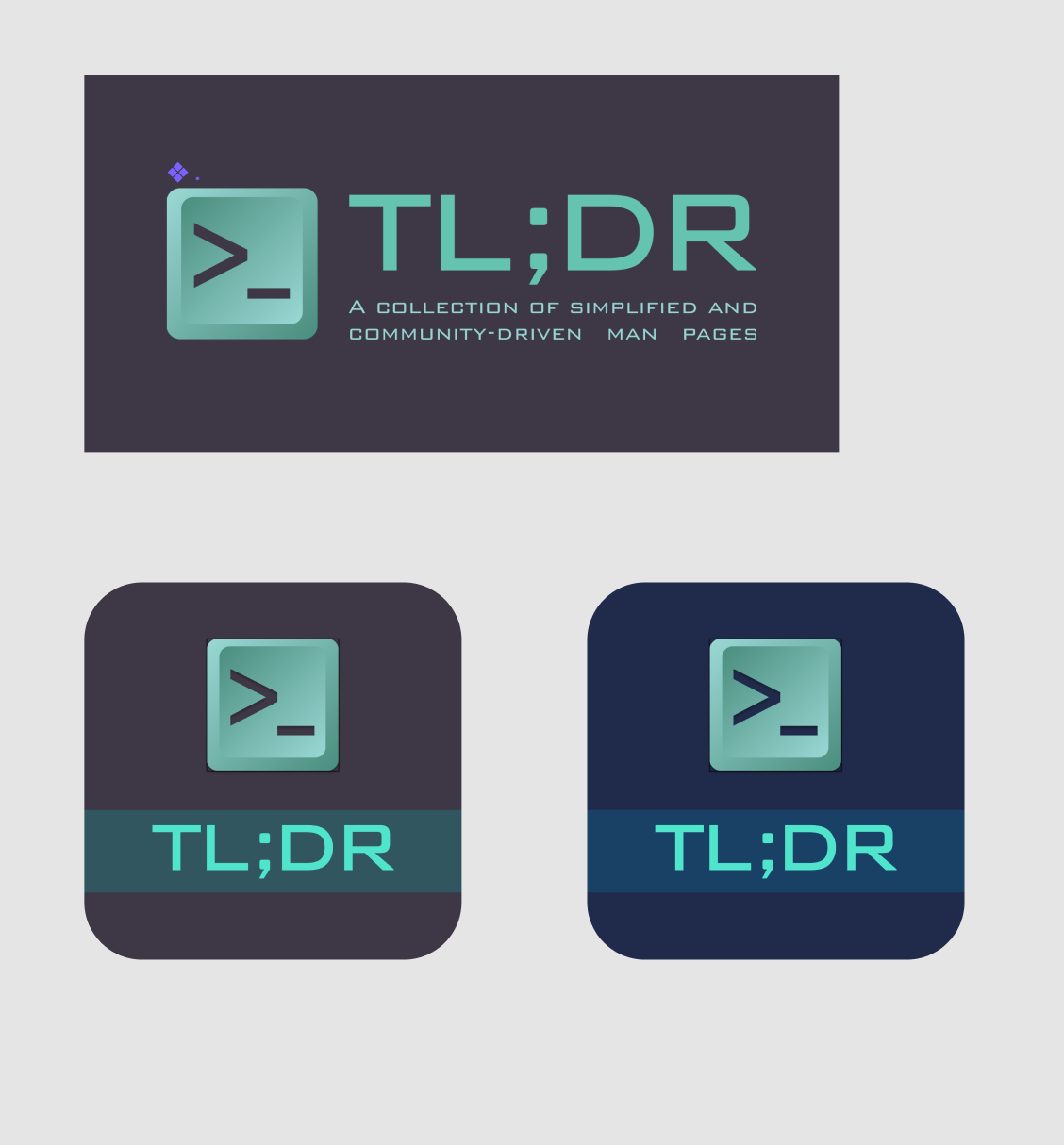
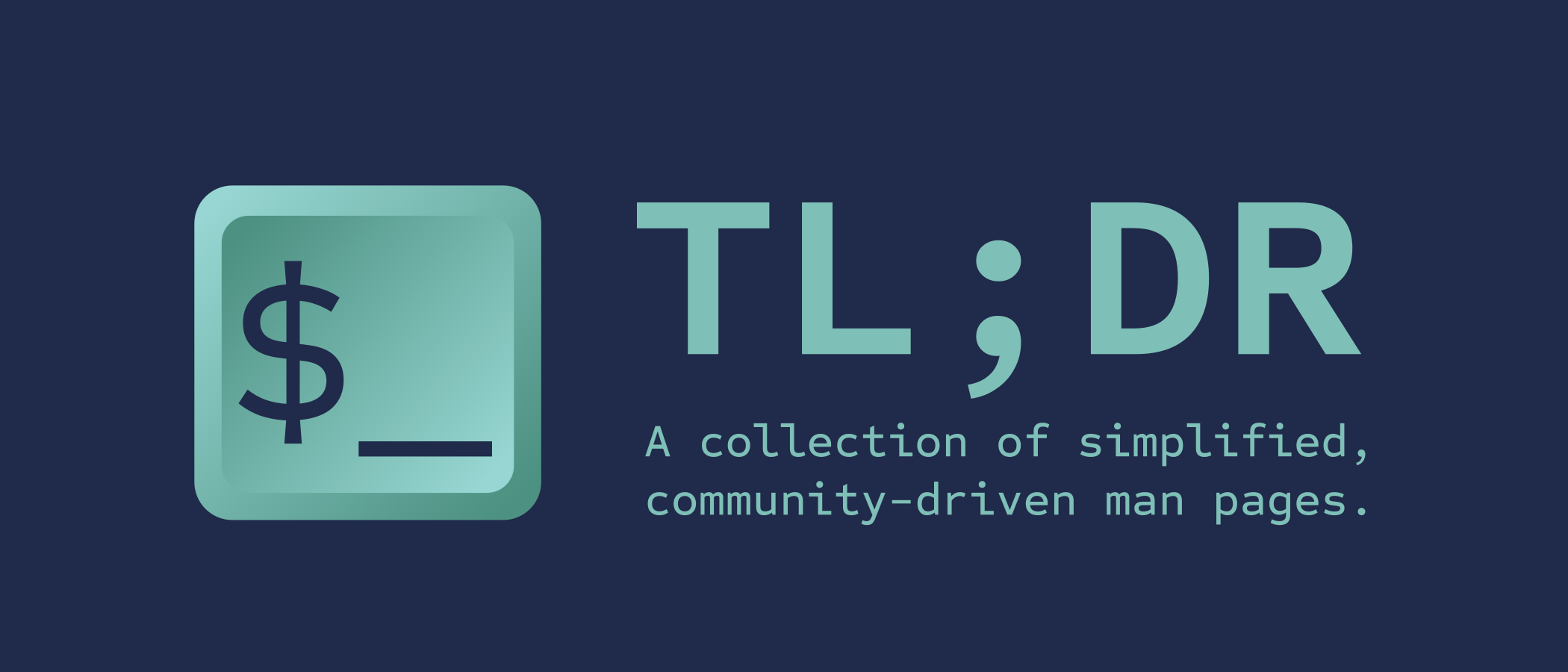
If we used this image for the icon/logo/favicon:

...and this one for social preview:
...with the following changes (everything else being equal — colors, shapes, etc.):
- Font changed to Source Code Pro
- Icon text changed from
>_to$_ - Slogan changed from justified to left-aligned
...would that be acceptable to everyone? Or did I miss any important detail?
If so, I'd be happy to recreate this in SVG so that we can wrap up the discussion :)
waldyrious
on 30 Oct 2019
Sounds fine to me @waldyrious
mebeim
on 30 Oct 2019
@waldyrious - Do you have the color codes ? And the shape of the button along with the gradient ?
agnivade
on 30 Oct 2019
No, I was planning on reconstructing those with Inkscape. I think that work is worth it because it's important that we retain the vector source of the image (so that we can make variations at different sizes, colors, etc. as needed).
waldyrious
on 30 Oct 2019
@waldyrious just to save you some time, here are my SVGs if they can be of any help (created in Inkscape).
mebeim
on 30 Oct 2019
Yep, sounds great to me @waldyrious :smiley_cat:
sbrl
on 31 Oct 2019
@mebeim the SVG was superb, thanks! So here's my proposal based on the described above:
Logo/icon:

Social preview:
Note: I used Liberation Mono and Ubuntu Mono for the text, because Source Code Pro's dollar sign deviates from the traditional shape by not having the vertical bar cross the entire "S".
I can make further adjustments if you guys want. Once we settle on a definitive design, I'll submit the SVG and PNG files to the repo.
waldyrious
on 3 Nov 2019
By the way, I was thinking we could take the opportunity to replace the logo for tldr-bot, to follow the same general design. Something like this, perhaps?

waldyrious
on 3 Nov 2019
Hmmm... I definitely like the >_ version more. That $ sign does not even seem like a fixed-width font :thinking:. The images from your previous comment are way better IMHO.
mebeim
on 3 Nov 2019
Thanks for the work @waldyrious ! All looks good to me. I am fine with both $_ and >_.
agnivade
on 3 Nov 2019
For me >_ is a way better looking. If we are going with Source Code Pro the second one from the link is the best option in my opinion.
PS. @waldyrious I really like the tldr-bot logo.
Aracki
on 3 Nov 2019
I agree that the "$" could look more code-y. Could you guys try out the following text:
TL;DR

$_
in https://app.programmingfonts.org/, using the largest available font size (32), and let me know which one(s) you prefer? Here are some examples:
|  |
|  |
|  |
|  |
|
|-|-|-|-|
| Agave | APL2741 | Borg Sans Mono | Inconsolata |
|  |
|  |
|  |
|  |
|
| Profont | Sometype Mono | Ubuntu Mono | Victor Mono |
waldyrious
on 3 Nov 2019
Profont, Inconsolata and Sometype look better than the others to me @waldyrious.
mebeim
on 3 Nov 2019
I really liked Sometype and APL2741 versions
BTW, awesome work @waldyrious
andrik
on 3 Nov 2019
I prefer a simpler one as _Sometype_ and _Inconsolata_. Both really nice.
Aracki
on 3 Nov 2019
Inconsolata/VictorMono/SometypeMono for me.
agnivade
on 5 Nov 2019
Seems like the common thread here is everyone likes _Sometype Mono_, so perhaps we could go with that?
Awesome work @waldyrious :D
sbrl
on 5 Nov 2019
Loving this thread <3 will be cool to update tldr.sh (and the web client) to use the same theme once it's out :)
And my vote would go for >_, but I don't mind $_ :+1: -- as long as it's (somewhat) memorable it'll be okay :rocket:
 ostera
on 6 Nov 2019
ostera
on 6 Nov 2019
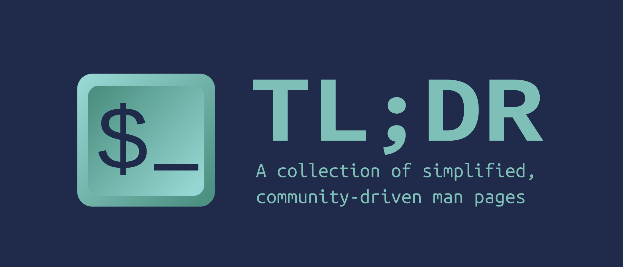
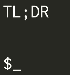
Alright guys! Thanks for the feedback and the patience. Here are the updated designs incorporating the suggestions you made. All pieces of text are now using Sometype Mono as the font. Let me know what you think!
Logo/icon:

Social preview:

waldyrious
on 10 Nov 2019
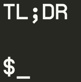
I just realized that we can actually add a period to the end of the tagline, which would make it perfectly justified without resorting to any weird spacing :D
WDYT?
waldyrious
on 10 Nov 2019
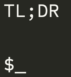
The button bevel looks too narrow now that I notice it :thinking:. Other than that looks fine. Also, maybe bold for the logo?
mebeim
on 11 Nov 2019
Looks fine to me :+1:
agnivade
on 11 Nov 2019
That looks great.
Thank you guys for this 😄
schneiderl
on 11 Nov 2019
I don't think the bevel looks too narrow. Why do you say that?
I can change the text in the button to be bold, though, if there are no objections.
waldyrious
on 11 Nov 2019
I think it looks great as is!
owenvoke
on 11 Nov 2019
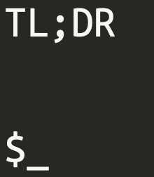
Maybe I would thicken up TL;DR just a little bit. But it looks very nice like this. Great idea to add a dot @waldyrious. 👍
Aracki
on 11 Nov 2019
Yeah, the bevel looks fine, and nice one with the justification!
Let's use this!
Shall I apply the logo and the 2nd social preview?
sbrl
on 12 Nov 2019
@mebeim - can you respond to the bevel concerns ? :)
agnivade
on 13 Nov 2019
I don't think the bevel looks too narrow. Why do you say that?
No reason other than personal preference, really. Keycaps have a very specific shape, if you carefully observe what they look like from above. IMHO a wider bevel (and also decentered) better recalls the shape of a keycap.
Example:
mebeim
on 13 Nov 2019
Is it supposed to look like a key on a keyboard? It's got multiple characters on it, so I think it looks fine as-is.
Besides, in the icon form I'm not sure it will be very noticeable anyway
sbrl
on 14 Nov 2019
I guess it's meant to look like a key. But IMO, it looks fine as is. If @waldyrious feels like spending more time on this, then I guess it's okay, otherwise I would suggest to go with what we have. And then come back to this when somebody has more free time.
@waldyrious - I also think we should upload the icon assets somewhere so that if folks want to experiment on the icon in future, they can ?
agnivade
on 15 Nov 2019
Just let me know when to set the icon / social preview etc.
sbrl
on 16 Nov 2019
I get where you're coming from, @mebeim. I just think that with the variety of hardware we have today, especially with laptops that use very flat keycaps, it's not a big deal that we don't depict the exact shape of old-school keyboards. The current design feels sufficiently generic to me to fit the notion of a keycap without trying to emulate a particular style. Besides, as @sbrl said, we do need the space for the actual label of the key, especially since the logo is meant to be usable in very small sizes.
@waldyrious - I also think we should upload the icon assets somewhere so that if folks want to experiment on the icon in future, they can ?
Yes, that was my plan from the start! 😃 As I said above: "it's important that we retain the vector source of the image (so that we can make variations at different sizes, colors, etc. as needed)."
@sbrl if the images above are the right size / aspect ratio, as far as I'm concerned you can go ahead and set them up in the social preview settings (make sure you use the banner with the final period that justifies the text 😄). I will clean up the SVG and submit a PR shortly, which once merged will finally close this issue! 🎉
waldyrious
on 21 Nov 2019
Woot ! profile picture for our org is set ! Check out - https://github.com/tldr-pages. (Might need a ctrl+shift+r)
agnivade
on 23 Nov 2019
I've left some screenshots in #3606, please take a look!
waldyrious
on 24 Nov 2019
Replied in the PR @waldyrious
Perhaps we can close this issue now?
sbrl
on 24 Nov 2019
Perhaps we can close this issue now?
I just opened #3619 which should close this once it's merged :)
By the way, I wonder who controls our Twitter account @tldr_pages. Was it @igorshubovych or am I misremembering? We should update the account's profile picture (and maybe think about reviving the account, e.g. by setting up some automated posting of random examples from the repo, or something like that :))
waldyrious
on 25 Nov 2019
Ah, that's a good idea @waldyrious. Maybe the tldr-bot could be updated to do that.
sbrl
on 26 Nov 2019
https://github.com/tldr-pages/tldr-bot/pull/8 :)
waldyrious
on 28 Nov 2019
Related issues
waldyrious
·
38Comments
waldyrious
·
32Comments
 jsonbruce
·
26Comments
ostera
·
30Comments
waldyrious
·
64Comments
jsonbruce
·
26Comments
ostera
·
30Comments
waldyrious
·
64Comments
Most helpful comment
I get where you're coming from, @mebeim. I just think that with the variety of hardware we have today, especially with laptops that use very flat keycaps, it's not a big deal that we don't depict the exact shape of old-school keyboards. The current design feels sufficiently generic to me to fit the notion of a keycap without trying to emulate a particular style. Besides, as @sbrl said, we do need the space for the actual label of the key, especially since the logo is meant to be usable in very small sizes.
Yes, that was my plan from the start! 😃 As I said above: "it's important that we retain the vector source of the image (so that we can make variations at different sizes, colors, etc. as needed)."
@sbrl if the images above are the right size / aspect ratio, as far as I'm concerned you can go ahead and set them up in the social preview settings (make sure you use the banner with the final period that justifies the text 😄). I will clean up the SVG and submit a PR shortly, which once merged will finally close this issue! 🎉