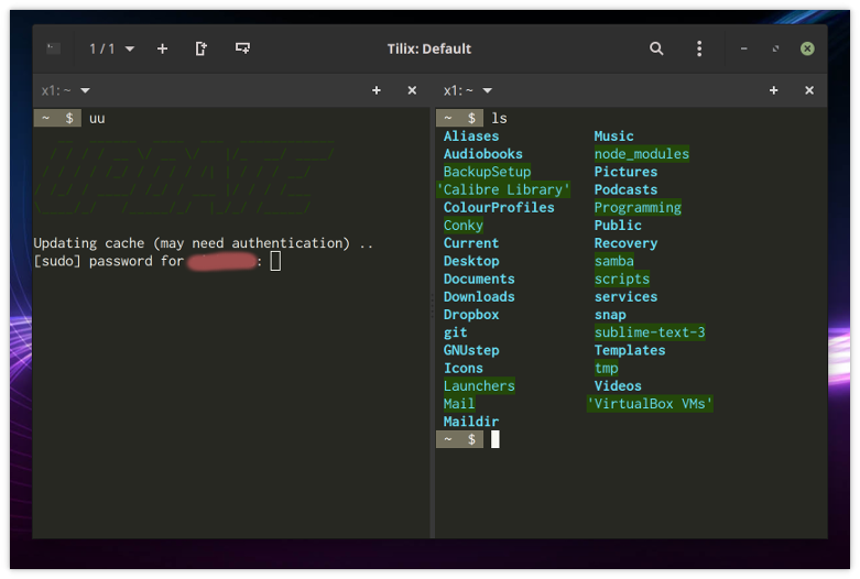
I am trying to determine why the colours in the ASCII-art word 'update' are faded; see the left pane in the image below. Perhaps it is because in Tilix I changed the green background colour. I did that in order to change how directories appeared in ls - see the right pane of the same image, below. Yet, if I changed the background colour, why has the foreground colour - which the ASCII is using - changed?
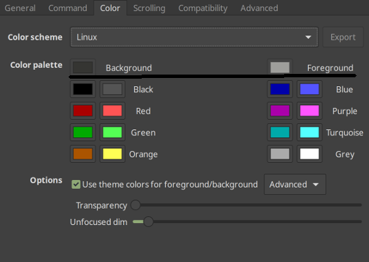
Perhaps the mistake is mine, but I cannot work out, from the Tilix colour options, how one sets what. Here are those options. I find them very confusing.
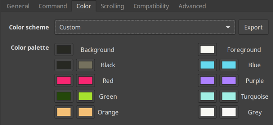
If the rightmost two columns are for foreground colour (and the leftmost two columns for the background colour), then why are there _two of_ those columns?
Mint 19.1 Cinnamon
$  tilix --version
Versions
    Tilix version: 1.7.7
    VTE version: 0.52
    GTK Version: 3.22.30

Tilix Special Features
    Notifications enabled=0
    Triggers enabled=0
    Badges enabled=0
 LinuxOnTheDesktop
All 10 comments
Well, you set it there. It seems to me that the green color you set in the config is exactly the same as the displayed one. It just seems darker because your artwork is composed of slashes which are really thin.
 FFY00
on 21 May 2019
FFY00
on 21 May 2019
Thank you for the rapid response. So, the ASCII art - the colour of which is set by a bash script as tput setaf 2 - is being displayed correctly, i.e. in the colour set in Tilix to green / #2? OK. But the question remains: how to understand the _four_ columns in the Tilix colour options?
LinuxOnTheDesktop
on 21 May 2019
You have background and foreground, nothing complicated there. For each one of them you have a column for normal colors and one for light colors. The one on the right is for light colors.
See https://misc.flogisoft.com/bash/tip_colors_and_formatting#colors
FFY00
on 21 May 2019
My bad, tilix uses the same colorscheme for background and foreground. The columns on the left are normal colors and the ones on the right are light colors.
FFY00
on 21 May 2019
No: with respect, it is confusing. Here is why.
(1) 'Normal colors' and 'light colors'? Why divide the colour set in that way? Indeed, how is one to understand the divisions? Is this something to do with light mode and dark mode (or something like that), those being notions mentioned somewhere else in the Tilix options?
(2) How is one meant to understand the following?
I appreciate the clarification that you have provided here but the UI should not need explaining.
LinuxOnTheDesktop
on 21 May 2019
This isn't actually an issue with tilix. This is the ANSI color standard, which is actully tied to the VGA standard. I understand it might be confusing at first, I never said it wasn't, but tilix isn't at fault here, this is just how the standard is defined.
See https://en.wikipedia.org/wiki/ANSI_escape_code#Colors
What this color palette does is shift the colors so that colors 0 to 15 match what the user wants.
FFY00
on 21 May 2019
Well, thanks, but I still don't have answers to my questions 1 and 2, and I do feel that Tilix's interface could go some way towards answering those questions. I add that other terminal emulators I have used - the XFCE one and the Gnome one, and a few others besides - did not induce this confusion about colours in me.
LinuxOnTheDesktop
on 22 May 2019
Sorry, let me answer them explicitly.
(1) The normal and light colors come from the VGA standard, they are the colors supported by VGA in the common text mode. As things evolved people started using video mode which of course supported more colors. Instead of rewriting the existing software they just extended it and added support for more color codes. The color palette could very well have only 8 colors, though the customization would be more limited, but for mainly historic reasons we use this 16 colors. I hope this clears things up for you.
(2) That's the default background color, same goes for foreground.
I guess it isn't that obvious that the colors next to each label are the normal and light variants but it doesn't strike me as that confusing. Maybe the interface could be updated to be more user friendly to people who don't have this prior knowledge, though I am not sure how. If you have any suggestions now is the time to let us know :grin:.
FFY00
on 22 May 2019
I fear I remain too boggled to be of much help. But let me try.
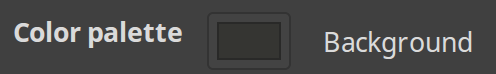
I) The window gives the impression that _all_ this . .
. . has to do with _background_ colours (and _mutatis mutandis_ for the foreground stuff). That seems _not_ be the case. I suggest you find a way to make that clear. Perhaps you could do that by having a horizontal line - something like this
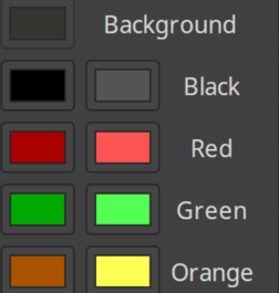
only with more vertical space above and below the line. Better, if practical, would be to move all the colour boxes into one row, something like this (but please ignored the ragged right side of the image):
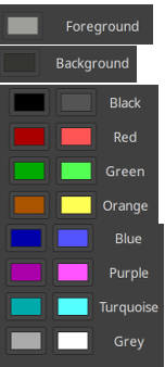
By doing away with the horizontal arrangement - the two large columns ('large' meaning: each comprising two columns themselves) - one removes a source of confusion.
II) I think you should insert the word 'default' before both 'Background' and 'Foreground'.
III) Put the column headings 'light' and 'dark' above the relevant column.
IV) You might include in the window a link to a webpage or file that explains all this stuff.
EDITED.
LinuxOnTheDesktop
on 22 May 2019
As for the main palette, there are 8x2 colors. The brighter counterparts usually do resemble the darker ones, and also technically they are connected (the "bright or bold" sequence switches to the corresponding other color, subject to a config option).
All other terminals that I can recall actually show these in a 8x2 (or 2x8) matrix. Tilix rearranges them to 4x4 for a better use of the overall screen real estate. I agree however that it might make it more confusing, less intuitive.
 egmontkob
on 22 May 2019
egmontkob
on 22 May 2019
Related issues
 sliddjur
·
3Comments
sliddjur
·
3Comments
 yodatak
·
4Comments
yodatak
·
4Comments
 alalfakawma
·
4Comments
alalfakawma
·
4Comments
 milisarge
·
3Comments
milisarge
·
3Comments
 zsrinivas
·
4Comments
zsrinivas
·
4Comments
Most helpful comment
I fear I remain too boggled to be of much help. But let me try.
I) The window gives the impression that _all_ this . .
. . has to do with _background_ colours (and _mutatis mutandis_ for the foreground stuff). That seems _not_ be the case. I suggest you find a way to make that clear. Perhaps you could do that by having a horizontal line - something like this
only with more vertical space above and below the line. Better, if practical, would be to move all the colour boxes into one row, something like this (but please ignored the ragged right side of the image):
By doing away with the horizontal arrangement - the two large columns ('large' meaning: each comprising two columns themselves) - one removes a source of confusion.
II) I think you should insert the word 'default' before both 'Background' and 'Foreground'.
III) Put the column headings 'light' and 'dark' above the relevant column.
IV) You might include in the window a link to a webpage or file that explains all this stuff.
EDITED.