Thegreatsuspender: New Dark Theme
Seems the new "dark" theme keeps getting brighter, LOL. It went from 444 to 777 which brought my screens back up to a candle-light in the dark from the back-lighting, apparently all so the bit of text/outlining could go from white to black, per the commit details.
Request either a return to the much darker background for all my suspended tabs (the a compromise light grey text on very dark preferable), or better yet in the future either a user-defined color-code for both background and foreground (and make the user responsible for themselves) :) or to protect them drop-downs with safer choices.
Ultimately, user-defined CSS for all active suspended elements would be ideal but PLEASE reconsider this new brighter "dark" theme! TIA!
 CollinChaffin
All 9 comments
@CollinChaffin This is actually great, and very timely feedback. We're just trying to lock down what the dark theme should look like. I'm not a 'dark theme guy' so it's good to hear from some real night folks. Will opt for darker! Thanks :)
 liamjohnston
on 20 Jul 2018
liamjohnston
on 20 Jul 2018
A dark grey or mid-black is a good go-to color for dark themes.
Some people like pure or dark black, but I think it being too dark conflicts with contrast between page elements (and monitor bezels).
Whatever it is in 7.3.0 that I have installed is nice.
 DAOWAce
on 10 Aug 2018
DAOWAce
on 10 Aug 2018
@DAOWAce hmmm v7.3.0 is odd. you're the second person to report being on that version, but in theory the latest version is only at v7.0.95 :D
perhaps you cloned the repo after a bad commit. anyway, I hope the latest dark theme colour is to your tastes.
 deanoemcke
on 15 Aug 2018
deanoemcke
on 15 Aug 2018
@deanoemcke I got the link in an older issue about the gscrollpos thing: https://github.com/deanoemcke/thegreatsuspender/issues/537#issuecomment-334925747
Never changed because of Chrome being horrid about extensions with its forced whitelist, didn't want to go through the whole ordeal again.
DAOWAce
on 16 Aug 2018
Can the settings page also go dark when dark mode is set. Seems only logical.
Also, once dark mode is turned on could you also make the icon drop down menu dark please.
Am using with Opera (stable-latest) with its dark mode UI turned on.
 JonnyRedHed
on 24 Aug 2018
JonnyRedHed
on 24 Aug 2018
@JonnyRedHed It's on the 'maybe to do one day' list. It's a nice idea in that it gives you instant feedback of what it might look like. BUT the settings pages aren't really for every-day use, so didn't think it super beneficial for the effort in coming up with something that looks good slash all the extra code.
Though the dropdown is a more common (every day) use case... I'll have a play with this idea.
liamjohnston
on 24 Aug 2018
@JonnyRedHed @liamjohnston i have made this into it's own issue: https://github.com/deanoemcke/thegreatsuspender/issues/727
deanoemcke
on 24 Aug 2018
Thanks. I have 200+ open daily tabs in Opera browser, and use your extension icon drop down menu many times per day, With dark mode UI turned on in Opera.
JonnyRedHed
on 24 Aug 2018
First of all I thank the author and all the contributors for the hard work making this truly great extension.
Check the screens below:
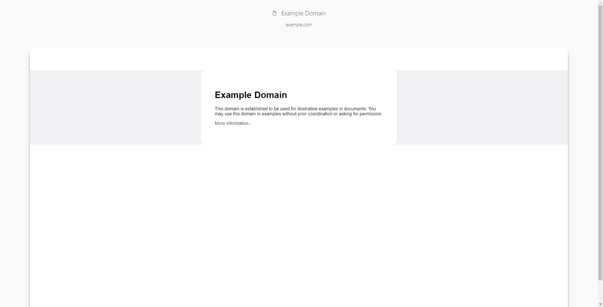
_Light theme (stays the same for mouseover)_
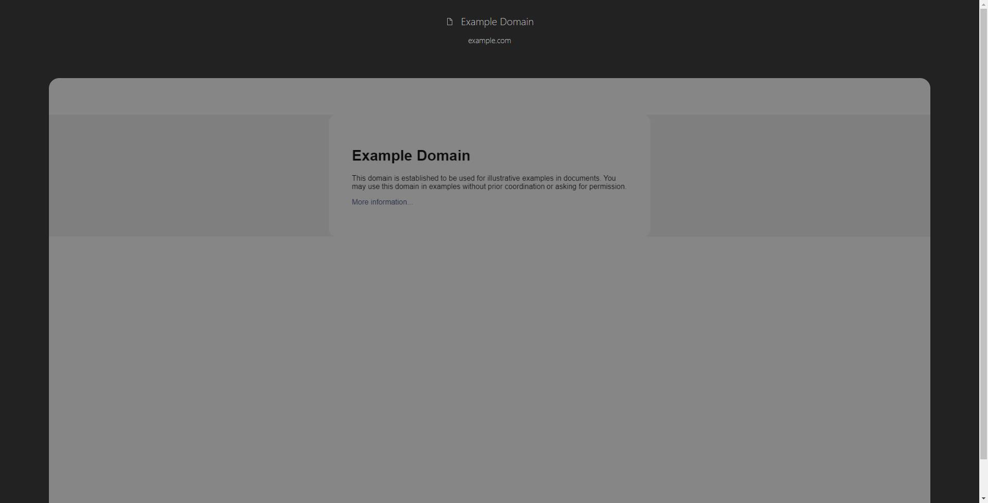
_Dark theme_
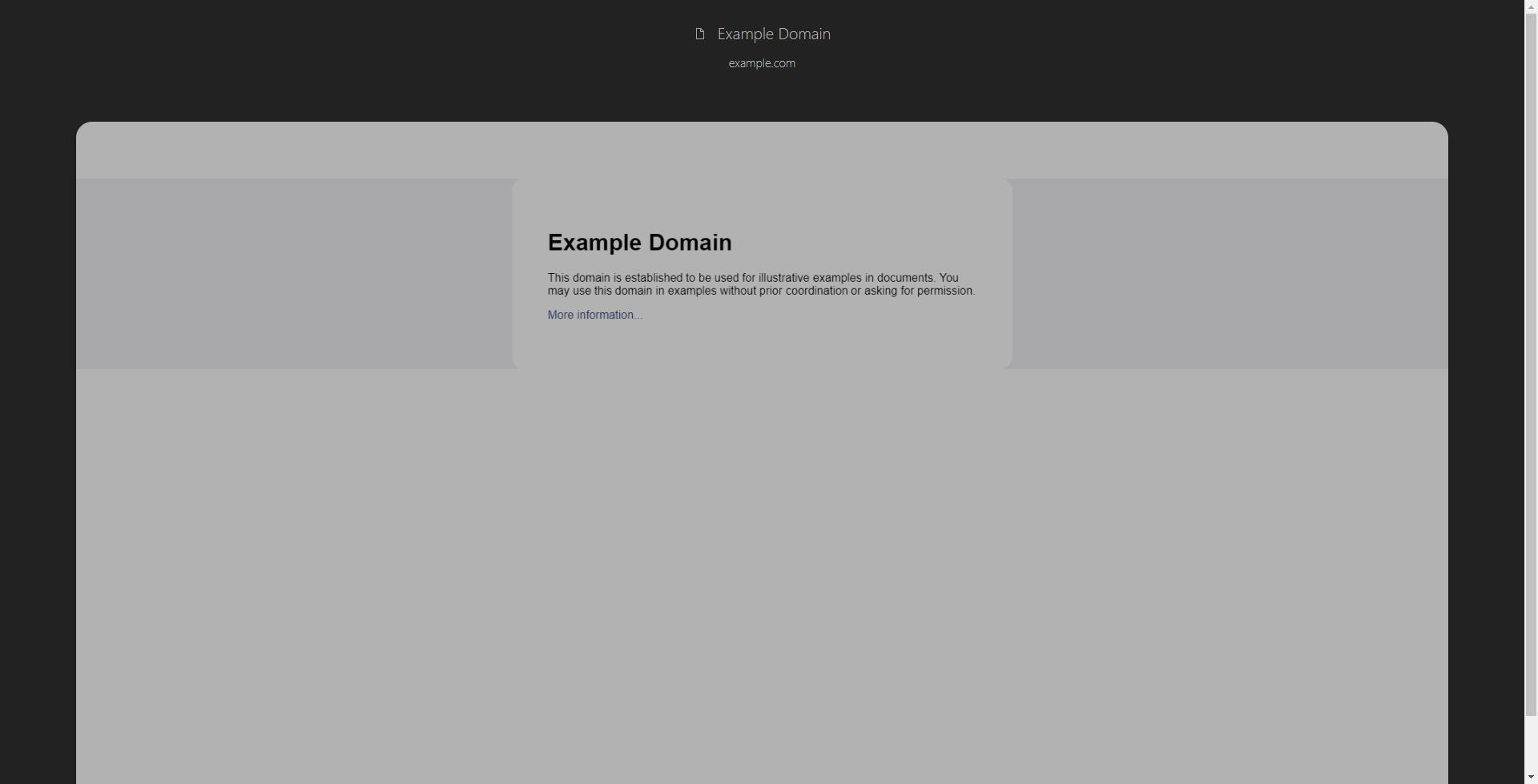
_Dark theme (mouseover)_
I understand that this was made to reduce eye strain as much as possible. While I support this with both of my hands I still think it's unnecessary to keep it dimmed on mouseover and imo it's a bit too dark by default. I often open suspended tabs just to peek for bits of information captured on them without reloading said pages and I find it harder to read text on such screenshots compared to light theme.
My proposition: set default dim to current mouseover-one's and remove it completely for mouseover. It can be implemented as an option without cluttering the settings page too much. Example:
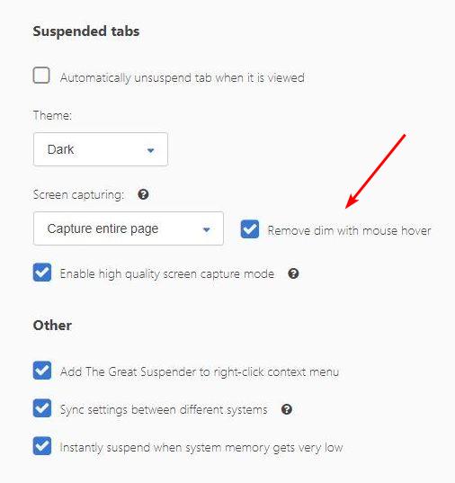
It will appear only when theme is dark and screen capturing is on obviously.
 snakecase
on 21 Oct 2018
snakecase
on 21 Oct 2018
Related issues
 RachelHendy
·
3Comments
RachelHendy
·
3Comments
 AlphaWong
·
5Comments
AlphaWong
·
5Comments
 hzhongmj
·
4Comments
hzhongmj
·
4Comments
 codemedic
·
3Comments
codemedic
·
3Comments
 TheMageKing
·
3Comments
TheMageKing
·
3Comments
Most helpful comment
@CollinChaffin This is actually great, and very timely feedback. We're just trying to lock down what the dark theme should look like. I'm not a 'dark theme guy' so it's good to hear from some real night folks. Will opt for darker! Thanks :)