The-seo-framework: A suggestion on how to visually adjust the extensions page
Hey
An edit:
I am looking at how to visually adjust the extensions page. (Need is the wrong word to use.)
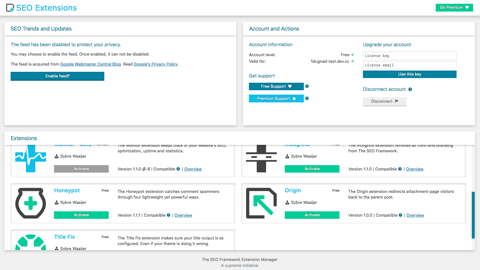
A new wireframe for it:
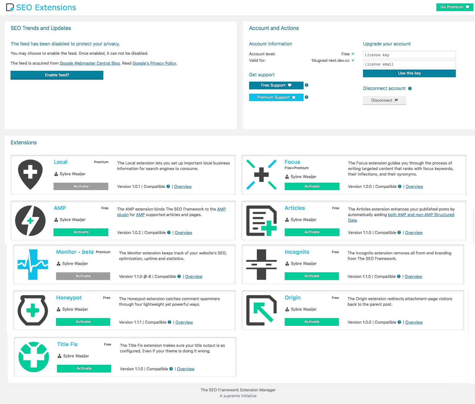
- Removed box shadow.
- Removed scroll bars.
- Removed fixed/sticky footer.
 paaljoachim
All 5 comments
"Need" is a big word 😟 This issue seems to come down to a personal preference.
I do not think this improves the design. This is not to say that it couldn't work with another interface.
My question to you is: "Why do you think this change is needed?"
Scrutinizing
It looks like you're using a 4K display. Please consider testing this on a 1080p screen, at 100% DPI scaling.
Also, consider using Monitor and Focus, their interface is based on the same principles currently implemented.
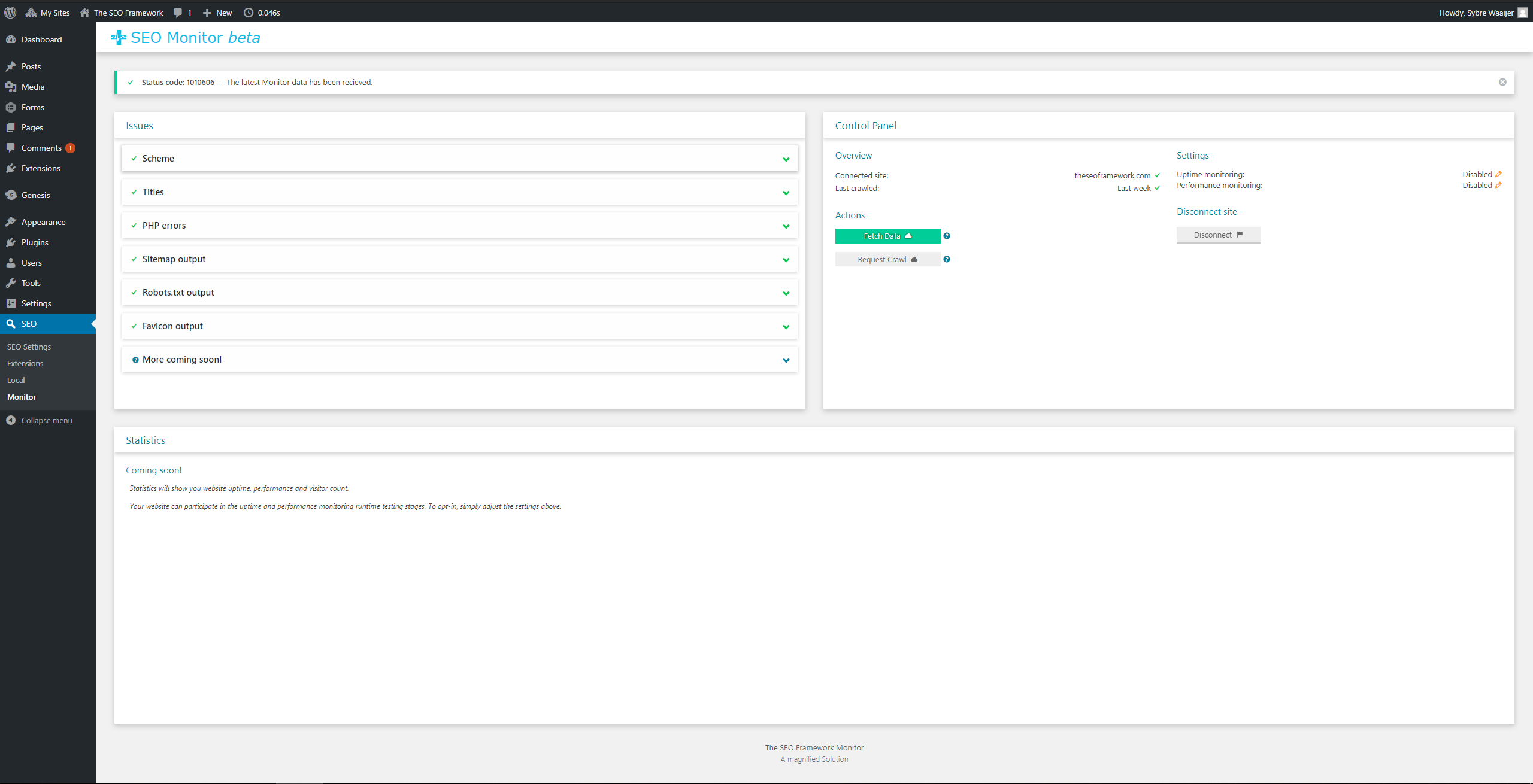
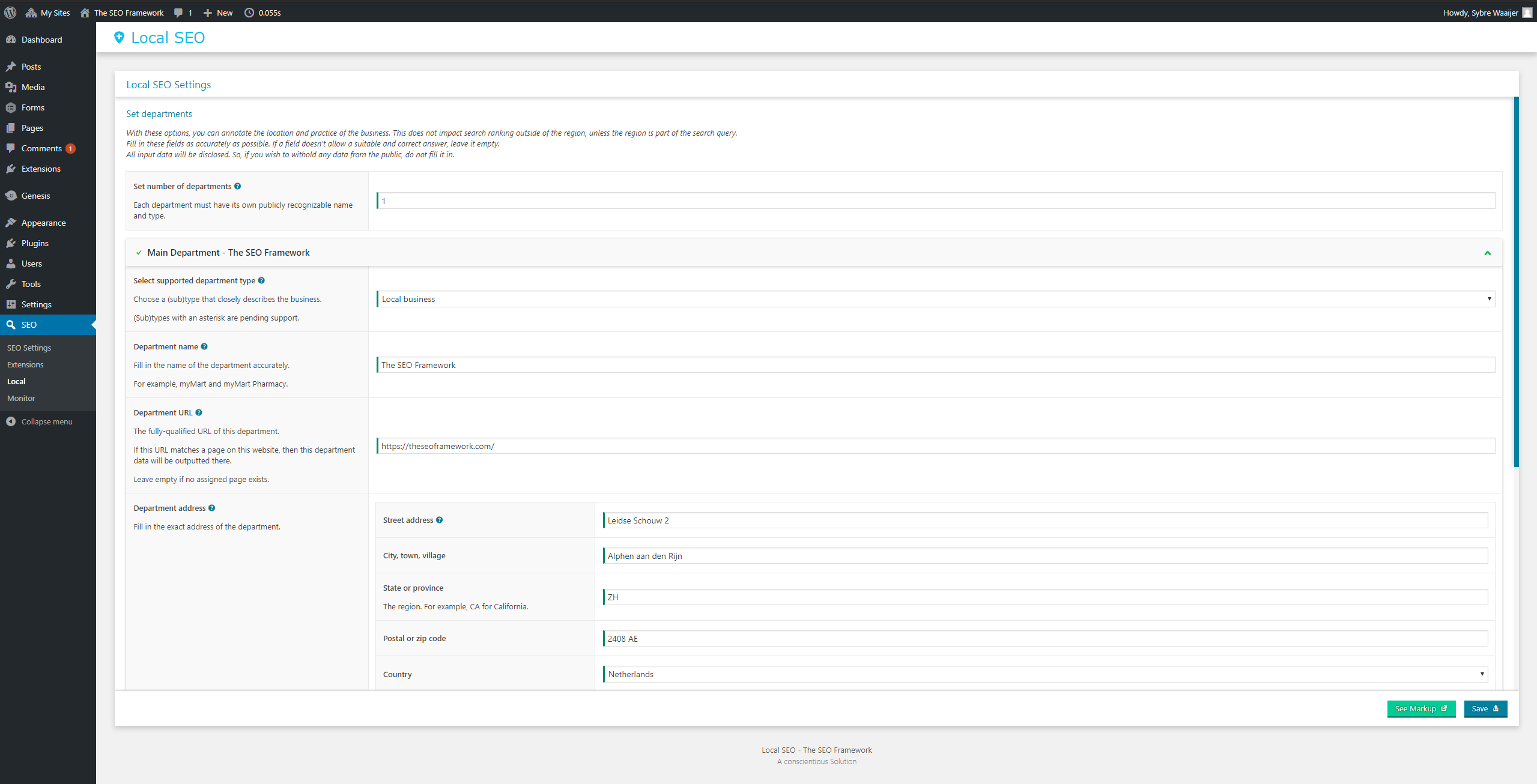
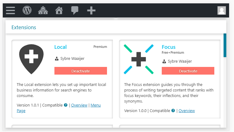
When the feed is enabled (Extensions main page), hundreds of issues are shown (Monitor settings), or many departments are loaded (Local settings), key actionable elements (buttons) will be removed from the current fold.
Monitor:
Local:
Why I hate ultra-flat design
When you remove shadows, you'll remove all forms of depth. The flat design might look "clean", but it takes users longer to process the information given.
Here's a case study by the Nielsen Norman Group: https://www.nngroup.com/articles/flat-ui-less-attention-cause-uncertainty/
A side-note: _The page fits one screen (at 1080p@100% DPI scaling, or larger). This is intended. The whole deal with it being compact is that everything's at your disposal. A one-glance interface, if you may._
The interface is meant to have at least one section (trends/account/extensions) per screen. Roughly 45 to 80 percent of your screen is covered by an inner-section; so, you'll always find an anchor point to swipe and scroll from (the title of a section).
This anchor point is distinguishable via a shadow. This is necessary on small screens.
Now, I'm not a "trained" UX designer. So, do take my words with a grain of salt: I might be wrong.
 sybrew
on 10 Aug 2018
sybrew
on 10 Aug 2018
It was just my initial reaction and in that reaction the word need showed up. An emotional response...
I should rather have said it looks cleaner without shadows and scrollbars. I think the page in it self can be scrolled with the content. (I personally like shadows when I create them myself but often times they distract more then what they give.)
Shadows draws attention away from the content.
Scrollbars inside content boxes forces the user to have to click or move the mouse inside the content box and then scroll. Having one default scroll on the page so that the page in itself is longer would be easier to navigate. One gets a fuller view of the content on the page.
Anyhow just something to think about..:)
The bottom line is that I just wanted to share my initial response.... I could have formulated it a bit better..:)
paaljoachim
on 10 Aug 2018
I do welcome all suggestions 👍 and please, keep them coming! It's what makes the plugins great 😄
I'm one that follows function over form—or rather, form follows function.
So, I do think it's important to implement what's best for the user.
Now, I know the current design isn't perfect, but it's very close to what I've first envisioned.
What I envisioned might be wrong, but fixing that will mean that the layout needs to be rewritten.
I do believe you're correct but have overdone the proposed solution.
Here's my stance on this issue:
- The shadows should stay. They're helping elements that differentiate and divide key elements. However, we could make them less overwhelming. I wish to mimic what I have on theseoframework.com. Examples: [1] [2] [3] [4].
- The content-scrolling within the blocks should stay. Removing this will cause technical mayhem; see if you want to enable the feed to understand why.
- The sticky footer is removed as soon as the screen is deemed too small. We might need to trigger this behavior earlier, i.e. on larger screens. The content gets crammed quite easily now.
sybrew
on 10 Aug 2018
This is the proposed layout for 2.0.1, note the slightly faded background gradient, that when scrolled, the header will pop ever so slightly, this tricks a little sense of separation.
On a 1440p screen, note that there are differences in the width of the right two columns, this is because I gave the rightmost column growing-priority:
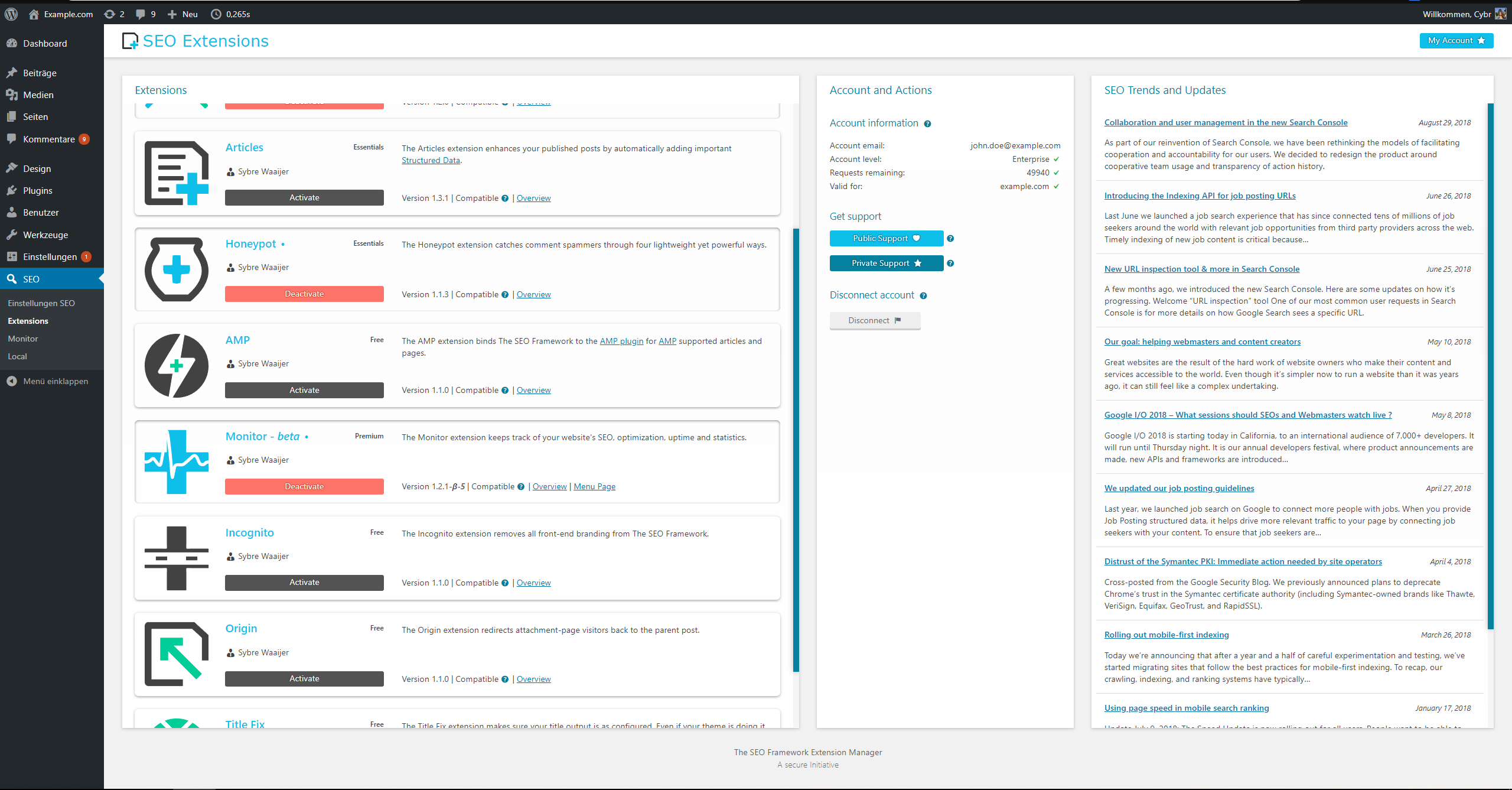
High resolutions aren't common. The design is made for 1080p, which explains why the columns look _too_ tall.
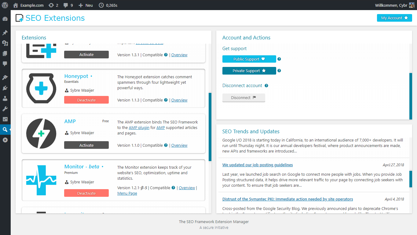
13-inch notebooks (768px) will see something like this:
Monitor will look like this, in 1080p:
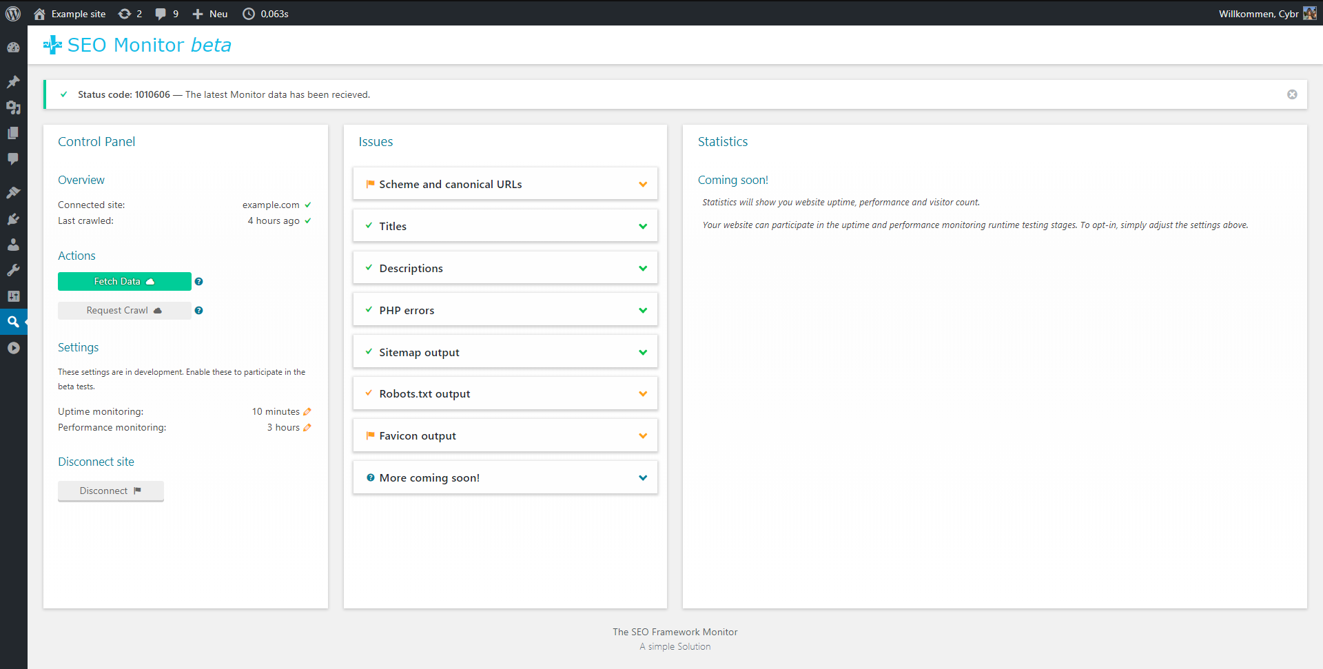
I couldn't bare shadowless, as I do want a sense of depth; which creates ease of use. I am limited by the WordPress interface, and this is the best I could do 😄
sybrew
on 3 Dec 2018
It looks good Sybre!
paaljoachim
on 4 Dec 2018
Related issues
 domegang
·
4Comments
sybrew
·
6Comments
domegang
·
4Comments
sybrew
·
6Comments
 ViktorSander
·
5Comments
ViktorSander
·
5Comments
 Ciantic
·
5Comments
Ciantic
·
5Comments
 epgunn
·
3Comments
epgunn
·
3Comments