Terraforming-mars: Prevent single click "no cards buy" action
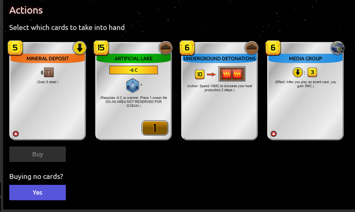
Very basic confirmation to prevent misclicking and buying 0 cards.
Even with the extra padding around the button, there is s high chance of misclick on mobile when aiming for the first card.
- if no cards are selected and "buy" is clicked, show a 2nd button (button "buy" become disabled)
- if the 2nd button is displayed, selecting a card removes it
 ssimeonoff
All 10 comments
Yes Yes Yes please 👍 Lost a game yesterday because of this, even though I wasn't playing on a mobile phone.
 funkybaboon
on 26 Oct 2020
funkybaboon
on 26 Oct 2020
I was thinking about the same problem today. I had a different UX in mind.
How about just a skip buy button (which is not a button but grey underlined text) next to the buy WITH confirmation for skip buy.
[Buy] _skip buy_
With this approach we don't have to add a second button on confirm.
Both approaches require two clicks. Benefit of your approach is that you don't see the skip button text, the drawback is that if a person doesn't know how to skip buy, she will be wondering how to do it as it says Buy which means you buy :)
The advantage of my approach is that both actions are available for the user to choose from, drawback is it adds a bit more clutter on the page.
 chosta
on 26 Oct 2020
chosta
on 26 Oct 2020
We could use the in-game alert for that so that, much like confirming overspending.
 Lynesth
on 26 Oct 2020
Lynesth
on 26 Oct 2020
@Lynesth that is great but we still have to be able to guide the user w/o making them think about what could go wrong.
Optimal solution to this is:
- State A - no selected card => A disabled button with label "Buy" (this will hint the player that an action needs to be taken)
- State B - one or more selected cards => Button becomes enabled and text is "Buy 1* cards"
! additional "skip buy" as I explained above next to the Buy button ( I still think it will be less confusing to the user if represented with all the actions) - this "skip buy" can be added to other elements instead of "Do nothing" radio button for example - and here we would need the in-game alert.
chosta
on 26 Oct 2020
Why not the same button, that changes between "Don't buy cards" and "Buy X card(s)" depending on number of cards selected ?
Lynesth
on 26 Oct 2020
Or that :)
The only difference is that not buying cards would only be possible if all of them are deselected and "skip buy" lets you do it anytime.
I like your solution and I've always imagined dynamic labels for the buttons as their meaning does change on many occasions based on previous actions. Feel free to open another issue on how to approach this on a higher level and we can discuss who and how to do it.
chosta
on 26 Oct 2020
I vote for -> Buy 'n' Card(s)
 SliceOfBread
on 26 Oct 2020
SliceOfBread
on 26 Oct 2020
+1 for dynamic label. Especially if it change color to red for action that player should double check like "discarding" or "buying no card".
 vsrisuknimit
on 26 Oct 2020
vsrisuknimit
on 26 Oct 2020
I like the "n cards" text on the button. Several times I have sold 2 patents when I only meant to sell 1 (because in some contexts selecting a card automatically deselects the previously selected card, but in that one it (duh) doesn't).
 kevinb9n
on 26 Oct 2020
kevinb9n
on 26 Oct 2020
I will implement this.
 bafolts
on 24 Nov 2020
bafolts
on 24 Nov 2020
Related issues
 vincentneko
·
3Comments
vincentneko
·
3Comments
 duckmammal
·
5Comments
duckmammal
·
5Comments
 rodrigomp84
·
5Comments
duckmammal
·
3Comments
rodrigomp84
·
5Comments
duckmammal
·
3Comments
 dabewi
·
5Comments
dabewi
·
5Comments
Most helpful comment
I like the "n cards" text on the button. Several times I have sold 2 patents when I only meant to sell 1 (because in some contexts selecting a card automatically deselects the previously selected card, but in that one it (duh) doesn't).