Terraforming-mars: Reduce the need to constantly scroll
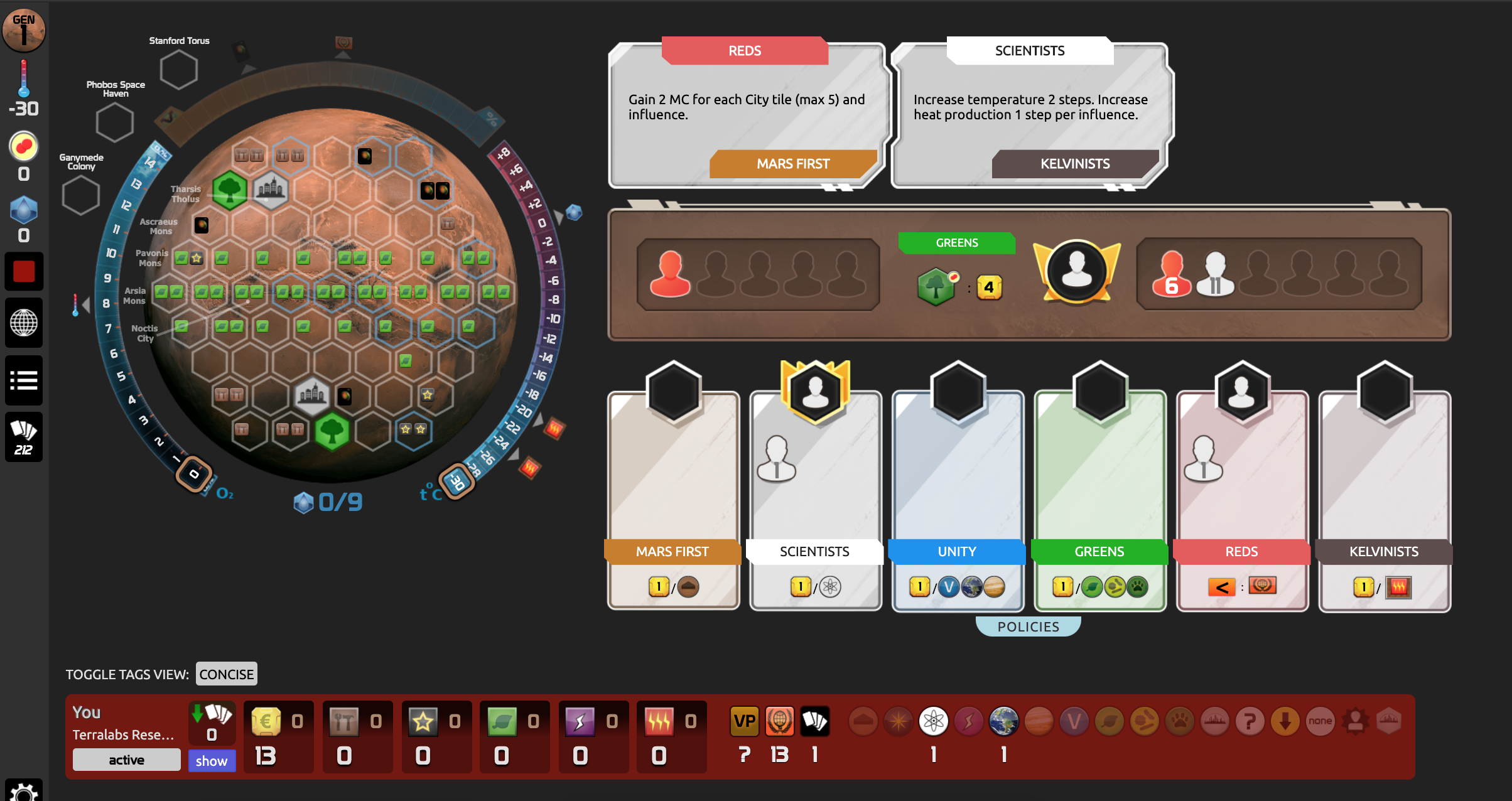
When playing a game without any of the expansions, the Very Vertical layout tends to be a great problem. Most of the game is spent scrolling up and down and back and forth. There are buttons on the side, but it's easier for me to use page up/page down. In the meantime, to the right of the map is this wide-open space where I would love to see the players' stats, and maybe the cards beneath them.
Imagine what this game could be like if you didn't have to scroll. Easier, I think. LMK your thoughts.
Edited to add: this isn't just my feedback, but feedback from a few friends who finally gave the app a run yesterday.
 kberg
kberg
All 13 comments
@kberg The right of the map is where Turmoil normally go when I play. I normally use 67% zoom level on my Chrome browser. Would it be weird to move things around when Turmoil is in play or not in play?
But I agree vertical scrolling should reduced. Check out #953 .
 vsrisuknimit
on 7 Oct 2020
vsrisuknimit
on 7 Oct 2020
This will always be a challenge but we are moving in the right direction. The complication comes from many different resolutions. Many people play on tablet, some use phones but there are also laptops and ultra hd screens. It's an issue for every web-app but we are aware and trying to improve the UX by trying to only improve the existing design and not patch it.
 chosta
on 8 Oct 2020
chosta
on 8 Oct 2020
I have been thinking about this lately, maybe even sketching a bit. I personally don't see how a good UI for mobile is even attainable, with this game, so I really am only thinking about desktop.
From my explorations so far I'm fairly convinced it's feasible to design an alternate "fixed" UI where you never scroll the entire page (and nothing ever jumps around the screen on you). Obviously some panels would require either scrolling or tabbing, locally, but overall everything should stay put. I also believe it can also be at least a little bit flexible to different screen ratios.
The trick is whether we could find something appealing enough that a few people would actually want to work on it.
I think we would have to accept that it is going to feel crowded / cluttered / busy. It just needs to be legible and functional. I don't see value in making it sleek and pretty when that conflicts with function (which is perhaps why I'm not a UI designer).
Is anyone interested in discussing this idea further?
 kevinb9n
on 16 Nov 2020
kevinb9n
on 16 Nov 2020
Is anyone interested in discussing this idea further?
🙋♂️
>
kberg
on 16 Nov 2020
I would have interest in working on the solution once a design were arrived upon.
 bafolts
on 17 Nov 2020
bafolts
on 17 Nov 2020
I was looking at a UI change and ran across this in player_home.less
.player_home_block--resources {
    position: sticky;
    top: -13px;
    z-index: 20;
}
but it is not used anywhere that I could find. Was it left over over from an old version? Seems like a good idea for the player's resource/tag section.
 SliceOfBread
on 18 Nov 2020
SliceOfBread
on 18 Nov 2020
It was removed because the sticky position doesn't work with the new interface. It has to be done via javascript and it's not super trivial. But we plan to do something about it in the future.
chosta
on 18 Nov 2020
I've spent a fair bit of time mocking up some ideas now. I started dumping them all into one giant image for convenience, but the ideas are mostly independent and not a package deal.
I don't want to just broadcast this monster, and am trying to reach out privately to @bafolts, but if anyone is also trying to think about what direction the UI should go in please drop me a line, I'm kevinb9n basically everywhere.
At some point we can decide whether it makes more sense to file each of the good ideas separately, or treat it as a cohesive "new UI". Or, you know, junk it all. :-)
kevinb9n
on 1 Dec 2020
I haven't been thinking about this at all. I am brian.folts on the googol. Feel free to email me and can figure out from there.
bafolts
on 2 Dec 2020
(I talked myself out of doing anything with the One Giant Mockup and will just file the separate issues.)
kevinb9n
on 4 Dec 2020
My mindset here is to pursue the goal of a NO-scroll UI, but through independent changes that should each reduce scrolling even if we don't get all the way there.
But getting all the way there is where I think the real benefits are delivered, because I think that's when you start to be able to play from "muscle memory".
One major problem with the "getting all the way to NO-scroll" idea is that it seems really, really hard to make such a suitable no-scroll UI for desktop that is somehow also usable and fun on mobile. I have no idea how we would do that.
So then I wonder: would we even consider having two different UIs for the game?
Maybe, maybe not. Just something to think about.
A couple other important issues that would be part of the overall puzzle for achieving a no-scroll UI are:
2008
2121
... and the one I need to work on filing next....
kevinb9n
on 16 Dec 2020
I've thought about this a fair bit.
Issue #2008 talks about a high-level organization for the whole page/screen: global state on top, player state below. And the player state is mostly just the existing tray plus #2001.
Those are separate because they can be done separately and profitably whether pursuing a no-scroll UI or not.
In THIS issue I'll present the ideas I have so far for possibly getting all the way to no-scroll.
There would need to be interest in no-scroll because it would be a ton of work.
(Reminder: I am making NO claim that there is any such thing as a good no-scroll UI for mobile devices. And if that's thought of as a reason not to bother having it for desktop either then we can shut all this down.)
First, obviously a big new challenge with this is dealing with multiple screen ratios. My thoughts for how we deal with that are:
- There is a "key region", rectangular region at the upper-left, which we will comfortably expect all users to have visible. (imho we should -- already – have a message encouraging users to make use of their browser zoom so that this much will always be true.)
- This region includes the global state (top), action bar (#953) (middle), and player state (#2008) (bottom), under the assumption that the player state includes a tabbed card viewer (#2001) which is just one card-height high
- Once the user makes that region visible, if they don't feel like they are wasting extra space anywhere on their screen, then they're done.
- If they want to make use of extra space below, they can make the tabbed card viewer (#2001) taller.
- If they want to make use of extra space to the right (and don't want that space for, say, discord), one thought is that they could open up a second tabbed card viewer there, which would work the same way as the other one, just "tall" instead of "wide". Then you can keep tabs, har har, on two different subsets of your cards at the same time. I wouldn't say I feel sure about this part or anything.
Now the really tough part would be figuring out what ratio the "key region" should have.
My own screen is 16:9, and I believe this is not uncommon, plus the browser eats up space at the top but not sides, so have been going with the notion so far that the key region should be wider than tall.
Under THAT assumption I'll show one way we could use that region.
kevinb9n
on 21 Dec 2020
I acknowledge that it may be hard to understand the discussion I'm trying to have without first catching up on all the text above and in the several linked issues.
Again, this idea of a fixed UI is Big, and either merits some significant attention or else probably shouldn't be bothered with.
So I'm happy for the devs here to go in either direction. If there isn't enough interest, I can live with that, I just wanted to do my best to explore the topic first. If, on the other hand, there IS interest, then I would really appreciate any time you could spend reading up on all the stuff I've posted, because the discussion will be difficult enough already.
My thoughts are that
- There is a lot of global state in this game.
- You don't usually need to see ALL of it at once, and we could never show it all if we tried anyway.
- But at any given time, it wouldn't be surprising if there were TWO areas of global state you wanted to look back and forth at.
(Aside: note that a single player's state belongs under the "player state" area of the interface, but when the purpose of an interface element is to combine information across all players, that makes it a piece of global state instead. That's why you see a tab for "players" below; it has everyone's tray and tag tracker visible together.)
If we have the width, then I think we can have TWO panels controlled by a row of tabs. This can be kept simple and understandable if we define one panel to be where the "pinned" tab goes, and the other to be where the "free" tab goes.
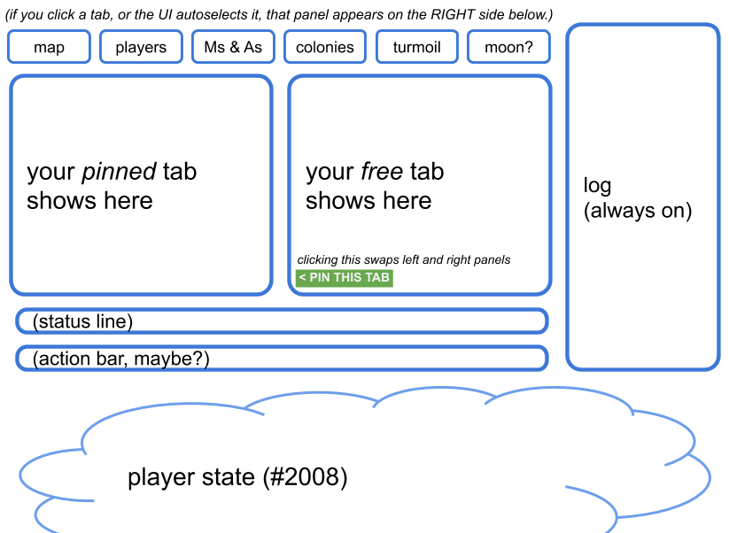
Some players might keep the map pinned all the time, and let the right side rotate between the other things they need. For others it might be the opponents tracker. I can't even predict how I would end up using this.
I feel it is very important that whenever I interact with the UI, in some way that requires me to interact with Tab X next, the UI should autoselect Tab X for me. I don't want to feel I have to shuffle information around while I'm in the middle of just trying to do a thing. This two-panel model should be friendly to that concept, because I do at least get one tab that will stay "safe" on the left while the contents on the right jump around a bit.
kevinb9n
on 21 Dec 2020
Related issues
 duckmammal
·
4Comments
duckmammal
·
4Comments
 sienmich
·
5Comments
sienmich
·
5Comments
 rodrigomp84
·
5Comments
rodrigomp84
·
5Comments
 ATiredVegan
·
5Comments
ATiredVegan
·
5Comments
 dabewi
·
5Comments
dabewi
·
5Comments