Terraforming-mars: UX: Backlog rework
Thoughts
Backlog is the center piece of the game.
It should be in view as much as possible and close to the rest of the players' info.
Main Suggestion
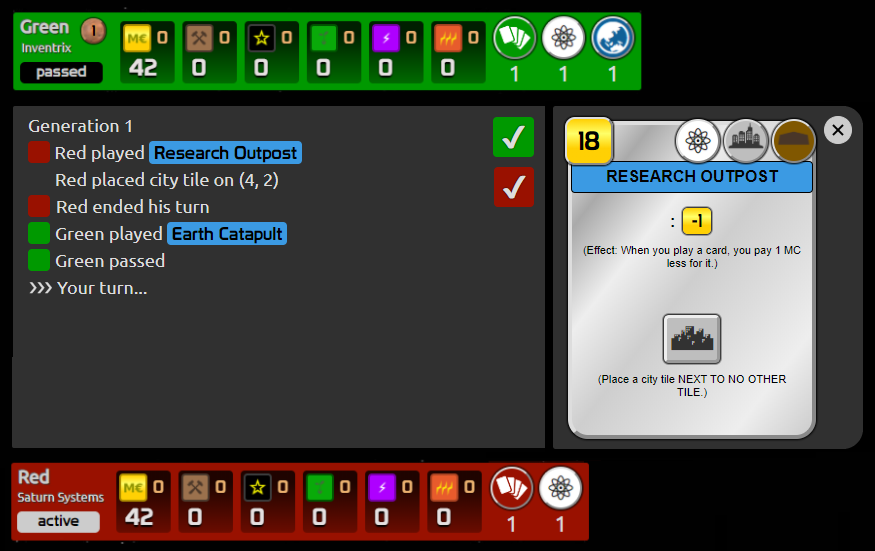
Related to #1207.
- Place the Backlog above the Current player board
Other features & changes
- When a card preview is opened, it is displayed on the right - the height of the backlog matches the preview height (only one card preview - opening a second removes the first)
- Filter per player functionality - a column of checkmarks, one per player, - unselecting a colour will filter out that player backlog.
- Every action is represented with a small player "cube" (visual connection to the checkmarks, player names are plain text without background colour)
- The side-effects of an action does NOT have a "cube" icon in front of them (e.g. the city placement info)
- The last entry of the backlog is dynamic and shows who is playing - example: Red's turn. Red sees "Your turn..." while everyone else sees "Red's turn..." (always visible, cannot be filtered)
 ssimeonoff
All 13 comments
I like it! ...But when I see an interface like that I usually try to understand what it does without the explanations. The only thing that kind of confused me was the colored checkboxes that toggle the players logs. A checkbox as UI should do the work but maybe we can position them differently and make them 50% smaller. I presume people would rarely filter by player so it does not have to take that much of our attention.
Again, amazing job with a lot of thought in it. Thank you!
Also, should we decide to do it this way I'd like to follow up on the player overview design from #1207 with this. So someone can assign me. Thanks.
 chosta
on 30 Aug 2020
chosta
on 30 Aug 2020
maybe skip the filtering all together?
ssimeonoff
on 30 Aug 2020
I think there's some value in it but we can definitely do without. Lets see what others have to say about it.
chosta
on 30 Aug 2020
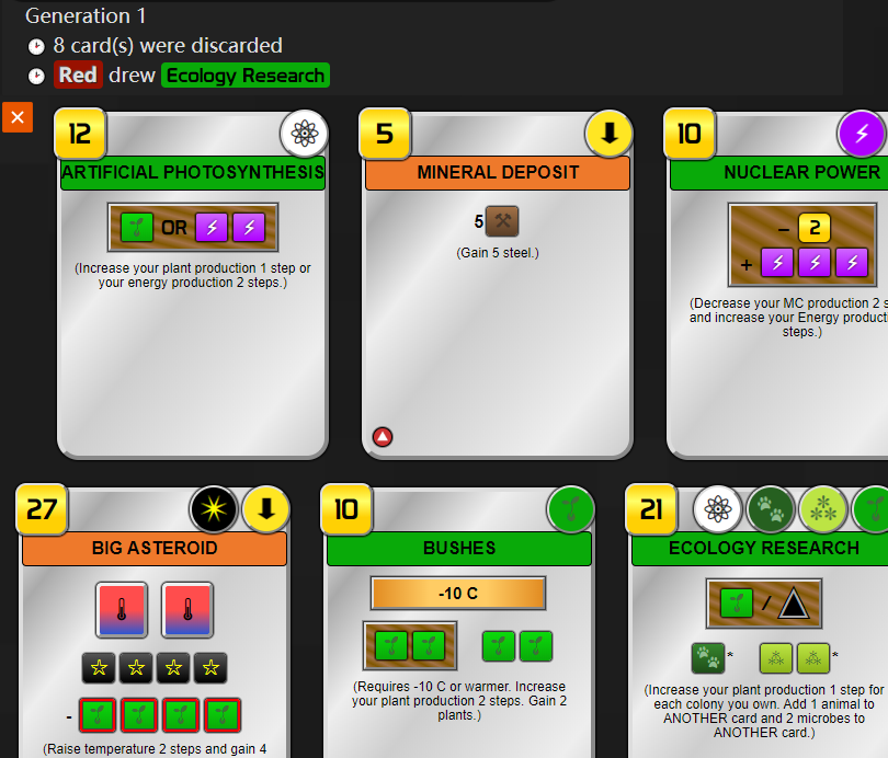
It‘s awesome, but I have a little question about that.
What 's more than one card preview displayed
 jijiqw
on 31 Aug 2020
jijiqw
on 31 Aug 2020
"player names are plain text without background colour" : what if one log contains two players's name , e.g. Red decrease Yellow 's energy prod
jijiqw
on 31 Aug 2020
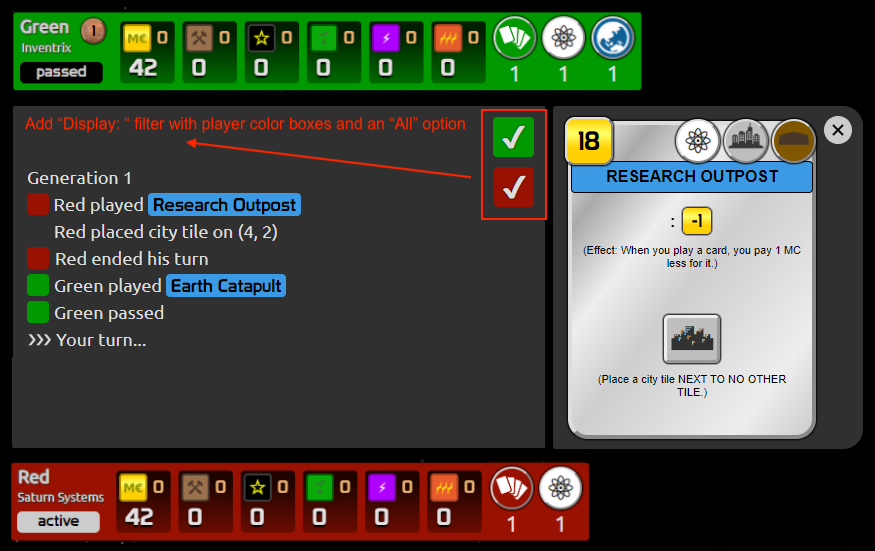
Filtering is a nice to have, but not essential imo. Would suggest to add it in a later iteration. Agree with @chosta about intuitiveness. This is one of several possibilities that would make it clearer:
 nwai90
on 31 Aug 2020
nwai90
on 31 Aug 2020
I dislike how there is no brown background for the production zone

It'd be nice to have the iconography of the cards match that of the play boards
 duckmammal
on 2 Sep 2020
duckmammal
on 2 Sep 2020
Part one is now live! Thank you @pierrehilbert @nwai90 @alrusdi @vincentneko @ssimeonoff for the reviews.
Let's keep this open, I'm going to work on the new Action log. Feel free to share your thoughts. The most comments I got were "where is the gen marker", "which generation are we now". So it seems we need have a more prominent marker apart from the top left one.
chosta
on 15 Sep 2020
Maybe I am blind but I can't find the generation (except in the log). Mainly needed for solo but always nice to have around.
Edit: Nevermind. I see it now.
 SliceOfBread
on 15 Sep 2020
SliceOfBread
on 15 Sep 2020
I also miss the draft order which is actually pretty helpful e.g. in a 5 player game to decide whether or not you want to pick a specific card or not.
 ap3h3ad
on 17 Sep 2020
ap3h3ad
on 17 Sep 2020
@ap3h3ad we show a target player name while drafting. I mean the person who will receive your remaining cards. Isn't it just enough?
 alrusdi
on 17 Sep 2020
alrusdi
on 17 Sep 2020
@alrusdi That's find. I couldn't quite catch it on the example screenshot above.
ap3h3ad
on 17 Sep 2020
Might the backlog eventually became "complete", meaning that one could completely reconstruct the game as it happened from the log alone (excepting hidden information)?
One thing it would need is, for every user action taken (either to the right or beneath), a list of numbers and icons that show all the inflows and outflows of resources and production capacities that happened as a result of that action. It would need a lot else, and I can see it being too much information for some users, who would want an option to switch between full and brief mode.
I would like this because I could see what had really just happened without having to click to view the card itself.
 kevinb9n
on 23 Sep 2020
kevinb9n
on 23 Sep 2020
Related issues
duckmammal
·
3Comments
alrusdi
·
5Comments
 dabewi
·
5Comments
dabewi
·
5Comments
 ATiredVegan
·
5Comments
ATiredVegan
·
5Comments
 rodrigomp84
·
5Comments
rodrigomp84
·
5Comments