Terraforming-mars: Play cards from hand prototype
I am trying to reduce scroll by removing Play card option. Card in the branch play-card-in-place can be played by pressing "Play!" button on card in hand
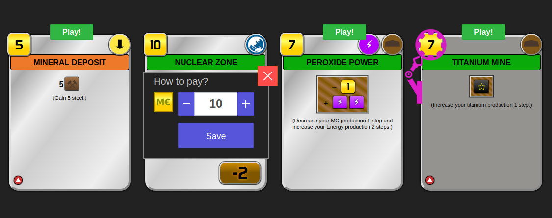
On the picture:
- Cards Mineral Deposit and Peroxide power can be played
- User pressed on Play! button on Nuclear zone card
- Titanium mine card is linked to Self replicating robots and can be played with discount
@bafolts @vincentneko @nwai90 is it okay to you? To me it is like first step to refactor actions (less clicks, less scroll, more dynamic data on cards)
 alrusdi
All 12 comments
@alrusdi This looks great! I would suggest to:
(1) make the Play! button and text slightly larger,
(2) move the button slightly up so it doesn't cover part of the card, and
(3) use a different colour that does not represent any of the card types (e.g. green is used for automated cards, blue is used for action cards)
Perhaps also add border-radius to the Play! button and Payment popup to make their shapes consistent with the cards' rounded edges.
 nwai90
on 14 Jul 2020
nwai90
on 14 Jul 2020
This looks great !
I agree with @nwai90 suggestions. Maybe using the same color (light blue) as the save button for the play button.
 vincentneko
on 14 Jul 2020
vincentneko
on 14 Jul 2020
"Cards in hand" block can be also removed.
If "Play card" card action shows all cards (the ones that cannot be played as well), effectively it renders player_home_block--hand obsolete.
 ssimeonoff
on 15 Jul 2020
ssimeonoff
on 15 Jul 2020
@ssimeonoff no, my idea is to completely remove Play card option
alrusdi
on 15 Jul 2020
Yes I understand the idea, but think about it in reverse.
If "play card" action is selected by default (see #953) and if it shows all cards (the ones that cannot be played a well in a different styling), the "play card" action will behave exactly as you want.
Another drawback is that "Cards in hand" is visible when the user goes for action "activate card", which is a lot of wasted space.
Plus, the main action in the game is to play cards, so it still good to keep it as such, especially when you have all actions separated in groups. And you will not need to display "Play" button over the card - under the option "play cards", selecting a card works as clicking such a button (and the user will know it)
About the UI: When a card is selected to show an overlay over it with the payment options and submit button - YES!
And the same should apply when activating cards.
ssimeonoff
on 15 Jul 2020
Example:
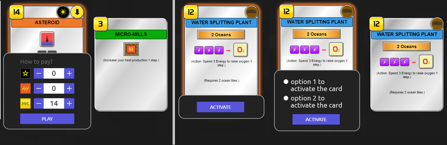
From left to right:
- "Play card" option is selected. The card is clicked (the submit button is called "Play").
- "Play card" option is selected. The card is not clicked (no extra buttons)
- "Activate card" option is selected. The card is clicked (only one way to activate the card)
- "Activate card" option is selected. The card is clicked (multiple options to activate the card)
- "Activate card" option is selected. The card is not clicked (no extra buttons- it looks identical to an unselected card when "Play card" option is chosen)
clicked card: a transition upwards was given as example. It will give the feeling that the card pops, plus less of the card will be hidden behind the overlay.
ssimeonoff
on 15 Jul 2020
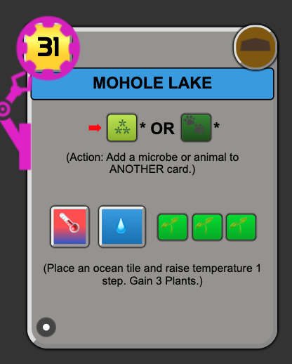
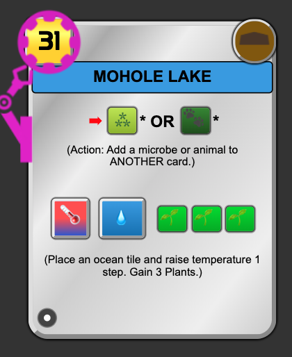
@alrusdi Could we also remove the dark grey background for Self-Replicating Robots card target? It seems to make the black text much harder to read compared to the original card.
nwai90
on 15 Jul 2020
@nwai90 of course we can
@ssimeonoff isn't it strange to see unplayable cards in Play card action? If it is not then we should separate them somehow. Can it be something like horizontal line with caption Not playable cards ?
alrusdi
on 16 Jul 2020
Actually it is a pretty much expected, since playing cards is done by picking a card from the hand, so effectively "Play cards" and "Cards in hand" lists should be identical (which is actually my initial point: don't add "play" functionality to the "cards in hand" list, but instead improves the "play card" list and remove completely "cards in hand").
The cards that are displayed, but cannot be played - they definitely needs to have different styling, no questions about it.
For example: https://dudetakeyourturnblog.files.wordpress.com/2018/10/tfm-player-hand.jpg
The official game uses opacity to indicate if a card is unplayable (for any reason).
Example:
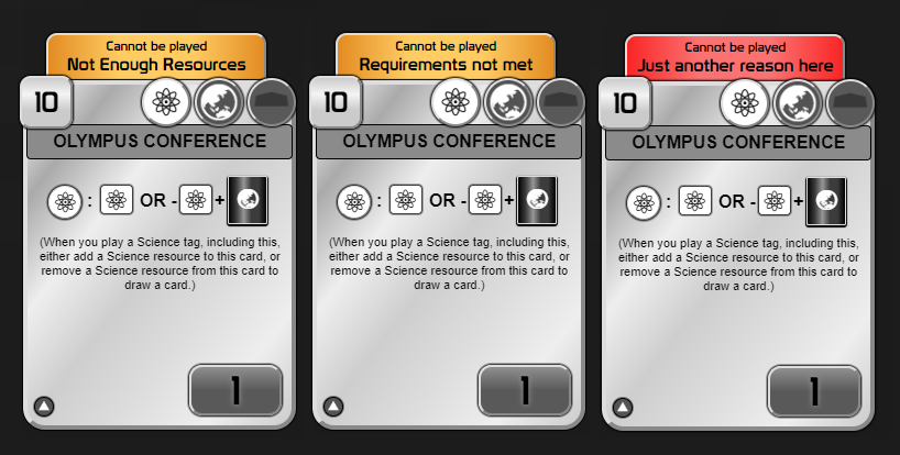
- Used greyscale instead of opacity for unaplayable cards.
- The label can indicate the actual reason why the card is unplayable.
- The labels can have different styling for the various reasons.
- unplayable cards probably should be sorted at the end of the list (after the playable cards)
ssimeonoff
on 16 Jul 2020
This looks great! Technically, I think the only two reasons why a card cannot be played are "Requirements not met" or "Cannot afford card". It would look quite nice with the above two colours.
nwai90
on 16 Jul 2020
* Used greyscale instead of opacity for unaplayable cards.I would like to see some hint of the cards type color (blue, green, etc) only in the cards title box to inform the player of the type of card easily.
 FreeLikeGNU
on 12 Aug 2020
FreeLikeGNU
on 12 Aug 2020
Let's close it as controversial. We can return to this discussion when new Actions UI will be introduced.
alrusdi
on 8 Sep 2020
Related issues
 Carcassonner
·
5Comments
Carcassonner
·
5Comments
 galfridus
·
5Comments
galfridus
·
5Comments
 cdekker
·
3Comments
cdekker
·
3Comments
 dabewi
·
5Comments
dabewi
·
5Comments
 ATiredVegan
·
5Comments
ATiredVegan
·
5Comments
Most helpful comment
Actually it is a pretty much expected, since playing cards is done by picking a card from the hand, so effectively "Play cards" and "Cards in hand" lists should be identical (which is actually my initial point: don't add "play" functionality to the "cards in hand" list, but instead improves the "play card" list and remove completely "cards in hand").
The cards that are displayed, but cannot be played - they definitely needs to have different styling, no questions about it.
For example: https://dudetakeyourturnblog.files.wordpress.com/2018/10/tfm-player-hand.jpg
The official game uses opacity to indicate if a card is unplayable (for any reason).
Example:
