Terraforming-mars: UX: Actions menus rework
This is a combination of some old ideas and the recent comment:
https://github.com/bafolts/terraforming-mars/issues/943#issuecomment-654776183 , made me to revise them.
Idea 1 - Separate the options and sub-options
Currently when a option is selected (e.g. play a card or sell a card), the sub-options are displayed right under the selected option.
If they are not mixed up and displayed in different containers, they can be displayed as flex or inline.
Idea 2 - Display the options inline
Example:

And if idea 1 is implemented, whatever option is selected, the following sub-options can be displayed below, without breaking the top alignment.
Idea 3 - Define the options and sort them by popularity
See the example above.
a. Player Project Card - same as now
b. Activate Card - same as now
c. Spend Resources - this is the interesting one. It aggregates all special moves.
When clicked, the displayed sub-options can look like:
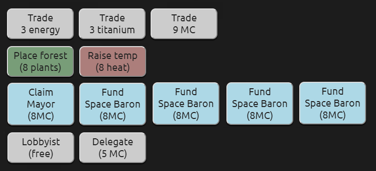
The sub-options are displayed inline, grouped by type and sorted by popularity.
The sub-options can also be styled slightly different (e.g. forest is green, temp is red, milestones and awards are in their lightblue colour, etc)
side-note: maybe on the row with the Trade buttons, at the end a label "X trading fleet remaining" can be displayed as well
d. Standard Projects - same as now, but displayed inline
e. End Turn or Pass - "End Turn" is 1st option and preselected (if available). Next to "Pass" a label can be displayed explaining that this is the end of the generation for the player. (maybe even make the button red)
f. Sell Cards - same as now
Top options and sub-options can have different active state design.
Example:
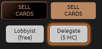
(sub-options are styled similar to the cards)
Idea 4 - After clicking "Save", open the last selected option.
Currently, when "Save" is clicked, the page always shows "Play project cards" selected.
This is bad UX, but with the ideas above it will get worse (more clicks will be needed), so it will be important to remember the selected top option upon submit (if that option is not the EndTurn/Pass one and if still contain sub-options)
Basically the top options to behave as a browser's tabs and aligned as such (maybe even can be styled as such).
When a top option has no available sub-options, currently it is not displayed at all, but also it can be displayed in a disabled state, if needed.
 ssimeonoff
All 15 comments
Wonderful! I love these change so much , can't wait to see it !
 jijiqw
on 8 Jul 2020
jijiqw
on 8 Jul 2020
Amazing! I would add an small reminder icons on topmost "Spend resources" button when you have an option to spend Heat, Plants etc.
 alrusdi
on 9 Jul 2020
alrusdi
on 9 Jul 2020
if such reminder is added, then it should be applied and for "Activate Cards".
ssimeonoff
on 9 Jul 2020
@ssimeonoff can you provide us a buttons markup like shown for Idea 2? I'll try to prototype it
alrusdi
on 10 Jul 2020
The images were just examples of the UX ideas.
For a direct implementation, maybe it will better a more subtle implementations (browser tabs)

width: 140px;
 height: 55px;
color: #bb8760;
text-shadow: 0 2px 2px black;
padding:5px;
font-size:19px;
text-aligh: center;
border-bottom:2px solid rgba(0,0,0,.5);
border-right:2px solid rgba(0,0,0,.5);
Last element to be without border-right.
Define the text labels (in various languages - the shorter, the better) and adjust the padding, uppercase or not, font-size,etc.
When a tab(option) does not contain suboptions:
color: rgba(0,0,0,.5); text-shadow:none;
When a tab(option) is active:
border-bottom:none;background:linear-gradient(black,transparent);border-radius:10px 10px 0 0;
ssimeonoff
on 10 Jul 2020
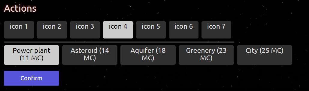
If we use icons for the top actions, buttons can be smaller and language agnostic:
- play cards - a card with green arrow down
- activate cards - a card with red right arrow
- trade - a trade icon
- delegates - a delegate icon
- sell cards - a card with a red X
etc
ssimeonoff
on 8 Oct 2020
Re: idea 3 at top, to me the "spend resources" grouping feels kinda arbitrary. Do these things really have much in common? Whatever they do have in common also applies to most standard projects as well. I think I'd rather the top-level list was on the longer side. That's just me though.
 kevinb9n
on 8 Oct 2020
kevinb9n
on 8 Oct 2020
I agree. It was more of a example. (you see in my latest post, Trade is a separate action as it is now).
The easiest way is, of course, all top options to exactly as they are, and when they are too many , will just wrap on a 2nd row.
These are just details.
The core idea is the top actions to be as browser's tabs and the sub-options to be displayed below.
ssimeonoff
on 8 Oct 2020
I've been filing a lot of issues lately as I've been thinking more and more about trying to use this site to teach friends who've never played before. (I haven't been brave enough to try it yet.)
One thing that's really fantastic about all the cards is that they will give the information using both text and highly standardized icons. I think it would be nice if we could follow that more in the interface – even in places where the board game itself didn't.
For example, what if when you clicked Standard Projects the options looked something like this?
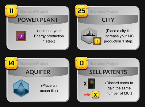
Why not? We already have that iconography with clear meanings; we should lean on it?
kevinb9n
on 18 Oct 2020
Thanks for a contribution, Kevin. I do like that. There's much about the
selection menu that can become more sophisticated.
 kberg
on 18 Oct 2020
kberg
on 18 Oct 2020
For example, what if when you clicked Standard Projects the options looked something like this?
I love it! Let's do it now? What about separate PR with this change only?
alrusdi
on 18 Oct 2020
This looks like a nice improvement. I can make the Vue components and data model should we accept to use this change.
 chosta
on 18 Oct 2020
chosta
on 18 Oct 2020
Random thoughts for you, but don't let me cause scope-creep.
I love the idea of an action bar which is always present and never changes – buttons only light up and dim as they are applicable. It could provide a couple spots to the right where situational options come and go:

(I think options that are actions should be styled somehow differently from not actions.)
My long-term wish, though, is that these buttons aren't actually "tabs" and don't open subtabs at all. Rather, that after clicking one, you go interact with the real game component you want. This becomes more feasible if we reduce scrolling. For any content that is tabbed (e.g. #2001), the interface should autoselect the relevant tab when you click the button. (Despite my Oct 8 complaint I put "convert resources" back together as one option; I figure you can click your actual plants or heat in your inventory tray after that...)
(and the killer move: leave action buttons lit (or at least half-lit) when I'm off-turn, based on what my options would be if everyone else were to pass. Why? "Maximize Off-Turn Planing")
kevinb9n
on 4 Dec 2020
Thanks to @sienmich for filing #2185 so we don't have to discuss standard-projects-as-cards in this issue anymore. Sorry for the erstwhile hijack!
kevinb9n
on 25 Dec 2020
Anyone interested in this should go look at #2192 as well - these two issues are sort of merging with each other in a certain sense.
kevinb9n
on 29 Dec 2020
Related issues
 ATiredVegan
·
5Comments
ATiredVegan
·
5Comments
 rodrigomp84
·
5Comments
rodrigomp84
·
5Comments
 vsrisuknimit
·
5Comments
vsrisuknimit
·
5Comments
 Carcassonner
·
5Comments
ssimeonoff
·
6Comments
Carcassonner
·
5Comments
ssimeonoff
·
6Comments
Most helpful comment
I've been filing a lot of issues lately as I've been thinking more and more about trying to use this site to teach friends who've never played before. (I haven't been brave enough to try it yet.)
One thing that's really fantastic about all the cards is that they will give the information using both text and highly standardized icons. I think it would be nice if we could follow that more in the interface – even in places where the board game itself didn't.
For example, what if when you clicked Standard Projects the options looked something like this?
Why not? We already have that iconography with clear meanings; we should lean on it?