Terraforming-mars: Easier to see global parameter level
I think the visuals for the global parameters should more clearly show the current level. I think the best way is to change the background colour as the meter fills up, not just the number colour. However, perhaps a simpler solution is to use a more striking colour than yellow for the numbers. The change from white to yellow doesn't seem obvious enough. Even worse, if you're playing with a blue-filtered "night light" mode (as it's called in Windows), the whites turn yellow and make it even harder to tell the difference. Perhaps red or green? Some experimentation might be in order.
 samyelias
All 8 comments
I tried some different shades of red and green previously, but they didn't seem to fit too well. Would you be able to suggest a suitable colour that we could use?
 nwai90
on 6 Jul 2020
nwai90
on 6 Jul 2020
I'll see if I can play around with it. I guess maybe the background colour might have to be shifted as well as the bar fills up.
samyelias
on 6 Jul 2020
I've suggested this variant
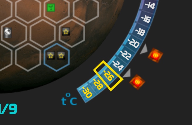
But it is hard to implement (very boring task)
 alrusdi
on 6 Jul 2020
alrusdi
on 6 Jul 2020
Better yet, would be to leave things as they are, but have a floating panel that has all the global parameters listed on it that is anchored to the right side of the screen, in much the same way your production levels / resources are anchored to the top of the screen.
 duckmammal
on 6 Jul 2020
duckmammal
on 6 Jul 2020
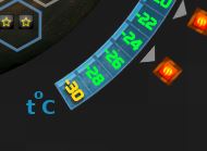
I thought this combination worked well, and is easy to distinguish in normal and night light mode.
samyelias
on 7 Jul 2020
I think it still doesn't settle the problems of not being able to see the global parameters while looking at the cards in your hand and the related issue of the game taking too long due to too much scrolling.
duckmammal
on 7 Jul 2020
@samyelias this variant is less readable in black&white. I think it is not that better than current to change
alrusdi
on 7 Jul 2020
Closed as resolved in https://github.com/bafolts/terraforming-mars/pull/1123
nwai90
on 13 Aug 2020
Related issues
duckmammal
·
3Comments
 ssimeonoff
·
6Comments
ssimeonoff
·
6Comments
 rodrigomp84
·
3Comments
rodrigomp84
·
3Comments
 vsrisuknimit
·
5Comments
vsrisuknimit
·
5Comments
 sienmich
·
5Comments
sienmich
·
5Comments