Terra-core: [terra-alert] Action Button Not Aligned Properly with Multiple Line Message
Bug Report
Description
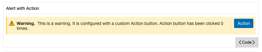
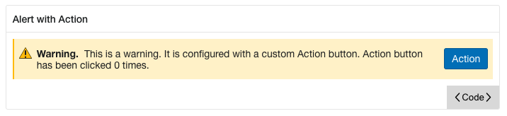
When you have a message that spans multiple lines the action button is vertically justified to the top of the alert container. I would have though it would be center justified in that case as it is with a single line message.
I'm not sure if the title/icon should also be center justified as well.
Steps to Reproduce
- Go to https://engineering.cerner.com/terra-ui/components/terra-alert/alert/alert
- Scroll down to the Warning "Alert with Action" example
- Reduce screen width to less than 1192px
- Observe the alignment bug(s).
Additional Context / Screenshots
Expected Behavior
The action button (and maybe the title/icon) should be vertically justified to the center of the container.
Possible Solution
.actions {
-  align-items: flex-start;
+  align-items: center;
Environment
- Component Name and Version: terra-alert@latest
- Browser Name and Version: Chrome@latest
- Node/npm Version: [e.g. Node 8/npm 5] 10.22.1/6.14.6
- Webpack Version: 4.30.0
- Operating System and version (desktop or mobile): Mac 11.1 BigSur
@ Mentions
 TheSavageDev
All 2 comments
This is what it would look like making the possible solution I provided above.
TheSavageDev
on 18 Dec 2020
@TheSavageDev - I am closing this issue as not the intended UX design, and this proposed change of the button position would violate the Cerner's UX Design Standards for Notification Banners.
Terra-Alert, as well as the Terra-Notification-Dialog, both have very strict visual layout and API requirement needing to be tightly controlled as critical UI elements that deal with patient safety and risk mitigation, guided by Human Factors, and governed by Regulatory requirements and CE Marking certification.
For reference, we have intentionally placed the button position such that it remains in a consistent and fixed location, so users have consistent expectations and reliability for clear action findability.
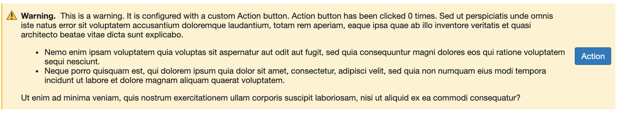
The proposed change would make the actions always fluid, never appearing in a consistent location, such that when the contents of the alert banner exceed the 1 or 2 line sample provided above, it forces the user to search vertically amongst the tall content, introducing the risk to potential to miss the action and not see it at all, which in turn has the potential to increase risk to patient safety. Example below:
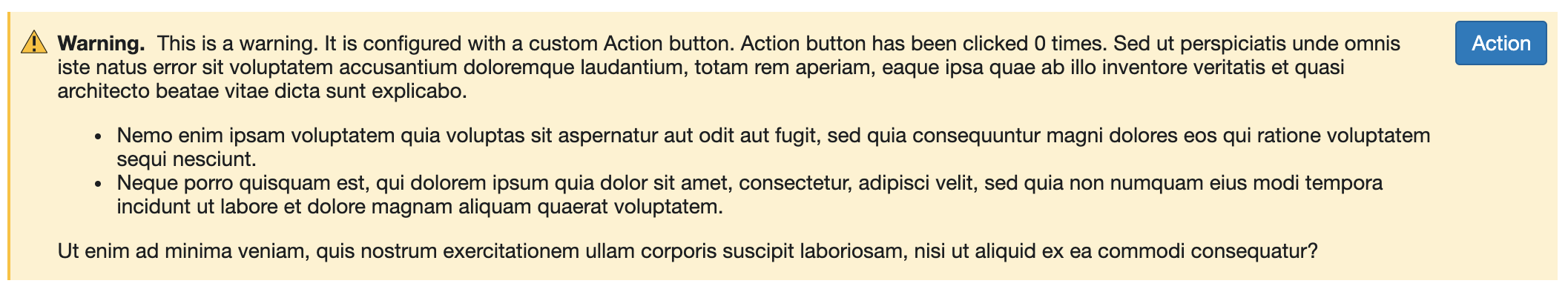
The current & intended design keeps actions pinned to the top right corner, regardless of content length within the banner, ensuring that users can always rely on looking in the same place to identify if actions are available, reducing change/variation blindness, as well as maintains parity with other existing Cerner UI frameworks in active use. Current shown below:
While seeming trivial, consistent button location and spacial awareness is a critical requirement needed for a UI component such as the notification banner.
\
\
We have a major version update to the Terra-alert planned, and UX will take a note to look at the padding and spacing for a more ideal visual presentation when there is 2-lines of wrapping text, so it looks also intentional and not oddly aligned, similar to when there is a single line of content, or when there is 3-4+ lines of content as it does now.
cc: @pranav300
 neilpfeiffer
on 7 Jan 2021
neilpfeiffer
on 7 Jan 2021
Related issues
neilpfeiffer
·
5Comments
 dv297
·
4Comments
dv297
·
4Comments
 noahbenham
·
4Comments
noahbenham
·
5Comments
noahbenham
·
4Comments
noahbenham
·
5Comments
 saisanthosh225
·
5Comments
saisanthosh225
·
5Comments
Most helpful comment
@TheSavageDev - I am closing this issue as not the intended UX design, and this proposed change of the button position would violate the Cerner's UX Design Standards for Notification Banners.
Terra-Alert, as well as the Terra-Notification-Dialog, both have very strict visual layout and API requirement needing to be tightly controlled as critical UI elements that deal with patient safety and risk mitigation, guided by Human Factors, and governed by Regulatory requirements and CE Marking certification.
For reference, we have intentionally placed the button position such that it remains in a consistent and fixed location, so users have consistent expectations and reliability for clear action findability.
The proposed change would make the actions always fluid, never appearing in a consistent location, such that when the contents of the alert banner exceed the 1 or 2 line sample provided above, it forces the user to search vertically amongst the tall content, introducing the risk to potential to miss the action and not see it at all, which in turn has the potential to increase risk to patient safety. Example below:
The current & intended design keeps actions pinned to the top right corner, regardless of content length within the banner, ensuring that users can always rely on looking in the same place to identify if actions are available, reducing change/variation blindness, as well as maintains parity with other existing Cerner UI frameworks in active use. Current shown below:
While seeming trivial, consistent button location and spacial awareness is a critical requirement needed for a UI component such as the notification banner.
\
\
We have a major version update to the Terra-alert planned, and UX will take a note to look at the padding and spacing for a more ideal visual presentation when there is 2-lines of wrapping text, so it looks also intentional and not oddly aligned, similar to when there is a single line of content, or when there is 3-4+ lines of content as it does now.
cc: @pranav300