Terra-core: Create new Dropdown-Button component
Feature Request
Description
Create a new dropdown-style button component with two features:
- one for a split-button (2 targets: regular button plus a dropdown icon-button that reveals the menu)
- one for a dropdown-button (1 target: clicking button reveals the menu)
Button should also contain a prop for isBlock to stretch to fill 100% of container's width.
Additional details posted here: https://zpl.io/a3gPoXy
Additional Context / Screenshots
screenshots:
Split-Button example:

Dropdown-Button example:

 neilpfeiffer
All 15 comments
What are the use cases or design recommendations for determining which component to use? Specifically between the Select, Dropdown Button, and Split Dropdown Button
 StephenEsser
on 6 Feb 2019
StephenEsser
on 6 Feb 2019
I agree with @StephenEsser with respect to the select vs dropdown. I can see the use case for split dropdown where you want to flex the option and then be able to perform that action. Why do we have select and dropdown button? They are the same.
Also, why are we not just styling the native select because it will always have better behavior and accessibility than something custom we create? Especially for really simple selects like this dropdown.
 nickpith
on 12 Jun 2019
nickpith
on 12 Jun 2019
@StephenEsser @nickpith These are good questions for the UX designers.
cc/ @neilpfeiffer @amberwilks
 bjankord
on 12 Jun 2019
bjankord
on 12 Jun 2019
@nickpith - A Select and a dropdown button are two entirely different UI controls. While they may share many similarities in structural composition, and could be programmatically controlled to behave in similar ways - it would be entirely inappropriate to do so.
A dropdown select is a _Form_ element - with the explicit intent of choosing a value from a list of options, holding that value in an input while a form is in an unsubmitted state, and then allowing a user to change the value if returning to that form. It essentially is a vehicle to "hold" or "change" a value.
A single button is never something that is a "holder" of a value or of information, it is explicitly an action that will do something. As such - when there are a series of similar actions, a common UI trick is to combine the independent buttons into a single UI control.
In more engineering speak - a dropdown-select allows you to set or modify a property or data value, a button is a method. So a split-button is bundled set of methods with one that is primary is separate and face-up, a dropdown-button is just a bundled set of methods with no primary (more like a menu).
neilpfeiffer
on 12 Jun 2019
@StephenEsser @nickpith - I can assist when it comes to the use cases of when to choose one component vs. the other. I would also refer you to our Cerner Design Standards: Buttons and Drop-down for additional information.
Dropdown Buttons:
- Provide the user with a list of items they must choose from once they’ve selected an initial action.
- When to use: Dropdown buttons are best used when users need to choose from more specific options to the button action they are interacting with.
- An example of this would be if you have a dropdown button that says 'Export' further options would be Export as PDF, Export as XML, etc.
Split Buttons:
- Provide the user with the ability to choose the primary action or an action from a listing of alternative actions.
- When to use: Split buttons are best used when there are many possible actions users can take, but only one primary action.
- An example of this would be google's old gmail design that had 'Reply' as the primary action, but you could also hit the dropdown from this split button to reveal different options such as: Reply All, Forward, etc.
Drop-downs:
- Present a list of options to a user when interacted with. It provides an easy and accessible way to group a large number of selectable options.
- Drop-downs are typically used in forms or filter workflows, where dropdown buttons and split buttons would not be appropriate.
- When interacted with, drop-downs provide a select menu with a list of options for the user to select from. If there is not an option selected by default, then provide a 'Select' placeholder value. If the field is not required, the user should be allowed to unselect or remove a previous selection.
 jenniferwurth
on 12 Jun 2019
jenniferwurth
on 12 Jun 2019
The wireframe visuals included above also do not communicate that there will be distinct visual differences between a traditional form-select and a dropdown button, which may be causing the confusion. In order to properly communicate to a user one vs. the other, there will be appropriate styling cues applied.
neilpfeiffer
on 12 Jun 2019
I will also add to @neilpfeiffer 's comment above. Using a Select control to create the drop-down button would violate accessibility guidelines. The control must announce itself as a button for screenreaders. The use of semantic code is very important for all assistive technologies.
 amberwilks
on 12 Jun 2019
amberwilks
on 12 Jun 2019
Tech Design for Dropdown Button
Summary:
Adds a dropdown button with two distinct types. One has a traditional button which shows the primary option and a dropdown button to reveal more options. Clicking options in the dropdown will run their action. The other type is a single button that opens the dropdown menu, then selecting an item from the dropdown menu will run the button's associated action.
Planning on using the Popup component to place and display the dropdown. The Button component could almost be reused for the one or two internal buttons but getting them to have all of the correct sizes and paddings would be difficult at best.
Requirements:
See the zeplin.
Requirements Added:
None thus far.
Requirements Dropped:
Centering the label when a width is set and left aligning the label if the label would occupy more than one line would require a very hacky implementation. It was agreed to leave the text centered if the line wraps.
Responsiveness:
None in this component.
Collapsible Menu is desired to be adapted to be able to show dropdown buttons, and when dropdown buttons get collapsed into the ellipsis button showing all of the options in the ellipsis button's menu.
Bidirectionality:
Alignment will be mirrored in rtl orientation.
Accessibility:
Component will be keyboard navigatable
- Component can be focused with tab
- Pressing enter or space on the button with the caret will open the dropdown and focus the first option
- Dropdown can be navigated with up and down arrows, home to jump to the first element, end to jump to the last element
- Pressing enter or space in the dropdown selects an option in the split component, or runs the associated action in the dropdown button
- Pressing escape closes the dropdown
React Props:
Note on defaultOption, this prop may be better represented if the two types were split into two components so split buttons could have a defaultOption and dropdown buttons could have a required string label instead.
| Prop | Type | Default | Description |
|----------|------|---------|--------------|
| children | node | required prop | The options to display in the dropdown menu |
| defaultOption | An object with a string label and function callback property | required prop | The option that will be shown in the button when the component is loaded. In dropdown buttons the callback is ignored and the label is what is shown on the button to open the dropdown. |
| variant | enum | 'neutral' | Either 'neutral' or 'emphasis'. Changes the display styles of the button |
| type | enum | 'dropdown' | Either 'dropdown' or 'split'. Changes the functionality of the component to either just have a button to open a dropdown or to have a button to run the currently selected action and a button to open the dropdown to select an action |
| disabled | boolean | false | Prevents the button from being clicked and the dropdown from being expanded |
| isBlock | boolean | false | Whether or not the button should display as a block |
Example:
<DropdownButton
  defaultOption={{ label: 'Primary option', callback: () => { console.log('primary option'); } }}
  variant={Types.EMPHASIS}
>
  <DropdownButton.Option label="1st Option" callback={() => { console.log('hi'); }} />
  <DropdownButton.Option label="2nd Option" callback={() => { console.log('bye'); }} />
</DropdownButton>
CSS
A wide variety of global variables will be required to meet theming demands for the component.
 Blackop778
on 12 Jun 2019
Blackop778
on 12 Jun 2019
1) Will the keyboard accessibility behave the same for both variants? In the zeplin outline it appears
dropdown type should open when the entire element is focused while the split type would open on when the button has focus (it seems like it shouldn't matter if the button specifically has focus for keyboard navigation?)
2) What is the display for a single option? Will it display a terra-button in place of the dropdown indicator?
3) IMO the props variant and type here are confusing. For terra-button type refers to the button type of 'submit', 'button', etc where here type more aligns with variant. Then for terra-select variant would match this component's intended type.
Because this component is technically two buttons, dropdown-button and split-button I am wondering if it would be clearer to create & export two components in the package. You also mentioned it would be easier foe differentiating the defaultOption prop.
4) Above you mentioned potentially using terra-popup for displaying the options. I am wondering if there will be UX pushback with how the target & content positioning will affect the menu display. It'll may be challenging to display the options align with the being of the button (or end when less room is available). Though @dkasper-was-taken might be able to provide better insights here.
5) How do we intent to render the button's height and text truncation when a new options selected is longer and needs to wrap to correctly display? If we render with the default option and then update it would move all the other content on the screen.
6) I am wondering if we should create an Options component, even if it is as simple as having the props callback and label.
 emilyrohrbough
on 13 Jun 2019
emilyrohrbough
on 13 Jun 2019
@emilyrohrbough
1: The dropdown type is a single button so there isn't anywhere else to focus, for the split type the dropdown opens when enter/space are pressed when the down arrow portion is focused.
2: I hadn't planned on doing anything special for having only a single option
5 & 3 (somewhat): After rereading what @sethbroox said when I asked for some clarification I believe the intention is that for either the dropdown type or split type when the user selects an option from the dropdown that it immediately run that option's action rather than for the split button put that action on the button outside the dropdown and require the user to press the outside button to actually run the action. If that is the case we could have a required prop to be the label, either for the dropdown or for the split button and have a separate optional callback prop that, if provided a value, would make the component into a split type as opposed to being a dropdown type if no callback is provided. It probably still would be clearer to create and export two components though.
6: This probably would be for the best. It would probably also mean that it would be easiest to use an implementation similar to terra-form-select.
Blackop778
on 13 Jun 2019
React is written to be HTML semantic, I'd agree with Emily in creating a component for the Button options. Whether it's Button, Option, or something else. Potentially removing the options prop in favor of children.
<DropdownButton variant="emphasis">
  <DropdownButton.Button label="Button 1" onClick={() => {}} />
  <DropdownButton.Button label="Button 2" onClick={() => {}} />
</DropdownButton>
Is label the appropriate name for the text within the options? Label has a strong meaning and purpose within form components.
Is sorting a requirement from UX? I think the user should probably do their own sorting. I'd expect the buttons to always be in the user defined order. We might consider removing this prop.
I think isDisabled should be disabled. For html attributes we generally match naming conventions unless there is a chance they can conflict. But in this context they share the same meaning.
I'd expect the positioning of the dropdown to be consistent. Either always opening down, or something similar to the Select where it opens down by default if it can fit, otherwise it will open up. The boundingRef should probably be abstracted from the user. I'd like to get other opinions on this. We might consider removing this prop.
We might also consider removing width. The dropdown Button is just a Button whose action opens a dropdown. We don't provide a width attribute for the regular Button. I'd expect the width, by default, to always be the auto width it grows to after adding text. If a user wants to adjust the width they should provide a class.
defaultOption is a tricky prop. The regular (non-split) dropdown button may have text that is not an option. In the example above give by jenniferwurth.
An example of this would be if you have a dropdown button that says 'Export' further options would be Export as PDF, Export as XML, etc.
The dropdown button may display "Export" but "Export" is not an option within the dropdown. It is the action of the Dropdown Button.
StephenEsser
on 17 Jun 2019
@StephenEsser
I've changed it to have an Option subcomponent.
I suppose title would be a suitable replacement for label, but I am not really opinionated on the matter.
Sorting was mentioned as part of what was labeled an optional feature that if the dropdown is alphabetically sorted then typing would jump to the option starting with those letters similarly to how a select works.
I can change isDisabled to disabled.
I am seeing issues with using the Popup and trying to get it to display exactly how UX wants. I don't see how boundingRef could be abstracted away from the consumer and didn't see any examples of the select opening anyway other than down. Do you have a link to an example?
The problem with using css for width would be that having a set width is intended to change the display functionality of the dropdown, setting it to the same width and centering it under the main button, but I am not sure if that is practical/possible with Popup :(
Did you see my idea in the comment above yours to separate defaultOption into a required label and optional callback, where if callback is provided the button would become a split button and otherwise be a dropdown button?
Alternatively exporting two components would solve this easily.
Blackop778
on 17 Jun 2019
We probably won't be able to use title either because it is a first class html dom attribute. Label is probably fine but we will want to check with UX / other members of the team. Other potential options are text or display.
I'm still a little hesitant to sort any of the users data. Type searching can still be used without sorting the list. The default select variant does this today. ( Is this what you are referring to? )
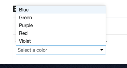
https://engineering.cerner.com/terra-ui/#/components/terra-form-select/form-select/select
Steps:
- Open Link
- Navigate to the default example
- Click to open the dropdown
- Press a character on your keyboard.
rfor example and notice it highlights Red.
The Select itself is an example for abstracting away the boundingRef. The Select implements terra-hookshot under the covers. Which is also what terra-popup uses. You can get the Select to open up by scrolling the Select to the bottom of the screen and then opening it. It opens up when there isn't enough room under.
The width of the Button can be obtain in javascript and used as necessary for the dropdown.
StephenEsser
on 17 Jun 2019
After talking with @neilpfeiffer sorting, width, shouldCloseOnSelection, and likely boundingRef are going to be cut and defaultOption and type are in the air. Going to update the table to reflect changes.
width will be covered by isBlock within a parent with a set width. shouldCloseOnSelection will become true and the only option.
Blackop778
on 25 Jun 2019
+1 on tech design with modifications we talked about in scrum today.
bjankord
on 26 Jun 2019
Related issues
 noahbenham
·
5Comments
StephenEsser
·
5Comments
noahbenham
·
5Comments
StephenEsser
·
5Comments
 ryanthemanuel
·
4Comments
ryanthemanuel
·
4Comments
 kschuste
·
3Comments
kschuste
·
3Comments
 saisanthosh225
·
5Comments
saisanthosh225
·
5Comments
Most helpful comment
@StephenEsser @nickpith - I can assist when it comes to the use cases of when to choose one component vs. the other. I would also refer you to our Cerner Design Standards: Buttons and Drop-down for additional information.
Dropdown Buttons:
Split Buttons:
Drop-downs: