Terra-core: Create show hide component
Issue Description
Create show hide component that follows Cerner's design standard
Issue Type
- [x] New Feature
- [ ] Enhancement
- [ ] Bug
- [ ] Other
Expected Behavior
The show hide component should be developed following Cerner's design standard for showing and hiding content.
 bjankord
All 52 comments
I talked with @neilpfeiffer and he confirmed that this is the same as issue #1785 and I will be working on the solution to both of these.
 gabeparra01
on 23 Aug 2018
gabeparra01
on 23 Aug 2018
Tech Design
Expected behavior
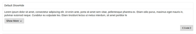
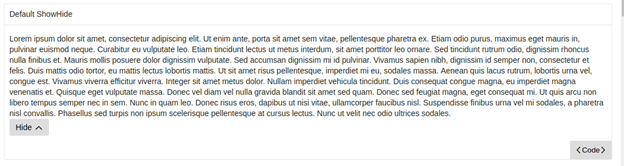
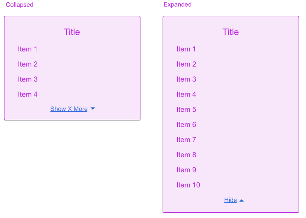
Allow the user to show or hide content on the screen. The content is hidden by default. While most of the content is hidden, a condensed preview of the full set of text will be shown to the user. When the "Show More" link is clicked, the full set of text will be displayed to the user, the link text will change to "Hide" and the icon will do a 180 degree turn. If the user clicks the link again, then the component will be reverted back to its original state with the link text displayed as "Show More", the icon back to its original position and displaying the preview text instead of the full text.
I still need to add hyperlink styling to the button, but these are the work-in-progress visuals:
Code Sample
This design will use terra-toggle as a dependency in order to harness the functionality. terra-icon will also be added as a dependency so that any of the Terra icons can be used in the display. For the link, there will be a private button/link class that is unique to the ShowHide component package. The code below is part of the render method and shows how terra-toggle and the custom button will be used.
return (
   <div {...customProps} className={showHideClassName}>
        {!this.state.isOpen && preview}
        <Toggle isOpen={this.state.isOpen} isAnimated={this.props.isAnimated}>
          {this.props.children}
        </Toggle>
        {button}
      </div>
    );
Here is another code snippet that shows example usage for the component:
import React from 'react';
// eslint-disable-next-line import/no-extraneous-dependencies, import/no-unresolved, import/extensions
import ShowHide from 'terra-show-hide/lib/ShowHide';

const fullText = 'Lorem ipsum dolor sit amet, consectetur adipiscing elit. Ut enim ante, porta sit amet sem vitae, pellentesque pharetra ex. Etiam odio purus, maximus eget mauris in, pulvinar euismod neque. Curabitur eu vulputate leo. Etiam tincidunt lectus ut metus interdum, sit amet porttitor leo ornare. Sed tincidunt rutrum odio, dignissim rhoncus nulla finibus et. Mauris mollis posuere dolor dignissim vulputate. Sed accumsan dignissim mi id pulvinar. Vivamus sapien nibh, dignissim id semper non, consectetur et felis. Duis mattis odio tortor, eu mattis lectus lobortis mattis. Ut sit amet risus pellentesque, imperdiet mi eu, sodales massa. Aenean quis lacus rutrum, lobortis urna vel, congue est. Vivamus viverra efficitur viverra. Integer sit amet metus dolor. Nullam imperdiet vehicula tincidunt. Duis consequat congue magna, eu imperdiet magna venenatis et. Quisque eget vulputate massa. Donec vel diam vel nulla gravida blandit sit amet sed quam. Donec sed feugiat magna, eget consequat mi. Ut quis arcu non libero tempus semper nec in sem. Nunc in quam leo. Donec risus eros, dapibus ut nisi vitae, ullamcorper faucibus nisl. Suspendisse finibus urna vel mi sodales, a pharetra nisl convallis. Phasellus sed turpis non ipsum scelerisque pellentesque at cursus lectus. Nunc ut velit nec odio ultrices sodales.';
const previewText = fullText.substring(0, 280);

const DefaultShowHide = () => (
  <ShowHide preview={previewText}>
    {fullText}
  </ShowHide>
);

export default DefaultShowHide;
Props
/* Describe react props */
| Prop Name | Type | Is Required | Default Value | Description |
|-|-|-|-|-|
| children | node | required | none | Content in the body of the ShowHide component that will be shown or hidden |
| preview | string | required | none | Text that will be visible to the user while the ShowHide state isClosed. |
| collapsedText | string | optional | Show More | Link text that will be displayed when the content is hidden. |
| expandedText | string | optional | Hide | Link text that will be displayed when the content is shown |
| icon | element | optional | IconChevronDown | Icon displayed next to text content within the show-hide button |
| isAnimated | bool | optional | false | Sets the ShowHide component to be animated when it is opened or closed |
| isInitiallyOpen | bool | optional | false | Sets the show-hide initial state to open |
| onClose | func | optional | none | Callback function triggered when ShowHide component is closed |
| onOpen | func | optional | none | Callback function triggered when ShowHide component is opened |
Responsiveness
Link/button text will wrap when width is overflowed.
Internationalization
This component must be able to be rendered with its mirror-imaged equivalent for rtl locales.
Accessibility
User should be able to tab to focus the field. The aria-expanded attribute will be used to indicate the open/closed state of the toggle section header.
gabeparra01
on 29 Aug 2018
I'm wondering if it would sound better to say the content is hidden instead of collapsed? Other than that everything looks good to me.
 tb5748
on 29 Aug 2018
tb5748
on 29 Aug 2018
Let's add two additional props which have a type set to string:
collapsedTextexpandedText
This will allow for people to customize the text displayed in the button if they need to.
e.g
collapsedText="Show 4 More"
expandedText="Hide"
bjankord
on 29 Aug 2018
@tb5748 fixed the description
gabeparra01
on 29 Aug 2018
@bjankord I added in the additional props
gabeparra01
on 29 Aug 2018
+1 on tech design.
bjankord
on 29 Aug 2018
Is show-hide the proposed name of this component?
 emilyrohrbough
on 29 Aug 2018
emilyrohrbough
on 29 Aug 2018
@emilyrohrbough yep, so the package name would be terra-show-hide
gabeparra01
on 29 Aug 2018
Given the toggle component provides the show-hide functionality, would it make sense to brand this component as preview or something along those lines? Or how to de play to distinguish the use of show-hide from toggle/toggle-button when people browser the UI library?
emilyrohrbough
on 29 Aug 2018
@emilyrohrbough that is a good question. I am not sure if the show-hide name came from UX designers in the Cerner Experience group or from @bjankord and his team. Brett do you have any thoughts on this? Both show-hide and preview sound like good names to me
gabeparra01
on 29 Aug 2018
show-hide is the vocabulary our UX team uses for this component in their designs, so I want to stick with that for the package name.
We originally built toggle and toggle-button prior to UX having any visuals for this type of functionality. We may deprecate toggle-button as the show-hide component follows the intended visuals and behavior UX wants for this type of functionality.
bjankord
on 29 Aug 2018
I believe we started calling the component show/hide as we saw several examples on the web with labels of Show/Hide. I was wondering if ShowMore-HideSome might be a little more descriptive of what the functionality is providing. Show-Hide makes it sound like the show or hide method is inclusive of the entire text.
tb5748
on 2 Sep 2018
Update: after translations have been created, I will add them to my forked repo. Then I will be ready for a pull request
gabeparra01
on 17 Sep 2018
We've received translations for this component:
Arabic ar
{
 "Terra.showhide.showmore": "أظهر المزيد",
"Terra.showhide.hide": "إخفاء"
}
English en
{
  "Terra.showhide.showmore": "Show More",
  "Terra.showhide.hide": "Hide"
}
English (US) en-US
{
  "Terra.showhide.showmore": "Show More",
  "Terra.showhide.hide": "Hide"
}
English (United Kingdom) en-GB
{
  "Terra.showhide.showmore": "Show More",
  "Terra.showhide.hide": "Hide"
}
Spanish es
{
  "Terra.showhide.showmore": "Mostrar más",
  "Terra.showhide.hide": "Ocultar"
}
Spanish (Spain) es-ES
{
  "Terra.showhide.showmore": "Mostrar más",
  "Terra.showhide.hide": "Ocultar"
}
Spanish (United States) es-US
{
  "Terra.showhide.showmore": "Mostrar más",
  "Terra.showhide.hide": "Ocultar"
}
German de
{
  "Terra.showhide.showmore": "Mehr anzeigen",
  "Terra.showhide.hide": "Ausblenden"
}
French fr
{
  "Terra.showhide.showmore": "Développer",
  "Terra.showhide.hide": "Masquer"
}
French (France) fr-FR
{
  "Terra.showhide.showmore": "Développer",
  "Terra.showhide.hide": "Masquer"
}
Dutch nl
{
  "Terra.showhide.showmore": "Meer tonen",
  "Terra.showhide.hide": "Verbergen"
}
Dutch (Belgium) nl-BE
{
  "Terra.showhide.showmore": "Meer tonen",
  "Terra.showhide.hide": "Verbergen"
}
Portuguese pt
{
  "Terra.showhide.showmore": "Mostrar mais",
  "Terra.showhide.hide": "Ocultar"
}
Portuguese (Brazil) pt-BR
{
  "Terra.showhide.showmore": "Mostrar mais",
  "Terra.showhide.hide": "Ocultar"
}
Swedish sv
{
  "Terra.showhide.showmore": "Visa mer",
  "Terra.showhide.hide": "Dölj"
}
Swedish (Sweden) sv-SE
{
  "Terra.showhide.showmore": "Visa mer",
  "Terra.showhide.hide": "Dölj"
}
Thanks for posting that @bjankord . For some reason I didn't get a notification email. Even though I am a watcher on that translations Jira
gabeparra01
on 18 Sep 2018
New tech design as a result of the discussions in #1910
Tech Design
Expected behavior
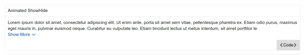
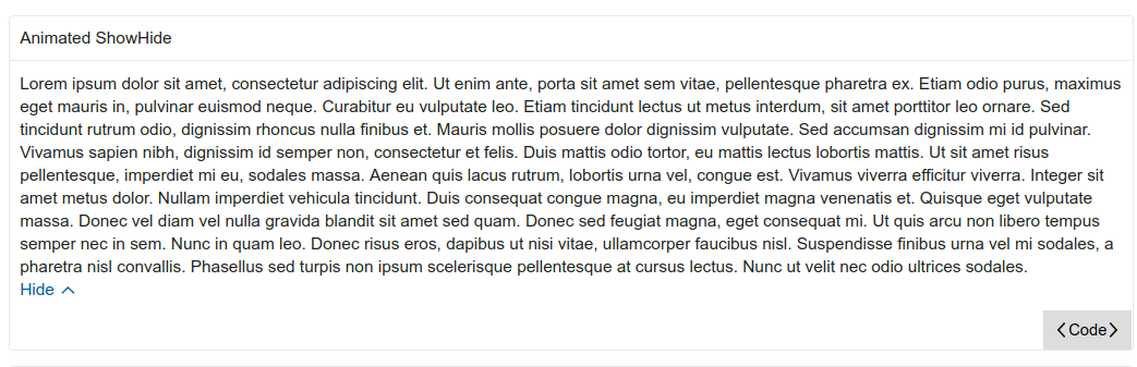
Allow the user to show or hide content on the screen. The content is hidden by default. While most of the content is hidden, a condensed preview of the full set of text will be shown to the user. When the "Show More" link is clicked, the full set of text will be displayed to the user, the link text will change to "Hide" and the icon will do a 180 degree turn. If the user clicks the link again, then the component will be reverted back to its original state with the link text displayed as "Show More", the icon back to its original position and displaying the preview text instead of the full text.
Visuals:
Code Sample
This design will use terra-toggle as a dependency in order to harness the toggle functionality. terra-icon will also be added as a dependency so that any of the Terra icons can be used in the display. For the link, there will be a private button/link class that is unique to the ShowHide component package. The code below is part of the render method and shows how terra-toggle and the custom button will be used.
Update: It will be a controlled component and will not have its own internal state. It will be a pure function component. For intl, it will use injectIntl and intlShape from terra-base. Sample code:
import React from 'react';
// eslint-disable-next-line import/no-extraneous-dependencies, import/no-unresolved, import/extensions
import ShowHide from 'terra-show-hide/lib/ShowHide';

const fullText = 'Lorem ipsum dolor sit amet, consectetur adipiscing elit. Ut enim ante, porta sit amet sem vitae, pellentesque pharetra ex. Etiam odio purus, maximus eget mauris in, pulvinar euismod neque. Curabitur eu vulputate leo. Etiam tincidunt lectus ut metus interdum, sit amet porttitor leo ornare. Sed tincidunt rutrum odio, dignissim rhoncus nulla finibus et. Mauris mollis posuere dolor dignissim vulputate. Sed accumsan dignissim mi id pulvinar. Vivamus sapien nibh, dignissim id semper non, consectetur et felis. Duis mattis odio tortor, eu mattis lectus lobortis mattis. Ut sit amet risus pellentesque, imperdiet mi eu, sodales massa. Aenean quis lacus rutrum, lobortis urna vel, congue est. Vivamus viverra efficitur viverra. Integer sit amet metus dolor. Nullam imperdiet vehicula tincidunt. Duis consequat congue magna, eu imperdiet magna venenatis et. Quisque eget vulputate massa. Donec vel diam vel nulla gravida blandit sit amet sed quam. Donec sed feugiat magna, eget consequat mi. Ut quis arcu non libero tempus semper nec in sem. Nunc in quam leo. Donec risus eros, dapibus ut nisi vitae, ullamcorper faucibus nisl. Suspendisse finibus urna vel mi sodales, a pharetra nisl convallis. Phasellus sed turpis non ipsum scelerisque pellentesque at cursus lectus. Nunc ut velit nec odio ultrices sodales.';
const previewText = fullText.substring(0, 280);

class DefaultShowHide extends React.Component {
  constructor(props) {
    super(props);

    this.state = { isOpen: false };
    this.toggleShowHide = this.toggleShowHide.bind(this);
  }

  toggleShowHide() {
    this.setState(prevState => ({
      isOpen: !prevState.isOpen,
    }));
  }

  render() {
    return (
      <ShowHide preview={<div>previewText</div>} isOpen={this.state.isOpen} onToggle={this.toggleShowHide}>
        <div>{fullText}</div>
      </ShowHide>
    );
  }
}

export default DefaultShowHide;
Props
/* Describe react props */
| Prop Name | Type | Is Required | Default Value | Description |
|-|-|-|-|-|
| children | node | required | none | Content in the body of the ShowHide component that will be shown or hidden. |
| intl | intlShape | required | none | The intl object to be injected for translations. Provided by the injectIntl function. |
| onChange | func | required | none | Callback function triggered when the component is expanded or collapsed. |
| preview | node | optional | none | Element(s) that will be visible to the user when isOpen is false. |
| buttonText | string | optional | Show More/Hide | Button text that will be displayed. |
| isOpen | bool | optional | false | Allows parent to toggle the component. True for open and false for close. |
| buttonAlign | string | optional | start | Applies style for which side of the container it aligns to. Options are start, center and end
Responsiveness
Link/button text will wrap when width is overflowed (length of one line is greater than the size of the container)
Internationalization
This component must be able to be rendered with its mirror-imaged equivalent for rtl locales.
Accessibility
User should be able to tab to focus the field. The aria-expanded attribute will be used to indicate the open/closed state of the toggle section header.
Updated to reflect comments. The aria-expanded attribute is already passed to the button as a prop to cover #1920. It uses the isOpen prop to determin if it is passing true or false
gabeparra01
on 27 Sep 2018
I think this tech design looks good. I missed this in the first tech design, but looking at the mockups from UX, we'll want the preview prop to be a node instead of a string. A use case from the mockups is a list that expands to show more list items.
I've also talked to @neilpfeiffer about the animation, we may cut that from the initial release. I need to follow up with him.
Let's get the other associates that were on the first PR to take a look at this tech design before moving to opening a PR for this.
bjankord
on 27 Sep 2018
I think this looks good. One thing to keep in mind would be the aria labeling for this component should be implemented or documented (see https://github.com/cerner/terra-core/issues/1920).
Also, are we providing the options where "show" / "hide" are icon-only icons or will we always have icon + text icons, where default text of show more / hide are provided?
emilyrohrbough
on 27 Sep 2018
We could reduce collapsedButtonText/expandedButtonText to just buttonText and let the consumer change the prop based on the isOpen state. Having two props seems like a holdover from the uncontrolled component implementation?
 tbiethman
on 27 Sep 2018
tbiethman
on 27 Sep 2018
I think this tech design looks good. I missed this in the first tech design, but looking at the mockups from UX, we'll want the
previewprop to be anodeinstead of astring. A use case from the mockups is a list that expands to show more list items.
I've also talked to @neilpfeiffer about the animation, we may cut that from the initial release. I need to follow up with him.
Let's get the other associates that were on the first PR to take a look at this tech design before moving to opening a PR for this.
@bjankord I will change the preview prop to type node. Please let me know what you and Neil decide about the animation feature.
@JakeLaCombe @StephenEsser @yuderekyu please review this tech design when you have time
gabeparra01
on 27 Sep 2018
I think this looks good. One thing to keep in mind would be the aria labeling for this component should be implemented or documented (see #1920).
Also, are we providing the options where "show" / "hide" are icon-only icons or will we always have icon + text icons, where default text of show more / hide are provided?
@emilyrohrbough Thank you for the link, I did not know about that standard. I'll implement/document it. I just looked over Zeplin requirements again and I did not see a requirement for an icon only feature or a text only feature
gabeparra01
on 27 Sep 2018
We could reduce
collapsedButtonText/expandedButtonTextto justbuttonTextand let the consumer change the prop based on the isOpen state. Having two props seems like a holdover from the uncontrolled component implementation?
@tbiethman Yeah that is a good point. I will refactor the two props into the single buttonText prop
gabeparra01
on 27 Sep 2018
Let's move forward without implementing an icon or text only option. We can enhance the component to do that if we need to in the future. cc/ @neilpfeiffer
bjankord
on 27 Sep 2018
@gabeparra01
Can you update the tech design comment with the changes discussed since posting it to verify we are all on the same page?
 StephenEsser
on 27 Sep 2018
StephenEsser
on 27 Sep 2018
Can you update the tech design comment with the changes discussed since posting it to verify we are all on the same page?
@StephenEsser I had a feeling I forgot something :). I updated the tech design.
gabeparra01
on 27 Sep 2018
+1 Looks great to me.
tbiethman
on 27 Sep 2018
+1
StephenEsser
on 27 Sep 2018
I am no longer able to use import { injectIntl, intlShape } from 'terra-base'; and export default injectIntl(ShowHide); now that it is a pure function component. The intl variable is undefined at runtime. I will have to use context instead:
const contextTypes = {
  /* eslint-disable consistent-return */
  intl: (context) => {
    if (context.intl === undefined) {
      return new Error('Component is internationalized, and must be wrapped in terra-base');
    }
  },
};
I will update the tech design
gabeparra01
on 27 Sep 2018
Ok sounds good, talked with @tbiethman and he didn't have any concerns. I still need to sync with @neilpfeiffer on the animation. I'm leaning towards pulling the animation from the v1.0.0 release.
bjankord
on 27 Sep 2018
I'm reviewing the animation with OCS today and should have direction on updates from UX.
 neilpfeiffer
on 27 Sep 2018
neilpfeiffer
on 27 Sep 2018
nitpick: what are people's thoughts on changing isOpen to isExpanded? seems to align more with the component's functionality
 yuderekyu
on 27 Sep 2018
yuderekyu
on 27 Sep 2018
thoughts on changing
isOpentoisExpanded? seems to align more with the component's functionality
Either one sounds good to me. @tb5748 suggested 'isOpen' https://github.com/cerner/terra-core/pull/1910#discussion_r220630790. So we should check with him too
gabeparra01
on 27 Sep 2018
@gabeparra01 - Outcome from OCS review:
[x] Remove
isAnimatedprop and the animation completely for initial implementation. Can be revisited in the future if still desired later.[x] Remove the
iconprop. Will instead need to provide icon as theme-able variable via inline-svg in css, one for default+focus state, one for hover+active/pressed state (since they will have different colors)[ ] Make
previewprop optional since designs sometimes have nothing showing in the preview (would be extra work to include an empty node/object just to show nothing).[ ] Add additional prop for the button positioning (
buttonPositionorbuttonAlignperhaps) with list of options asstart,center,end, which applies style for which side of the container it aligns to.
neilpfeiffer
on 28 Sep 2018
Either one sounds good to me. @tb5748 suggested 'isOpen' #1910 (comment). So we should check with him too
@gabeparra01 @yuderekyu I don't have a preference there as long as it doesn't end up being toggle again 😅
tbiethman
on 28 Sep 2018
@gabeparra01 Regarding injectIntl not working for functional components, I was curious as to why that would be the case. So I wrote a little component that tried it, and it worked.
const IntlComponent = injectIntl(({ intl }) => {
  console.log(`intl: ${Object.keys(intl)}`);
  return <div>This should log out the keys on intl if it is defined</div>
});
So I don't want to thrash your tech design, go ahead with what you have. But for posterity, I think using injectIntl should be viable for all components.
tbiethman
on 28 Sep 2018
nitpick: what are people's thoughts on changing isOpen to isExpanded? seems to align more with the component's functionality
Quick audit of existing props & concepts names for open/closed v. expanded/collapsed:
When defaulting to not-open (collapsed), we have:
isOpen(form-select),
isOpen(menu),
isOpen(application-layout-links/_TabMenu)
isOpen(toggle & toggle-button),
isOpen(abstract-modal),
isOpen(dialog-modal),
isOpen(disclosure-manager),
isOpen(overlay),
isOpen(hookshot),
isOpen(popup),
isOpen(slide-panel),
isOpen(application-layout/_LayoutSlidePanel),
isInitiallyOpen(toggle-section-header),
isTimeClarificationOpen(date-time-picker),
isExpanded(example-template),When defaulting to being open (expanded), we have:
isCollapsed(clinical-data-grid/sections)
isCollapsed(application-layout-links/_tabs)the ARIA attribute for open/closed is:
aria-expanded={true}
aria-expanded={false}other general states
collapsedTabs(tabs)
isCollapsibleMenuItem(collapsible-menu-view)
neilpfeiffer
on 28 Sep 2018
Question for group, should we stick with a single callback for onToggle (consumer has to track open/close state if desired) or would consumers prefer explicit callbacks for onOpen and onClose like we have in Toggle-Section-Header
neilpfeiffer
on 28 Sep 2018
In regards to isOpen prop name, let's stick with isOpen. As @neilpfeiffer pointed out, we use that naming convention across a wide array of other components.
Question for group, should we stick with a single callback for onToggle (consumer has to track open/close state if desired)
I would stick with a single callback for onToggle for this component.
bjankord
on 28 Sep 2018
My configuration for injectIntl was off but @tbiethman helped me get it working. I updated the tech design again
gabeparra01
on 28 Sep 2018
Everybody good with the tech design?
@tbiethman @JakeLaCombe @emilyrohrbough @yuderekyu @StephenEsser @neilpfeiffer
bjankord
on 28 Sep 2018
Does anyone have thoughts on changing onToggle to onChange?
StephenEsser
on 30 Sep 2018
onChange sounds good to me, its matches more idiomatic react terms.
bjankord
on 1 Oct 2018
+1 on tech design, I think this looks solid.
bjankord
on 1 Oct 2018
+1
tbiethman
on 1 Oct 2018
+1
StephenEsser
on 1 Oct 2018
Looks good to me with onChange
yuderekyu
on 2 Oct 2018
+1 after changing preview to be optional and adding new buttonAlign prop, per https://github.com/cerner/terra-core/issues/1563#issuecomment-425268096.
And onChange sounds good to me as well.
neilpfeiffer
on 2 Oct 2018
+1 new design looks good.
emilyrohrbough
on 2 Oct 2018
+1 after changing
previewto be optional and adding newbuttonAlignprop, per #1563 (comment).
AndonChangesounds good to me as well.
Updated the tech design
gabeparra01
on 2 Oct 2018
@gabeparra01 Looks like we've got consensus on this, lets move forward with a new PR.
bjankord
on 2 Oct 2018
This is now available on npm: https://www.npmjs.com/package/terra-show-hide
bjankord
on 19 Oct 2018
Related issues
 cwalten
·
6Comments
cwalten
·
6Comments
 dv297
·
4Comments
dv297
·
4Comments
 noahbenham
·
4Comments
noahbenham
·
4Comments
 FloraChenCerner
·
4Comments
noahbenham
·
5Comments
FloraChenCerner
·
4Comments
noahbenham
·
5Comments
Most helpful comment
In regards to
isOpenprop name, let's stick withisOpen. As @neilpfeiffer pointed out, we use that naming convention across a wide array of other components.I would stick with a single callback for
onTogglefor this component.