Issue Description
Create new Avatar component with OCS styling.
Issue Type
- [X] New Feature
- [ ] Enhancement
- [ ] Bug
- [ ] Other
 ChaseSinclair
All 18 comments
Technical Design: terra-avatar
Summary:
This is a new component that allows the consumer to specify which type of avatar they wish to utilyze for their use case.
Expected behavior:
Should be able to give the component an icon, an image or text which will display inside the circular wrapper.
Responsiveness:
The content within the avatar does not change, only the size. The size of the avatar is dictated by the component where it lives.
I18N / Bi-directionality:
These changes should make no changes to the existing ltr/rtl functionality.
Interaction States
Avatars will not have interaction states.
Accessibility
We'll provide an aria-label to indicate that the component is an avatar.
React Props:
| Props | Type | Default | Description |
| ----------- | ----- | --------- | --------------------------------------------------------- |
| alt | string | undefined | The text content that specifies the alternative text for the image. |
| icon | element | undefined | The icon to render. |
| image | string | undefined | The image to display. |
| initials | string | undefined | The initials to display. |
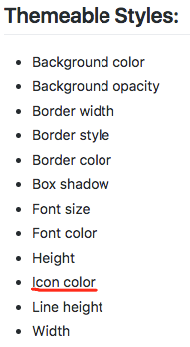
Themeable Styles:
- Background color
- Background opacity
- Border width
- Border style
- Border color
- Box shadow
- Font size
- Font color
- Size
- Icon color
- Line height
ChaseSinclair
on 8 Feb 2018
- Can we mention the props that are defined vs those optional?
- Can we mention the variant types for the avatar?
- By "Should be able to give the component a child", did you mean it should have children as a prop?
- Circle stroke width needs to be theamable.
- Update the design with the interaction states?
- Can we explicitly mention the icon properties that would be themeable?
- Can we update the name initials to be more generic, maybe something like avatarText?
 dm123455
on 8 Feb 2018
dm123455
on 8 Feb 2018
Should be able to give the component a child (icons, image or text) which will display inside the circular wrapper.
Can we change this _child_ to be _graphic_?
 dylanklohr
on 9 Feb 2018
dylanklohr
on 9 Feb 2018
Can we add an aria-label for the entire component that would just read avatar or something simliiar to this design, under an accesibliity section?
dylanklohr
on 9 Feb 2018
You mention in the props table above that icons is
array of elements
This is probably an implementation detail, but I, personally, wouldn't mandate that it's an array. Rather, I'd set the prop to be able to accept an element, or an array of elements.
If you're familiar with the way that React handles opaque data types like children, they essentially give the ability to pass one, or a number of children to a given component. I have an example of this I can show you.
dylanklohr
on 9 Feb 2018
Can we mention the props that are defined vs those optional?
By 'defined', do you mean have default values? All props are optional, and variant defaults to 'default'. If none of the props are provided then an empty circular avatar is rendered.
Can we mention the variant types for the avatar?
Yep, that's mentioned in the table.

By "Should be able to give the component a child", did you mean it should have children as a prop?
This should probably be rephrased to "Should be able to give the component a list of icons, an image or text which will display inside the circular wrapper.".
Circle stroke width needs to be theamable.
It is themeable as border width.
Update the design with the interaction states?
Avatars will not have interaction states as mentioned in the callouts. I've updated the tech design to mention this.
Can we explicitly mention the icon properties that would be themeable?
I mentioned that the icon color is themable. The size of the icons is inherited from the avatar size itself.
ChaseSinclair
on 9 Feb 2018
The multiple variant has been removed as a part of this issue. It is not required for consumer work in this quarter. @bjankord @dm123455
ChaseSinclair
on 9 Feb 2018
+1
dylanklohr
on 9 Feb 2018
- I meant required(not defined) vs optional.
- The callouts mentions "If an avatar is by itself the only change in state will occur with the mouse pointer." for the interaction state.
- Also please update the name initials to be more generic.
dm123455
on 9 Feb 2018
+1
dm123455
on 9 Feb 2018
Is this expected to be an enhancement of the ProfileImage or will this be a standalone component?
 emilyrohrbough
on 13 Feb 2018
emilyrohrbough
on 13 Feb 2018
Is this expected to be an enhancement of the ProfileImage or will this be a standalone component?
It is a standalone component.
ChaseSinclair
on 19 Feb 2018
Does this depreciate profile image?
 mjhenkes
on 19 Feb 2018
mjhenkes
on 19 Feb 2018
Does this depreciate profile image?
This may be a question @bjankord could answer. I would think we could deprecate profile image with this.
ChaseSinclair
on 19 Feb 2018
I would think we could deprecate profile image with this.
They do sound like very similar concepts IMO. Could we just enhance the Profile Image?
emilyrohrbough
on 19 Feb 2018
They do sound like very similar concepts IMO. Could we just enhance the Profile Image?
I remember speaking with @bjankord about whether to start a new component or enhance the existing. We came to the conclusion that the avatar was different enough to warrant a new component.
Could you explain in more depth when the Avatar would be used over the ProfileImage? They sound like very similar concepts IMO.
They do share some similarities, but the Avatar can display text or a custom, theme-able icon.
ChaseSinclair
on 19 Feb 2018
+1 on tech design. On this, I'd like to move forward with avatar as a new component separate from profile-image. Then, at a later date, follow up on reconciling the 2 components into 1 component. I foresee us deprecating profile-image and addinf it's functionality into the OCS avatar component.
 bjankord
on 19 Feb 2018
bjankord
on 19 Feb 2018
JIRA created
 PaulSolDev
on 26 Feb 2018
PaulSolDev
on 26 Feb 2018
Related issues
 yuderekyu
·
3Comments
bjankord
·
5Comments
yuderekyu
·
3Comments
bjankord
·
5Comments
 noahbenham
·
5Comments
noahbenham
·
5Comments
 neilpfeiffer
·
3Comments
neilpfeiffer
·
3Comments
 StephenEsser
·
4Comments
StephenEsser
·
4Comments
Most helpful comment
You mention in the props table above that
iconsisThis is probably an implementation detail, but I, personally, wouldn't mandate that it's an
array. Rather, I'd set the prop to be able to accept an element, or an array of elements.If you're familiar with the way that React handles opaque data types like
children, they essentially give the ability to pass one, or a number of children to a given component. I have an example of this I can show you.