Terra-core: Do not allow user to clear selection in terra-form-select
Issue Description
The new terra-form-select always includes a "-Select-" option that lets the user clear the selection. We need a way for a consumer of the control to turn off this functionality, as it allows the user to leave a valid state and go to an invalid state.
(This was possible in the old terra-form/select.)
Issue Type
- [ ] New Feature
- [X] Enhancement
- [ ] Bug
- [ ] Other
Expected Behavior
Allow the consumer of terra-form-select to indicate that the user is not allowed to clear a selection once it has been set/made.
Current Behavior
The terra-form-select control always includes a "-Select-" option that lets the user clear the selection.
 hboege
All 9 comments
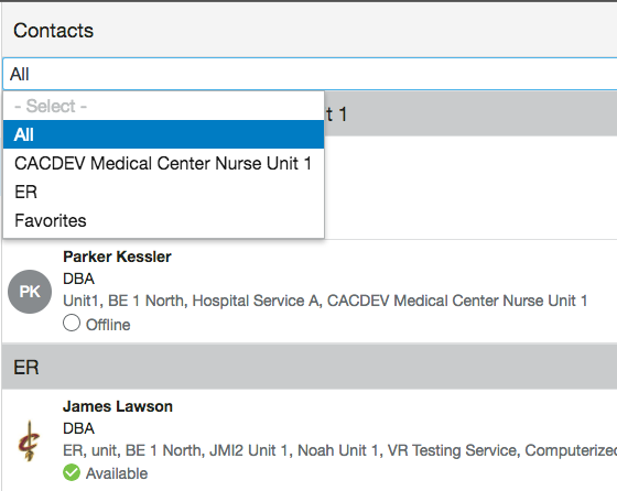
It might make sense to allow the - Select - option to be removed or set as a different value, etc. Here's an example of how we'd like to use it. We default to "All" so including a Select option doesn't make much sense.
 noahbenham
on 2 Feb 2018
noahbenham
on 2 Feb 2018
Tech Design
Summary
The Select component will now receive a new prop 'isPlaceholderHidden'. This prop will determine if the clear option- Select - should be visible.
React Props:
Select
Prop | Type | Default | Description
------------ | ------------- | ------------ | -------------
isPlaceholderHidden | boolean | false | Indicates whether the clear option should be visible
Examples
import React from 'react';
import Select from 'terra-form-select';

<Select
  name="foo"
  defaultValue="b"
  isPlaceholderHidden
>
  <Select.Option value="m" display="moo" key="m" />
  <Select.Option value="b" display="boo" key="b" disabled />
  <Select.Option value="z" display="zar" key="z" />
</Select>
In case when isInvalid and isPlaceholderHidden both are true for the Select component, then the default option will be a blank option.
 mayurikini
on 7 Feb 2018
mayurikini
on 7 Feb 2018
+1 on tech design. I wish I could think of a better name for the isClearSelectionHidden prop.
 bjankord
on 8 Feb 2018
bjankord
on 8 Feb 2018
Maybe some variation of:
isPlaceholderDisabled, allowBlankSelection, isNullValueDisabled, allowInvalidSelection, removeNullValue, isNullValueHidden, isDefaultValueHidden
 dkasper-was-taken
on 8 Feb 2018
dkasper-was-taken
on 8 Feb 2018
@bjankord @dkasper-was-taken changed the prop to isPlaceholderDisabled
mayurikini
on 8 Feb 2018
How about isPlaceholderHidden?
 mjhenkes
on 8 Feb 2018
mjhenkes
on 8 Feb 2018
+1
 tbiethman
on 8 Feb 2018
tbiethman
on 8 Feb 2018
Resolved in #1229
bjankord
on 9 Mar 2018
JIRA created
 PaulSolDev
on 15 Mar 2018
PaulSolDev
on 15 Mar 2018
Related issues
 FloraChenCerner
·
4Comments
FloraChenCerner
·
4Comments
 StephenEsser
·
4Comments
noahbenham
·
4Comments
StephenEsser
·
4Comments
noahbenham
·
4Comments
 saisanthosh225
·
5Comments
StephenEsser
·
5Comments
saisanthosh225
·
5Comments
StephenEsser
·
5Comments
Most helpful comment
How about
isPlaceholderHidden?