- The new icon's border is extremely thin, so it's flickers on my screen.
- New icon is very small (compared to other icons)

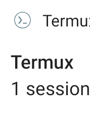
- Termux application version: 0.95
 532910
All 6 comments
Android development guidelines have exact specs for notification icons. I would suggest following them.
Also I can volunteer to create some mock-ups
 ezhd
on 12 Jul 2020
ezhd
on 12 Jul 2020
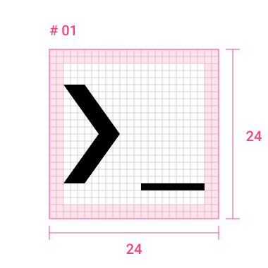
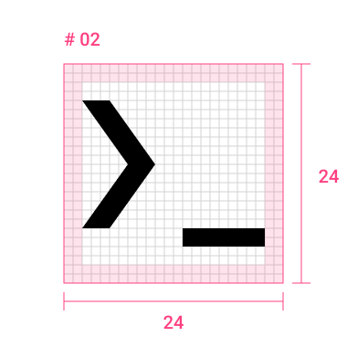
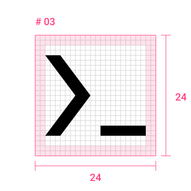
Here are some wireframe mockups I made just now.
Following Android system icons guidelines
And this is real life screenshot comparison on Pixel 2XL device. (Compiled preview apk with svg vector assets)
if anyone interested, I can share svgs ready for production :)
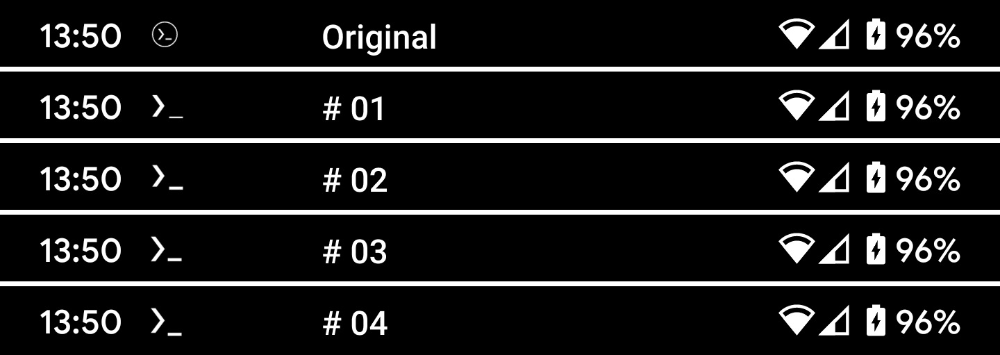
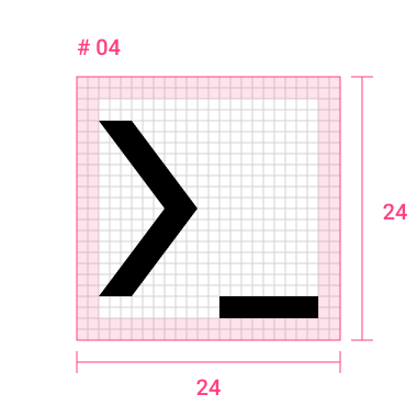
Personal favorite is the last # 04
ezhd
on 13 Jul 2020
Personal favorite is the last # 04
Agree, the last one seems best. Could you submit a PR with updated icon?
 xeffyr
on 13 Jul 2020
xeffyr
on 13 Jul 2020
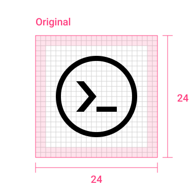
While I agree that the new one is too thin, isn't it best if it keeps the same placements and proportions as the launcher icon? The last one of your mockups does not. As you can see in the original notification icon (which is identical to the launcher icon apart from the circle), the bottom of the > and _ should align.
 trygveaa
on 13 Jul 2020
trygveaa
on 13 Jul 2020
I agree that # 03 follow launcher icon the most. In fact it is exact copy. The # 04 was inspired by real life terminal underscore caret, which is usually falls under the line.
As an afterthought I guess we should stick to the original launcher icon aka # 03
(This is why we have several version presented)
ezhd
on 13 Jul 2020
Part of v0.96 release.
xeffyr
on 30 Jul 2020
Related issues
 QGB
·
3Comments
QGB
·
3Comments
 nedz14
·
4Comments
nedz14
·
4Comments
 bitnetwork
·
3Comments
bitnetwork
·
3Comments
 ngroup
·
5Comments
ngroup
·
5Comments
 AlainKnaff
·
4Comments
AlainKnaff
·
4Comments
Most helpful comment
Android development guidelines have exact specs for notification icons. I would suggest following them.
Also I can volunteer to create some mock-ups