Adaptive icons make app icons more consistent, it would be nice if Termux had one too.
 flipflop97
All 23 comments
Please add support for icon shape
https://developer.android.com/guide/practices/ui_guidelines/icon_design_adaptive.html
https://material.io/guidelines/style/icons.html
 532910
on 20 Apr 2018
532910
on 20 Apr 2018
So which would it be?
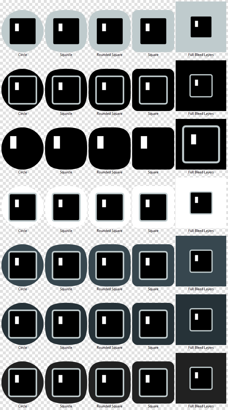
I like the elegance of number 3 but just black icons easily blend with dark/black backgrounds - leaving just small white rectangle.
My favorite would be number 6.
Please ignore the sizes. Now I realized that the terminal icon should be just a tiny bit smaller.
 moneytoo
on 25 Jun 2018
moneytoo
on 25 Jun 2018
awesome!
Yes, 3 is nice, but may be invisible.
Really I can't prefer one of them, all are cool.
532910
on 25 Jun 2018
Nice work! 2, 3 and 5 look the best imo.
flipflop97
on 25 Jun 2018
@fornwall Here is what I came up with following my proposal at Gitter. What do you (and everyone else) think?


I have the files ready and can make a PR once the design is approved.
 lokesh-krishna
on 5 Jul 2018
lokesh-krishna
on 5 Jul 2018
I think it looks good!
 fornwall
on 5 Jul 2018
fornwall
on 5 Jul 2018
Should I make a PR or do you want further opinions on this?
lokesh-krishna
on 5 Jul 2018
I'm fine with a PR! We can release it and see what people think.
fornwall
on 5 Jul 2018
Please review #762.
lokesh-krishna
on 5 Jul 2018
It will be invisible on black background!
532910
on 5 Jul 2018
True, if the background is #000000. If you're talking about the background of the app drawer when using a dark wallpaper on Android 8.1, the black used in this icon is darker than the background and can be distinguished. Also, the problem of blending in is reduced by using two characters rather than the single block.
The problem of blending in is also present when slapping icons onto a white plate such as Google has done with several of their icons as the background is barely visible or sticks out in a bad way on white backgrounds. I don't know how to address it when using black or white.
I could use different colors (I love the Nord color scheme so maybe the background and foreground colors from that color scheme or any other color scheme that we can arrive at a consensus for) but these colors reflect the default Termux color scheme and that's why I went with them.
Here's what the icon would look like with the background and foreground colors from the Nord color scheme:

lokesh-krishna
on 6 Jul 2018
Moreover, what > means? My prompt ends with %, and $ for most of other people.
532910
on 6 Jul 2018
Moreover, what
>means?
Interesting question. This proved to be an interesting read: Why is >_ used as a terminal icon anyway?.
lokesh-krishna
on 6 Jul 2018
@lokesh-krishna, @c-e-p-x-u-o Probably that > is a last symbol of DOS console prompt (full is like C:\>). But anyway this is a 'terminal' so I don't see anything wrong with that. Also, default prompt for fish shell ends in >.
 xeffyr
on 6 Jul 2018
xeffyr
on 6 Jul 2018
Should this be fixed by #762?
I've updated to v0.65 but Nova still displays the legacy icon inside a background, not the adaptive one.
 brunelli
on 6 Aug 2018
brunelli
on 6 Aug 2018
I'm using the OmniROM stock launcher and the adaptive icon shows up properly on it. Could you test any different launcher to see if this is something exclusive to Nova?
lokesh-krishna
on 6 Aug 2018
Yes, just tested in Pixel Launcher and Action Launcher, both still shows the round icon.
I'm running Sony's stock Android 8.0 on a Xperia X.
brunelli
on 6 Aug 2018
The adaptive icon shows up properly on Lineage 15.1
But it looks bad on the dark background. (Blurred Lines live wallpaper)
532910
on 6 Aug 2018
@c-e-p-x-u-o There's a PR (#797) to try out an alternative color.
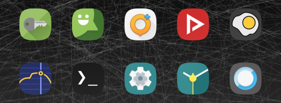
Out of curiosity what's that app with an omelette for an icon.
lokesh-krishna
on 6 Aug 2018
scrambled exif, it removes metadata from the photo
532910
on 6 Aug 2018
I'd like to add a note about icon.
Old icon was way more stylish, and unique, despite simple design. The whole idea of adaptive icons was bad, because it adds more restrictions to design, and doesn't provide any real benefits except new visual effects, which are not that important, since we're looking for icon on desktop, and usually drop our attention after finding it, because app if find, and already opening. Since 90% of time is spent on search for icon in menu/desk, 5% on icon animations animations (because it's really fast), and 5% on launching animation (because it's as same as fast as icon animation), icon animations are not prior here. Old icon was easy noticeable on both dark bg (desk, with dark wp) and light bg (menu in stock android). New icon is really annoying since I tend to use #000000 background on my desk.
If adaptive icons could have different background which isn't just cropped, it could be more flexable, and old icon could be easily adapted.
So I agree with https://github.com/termux/termux-app/issues/552#issuecomment-399833763 and number 6 is the best out there. Yet the old variant was better than any other in my opinion
 andreyorst
on 21 Aug 2018
andreyorst
on 21 Aug 2018
What I don't understand most is why we end up going "Nordic".
 tomty89
on 22 Aug 2018
tomty89
on 22 Aug 2018
Should be closed, right?
532910
on 31 Jan 2019
Related issues
 rjsteinert
·
4Comments
rjsteinert
·
4Comments
 joakim-noah
·
5Comments
flipflop97
·
3Comments
joakim-noah
·
5Comments
flipflop97
·
3Comments
 Areahints
·
4Comments
Areahints
·
4Comments
 QGB
·
3Comments
QGB
·
3Comments
Most helpful comment
So which would it be?
I like the elegance of number 3 but just black icons easily blend with dark/black backgrounds - leaving just small white rectangle.
My favorite would be number 6.
Please ignore the sizes. Now I realized that the terminal icon should be just a tiny bit smaller.