Terminal: Investigate/implement renderer setting to disable ligatures
I think there is a setting somewhere in the DirectWrite stuff that will let you tell ligatures to go away and just use the individual symbols from a given font.
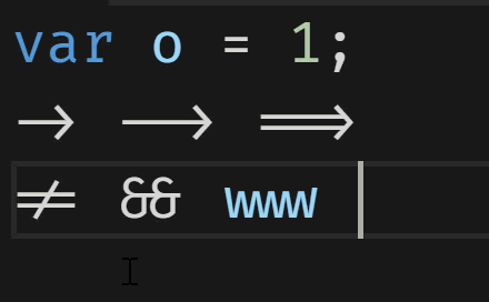
I think that by doing nothing, fonts like Fira Code are choosing the ligature.
This represents rooting around in DirectWrite land to see if:
- If there is a setting to stop ligatures from forming
- If we should pipe it through (or tell folks to stuff it because they could just choose a non-ligature font)
- Piping it through as a user preference, potentially.
Anyone could do the rooting around, so tagging as help-wanted. Please don't get too far without letting us know the investigation first.
Also, this is coming out of #514
 miniksa
All 22 comments
The font picker that gets added to the app settings, could be sure to include options for discretionary ligatures, as well as possibly stylistic sets?
Opentype gives you a lot of options, as do Variable fonts, which could have a width slider for fonts which support that.
This should also lead to a discussion about the design and features of Cascadia Code or future versions of Consolas and which of these Opentype/Variables features should be implemented.


Stylistic Alternatives
Ligatures

Variable Weight
 mdtauk
on 14 May 2019
mdtauk
on 14 May 2019
@miniksa shot in the dark here - I have done some DirectWrite work in the past and I _think_ you can do what you want with "GetGlyphs". I am not sure the code I am referencing is even used in your scenario but I thought maybe with some luck the suggestion would be helpful. If not sorry for wasting your time. ☹️
- In CustomTextLayout.cpp Line 275
// Can you pass in features and featuresLength to disable ligatures?
DWRITE_FONT_FEATURE fontFeature = { DWRITE_FONT_FEATURE_TAG_STANDARD_LIGATURES, 0 };

r = _analyzer->GetGlyphs(..., fontFeature, length, ....)
 dlong11
on 1 Jun 2019
dlong11
on 1 Jun 2019
@miniksa
IDWriteTextAnalyzer's methods (GetGlyphs, etc.) accept a list of feature tags (like liga for liagatures), and you can easily configure that.
For variation support, you need to use IDWriteFactory6 and related methods to deal with that. (MSDN don't have documents about it! WHY?)
Please note that there are some features that are mandatory for supporting complex scripts, so they cannot be turned off. IDK whether rvrn belongs to it, and it is used to support variable fonts' non-continuous variations. (check out this crazy example!)
Here are some sample code: https://github.com/fdwr/TextLayoutSampler/blob/master/DWritEx.ixx
cc. @fdwr
 be5invis
on 8 Jul 2019
be5invis
on 8 Jul 2019
Is it appropriate to have a font rendering option that forces mono spaced glyphs? Or is this specifically an issue with the font? I may have this wrong but I think there are half/double spaced glyphs, however in other terminal emulators powerline / nerdfont arrow glyphs are single spaced glyphs but in this terminal it's making the arrows double spaced glyphs. By the way, what MS is doing for developers is incredible.
 jasonxoc
on 4 Sep 2019
jasonxoc
on 4 Sep 2019
Ah sorry guys, I see that this was talked about here:
The powerline glyphs are in a region of the character table specified as "ambiguous width." Whenever we get one of those, we ask the font how wide the grapheme cluster is. This is required to eventually support things like Devanagari and other N:M glyph->cell mapping scripts. Anyway, the standard NerdFont patcher installs the powerline glyphs as double-width glyphs.
So, Windows Terminal asks how wide the powerline characters are and gets "two cells".
There's a conhost instance backing every tab. That one also (for a long list of legacy compatibility reasons that are better explained in #1739) needs to count cells and widths and characters and stuff. That one is not using the same font, so it gets a different answer: "one cell".
They trivially and immediately disagree on where the cursor is, and where all characters after the mis-identified grapheme cluster are.
jasonxoc
on 4 Sep 2019
Chiming in here to say that there is (anecdotally) a significant number of people who aren't big fans of fancy coding ligatures, and that being able to turn them off would be a godsend. Personally, I'd like to try using the shiny new Cascadia Code you guys have so lovingly put together, but not being able to disable its ligatures is stopping me from sticking with it.
 obskyr
on 21 Sep 2019
obskyr
on 21 Sep 2019
Currently, Fira Code & Cascadia Code rely on the opentype feature calt to display code ligatures. This feature should be active by default, but is possible to turn off. From what I can tell, this is how VS Code offers an option to toggle code ligatures (their option toggles both liga and calt).
I am currently making a font with code ligatures (https://github.com/arrowtype/recursive), and looking into using discretionary ligatures dlig for code ligatures, for exactly the reason that some people like them, but some people don't, and I don't believe they should be on by default.
So, in my mind, the ideal controls for this would be:
 thundernixon
on 3 Oct 2019
thundernixon
on 3 Oct 2019
@thundernixon Would you ever want to display dlig without clig? That is, are there 4 distinct states of interest here, or just 3? (a) No ligatures at all (b) Default ligatures (c) All ligatures.
 fdwr
on 3 Oct 2019
fdwr
on 3 Oct 2019
@fwdr good question! It's hard to be totally confident in a universal statement about typography, especially because I am only familiar with Latin script. However, I _think_ you are mostly correct in seeing this as a three-state option, rather than a four-state option. Both are abstractions, but the simpler one probably covers almost all reasonable (Latin) uses of these four features, and would have the benefit of being possible through a single setting with a radio-button option.
I see it as:
- no ligatures at all, even if they improve readability
- subtle ligatures that are "default" to the typeface, there to improve readability without being especially noticeable (liga, clig, and calt)
- noticeable, "decorative" ligatures that are there to add style and delight (dlig)
It's natural to add ligatures for readability without adding ligatures for flair. However, I doubt many type designers or users would want to add ligatures for flair, without also adding ligatures for readability.
thundernixon
on 3 Oct 2019
@thundernixon
Why can't we just allow users to specify features and variation coordinates? Like {variation:{wght: 350}, features:['calt', 'liga', 'COOL']}.
Note: we _may_ need allowing them to specify variations for bold (axis wght), italic (axis ital, slnt) and bold-italic.
be5invis
on 3 Oct 2019
@be5invis It's just not very user-friendly, is it? A user shouldn't have to know the specifics of the OpenType format to turn ligatures on or off.
obskyr
on 3 Oct 2019
@obskyr well, it could basically follow the CSS approach to font control, which should presumably be friendly enough for most folks wanting to customize a developer app. It would likely be less about them knowing the opentype format, and more about font developers documenting what settings are available. It would open up so much more flexibility to allow users to specify variation axes and opentype features, and avoid asserting an abstraction onto all languages, users, and screens. After all, almost 100% of the user’s interface in a terminal is typography, so it might make sense to allow some control.
Potentially, might there be a way to have a simple ligature (choices Off, Default, All) control, but allow this to be overridden by a @be5invis’s CSS-like advanced setting?
thundernixon
on 3 Oct 2019
@thundernixon
OpenType: "Off", "Default", "All", "Custom" ← write "CSS" if this option is chosen.
be5invis
on 4 Oct 2019
@be5invis I like it! Though, I think the label OpenType wouldn't really be quite clear ... what is OpenType: All? Maybe something like...
OpenType: ⚪️Off 🔘Default ligatures ⚪️All ligatures ⚪️Custom...
 arrowtype
on 5 Oct 2019
arrowtype
on 5 Oct 2019
Though, I think it would have to be constrained _what_ CSS could be written. Probably, it should be specifically font-feature-settings, and allow whatever values that allows, like "dlig", "ss08", "swsh" 2, "onum"; etc.
https://helpx.adobe.com/fonts/using/open-type-syntax.html
https://developer.mozilla.org/en-US/docs/Web/CSS/CSS_Fonts/OpenType_fonts_guide
Specifically, I think font-variation-settings would make more sense if placed nearby general font choice – maybe under a Custom... or Advanced... button of some sort.
arrowtype
on 5 Oct 2019
Looping back on this with something related:
VS Code now supports control over opentype features, including dlig, stylistic sets, and more!
https://github.com/microsoft/vscode/issues/80577
Basically, they have just allowed users to directly enter OpenType tages into the settings.json file, under fontLigatures:
"editor.fontLigatures": "'ss01','ss02','dlig','onum'"
This isn't _perfect,_ because the name of the setting isn't quite logical – ligatures are only one type of OpenType feature. A more apt name might be something like editor.openTypeFeatures or fontFeatures (similar to font-feature-settings in CSS). Still, it's a very good start, and the general scheme of entering OT feature tags into JSON settings seems like it might be pretty ideal for the Windows Terminal's profile.json settings!
arrowtype
on 18 Nov 2019
To add to what @arrowtype has stated, I've found I can disable (which by default it was) font ligatures in VSCode with:
"editor.fontLigatures": false
 ctataryn
on 25 Mar 2020
ctataryn
on 25 Mar 2020
FYI for Jetbrains Mono users they now have a version without ligatures called JetBrains Mono NL:
https://twitter.com/bulenkov/status/1244376357443964929?s=20
ctataryn
on 30 Mar 2020
This isssue is now more important, because after the latest update, Cascadia Code includes ligatures which cause visual problems in Terminal, e.g. when printing "." after one another like a progress bar.
 PetterS
on 23 Apr 2020
PetterS
on 23 Apr 2020
My best guess here, which hasn't been validated yet, is passing a DWRITE_FONT_FEATURE_TAG with DWRITE_FONT_FEATURE_TAG_CONTEXTUAL_LIGATURES (https://docs.microsoft.com/en-us/windows/win32/api/dwrite/ne-dwrite-dwrite_font_feature_tag) in a DWRITE_FONT_FEATURE (https://docs.microsoft.com/en-us/windows/win32/api/dwrite/ns-dwrite-dwrite_font_feature) with the parameter set to 0 or something inside the IDWriteTextAnalyzer calls to GetGlyphs (https://docs.microsoft.com/en-us/windows/win32/api/dwrite/nf-dwrite-idwritetextanalyzer-getglyphs) and/or GetGlyphPlacements (https://docs.microsoft.com/en-us/windows/win32/api/dwrite/nf-dwrite-idwritetextanalyzer-getglyphplacements) inside our CustomTextLayout class.
I would have to play around with it and/or ask the DWrite folks.
miniksa
on 24 Apr 2020
Would this setting also disable the abnormal rendering of x between digits (https://github.com/microsoft/cascadia-code/issues/285)?
 KalleOlaviNiemitalo
on 12 Jun 2020
KalleOlaviNiemitalo
on 12 Jun 2020
Yes.
 DHowett
on 12 Jun 2020
DHowett
on 12 Jun 2020
Related issues
 xmm1989218
·
3Comments
xmm1989218
·
3Comments
 warpdesign
·
3Comments
warpdesign
·
3Comments
 wkbrd
·
3Comments
wkbrd
·
3Comments
 ghost
·
3Comments
ghost
·
3Comments
 geeksfn
·
3Comments
geeksfn
·
3Comments
Most helpful comment
To add to what @arrowtype has stated, I've found I can disable (which by default it was) font ligatures in VSCode with:
"editor.fontLigatures": false