Tensorboardx: how to merge multiple scalar into one figure
Hi, thanks for the excellent library.
I have a question. When add a write.add_scalar, a new figure is generated.
I wonder how to merge multiple scalar into one figure? It is similar with the write.add_scalars function, however I have to call the write.add_scalar in different positions of the code.
 blueardour
All 6 comments
Sorry I can understand your question. Doesn't demo.py work for your case?
 lanpa
on 29 May 2018
lanpa
on 29 May 2018
Yes, the demo.py work perfect for me. Sorry for my unclear description.
I have a requirement like the following:
`
writer = SummaryWriter()
for iter in emuerate(xx):
write.add_scalar('loss', loss, iter)
if iter % 1000 ==0:
write.add_scalar('top1', top1, iter)
write.add_scalar('top5', top5, iter)
write.close()
`
After I show the log in tensorboard, the loss, top1, top5 are in different figures.
I wonder if I could merge these plot into one figure. Could it possible provide some 'write.merge()' function. The write.add_scalars interface seems to enable multiple variable grouped into one figure, however it requires all variable in the same sentence.
blueardour
on 31 May 2018
What arguments would be passed to write.merge()? Wouldn't it similar to add_scalars?
lanpa
on 31 May 2018
Yes, I expect pass the variable name with the same x-axis(for example, all the 'loss', 'top1', 'top5' scalars employ the 'iter' as their x-axis) into the write.merge(). So that these scalars could be drawn in the same figure.
I'm sorry that I don't know whether it is hard to implement this function.
The following is some figure I draw with matplotlib.
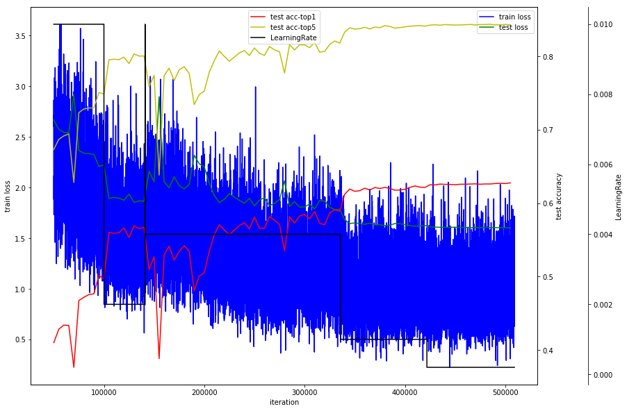
By the kind of figure, the val loss in some trival is a little higher than the training loss, indicating a over fitting.
blueardour
on 1 Jun 2018
Oh, I think I got your point. Does the following code work for you?
for n_iter in range(10000):
    writer.add_scalars('data/scalar_group', {'loss': n_iter*np.arctan(n_iter)}, n_iter)
    if n_iter%1000==0:
        writer.add_scalars('data/scalar_group', {'top1': n_iter*np.sin(n_iter)}, n_iter)
        writer.add_scalars('data/scalar_group', {'top5': n_iter*np.cos(n_iter)}, n_iter)
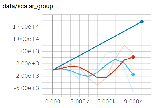
Looks like you use matplotlib, you may also interested in discussing #152 with us.
lanpa
on 1 Jun 2018
Great. Thanks for the illustration. It solved my problem. I would also look at the #152 issue.
blueardour
on 4 Jun 2018
Related issues
 acgtyrant
·
4Comments
acgtyrant
·
4Comments
 yaodi833
·
6Comments
yaodi833
·
6Comments
 nsknsl
·
7Comments
nsknsl
·
7Comments
 gar1t
·
4Comments
gar1t
·
4Comments
 SunHaozhe
·
3Comments
SunHaozhe
·
3Comments
Most helpful comment
Oh, I think I got your point. Does the following code work for you?
Looks like you use matplotlib, you may also interested in discussing #152 with us.